Braeside Bedroom Redesign
We always enjoy guiding our clients through the design process, particularly during life transitions like a big move or changes to the family unit. This was another one of those projects and we were excited to help bring our client’s personality into her bedroom to create a space she loves being in… her own sanctuary. A lot of times when we bring furniture with us from that last phase of life, it can often keep us tied to the past in a way that isn’t always helpful. Being able to embrace who you are in this new phase and surround yourself with items, colours and textures that are representative of who you are and how you want to feel can be extremely liberating. So let’s dive into this bedroom redesign project in St. Albert’s Braeside neighbourhood!
After photos by the incredible Darren Lebeuf.
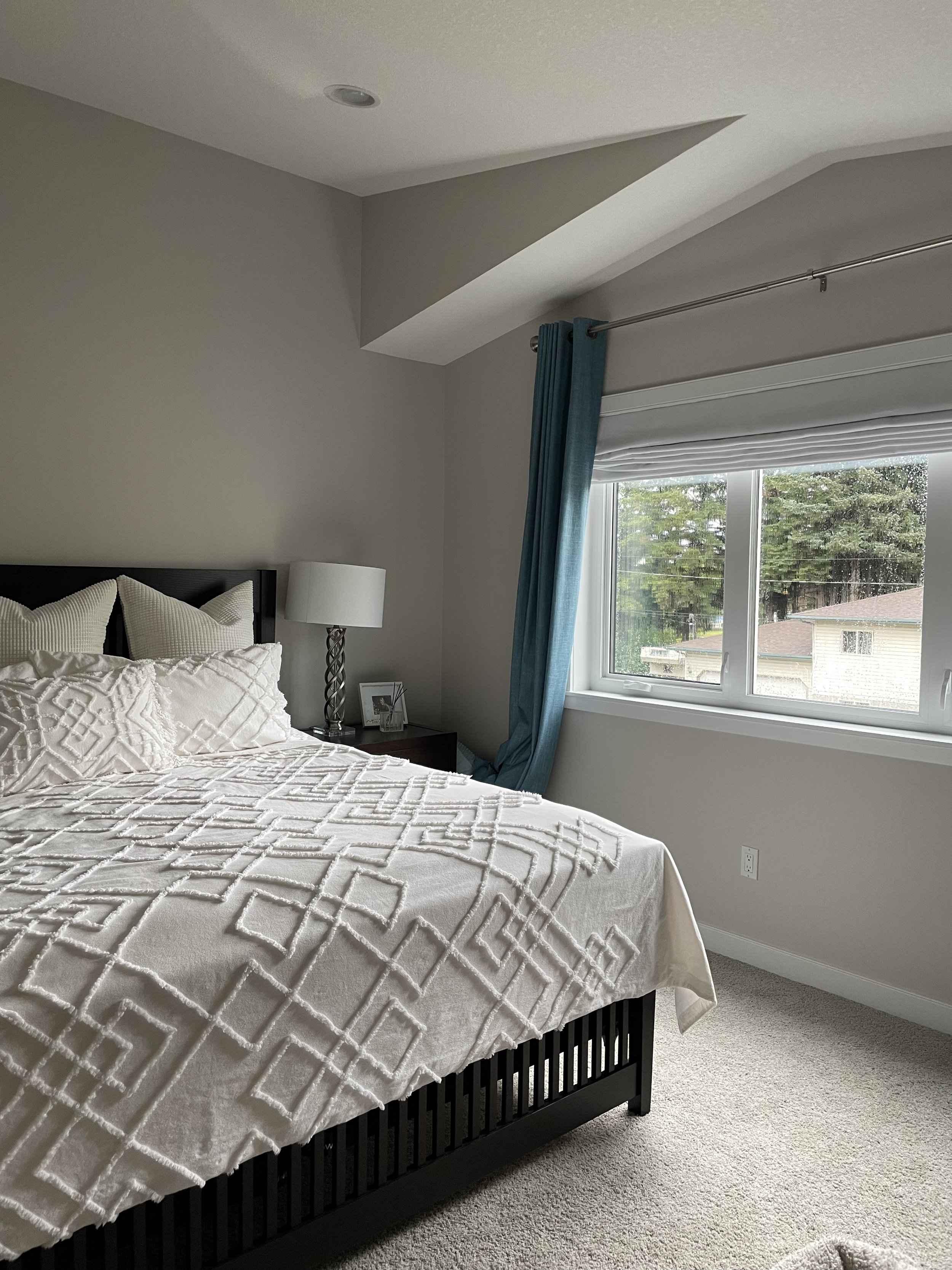
The Before
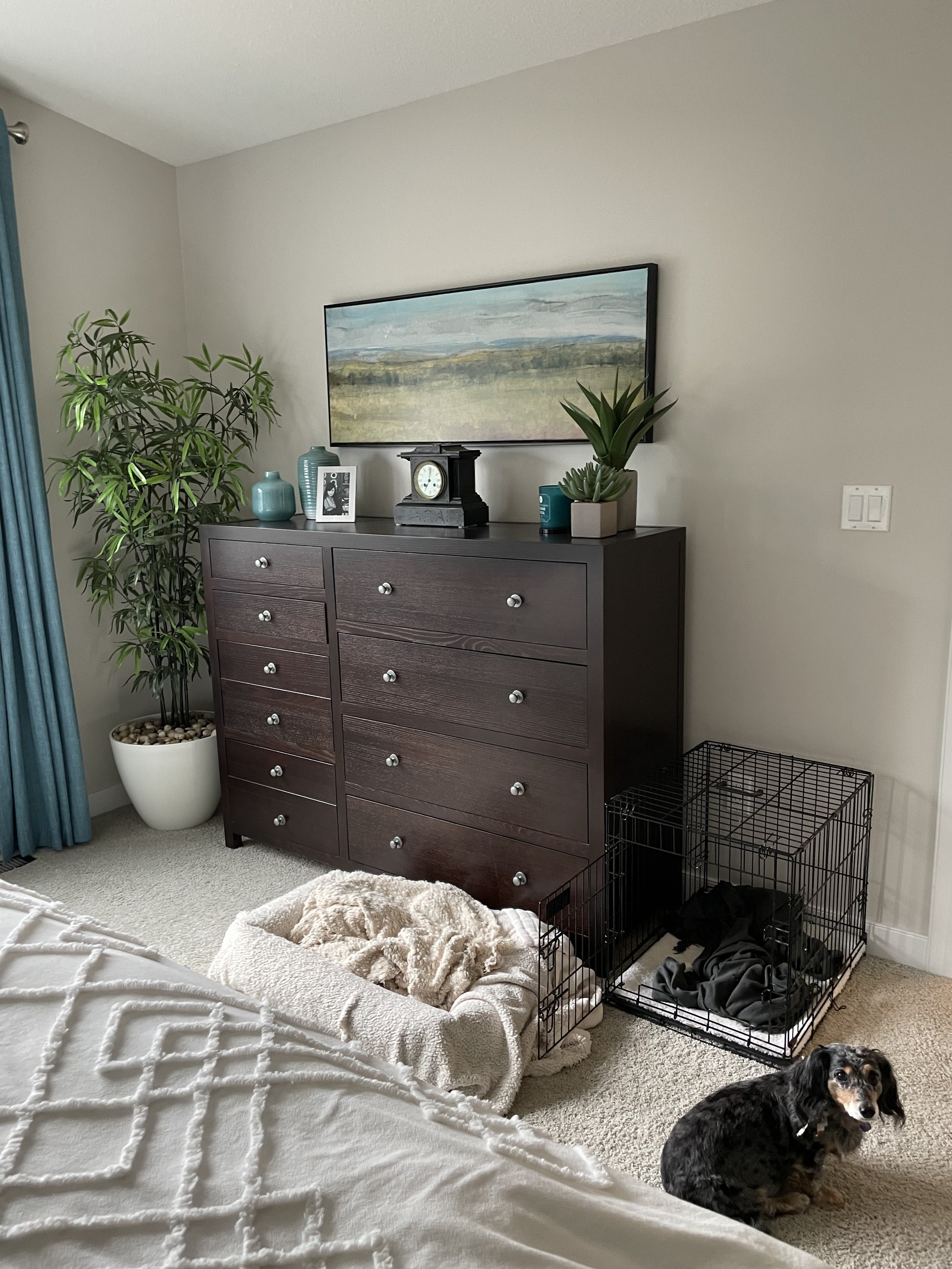
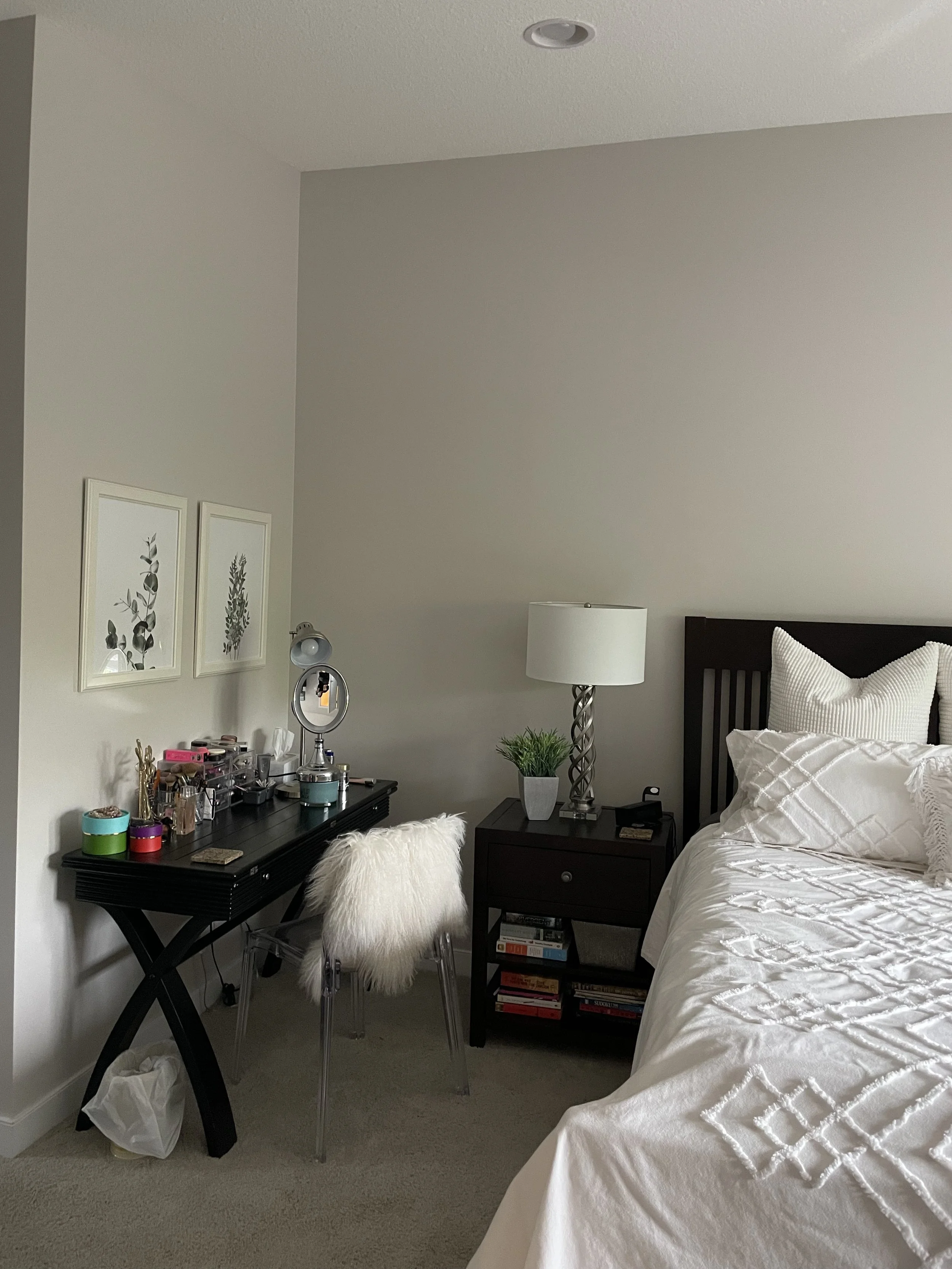
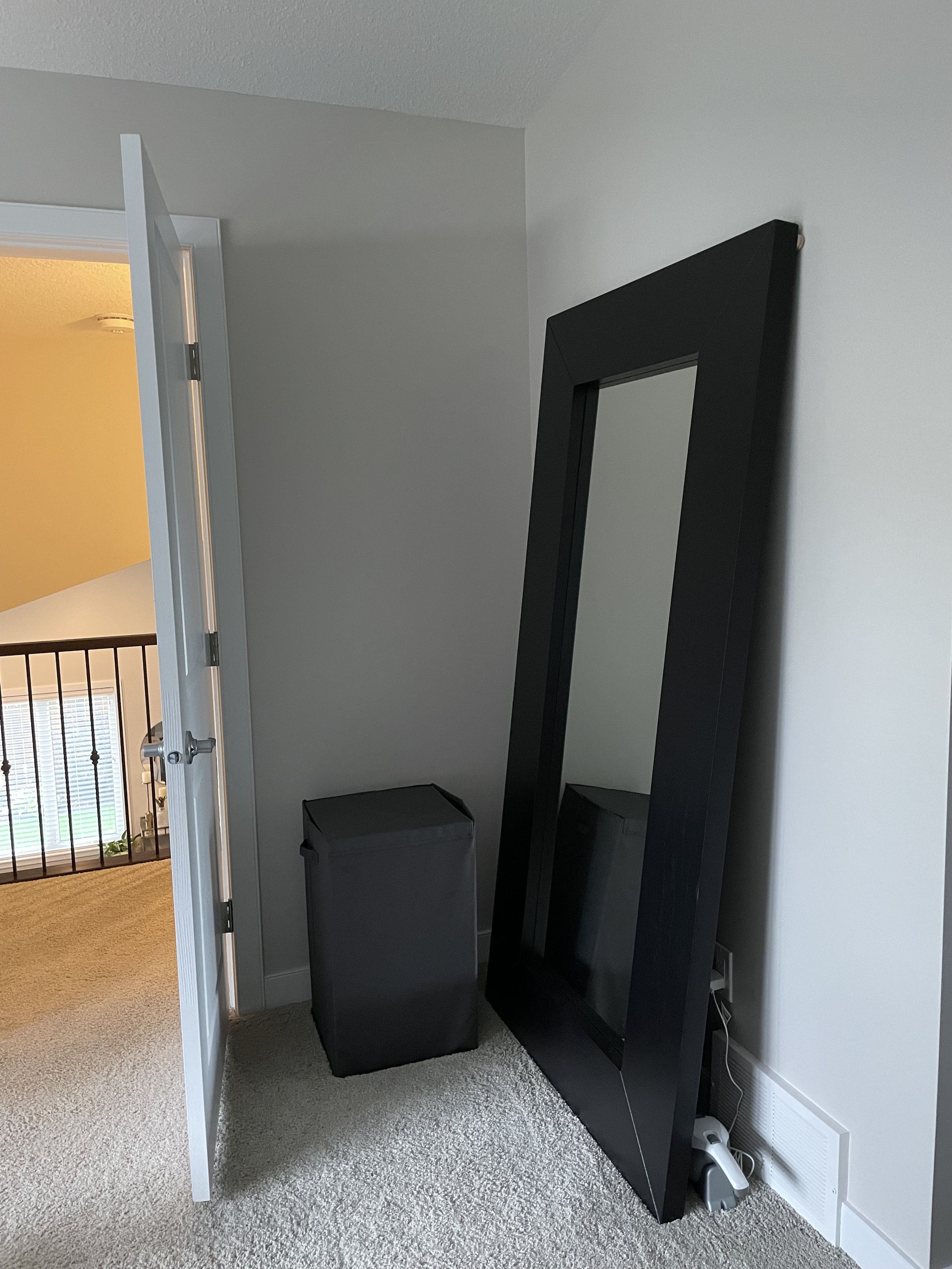
The bedroom that existed when we were brought in was feeling a bit bland and lacking that personality our client desired. With all the furniture feeling dark, heavy and similar in look and feel, it doesn’t leave a lot for our eyes and brain to get drawn into.
There was also a limited amount of textures and layers, which can keep us from having enjoyable feelings when we walk into a space. So of course, it was time to change that look and feel to create something that felt dynamic, enticing as well as feminine and welcoming.
The Design Concept
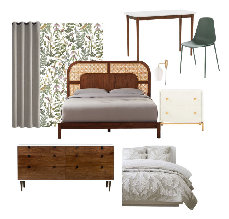
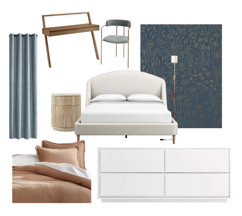
For the design, we started off with two options, one that was more wood focused with lighter elements and another that was more white focused for the furniture, with darker elements like the wallpaper and bedding. We ended up with a combo of the two for the final design, incorporating the bold blues along with more wood elements.
Through our revision process, we ended up incorporating a bit of both looks in the final design.
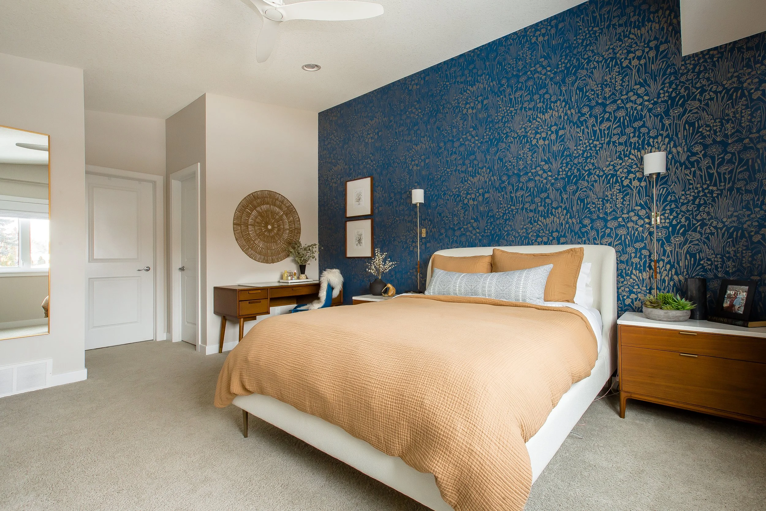
The End Result
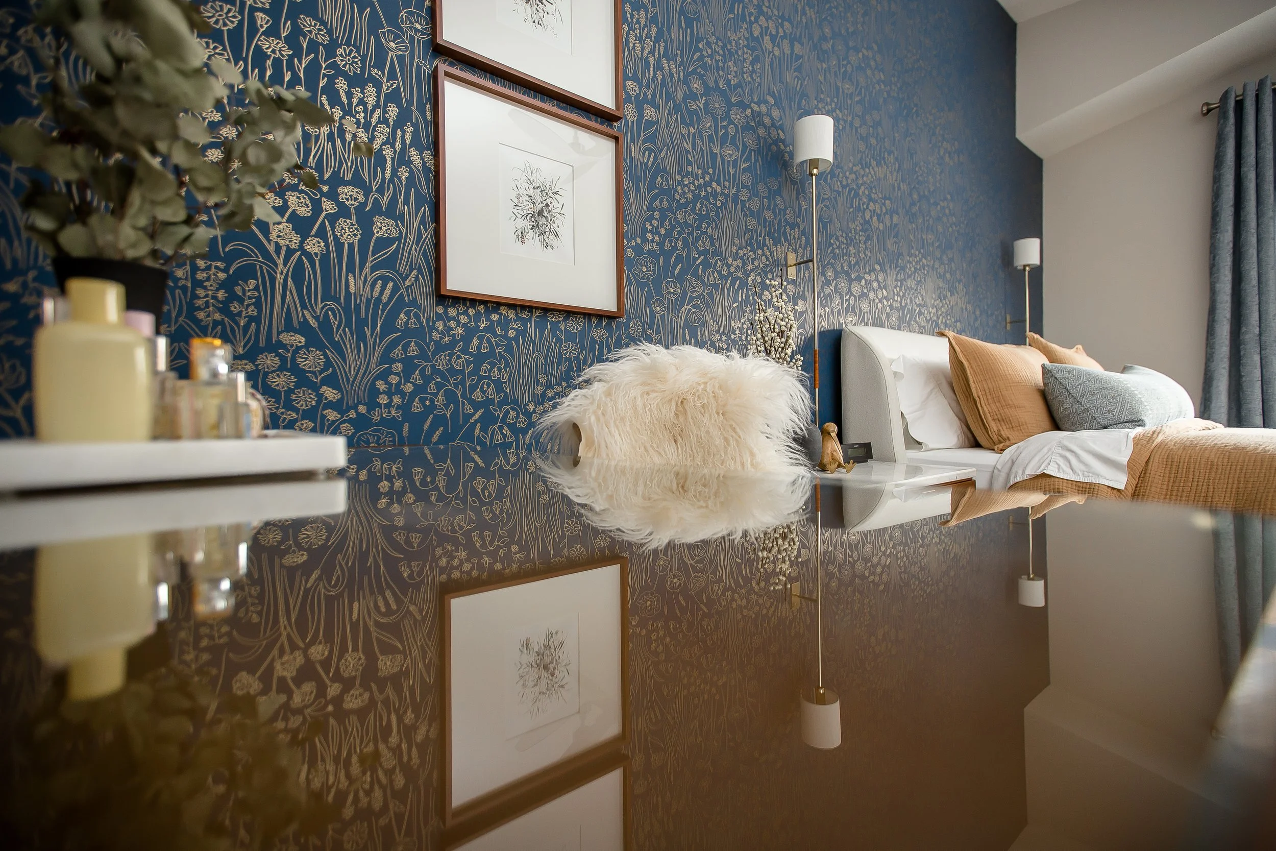
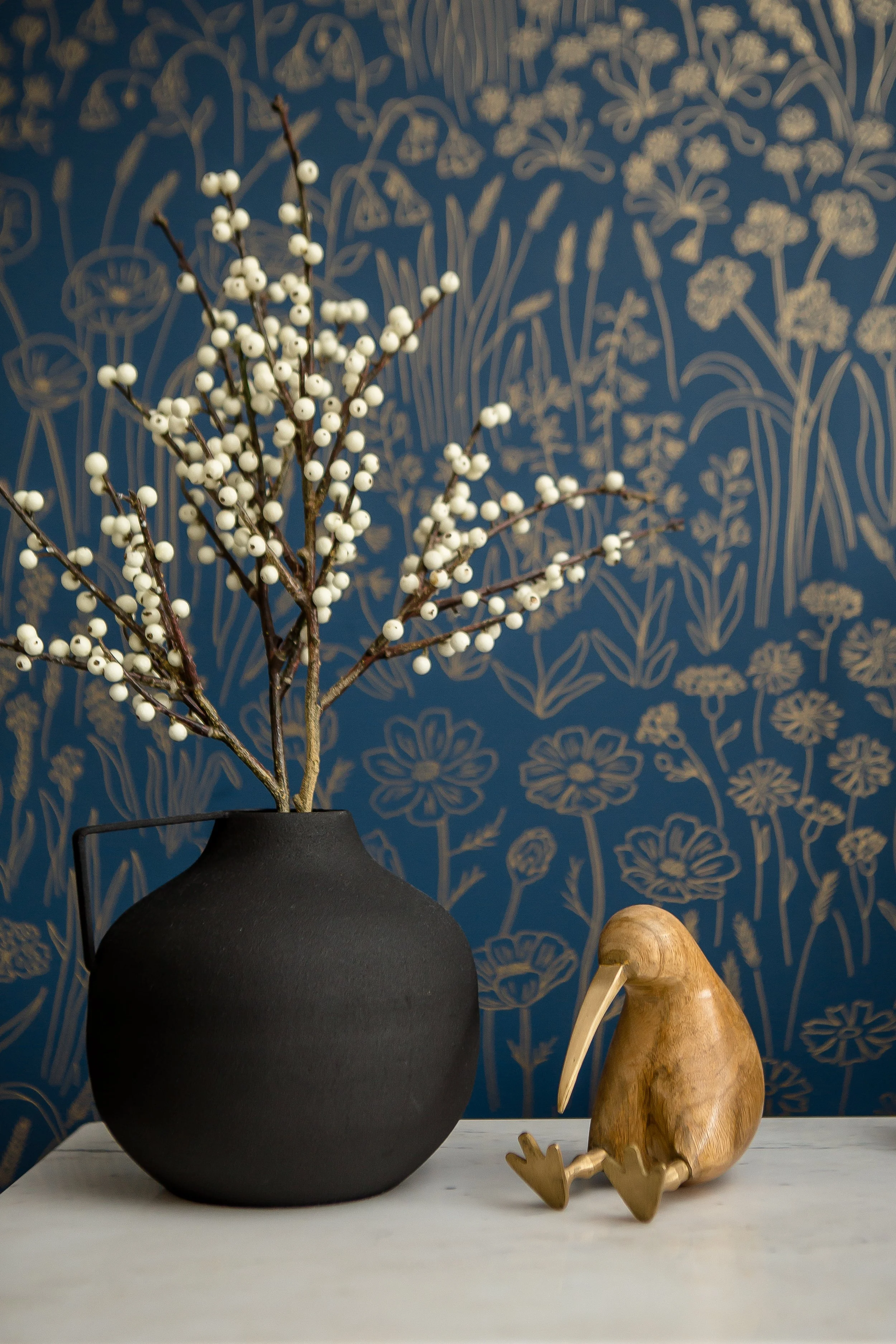
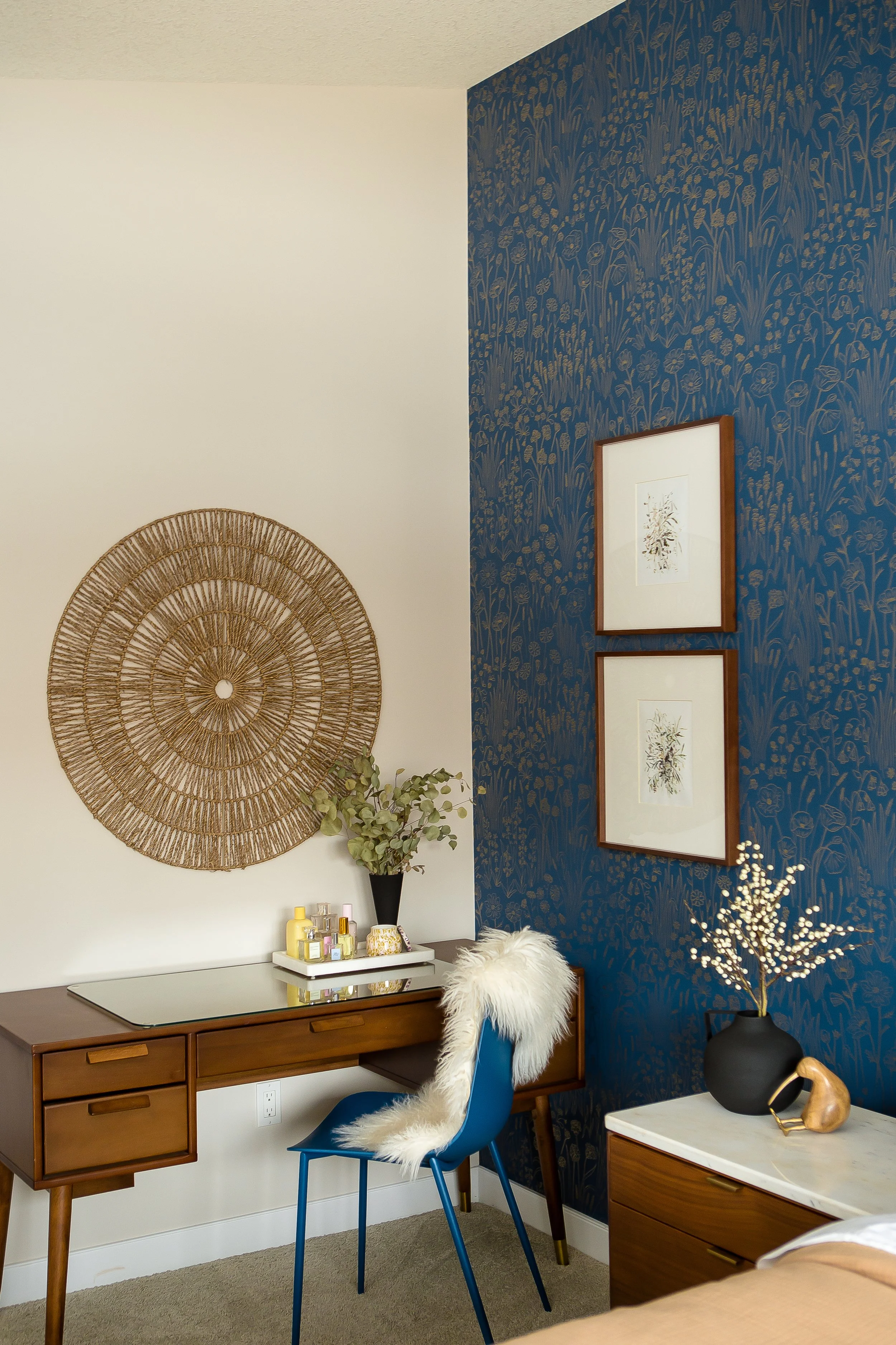
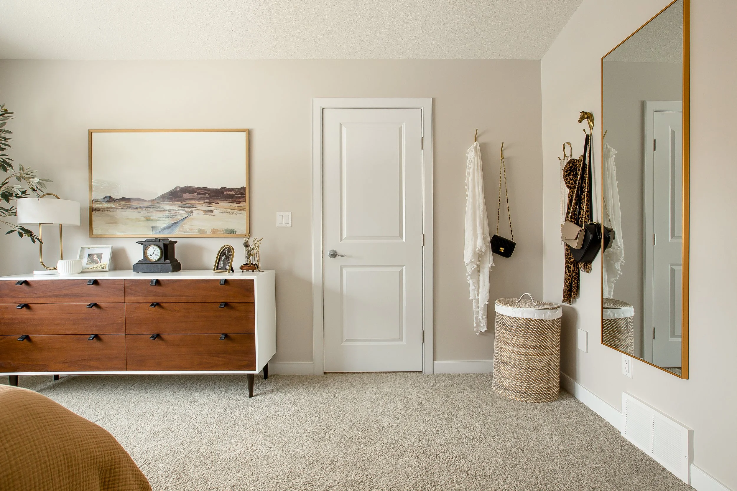
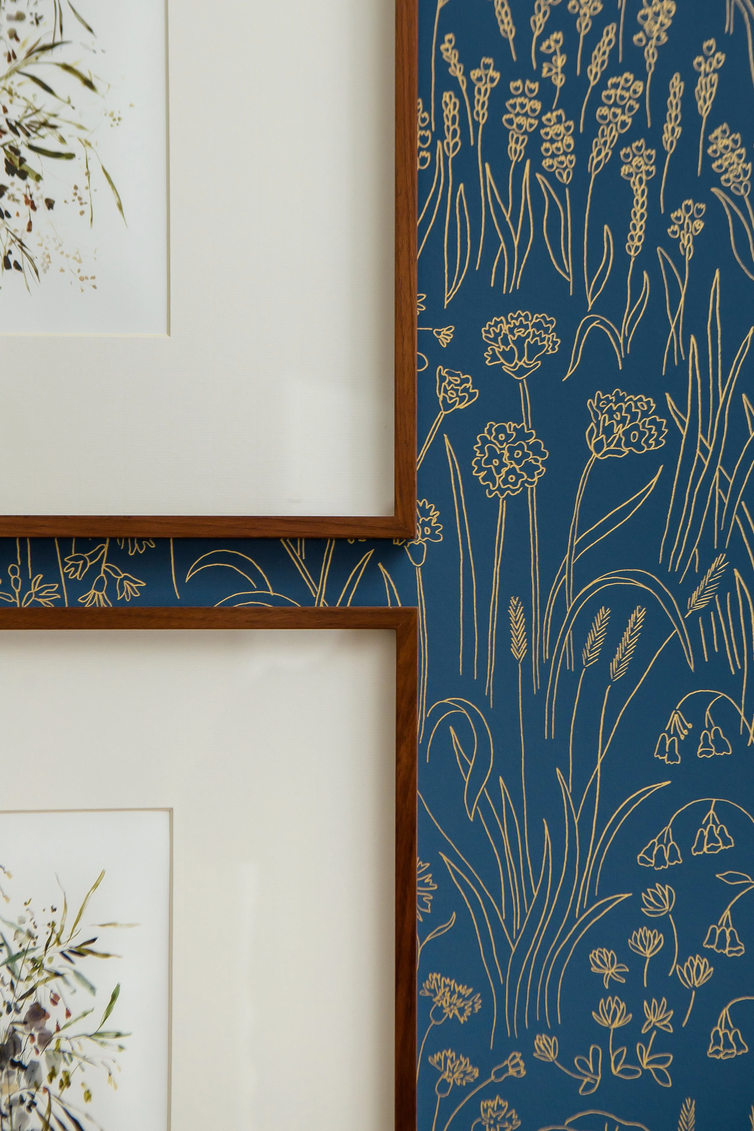
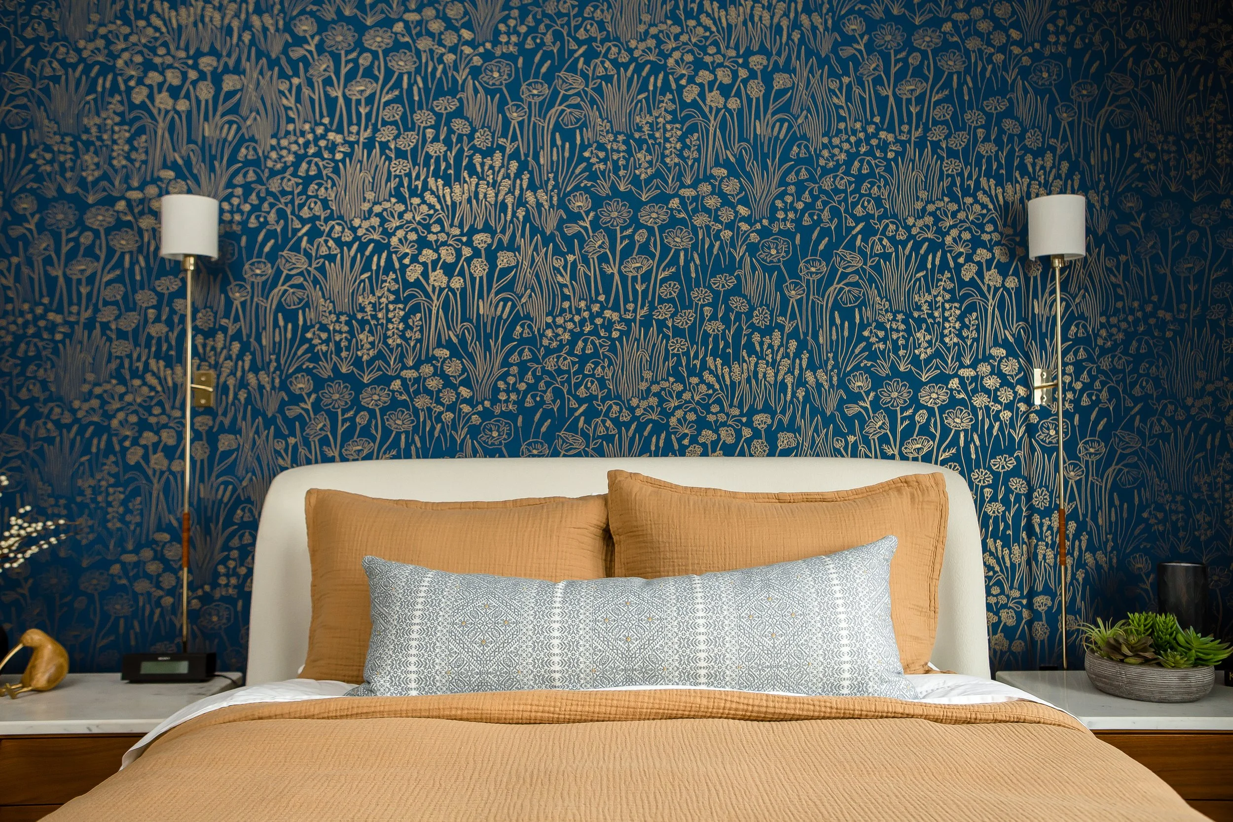
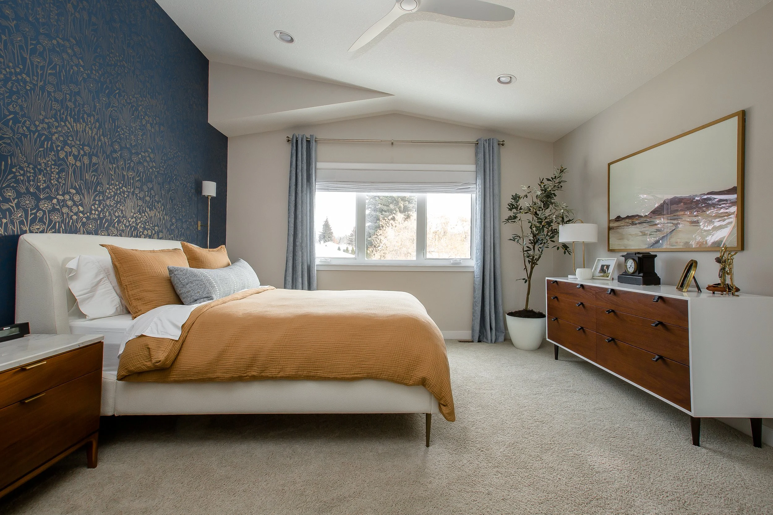
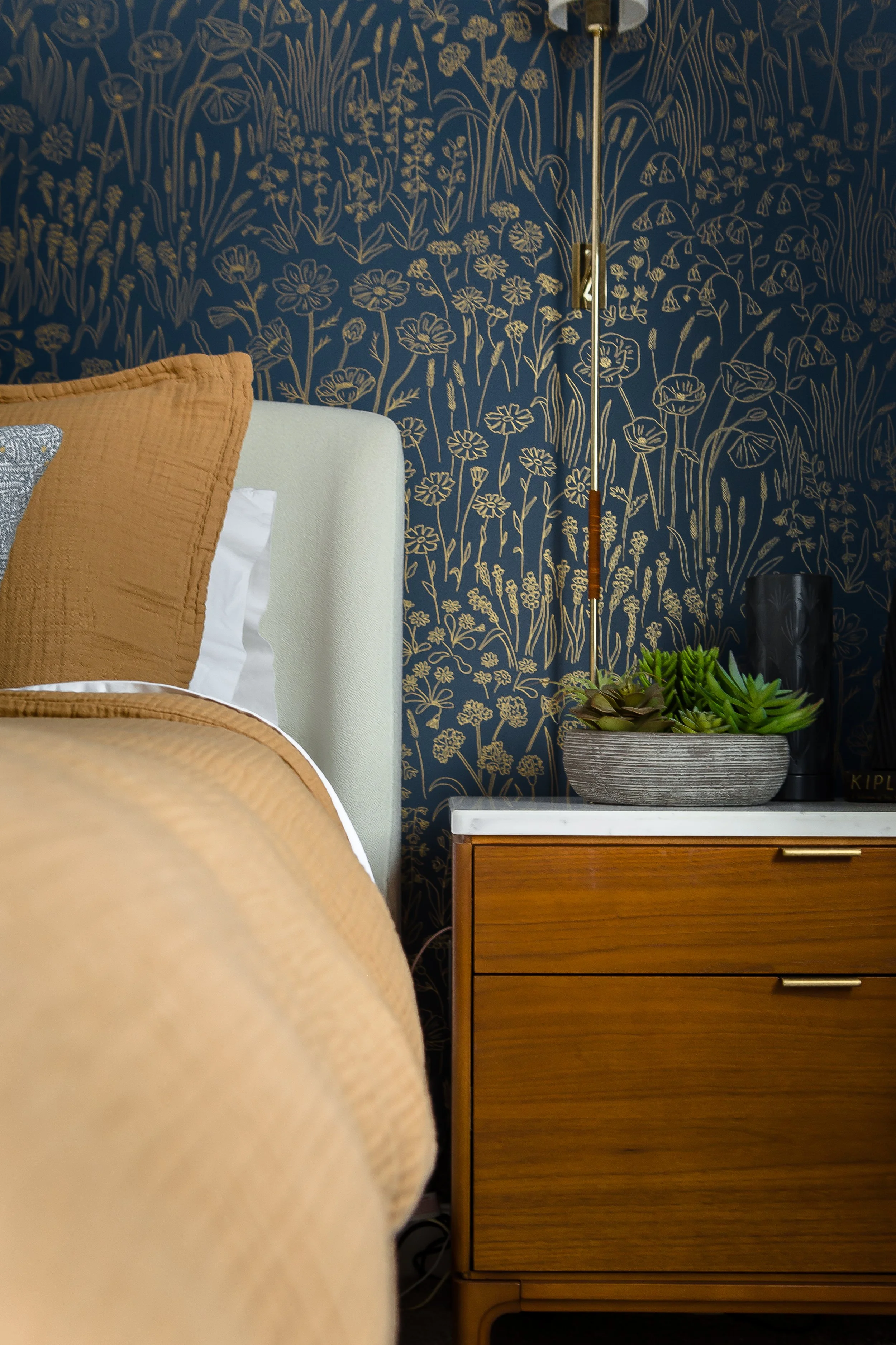
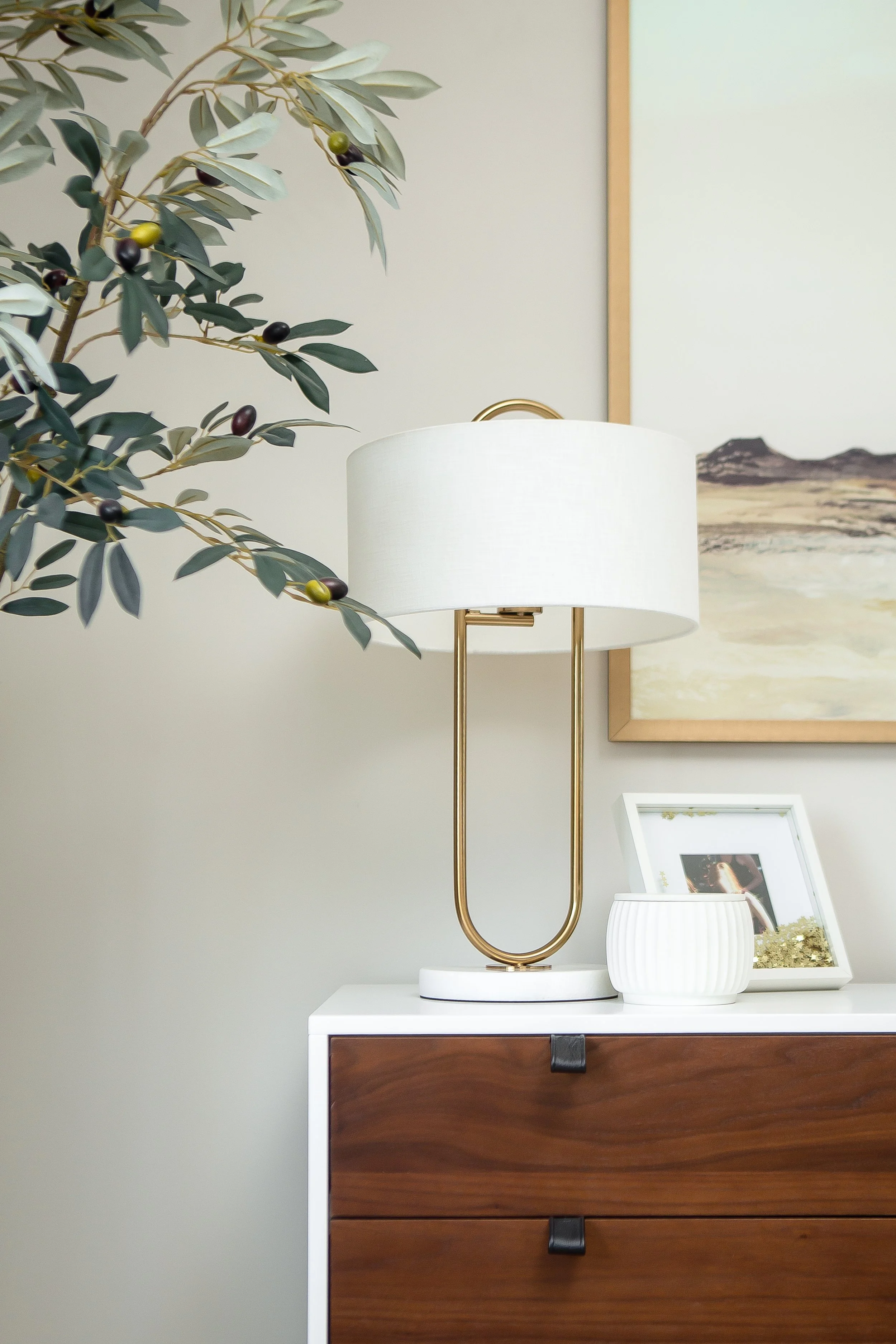
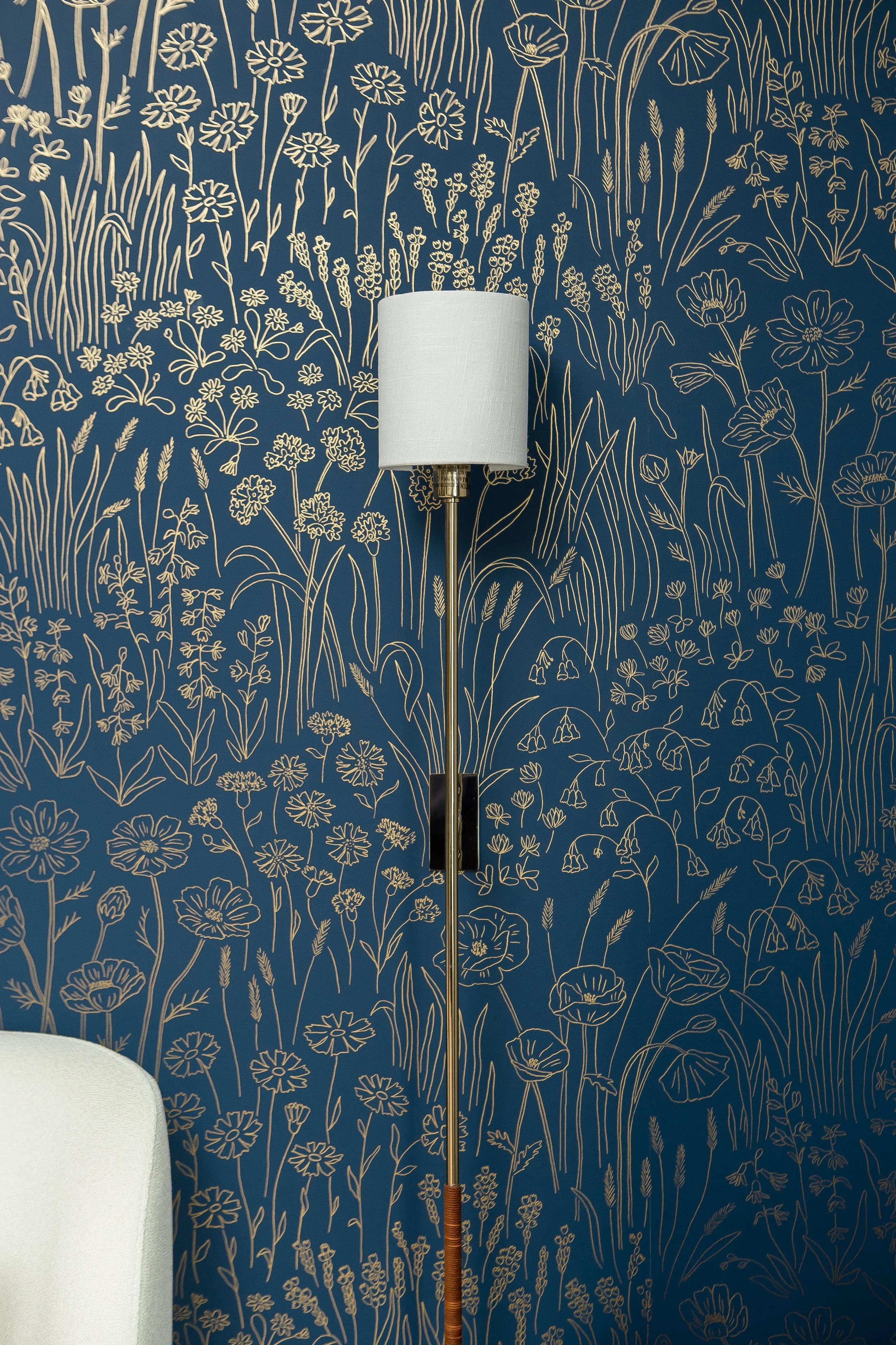
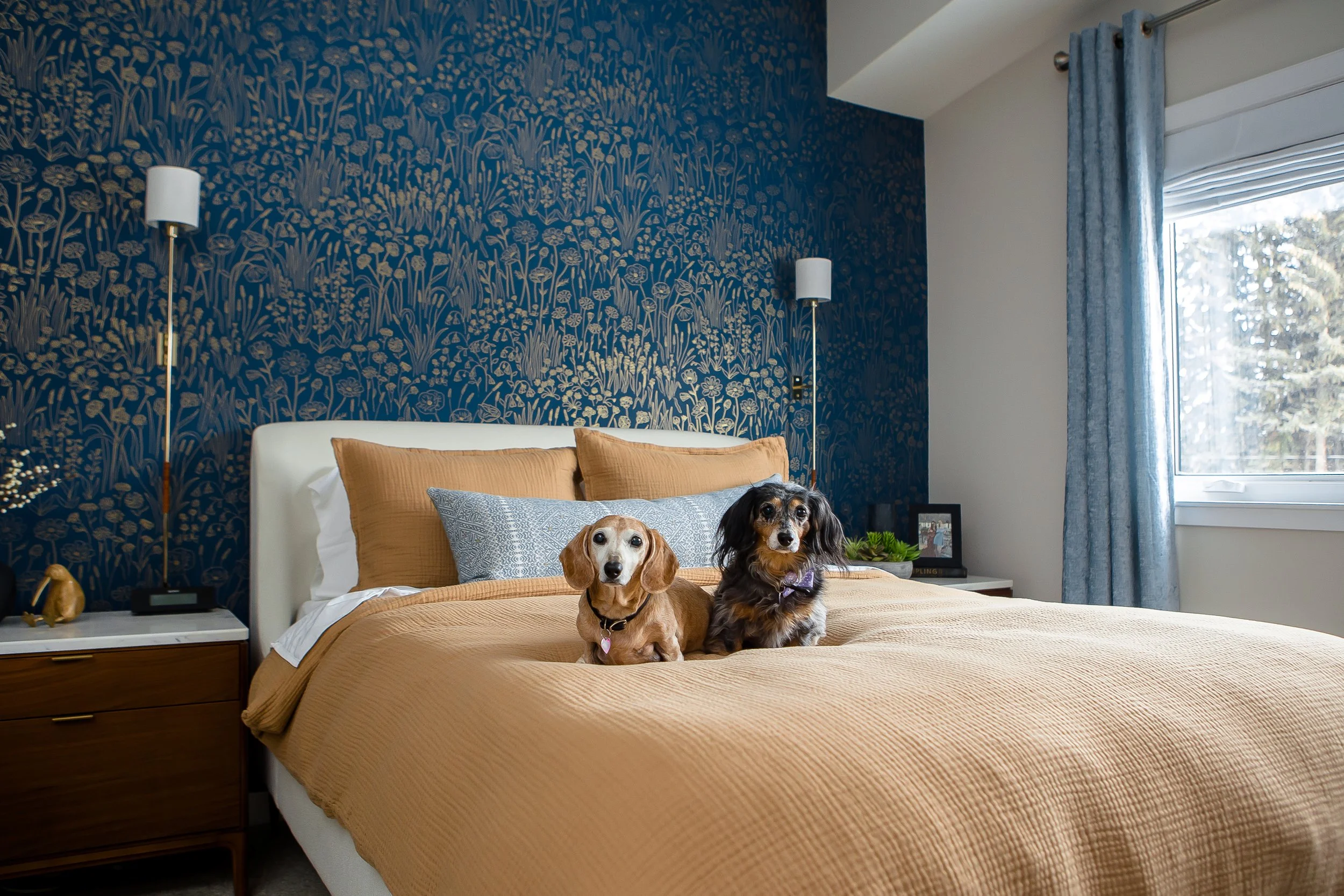
With the stunning deep blue alpine flower wallpaper as the basis for the design, we layered woods, fabrics, additional florals, metallic and natural elements to create this new space. Because the room is quite tall, we also wanted to fill that space more to take advantage of that height. The wallpaper and the tall sconces help to do this, along with the large artwork above the dresser.
The marble tops of the nightstands as well as the white framing on the dresser help to lighten the wood furniture and create additional visual interest in the space.
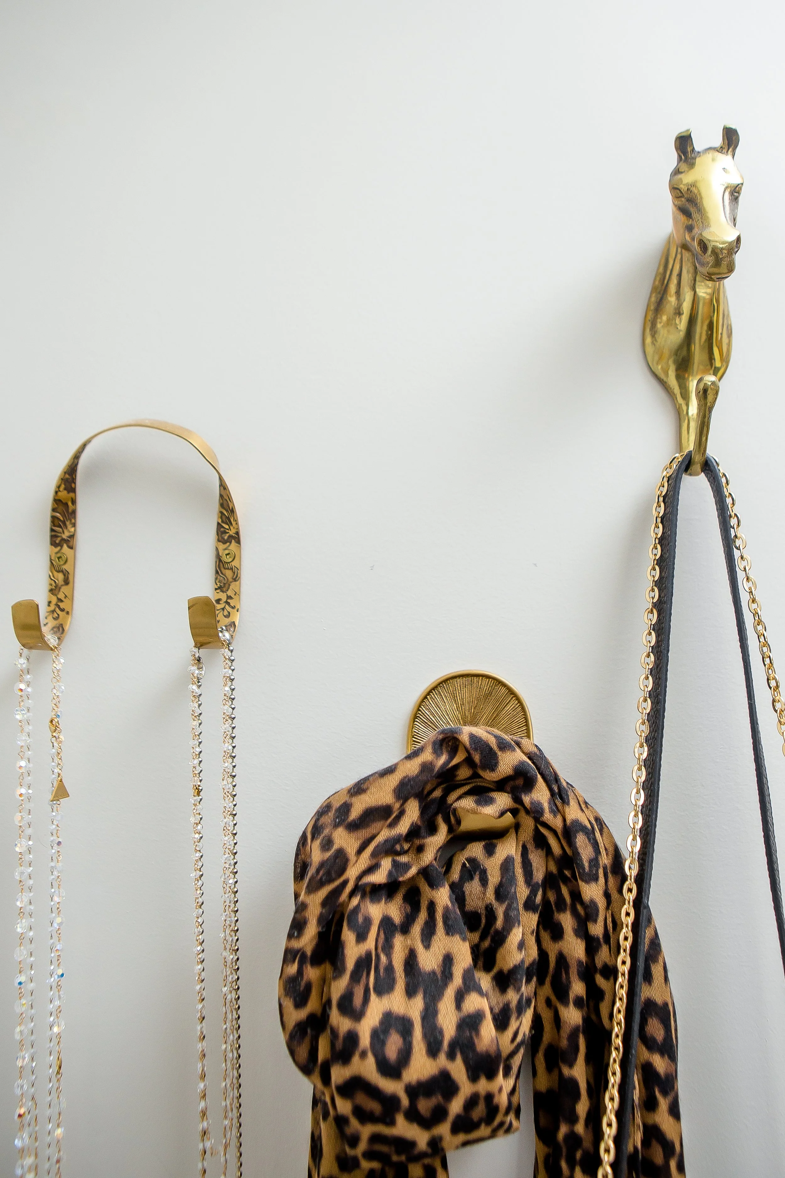
And when you can’t decide on just one look for your hooks, get them all! Love the eclectic look with the mismatched hooks that are tied together through their brass finishes.
I adore this wallpaper. The metallic florals add so much depth and interest to the space; it’s just stunning.
And we did a little bit more…
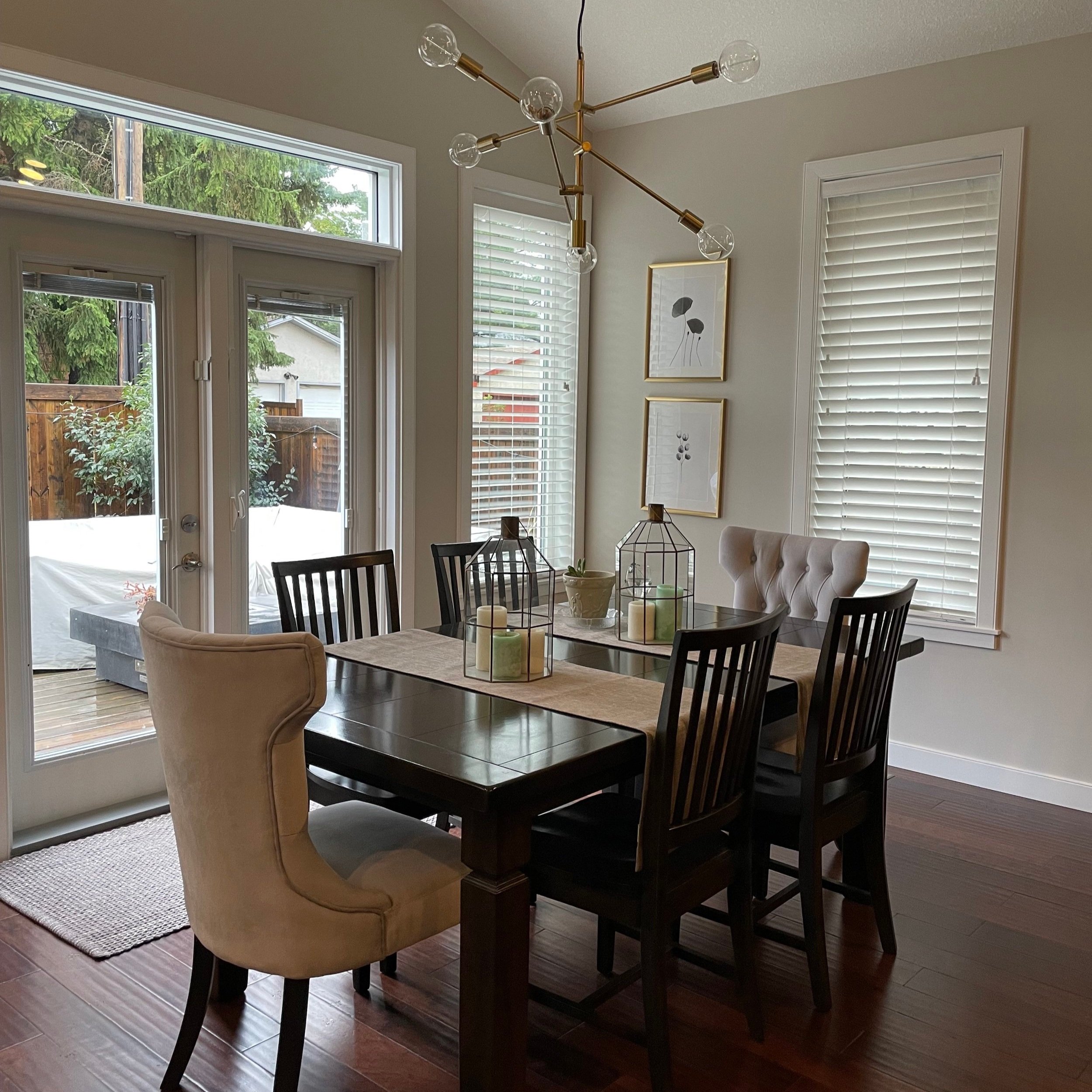
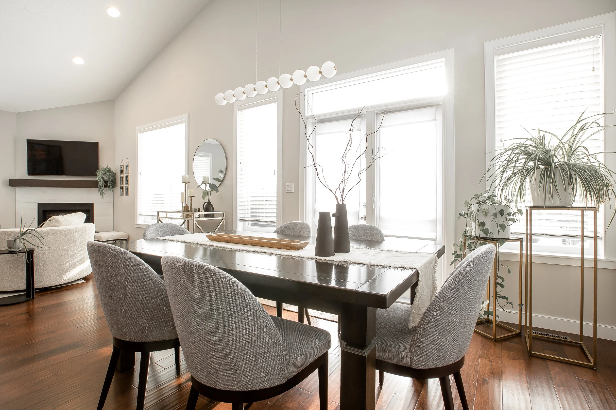
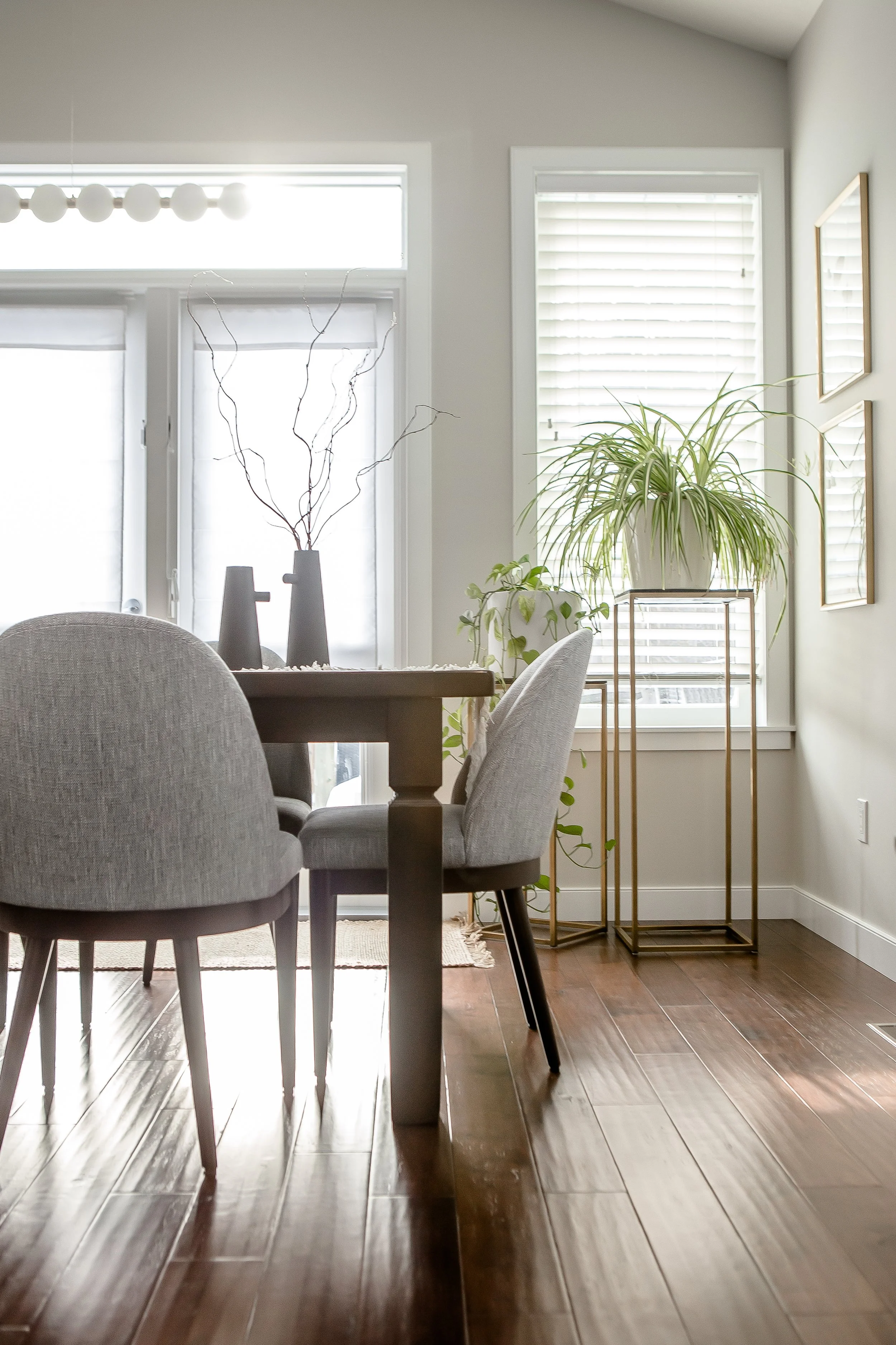
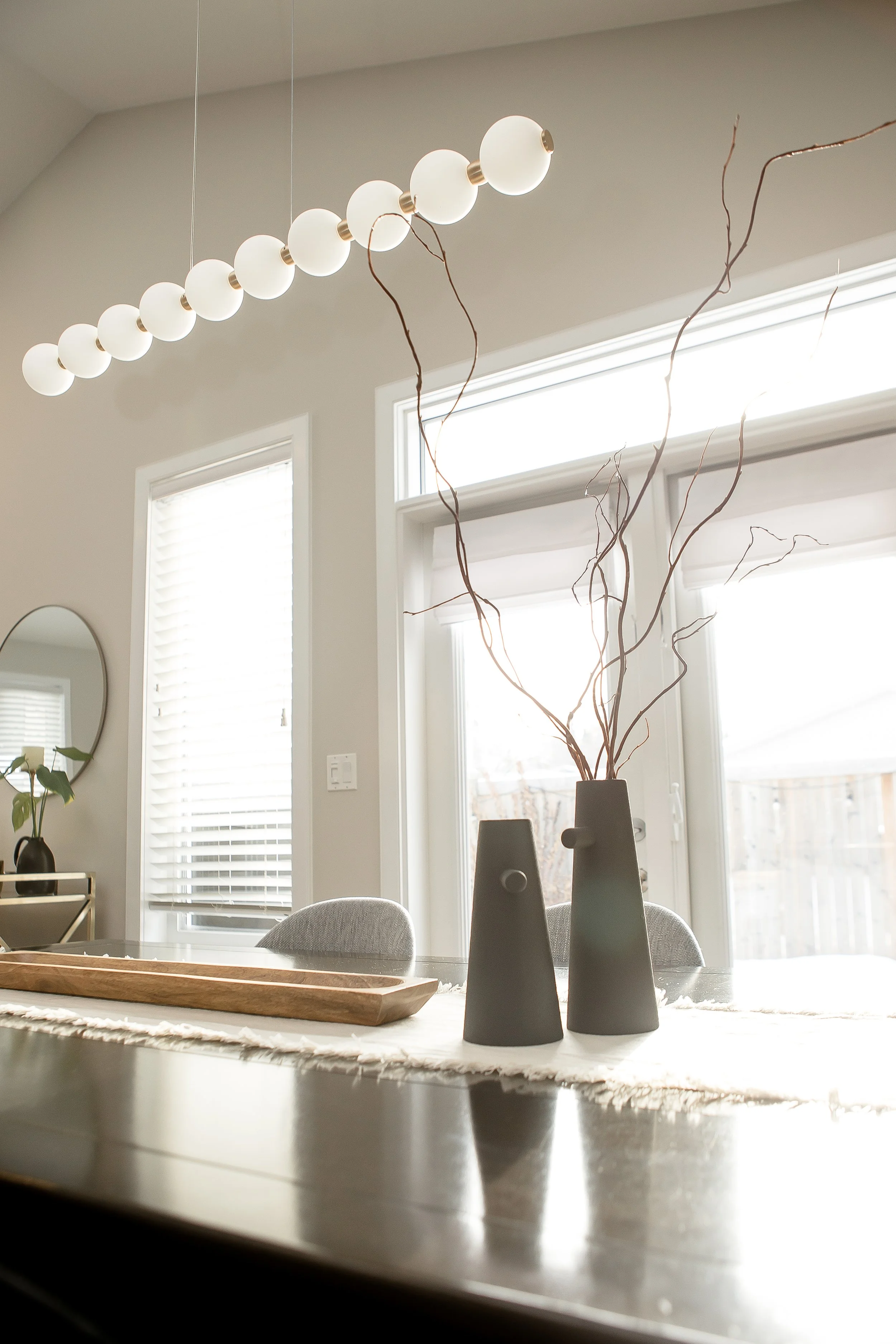
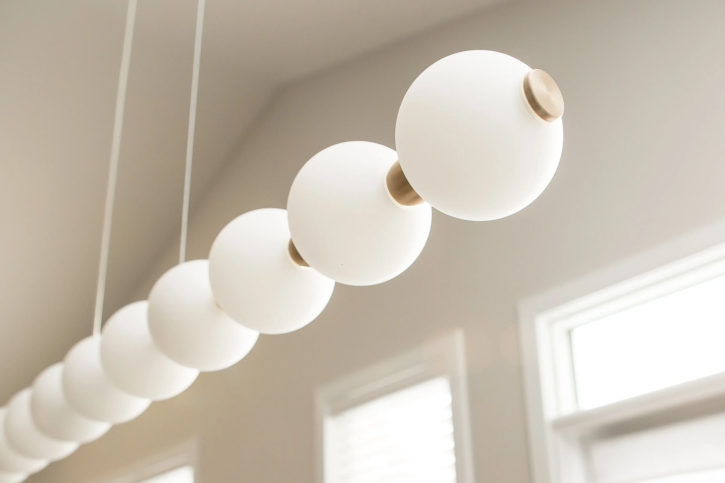
In addition to the bedroom redesign, we also assisted with a few design choices on the main floor, including new dining room lighting and chairs, and some decor choices at the front entry.
The focus was on tying together the existing elements with the new look and feel our client was after.
While we love a good renovation, your home can feel completely new with the right furniture, lighting and decor updates. We call this a redesign and it’s another project type that we regularly take on. If you’re ready to transform your home and, consequently, your life, please get in touch to discuss your project during a complimentary 20 min discovery call.

