Collected Lighting Looks
Light fixtures can be one of the most dynamic features of a home - and also one of the most important. I like to do a more collected look throughout a space because when a home uses only fixtures from a “collection family,” it can be a bit dull - still aesthetically pleasing, but yeah.
Case in point:
Now I’m not saying there is technically anything wrong with this, I just prefer to mix it up a bit.
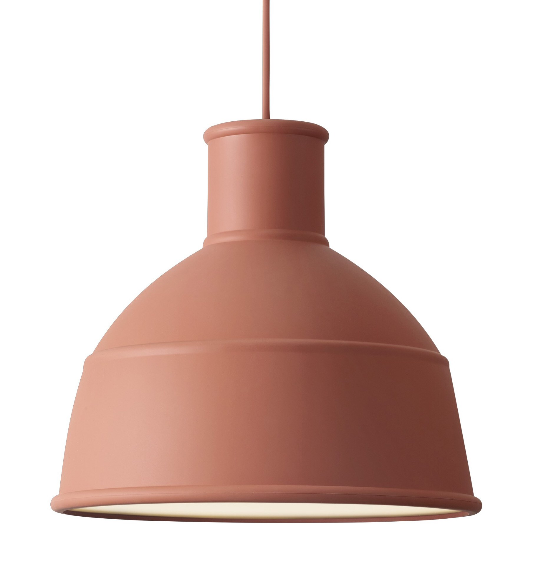
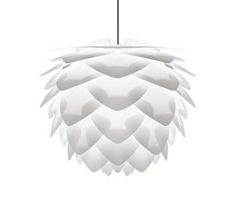
The most recent client’s home I selected lighting for is a beautiful infill duplex (built by Whisper Rock Homes) in Forest Heights, Edmonton. We had several different types of lighting required: outdoor, sconces, pendants, ceiling lights, and vanity lights. The homeowners desired a clean, yet cozy, aesthetic in the home (hello, Hygge!) so our overall choices reflected that. The look and feel we went for was natural, neutral and visually interesting. I always like to start with one or two fixtures as a jumping off point - typically the kitchen and dining room fixtures as they are usually the most visible and most used. For this home it was the Muuto Unfold pendants above the island and the Siliva pendant over the staircase just off the living room.
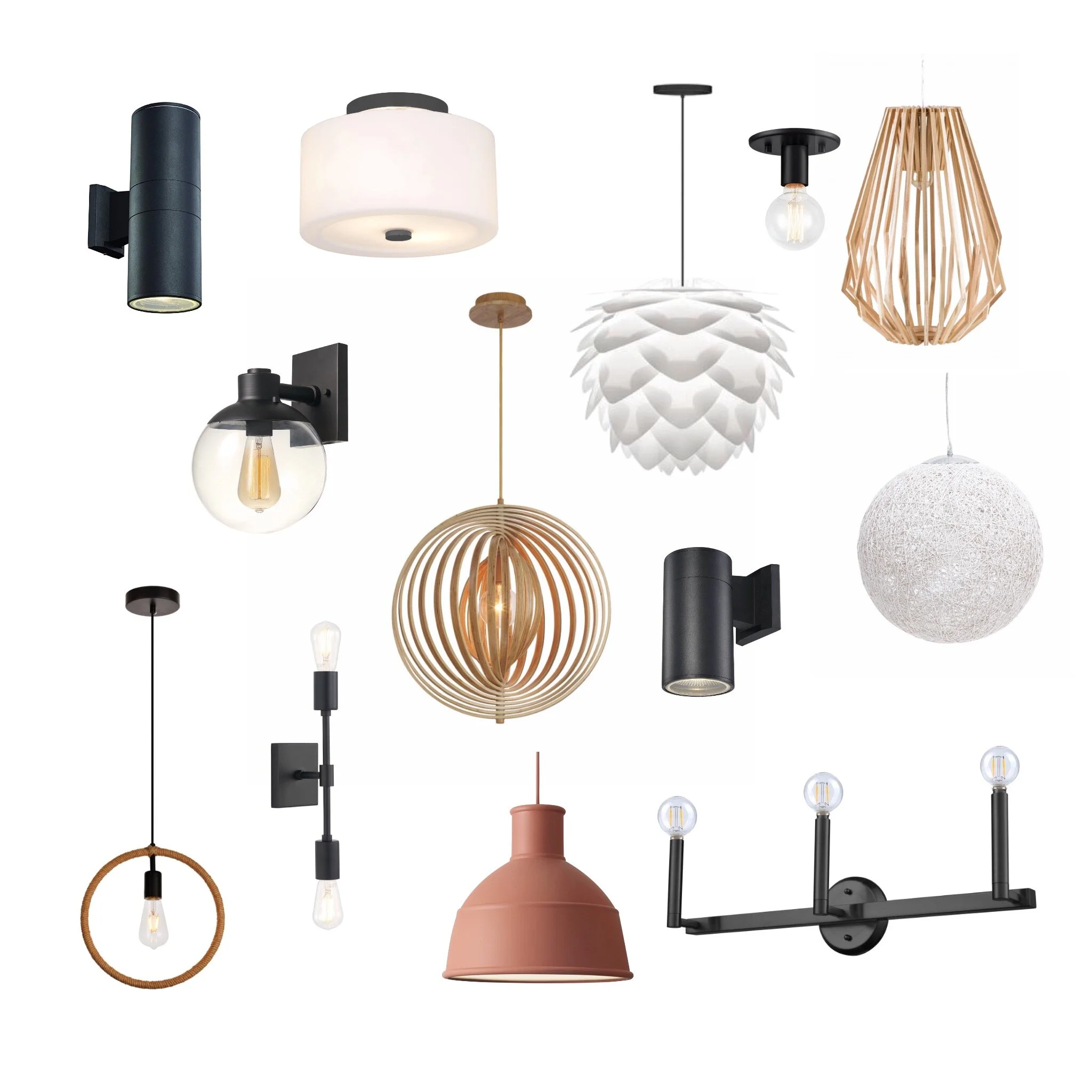
Here’s the final selection:
As you can see, some of these selections are quite different from one another, but they all connect through their shapes, materials and colours. The natural aspects come through in the materials - wood, rope, and terracotta, as well as the actual shape (the acorn look of the Silvia). From a colour perspective it is just black, white and brown tones. The shapes are typically round but also geometric, as well as being relatively simple.
You also don’t need to spend a fortune on lighting either. I recommend spending more on your statement lights - the ones you really love - and looking for lower cost fixtures for the not as important areas. The range for these fixtures was between $20 and $300 each. Also, don’t be afraid to use different sources for your lighting. Even with a builder you can often “supply your own.” In this case, we supplied 4 of the 13 types of fixtures, the remaining 9 were from the builder’s preferred supplier.
Sources: Structube Frame (no longer available), Structube Globe, Muuto Unfold Pendant, Umage Siliva Pendant, Transglobe Pocket Lanterns, Wrought Studio Rosemont Sconce, Breakwater Bay Sigmon Sconce, DVI Semi Flush Mount, Gerrit Pendant, DVI Vanity Light, Eurofase Abruzzo, Matteo Kasa.
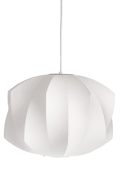
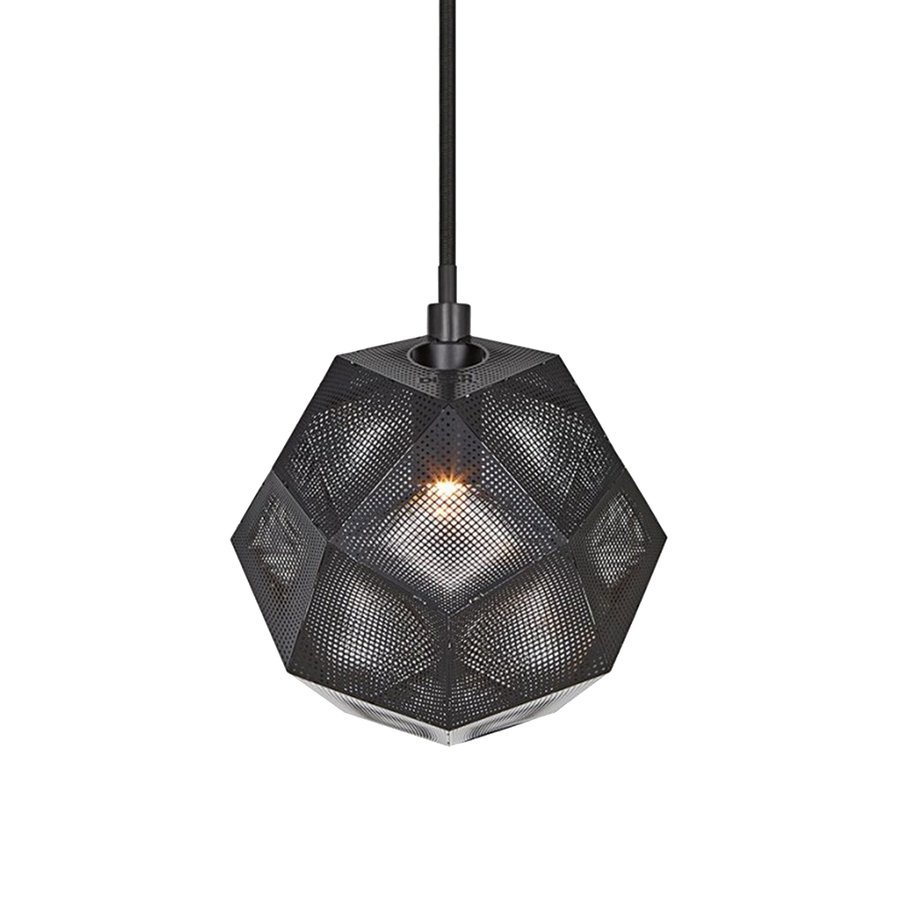
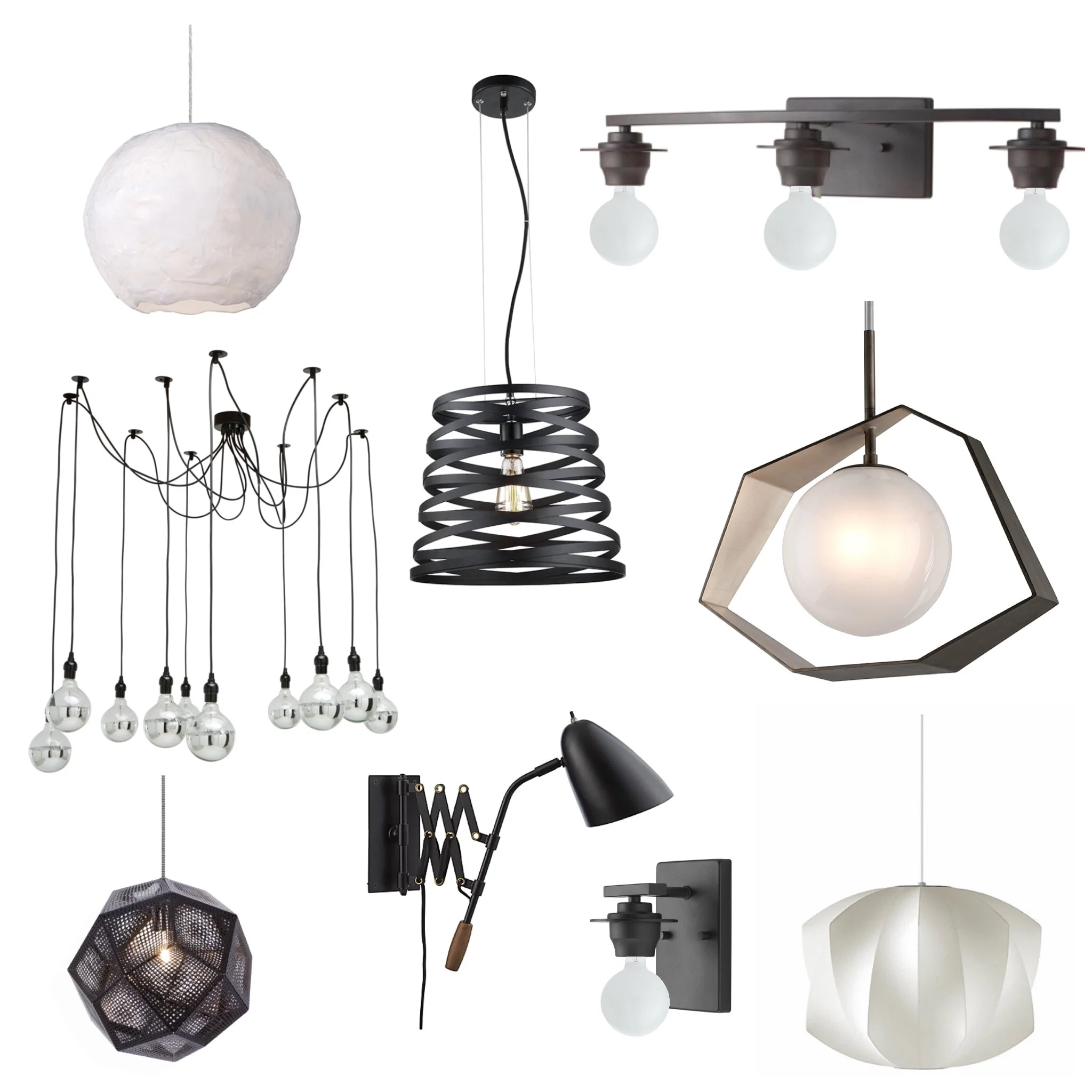
Another example is the lighting I chose in my own home in Edmonton. The colour scheme is black and white and the overall shapes replicate circular and linear patterns. Sometimes choosing particular bulbs can help to tie the items together - like the white round bulbs for the vanity lighting. The jumping off point here was the Nelson Propeller Bubble Pendant for the Master bedroom and the Tom Dixon Etch pendants chosen for the kitchen.
This collection of lighting also had to tie in with the age of the home. Being a 1954 build and with as much of the original character maintained, they had to work with elements like the original hardwood and plaster work on the ceilings, along with the contemporary and whimsical features I added. There were definitely a few people who were skeptical when I showed them the lighting plan but once everything was installed, that skepticism vanished. The range here was between $50 to $950 and was supplied through 4 different sources.
As a note, the bulbs chosen for the Asaki pendant (or as one of my client’s calls it: the octopus light) are different than shown. Instead of silver bulbs, they are round clear glass - some with pattern and some plain.
Sources: Nelson Propeller Bubble Pendant, Tom Dixon Etch Mini Pendant, Kuzco Artemis, Troy Lighting Origami, Progress Debut, Maxilite Pendant, Nuevo Asaki Pendant, Crate and Barrel Morgan Black Sconce.
So what do you think - are you willing to mix it up with your own lighting choices? Any of the fixtures make you want to change up your own lighting?
Kierstin Smyth Design
Edmonton Interior Design Consultant


