My Home Tour: Dining Room
Everyone keeps asking me - when are you going to share the details of your own home renovation? And I keep saying, well it isn't quite done yet (ie: it isn't perfect), to which I get the response, well it looks done to me.
So, I've decided to share one of the spaces I do feel pretty good about - the Dining Room!
Here's the before: it was pretty cute but just not our style.
Listing photo from realtor.ca
Quick background: in June 2017 we purchased a 1950s semi-bungalow and proceeded to gut 2/3 of it and update the other 1/3. The dining room falls into the "other 1/3" category. The bulk of the renovations were completed late summer 2018 and included creating a lovely basement suite (hello income property!) a full kitchen re-do, and gutting / redesigning the entire 2nd floor which added another bathroom and laundry area to the home.
The general colour theme of the house (and my life in general) is black, white and "natural" with pops of colour here and there. I wanted to ensure that the design still respected the age and architecture of the house, while creating a home that worked for us and felt like us.
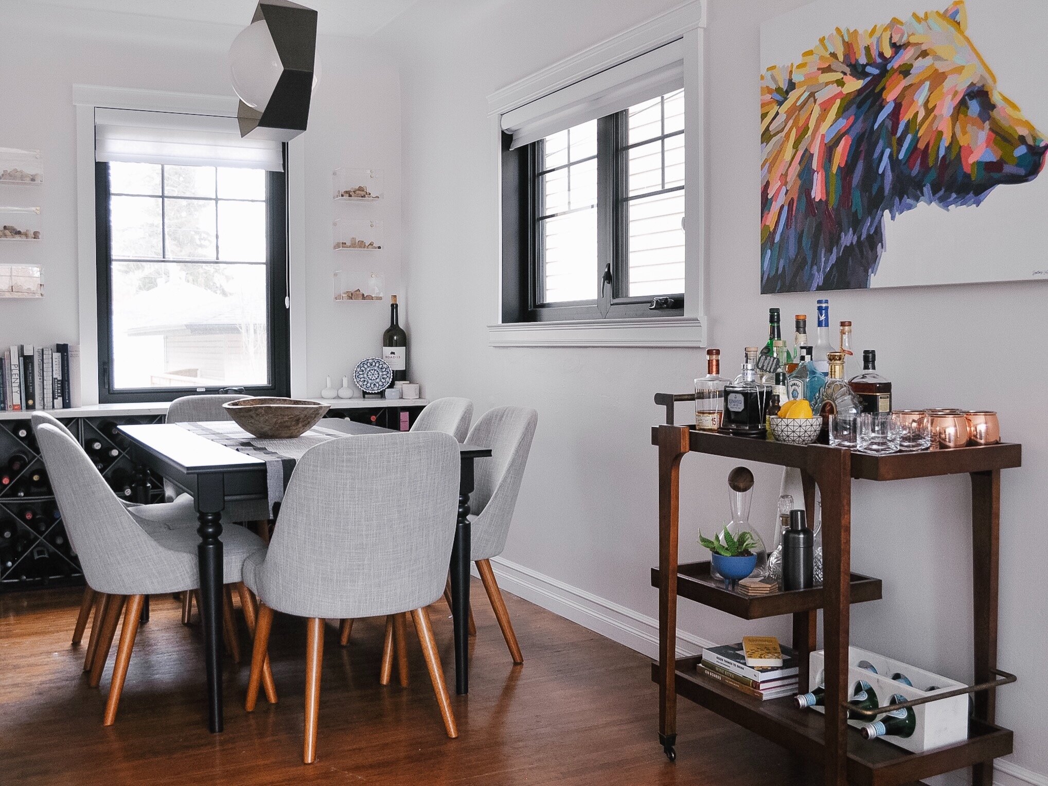
The flooring is the original hardwood. We refinished it during the renovation, sanding it down enough to be able to change the colour, but not so much that we lost the character (ie: the wear and tear, scratches, etc.). The entry into the kitchen was actually made smaller so that I could fit the full height pantry cabinet in on the kitchen side. Beyond that, the walls were painted white and the ceiling was left as is. The windows were replaced throughout with beautiful (and energy efficient) black casement windows. (A lot of people were skeptical of the black. They aren't anymore.)
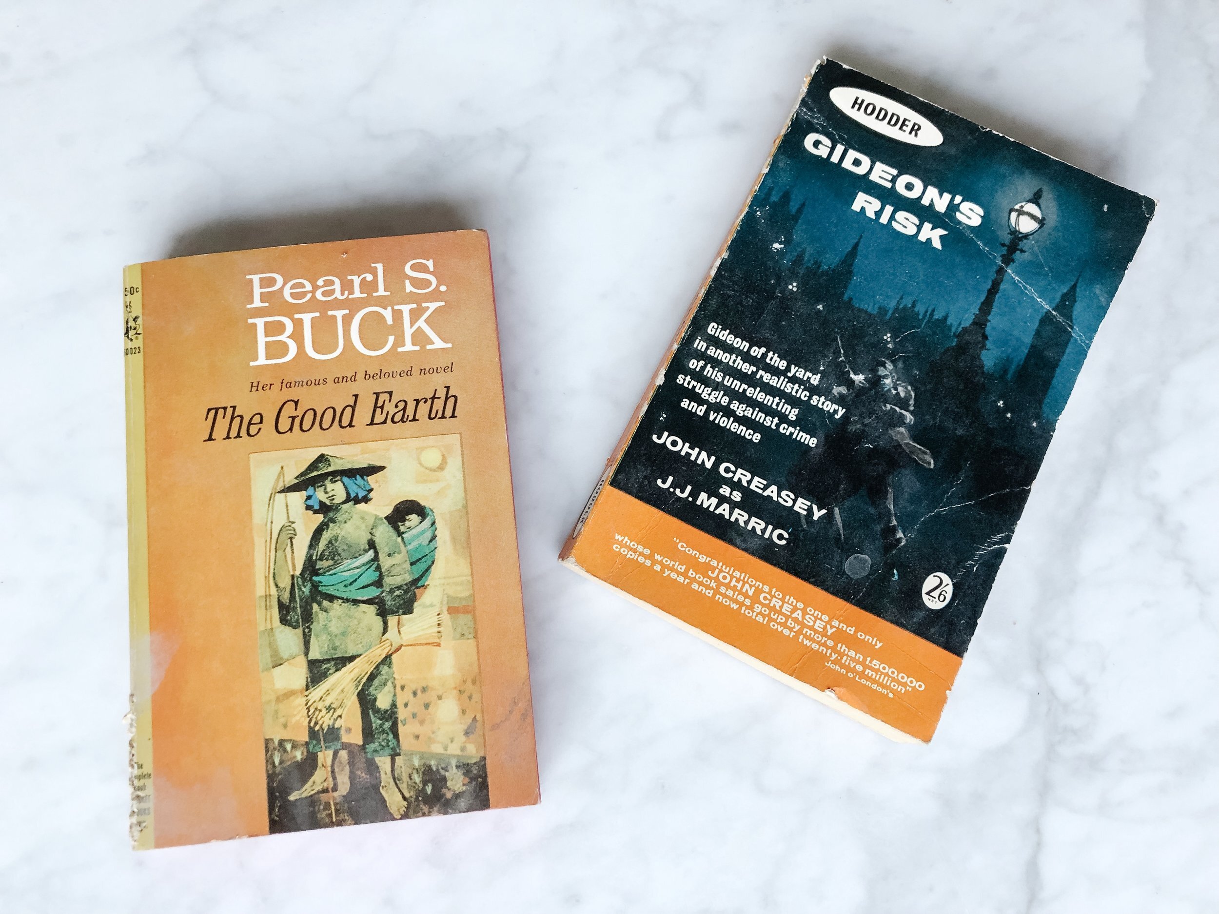
We took out the previous built-ins because we had something rather important to accommodate - our wine storage. In the process of removing the old shelving, we found two books hidden under the base cabinets:
The 1964 version of The Good Earth and the 1962 version of Gideon’s Risk
Our new wine storage was built using metal bins which are housed in a painted wood frame and topped with the same Caesarstone White Attica quartz countertop that we have in the kitchen. The bins hold 120 bottles in total and I can get another 12 in the side wood shelves if stored upright.
I keep some of my most used (and nicest looking) cookbooks out on display as well. The rest get tucked away in a kitchen cupboard. I find that having them available and visible keeps me motivated to cook and bake regularly. And I’m totally okay that my Duchess cookbook is a bit dirty from flour.
I had the idea to display our corresponding cork collection in acrylic boxes to give a more modern feel to something that can typically feel quite traditional. I searched for a long time to find just the right thing and was close to pulling the trigger on having some custom made when IKEA (of all places) released these. It was a bit of a struggle to get enough that weren't damaged (they are super delicate) and even more of a struggle to attach them to the wall (our walls are drywall that is plaster coated), but I made it happen and love how it turned out.
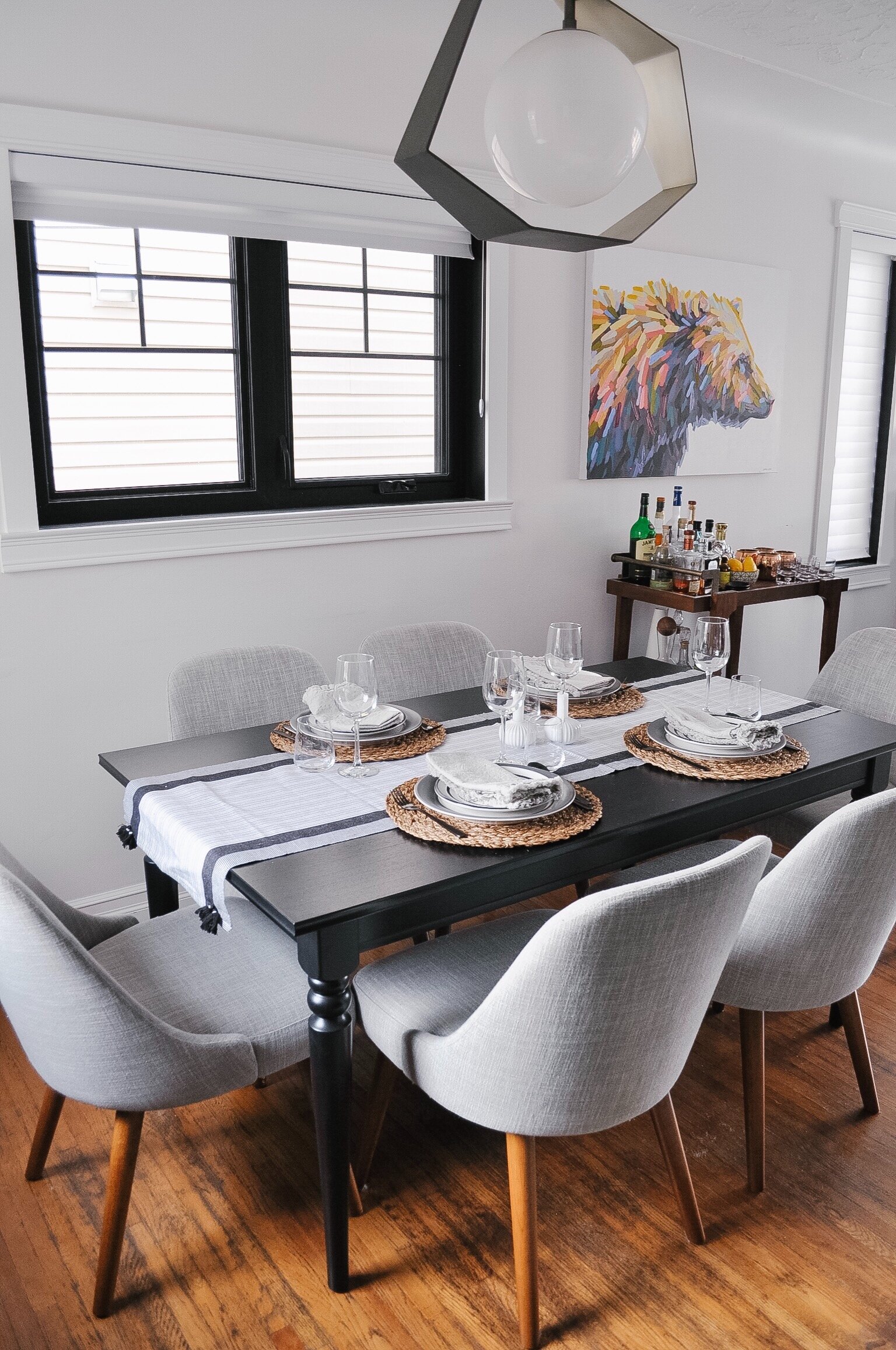
I also struggled to find a dining table that we liked and that fit the space. It's quite narrow so I knew we needed something under 36” wide. We also wanted the table to be able to extend when we host more people (and for the extension to be hidden in the table). IKEA came through again with the INGATORP table. I paired it with the Mid-Century dining chairs from West Elm and typically keep it styled with a table runner, the antique dough bowl I picked up at Plum Home.
The dining room fixture (Troy: Origami) was chosen to tie in with other fixtures in the house but I also liked that the centre white globe had a bit of a mid-century feel and the angular frame around it gave added visual interest. It was another one of those items that people were skeptical about and again, no one is skeptical now.
There is some space between the dining room and living room and we needed more bar type storage. Before I found the storage, I splurged on Clive. I'd been eyeing Dallas LaRose's bears for a while and when I saw Clive at her pop-up opening, I knew he had to be mine. I’m still planning to have him framed, likely with a simple walnut gallery style.
I tried a sideboard style cabinet first in the space but it just looked repetitive as the height matched the wine storage and the table. Since I wanted the painting to go in that space, I needed something that could still provide enough balance. We decided to do a bar cart and spent a lot of time looking for one that we thought was affordable. The final choice was the Clarity Bar Cart from Wayfair.
Our every day dining set up is essentially the same as when we have company. The black, white and natural theme is continued with our dishes, cutlery, placemats and napkins.
The other very important part of the dining table, for me, is to have candles. This is a tradition that I stole from my Norwegian friend, Mari, who lights a candle at every meal. I’ll admit, I don’t often take the time at breakfast but do my best for dinners. These two candle holders are my favourite - likely because I bought them with Mari when we last visited them in Norway.
And there you have it - our dining room! I’m looking forward to showing you more of the home soon!
Kierstin Smyth Design
Edmonton Interior Design Consultant


