Double Bathroom Renovation
This renovation of two bathrooms in a home in the Strathearn neighbourhood of Edmonton came about a bit differently than most of our projects. My clients had already hired a contractor to take on the renovation and, when it was suggested to them that they should work with a designer to finalize the design and details, the clients reached out. We’ve known each other for a couple years as a result of both owning wheaten terriers, so I was beyond excited to work with them to bring the bathroom renovation into reality. The clients already had some great ideas and a few finishes selected, meaning my role was to refine those ideas and pull together the remaining pieces. As with so many projects over the past two years, this one was also delayed as we waited some time for one particular tile to come back in stock. But the wait was worth it as these two bathrooms are just so dreamy!
All after photos taken by Darren Lebeuf for Kierstin Smyth Design. Contractor for the project was Priority Builders.
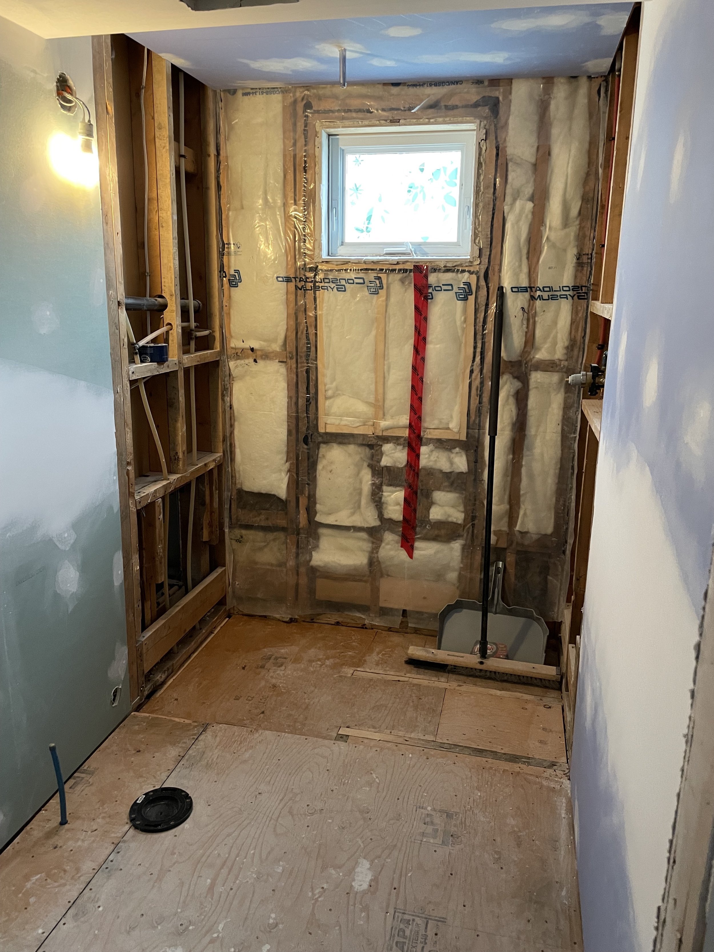
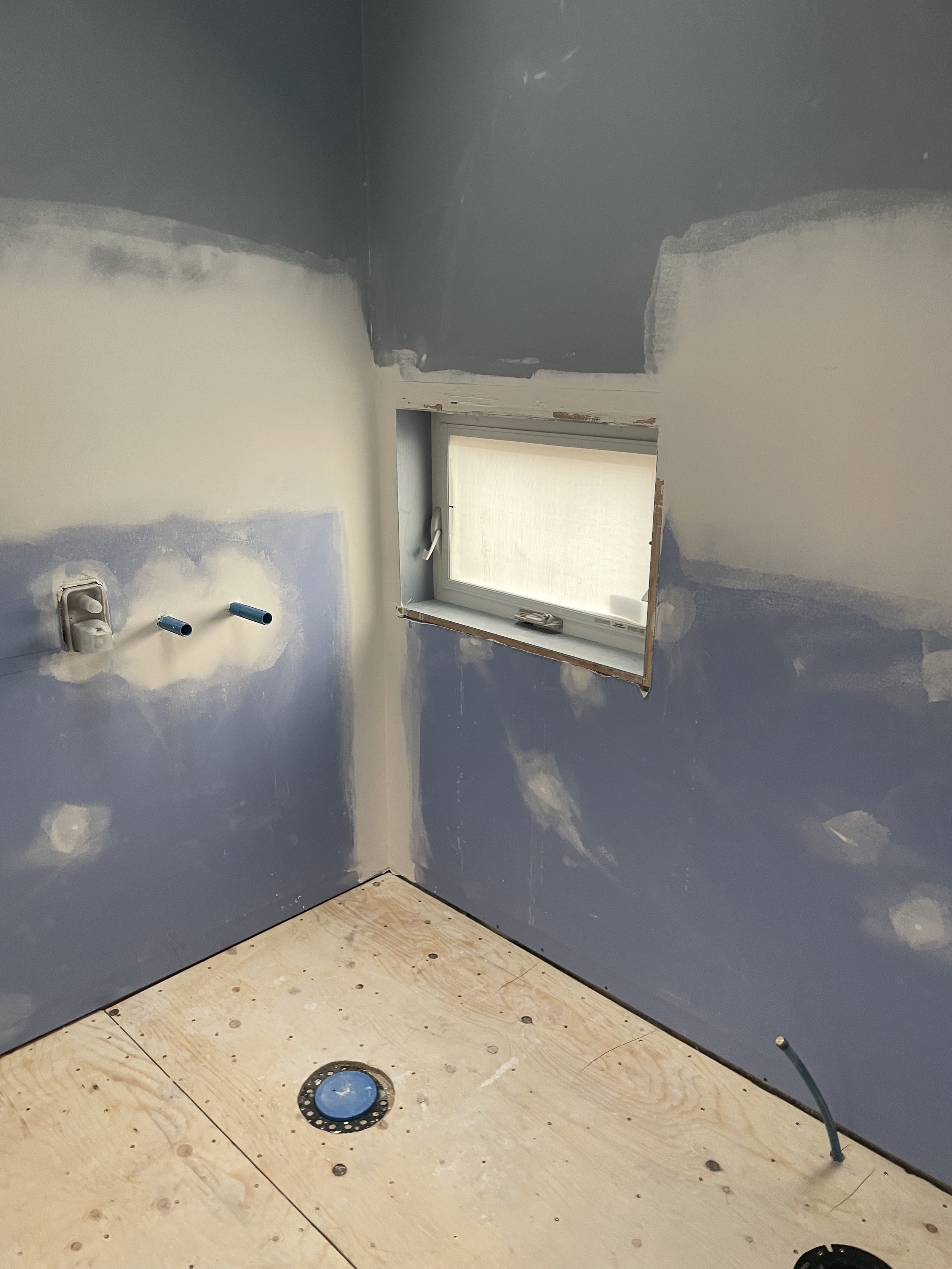
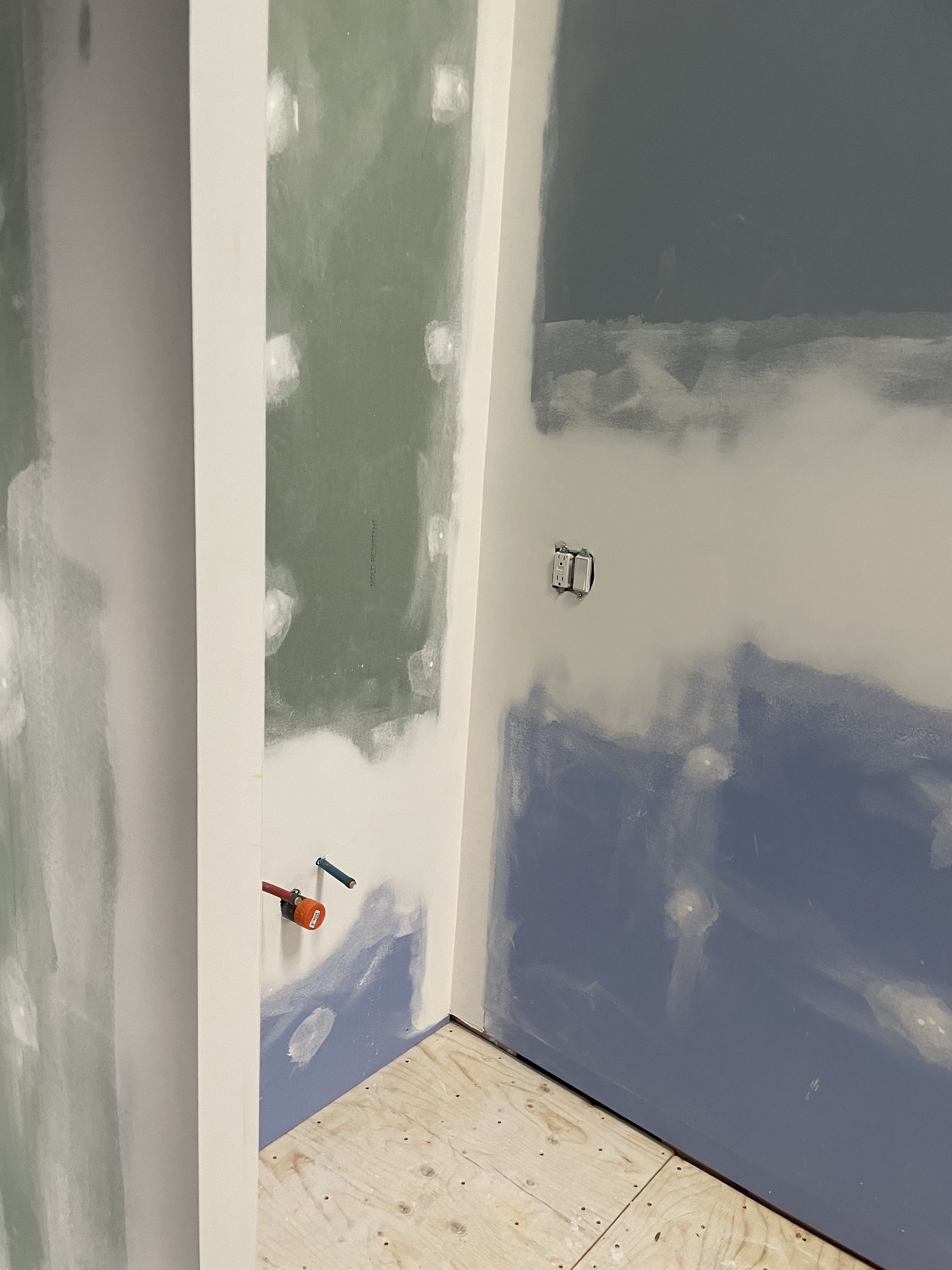
Where We Started
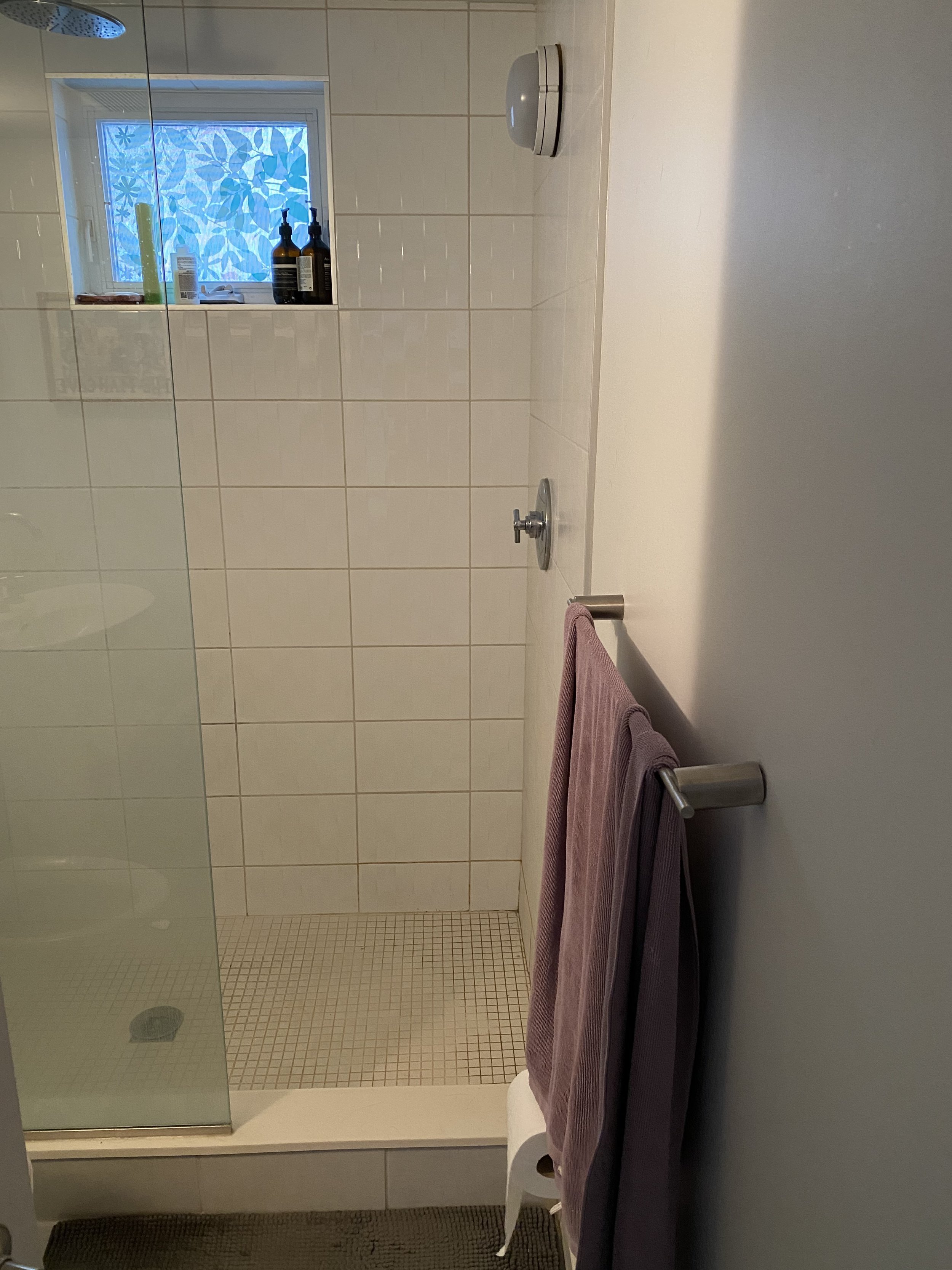
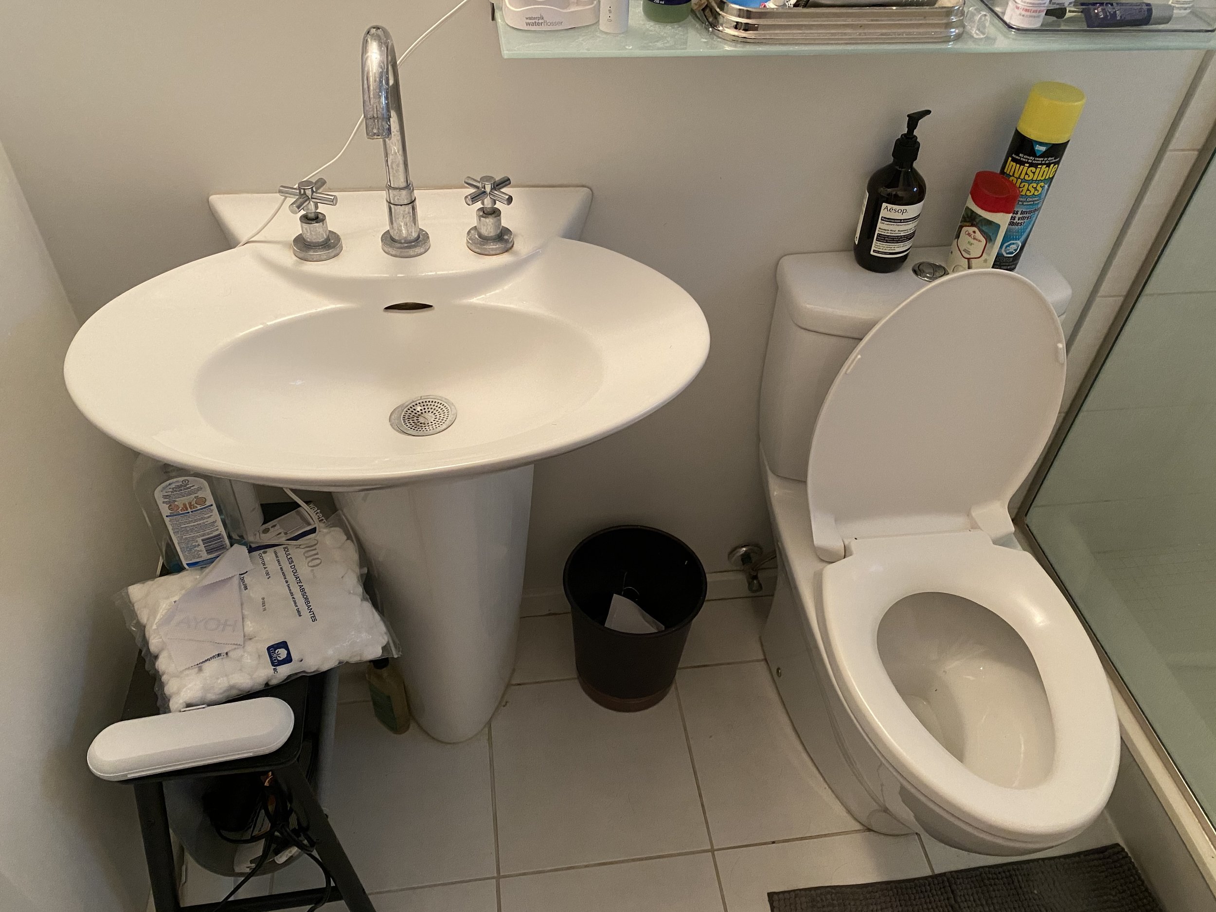
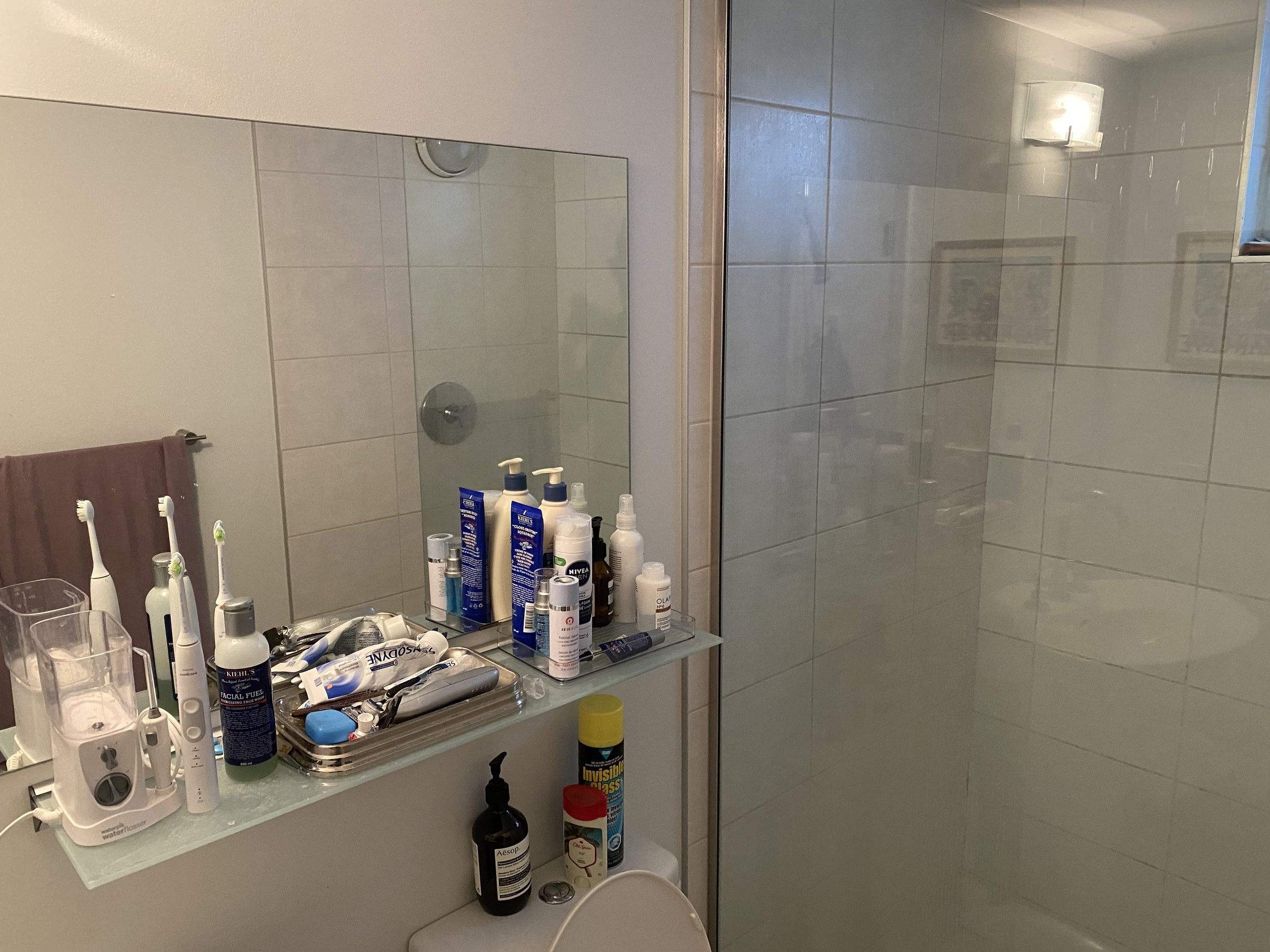
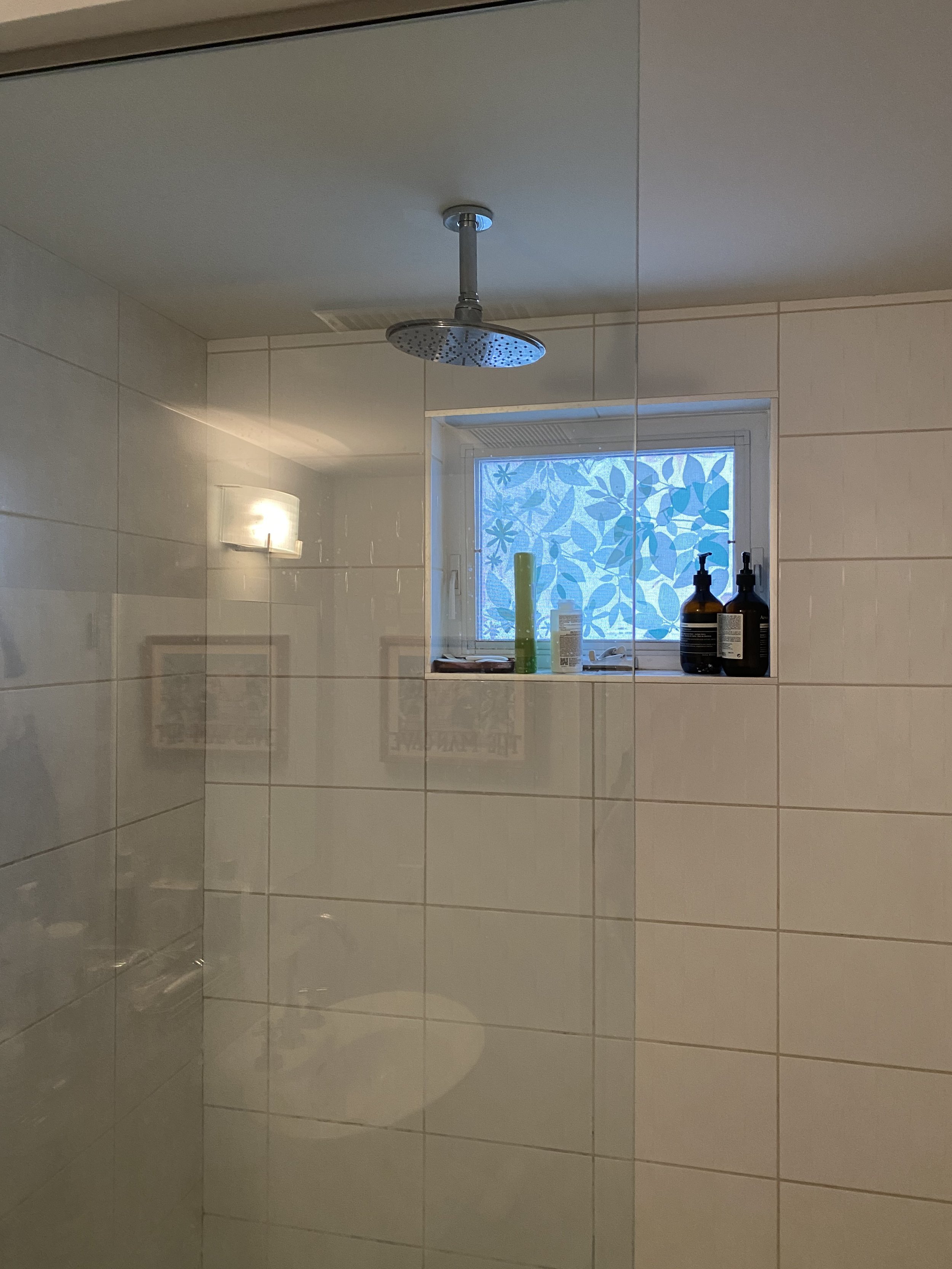
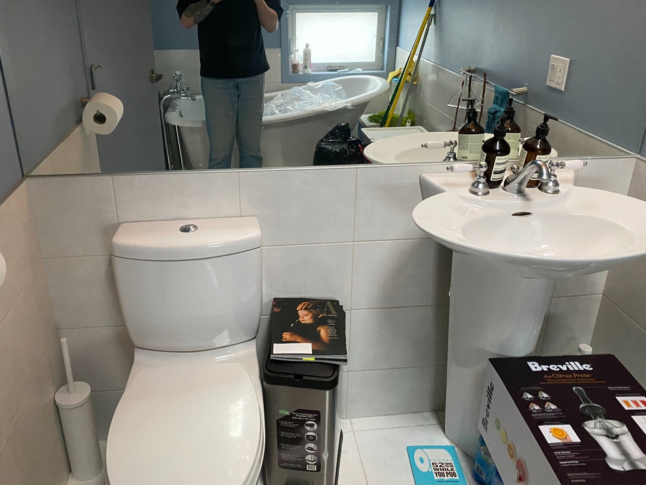
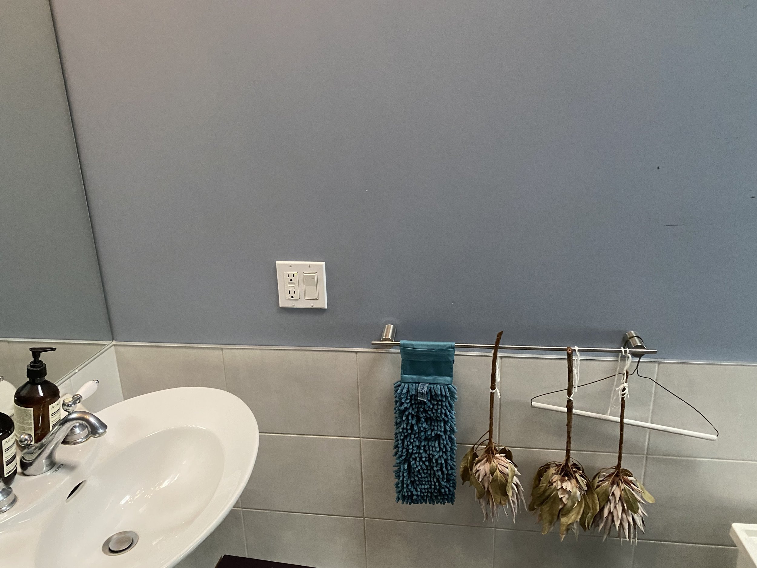
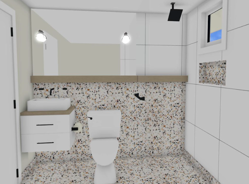
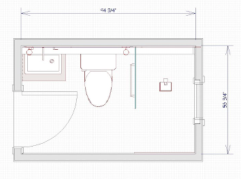
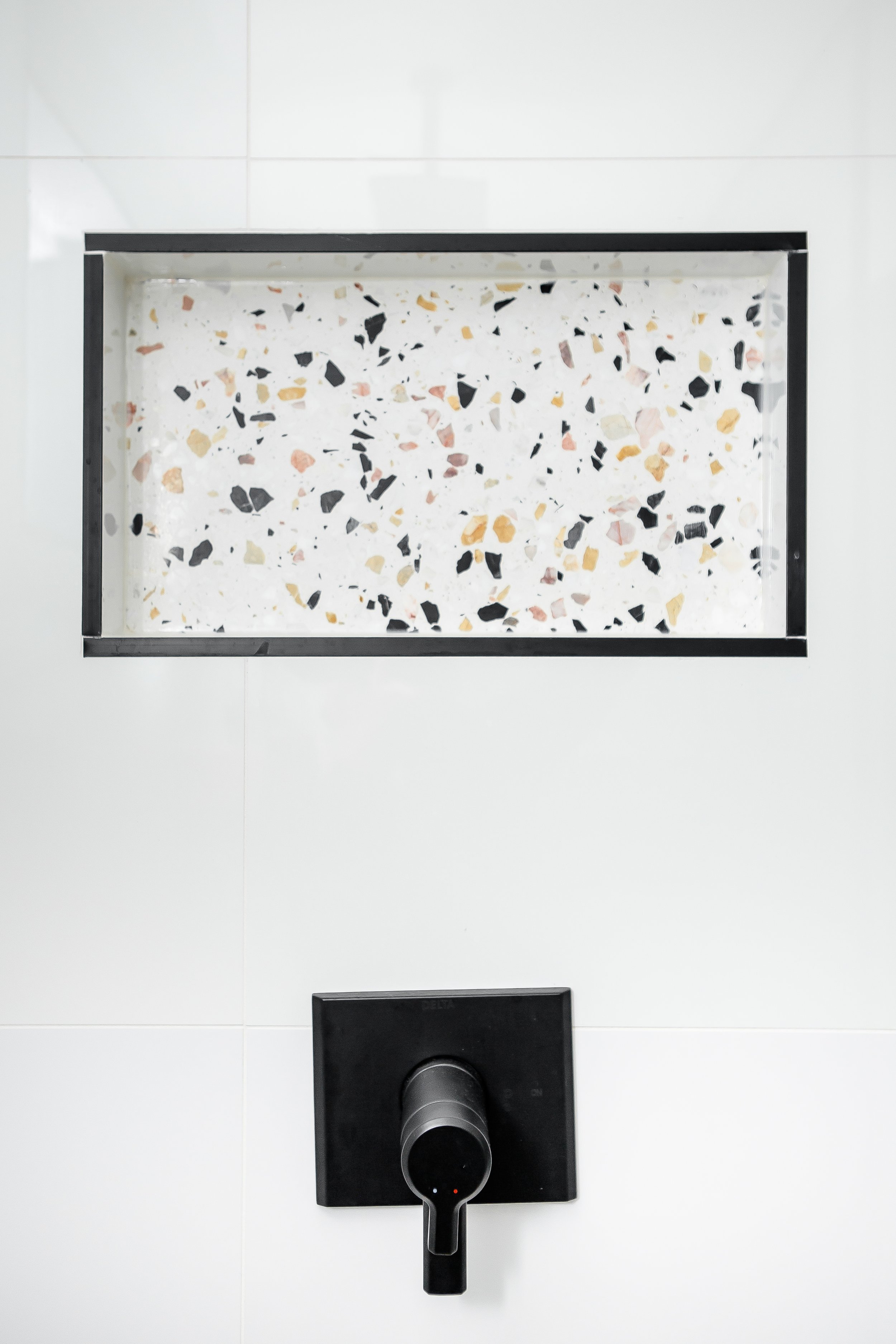
The primary bathroom is just off the primary bedroom and is utilized as an en suite. The layout of the bathroom remained the same but adding more storage was key. Both bathrooms only had a pedestal sink to start with, so we added vanities with drawer storage for both. Originally there was just a small ledge for storage in the primary, so that was also expanded to run the length of the bathroom and a niche was added to the shower to introduce even more functional space.
From a design perspective, the space was dated and a bit boring.
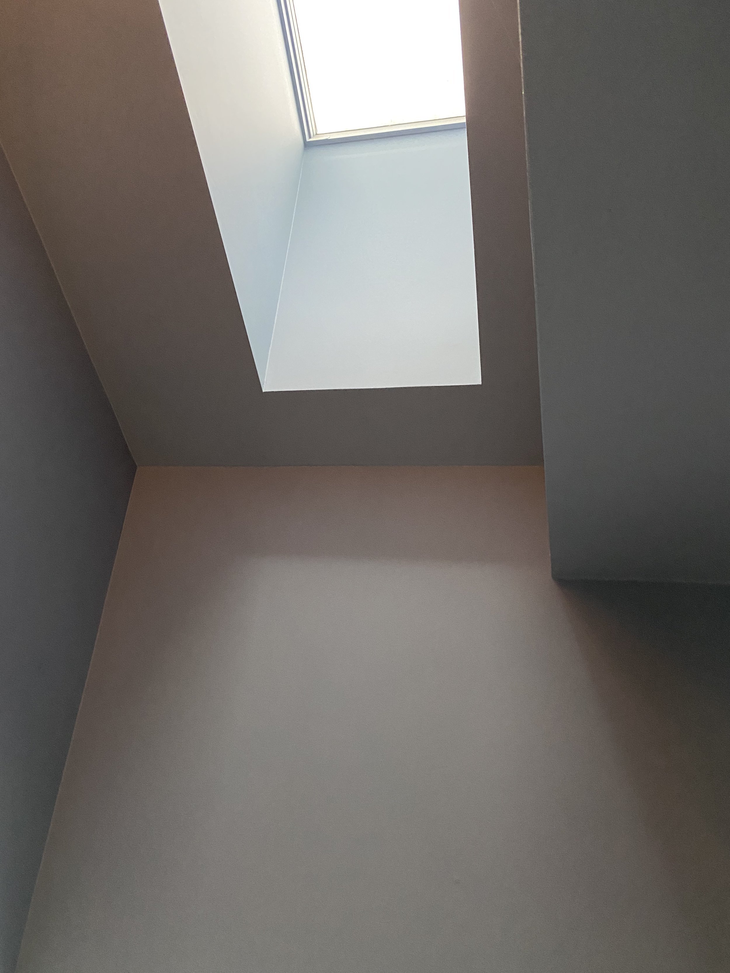
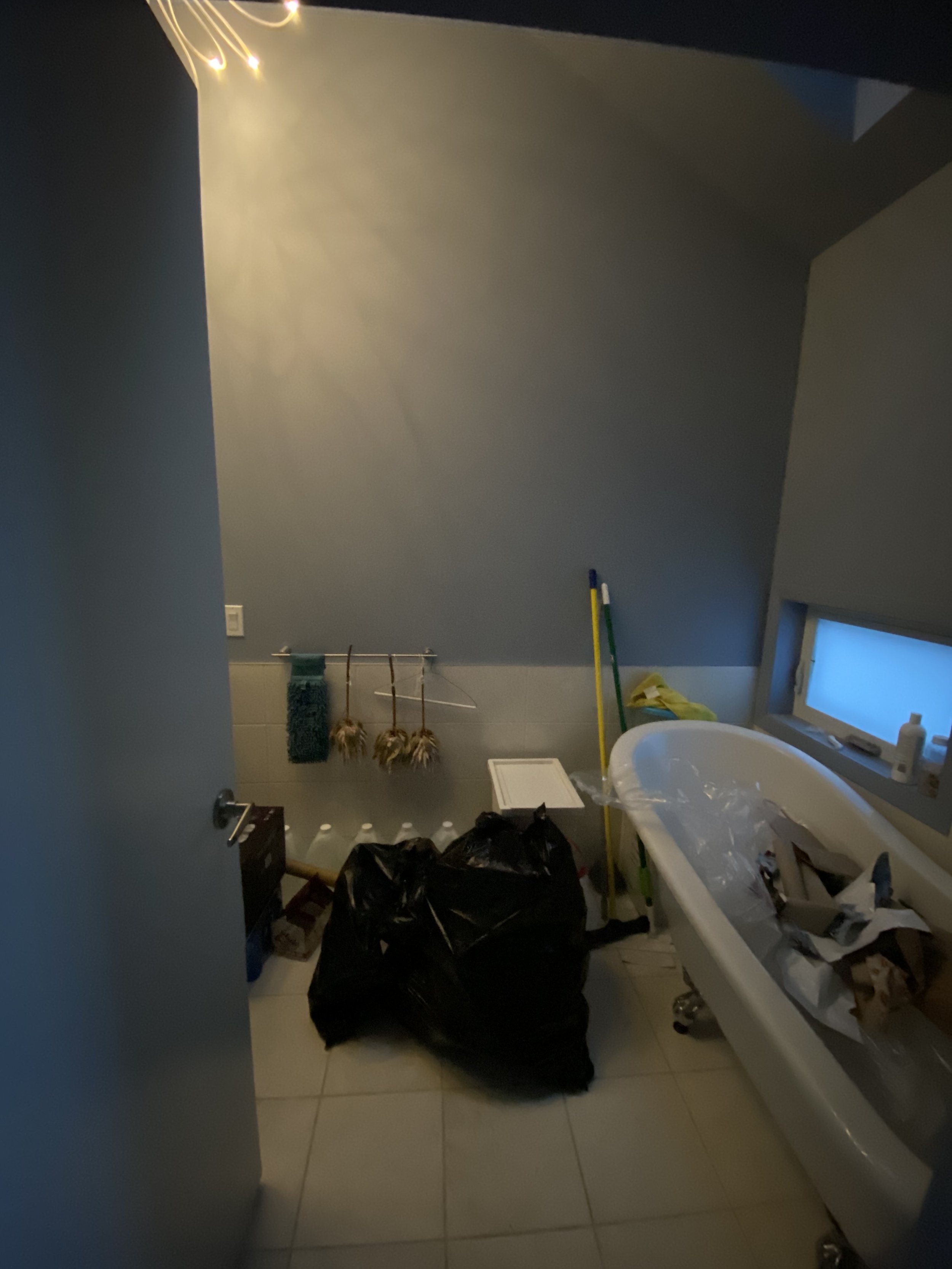
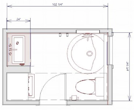
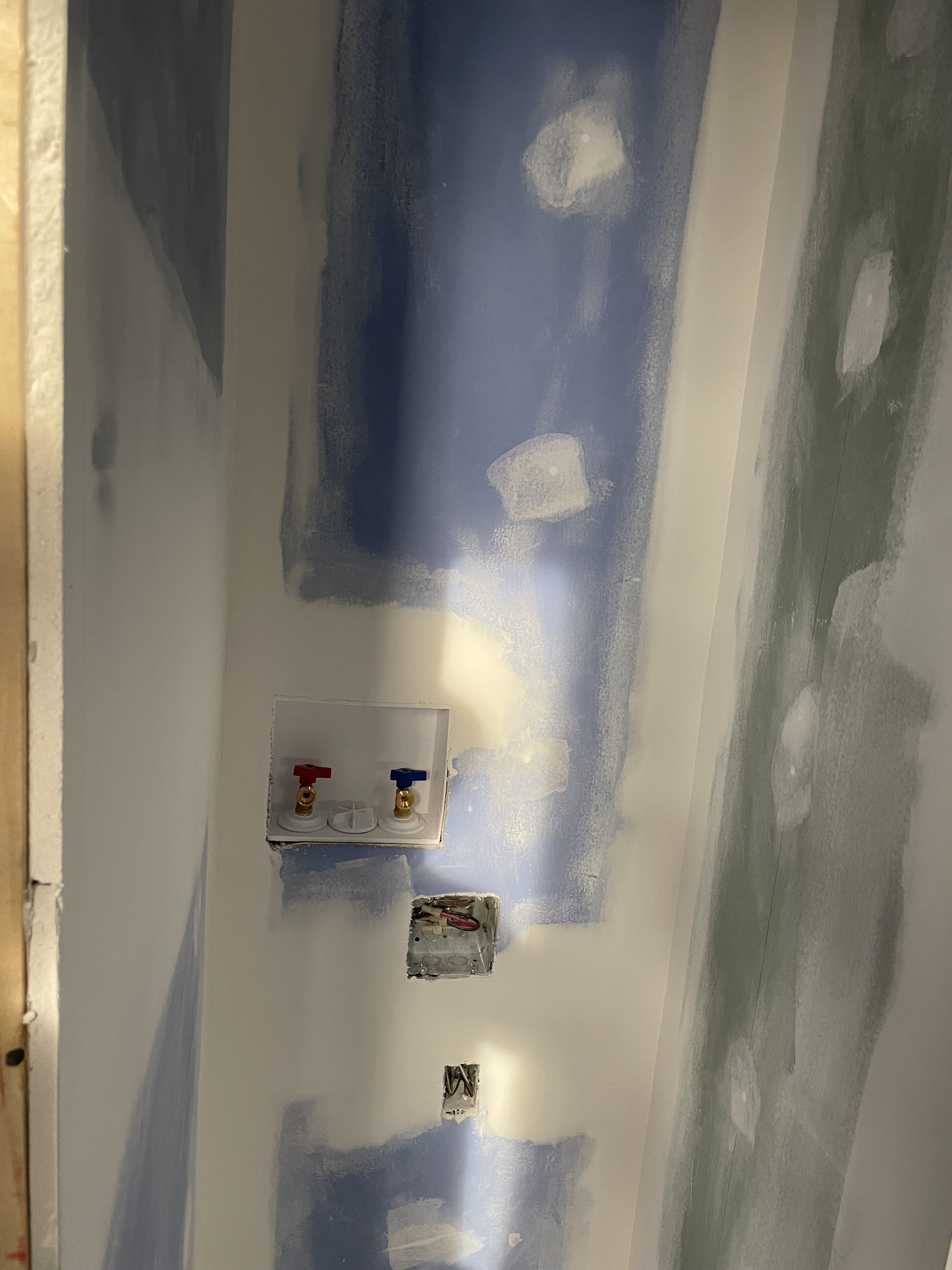
In the secondary / guest bathroom there was a claw foot tub, toilet and pedestal sink. It was also not functional and, as a result, just became a sort of storage space in the home. It is such a great space that also features a skylight and had so much potential. Another element the clients wanted to incorporate into the secondary bathroom was the laundry.
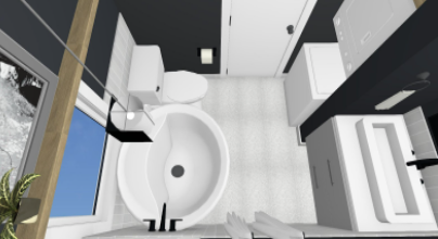
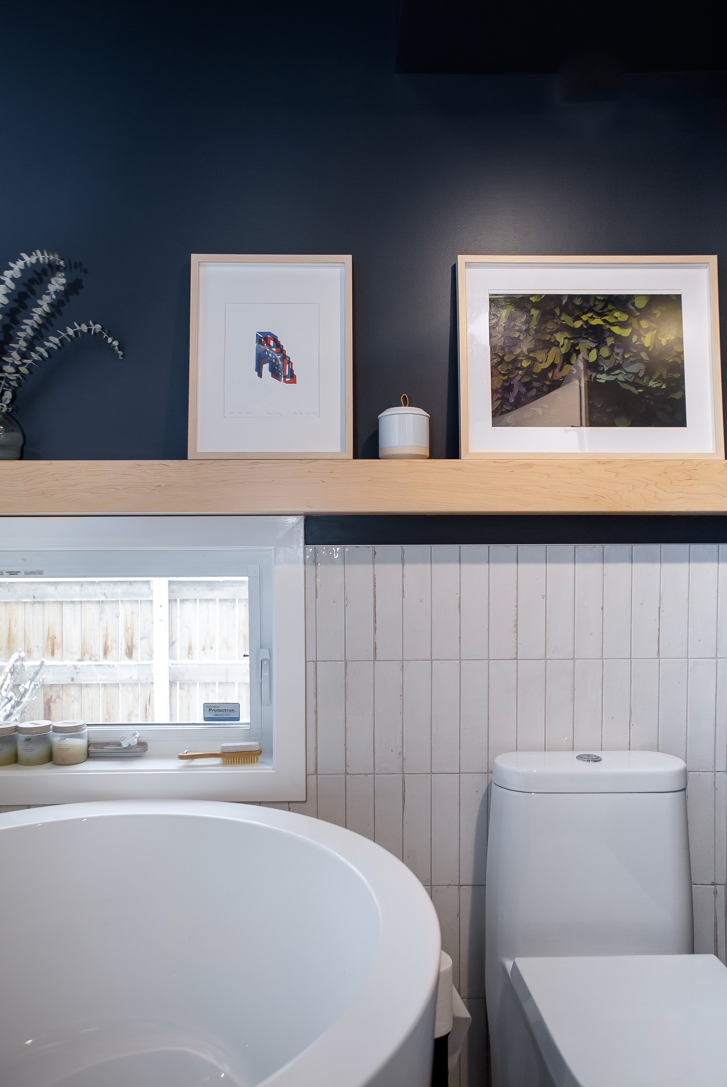
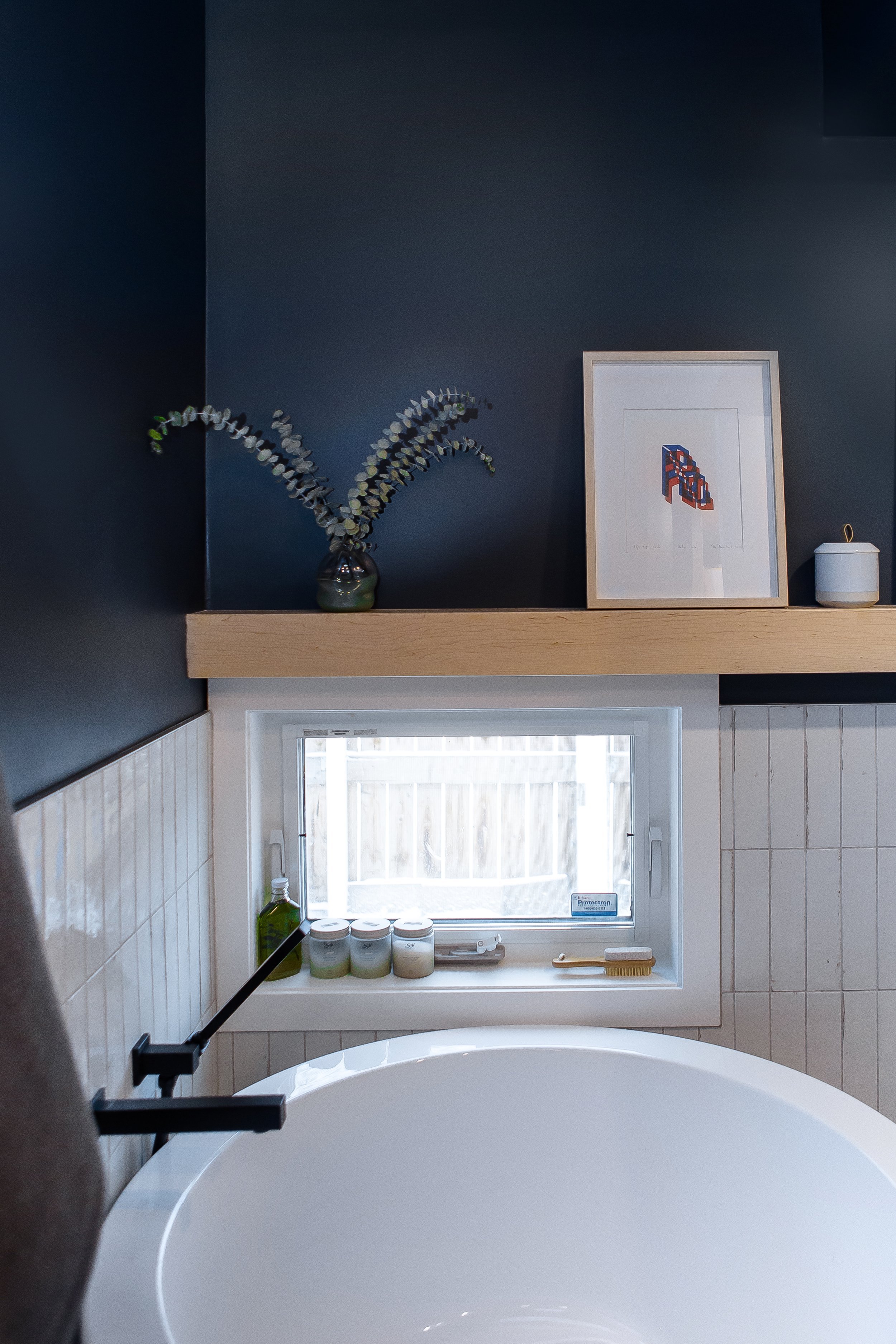
The solution in this space was to relocate the toilet to the opposite side of the bathroom, and reduce the size of the tub … which may be the best feature of the whole renovation! We got to introduce a beautiful Japanese-style soaker tub. Originally a square tub was chosen, but when it went out of stock we swapped it with a round one, and I’m glad it turned out that way because the round option looks so good in the space.
The Design and Renovation
As mentioned, the clients already had some elements chosen, like the terrazzo tile for the primary bathroom, the desire for black fixtures, the new soaker tub, and the new ventless washer / dryer combo.
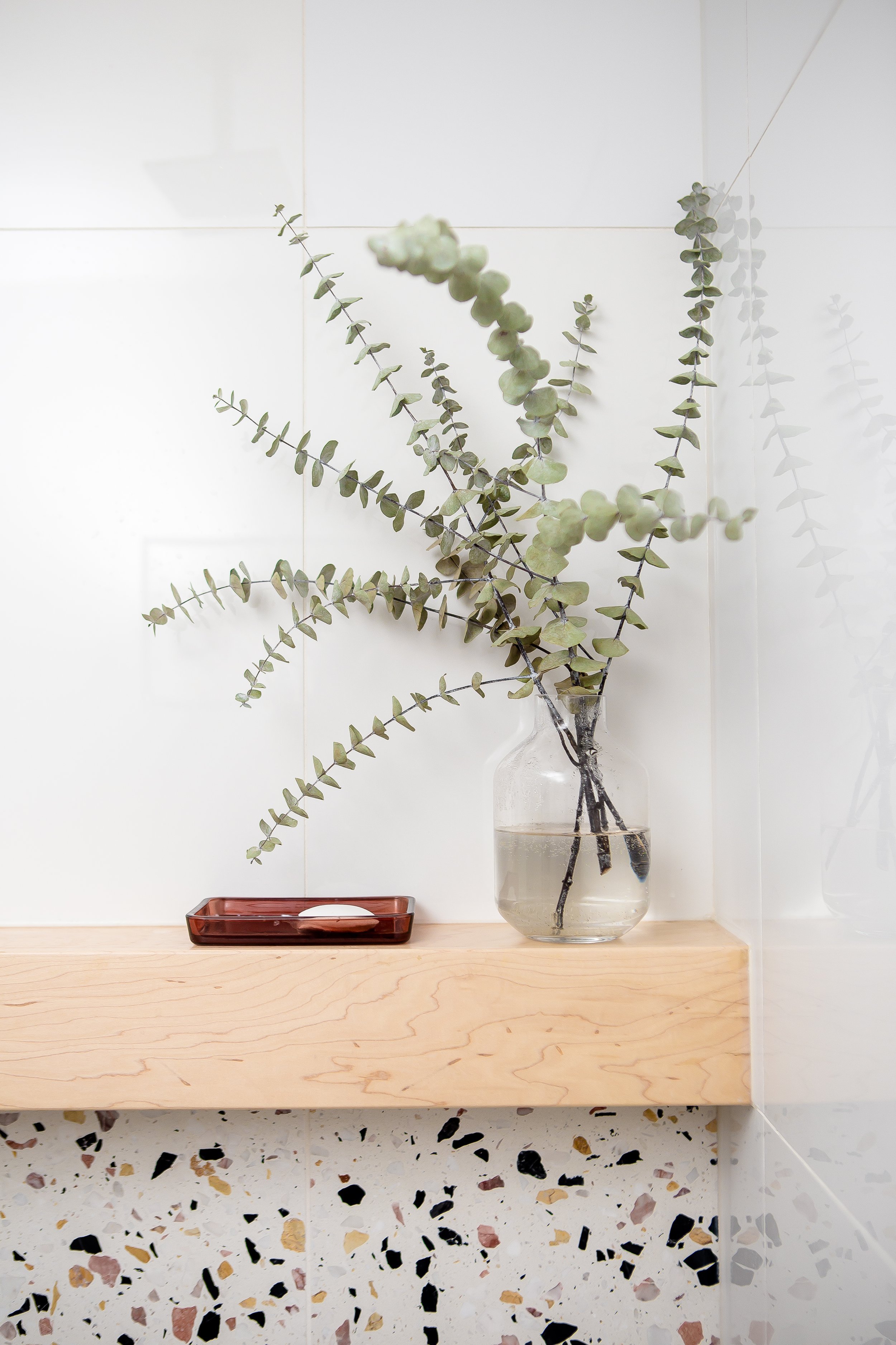
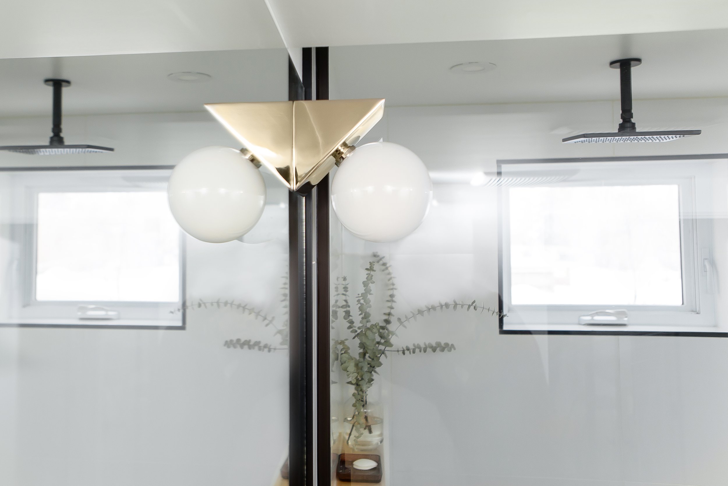
Because both bathrooms are on the smaller side, it was important to make them feel larger and make the most of the space. We carried the terrazzo from the floor up the wall, and repeated it again in the niche. The maple ledge went the full length of the wall to add storage both inside the shower and along the vanity area. The floating vanity creates a feeling of lightness and brings along more storage too. The walls were done in a white tile and above the vanity and toilet we did a full mirror with polished nickel sconces mounted above. This allows more more light to be reflected and creates a seamless look in the space.
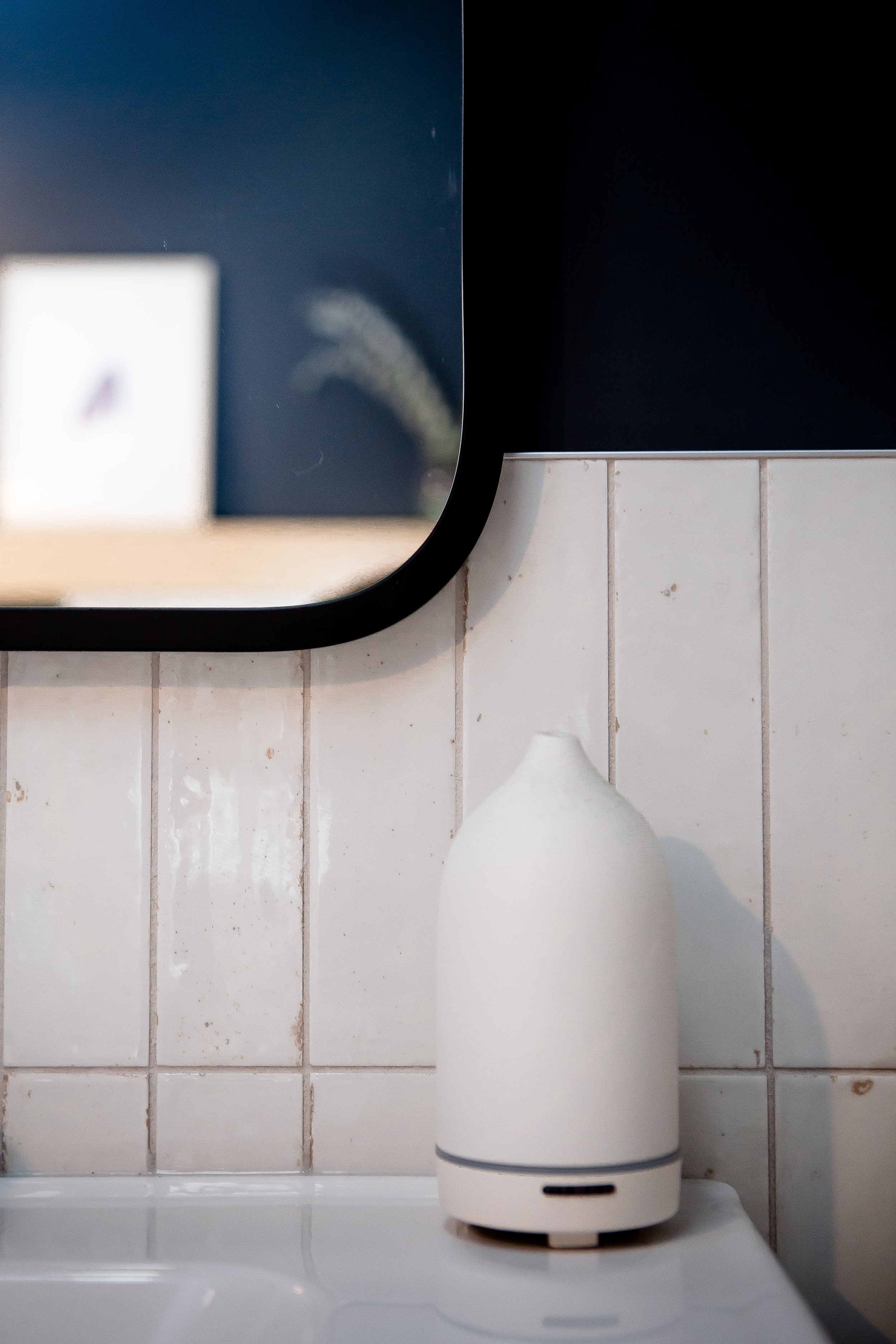
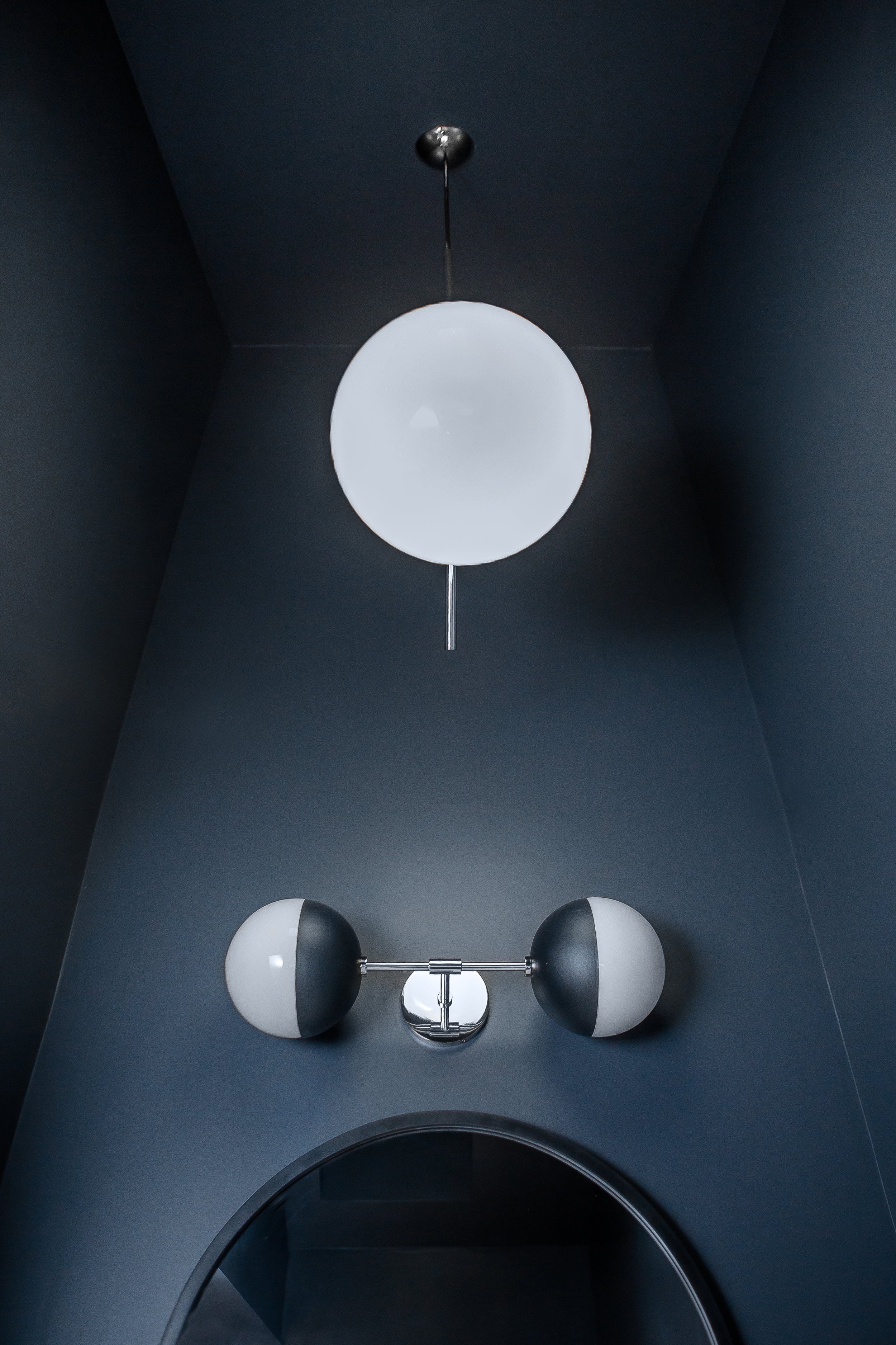
In the secondary bathroom, we created each functional space to be an exact fit for the required function. The laundry was enclosed by a wall that meets up with the bulkhead above. The remaining space above the laundry was utilized with maple shelving for additional storage. Another floating vanity with storage was incorporated along with a matching maple shelf to tie the two spaces together. We used a white terrazzo-look tile on the floor and a small, vertical subway tile with a handmade look along the walls of the toilet, bath and vanity area. It was topped off with a dark paint colour throughout the space (including on the ceiling) which adds drama while also making it feel cozy.
We also used wall-mounted faucets for the tub in the secondary bathroom and the vanity in the primary bathroom to save on space.
As with most renovations, we made a few changes during the process but for the most part, the end result is pretty close to the original design. The most challenging aspect was the terrazzo tile in the primary bathroom, as the subfloor in the shower area had to be lowered, and the transition to the hardwood at the entry door also had to be reconfigured to accommodate the thickness of the tile.
The Final Reveal
The showstopper of the primary bathroom is most definitely the terrazzo tile. Every other element is there to support it, and maintaining the use of neutrals throughout the rest of the space keeps it feeling timeless.
It’s such a light and bright space that also feels warm and inviting.
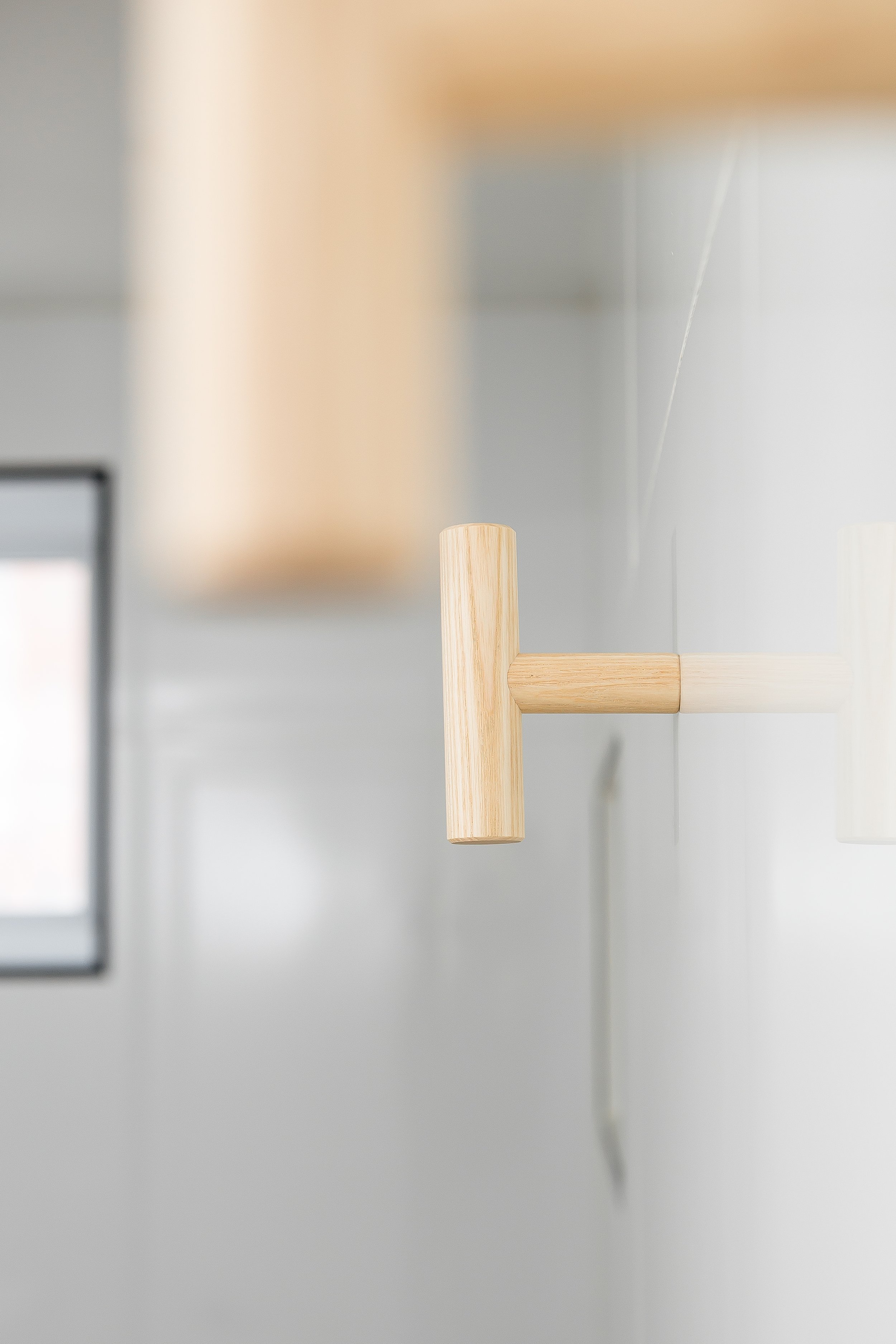
There is so much reflection of light in the space – from the large mirror to the glass shower screen and even the sconces. The polished nickel finish allows them to almost blend into the mirror while still creating depth and interest with their unique shape. And the wood elements are carried into the accents like the towel and robe hooks, as well as the wooden bathmat.
The second bathroom fits so much functionality into a small space. It’s no longer a storage space but is now a retreat the homeowners love.
Since it’s completion, the homeowners have told me that they now use their tub regularly, and look forward to relaxing in this space.
And of course, this post wouldn’t be complete without a puppies + design image featuring the clients’ two wheaten terriers, Enzo and Otis.
Ready to renovate your bathroom? We’re here to help make the most of your space and create a design that reflects who you are and how you want to feel in your home. Reach out to discuss your project!


