3 Festive (and minimal) Place Settings
Well, it’s that time of year again! And I thought I’d have a bit of fun and do up 3 Festive Place Settings for a bit of inspiration. Instead of going all out, each design is kept minimal in its overall aesthetic but still achieves the desired festive look depending on your taste!
So here we go!
Look 1: Minimal Rustic
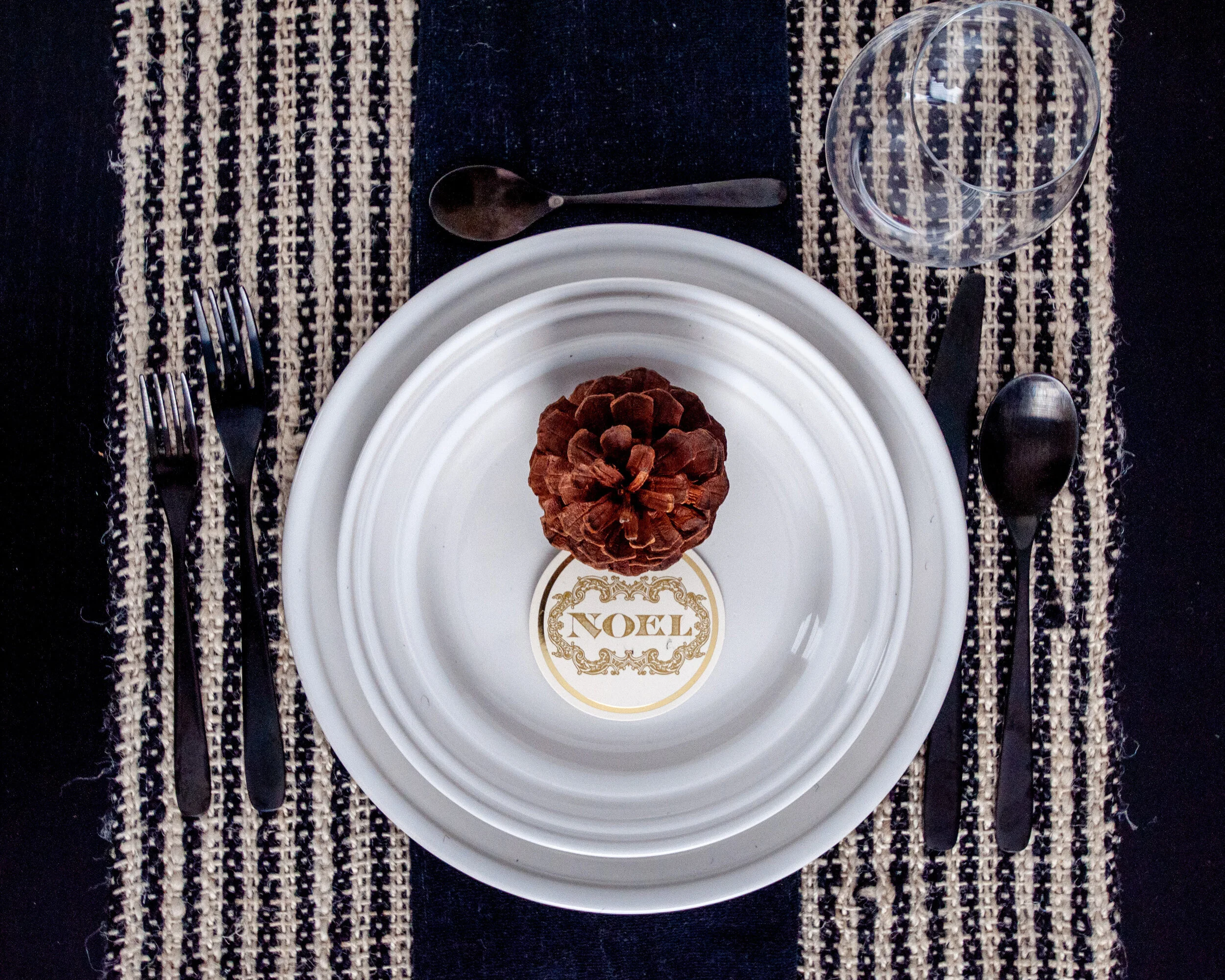
When less really can be more.
Creams and black create a luxe neutral palette which maintains visual interest by the different textures and materials. The pinecone and gift tag add just enough of the festive feel so your guests remember what dinner they are actually attending.
Look 2: Minimal Glam
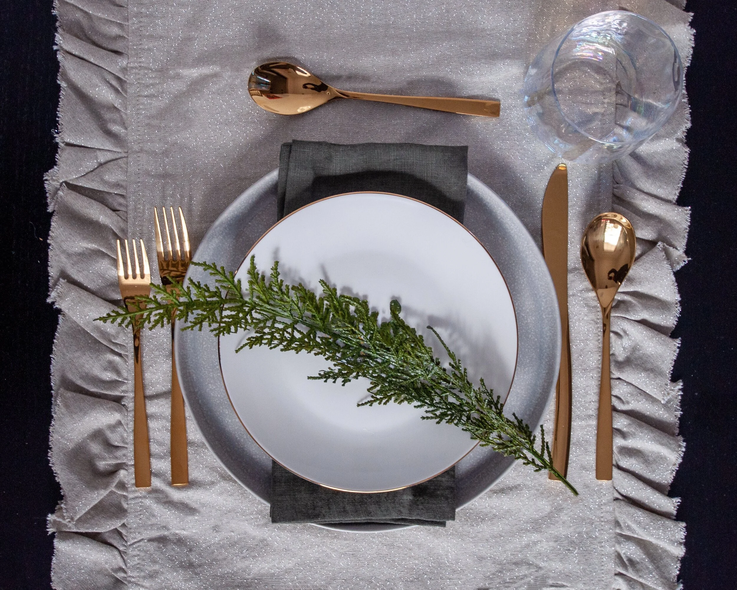
When you just can’t give up the glam.
Gold cutlery is the focus of this place setting and is accented by the simple gold rimmed plate and the slightly iridescent wine glass. The table runner is frilly and sparkly but the raw edge works to keep it real. And because it still needs to feel festive, a little green in the napkin and cedar sprig will do the trick. Oh and it’s okay to go faux with your greens, as someone who breaks out into a rash from touching cedar, I’d be a bit cautious before putting it onto your guests plates!
Look 3: Minimal Country
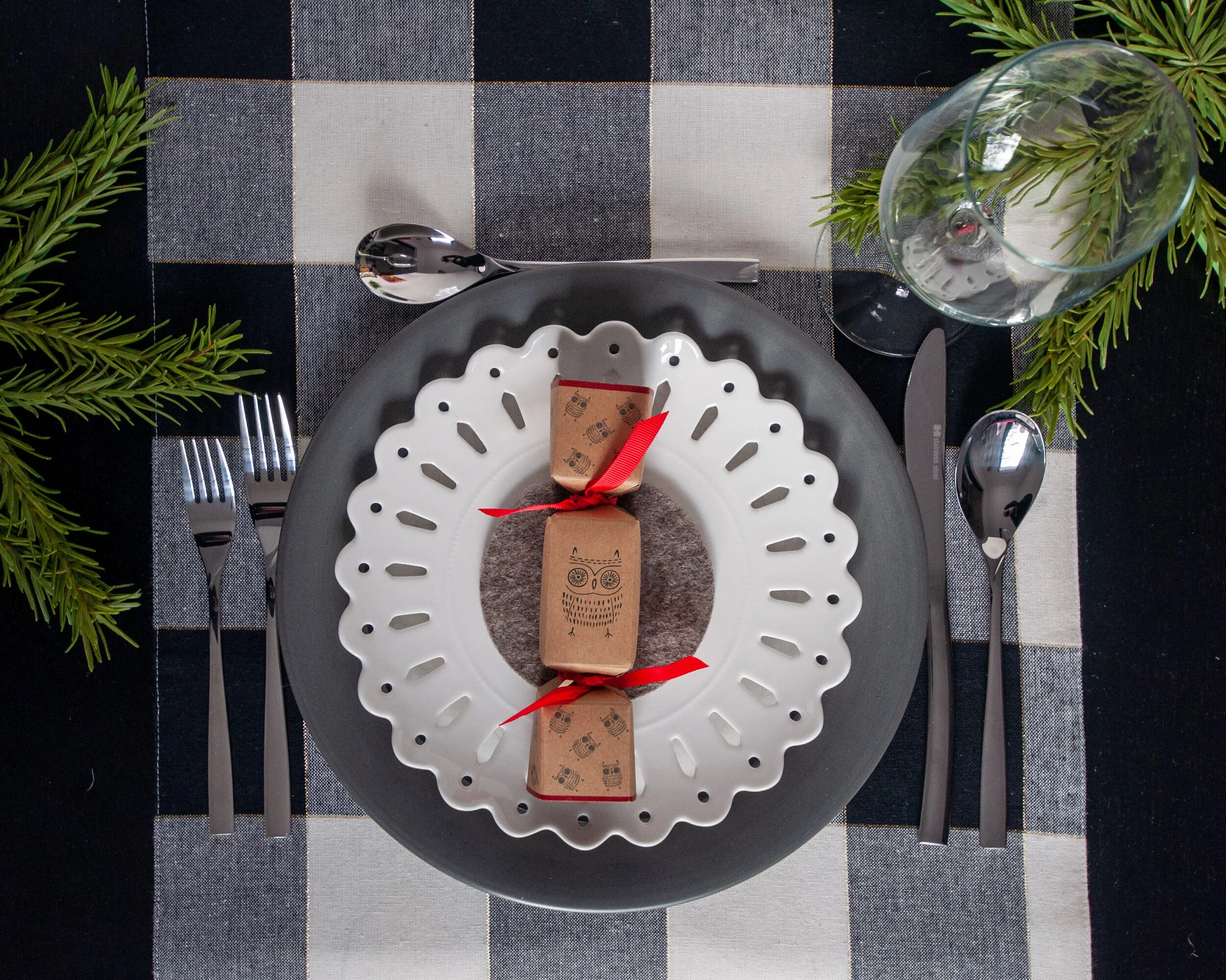
When buffalo plaid is life.
A neutral version of the traditional red buffalo plaid sets the tone for this setting. The grey and white is repeated in the plates and cutlery with a bit of the outdoors brought inside with some pine greenery. The red-accented craft paper cracker adds that hint of whimsy that pulls it all together.
So what do you think? If you had to choose your favourite, which one would it be?
Kierstin Smyth Design
Edmonton Interior Design Consultant