Glenora Redesign Project
I was absolutely ecstatic when one of my clients reached out about working with her boys to redesign their rooms (and to do a bit of updating around the rest of the home too)! It was so much fun to sit down with each of her sons and discuss how they wanted to feel in their rooms. And now, I may not be a parent, but I think it was such a great experience for them to sit down with a professional and be able to communicate what they wanted in a room, have a full say in the process and then see their vision come to life. And I was just blown away by the amount of thought they put into it. The only request from mom and dad was that I ensured it stayed on budget and their designs worked with the rest of the home.
Sports + Chill
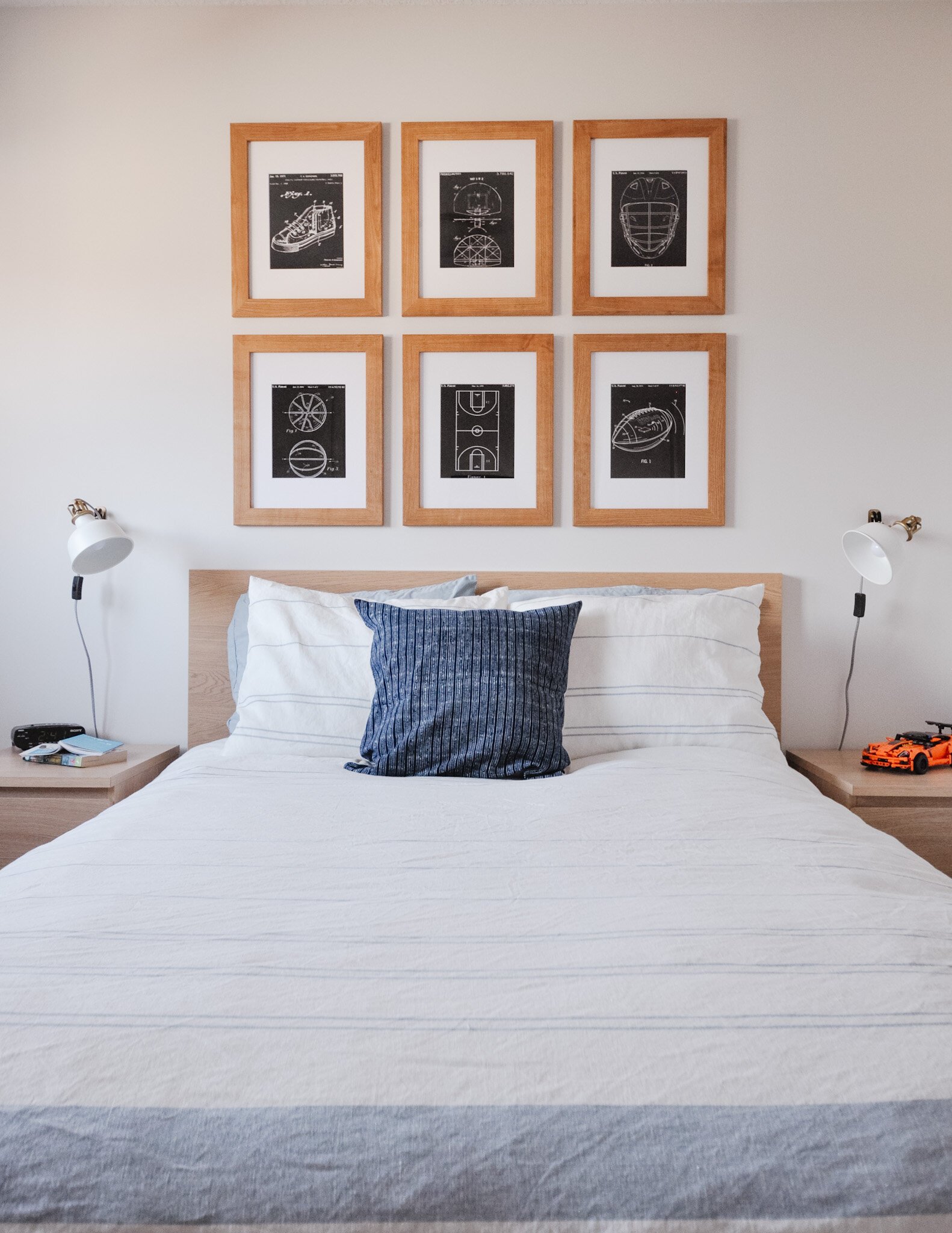
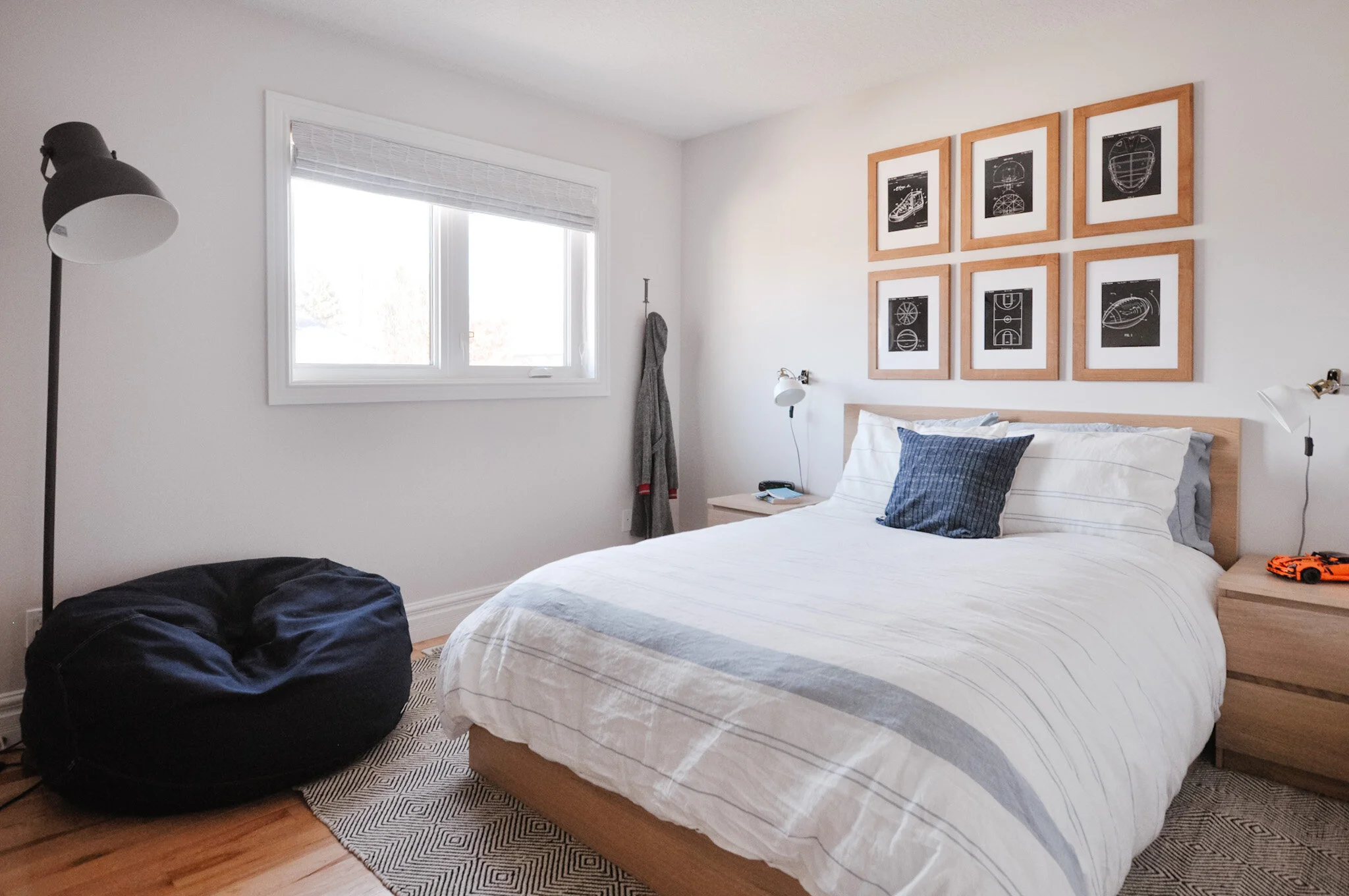
One was looking for a more zen space where he could chill out and get away - and have a great spot to read. He didn’t want any dark colours and wanted it to be light and neutral tones. Blue was allowed for the bedding and he wanted a sports theme but without reference to a particular team. A beanbag chair was a big priority as a spot to read but also something that was portable so he could go sit in his brother’s room too. His preference was for a rug that filled the room and it was important to him that the space felt more mature.
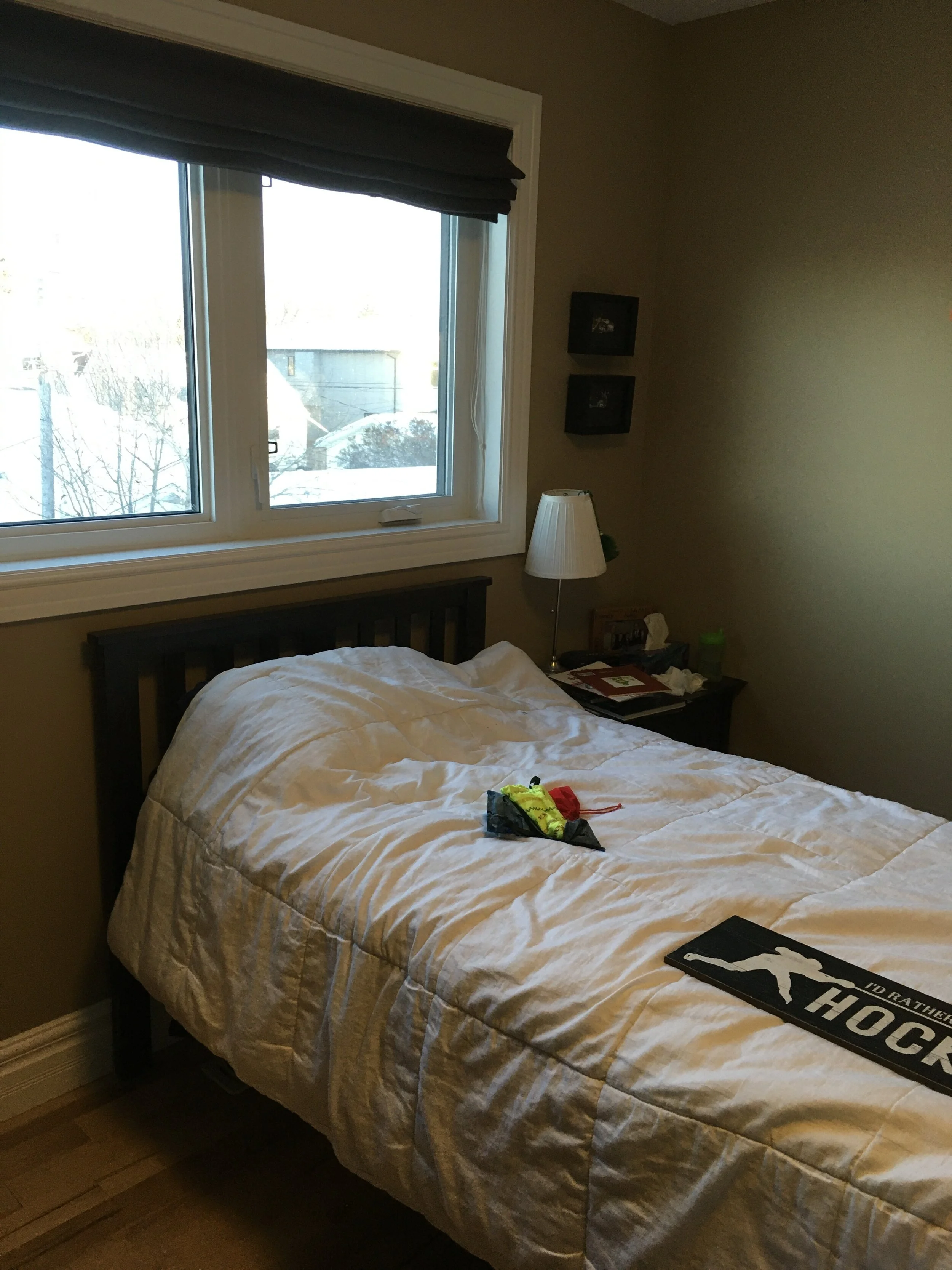
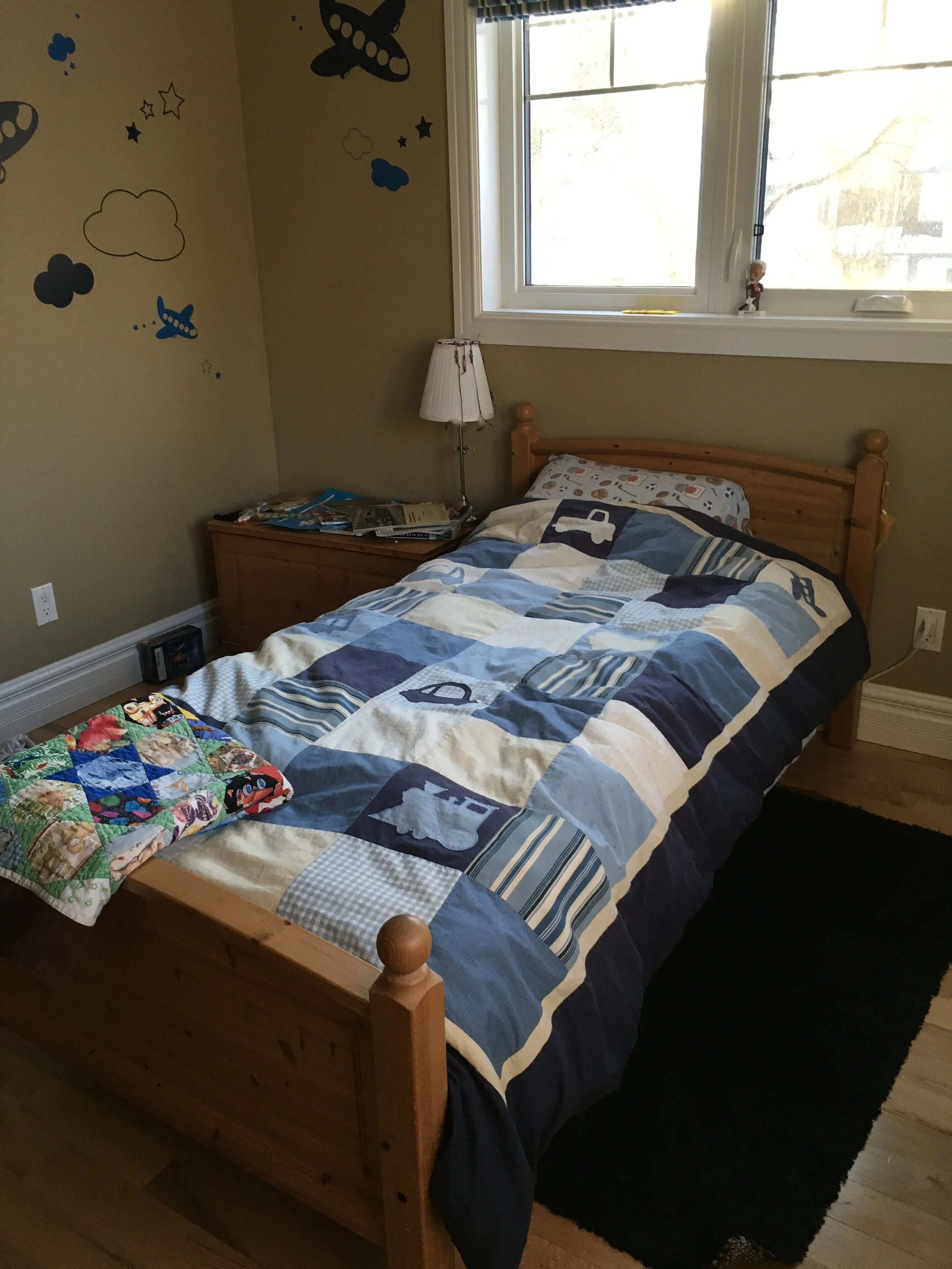
BEFORE
AFTER
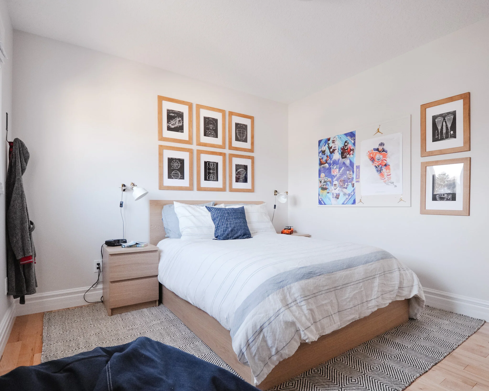
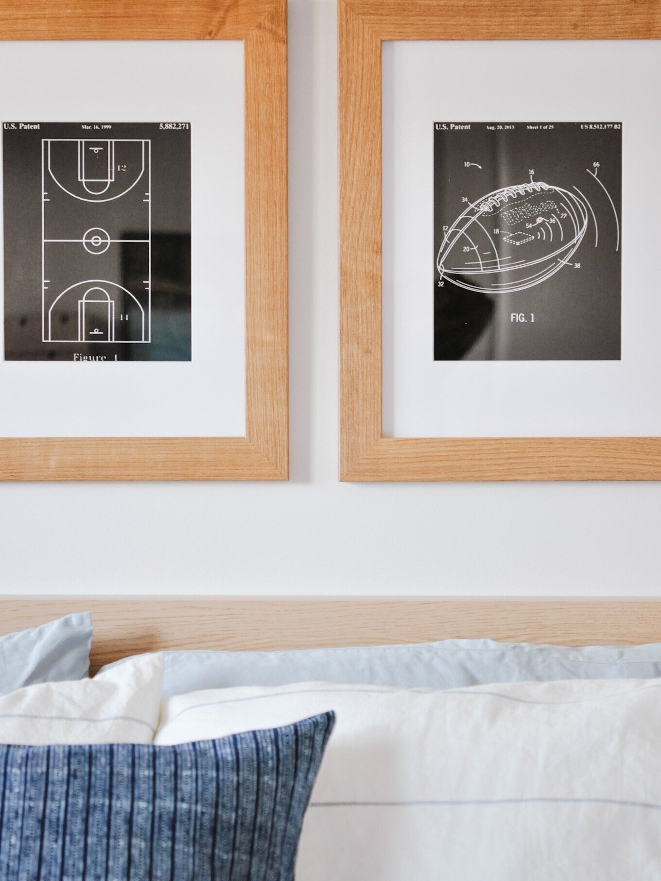
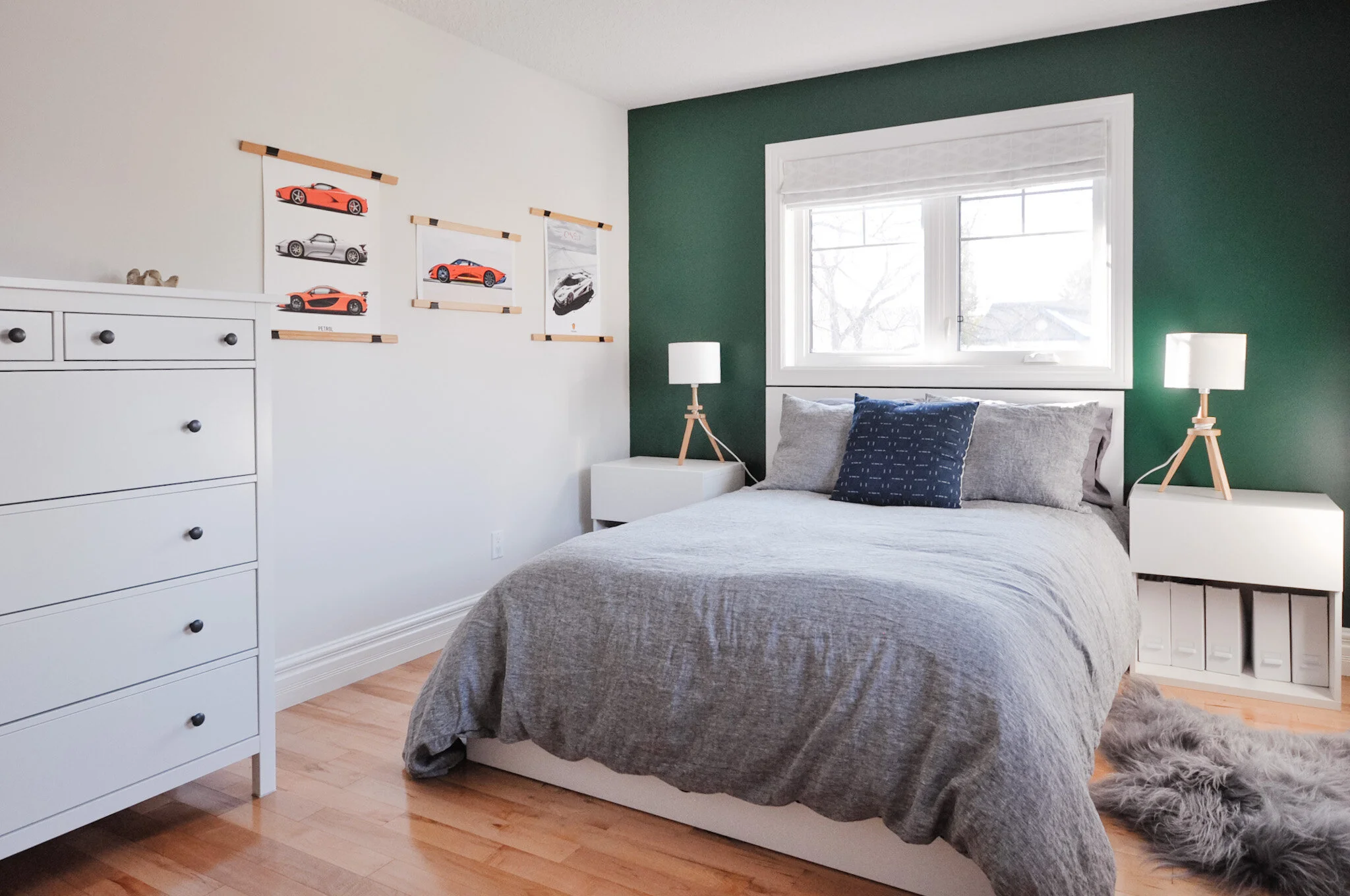
The overall vibe includes light woods, neutrals and a pop of navy. Because he didn’t want a particular sports team or player to be represented, I chose patent print style sports images of hockey and football (his favourites). It adds a more grown up vibe but still keeps the sports aspect front and centre. The bulletin board was painted to match the wall so that it blends in but still gives him a spot to change up what is displayed.
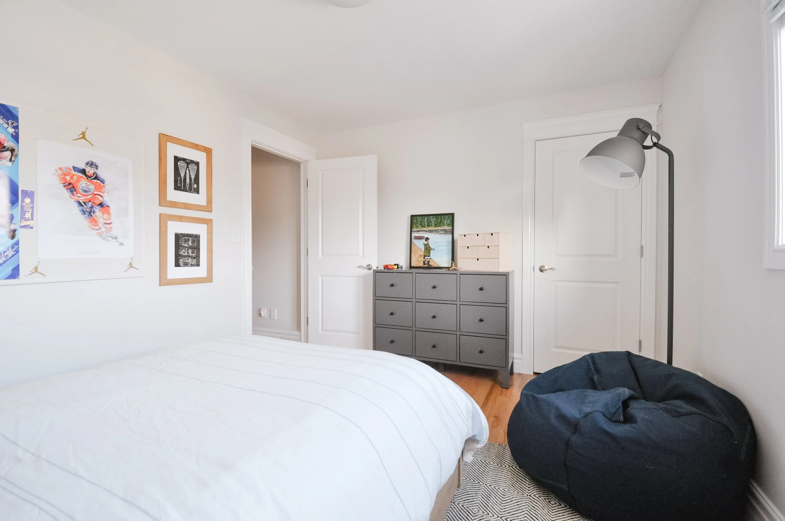
Having a spot to get away from it all and enjoy a good book was also key - plus he really wanted a bean bag chair. I’m told he uses it all the time.
Cars + Creativity
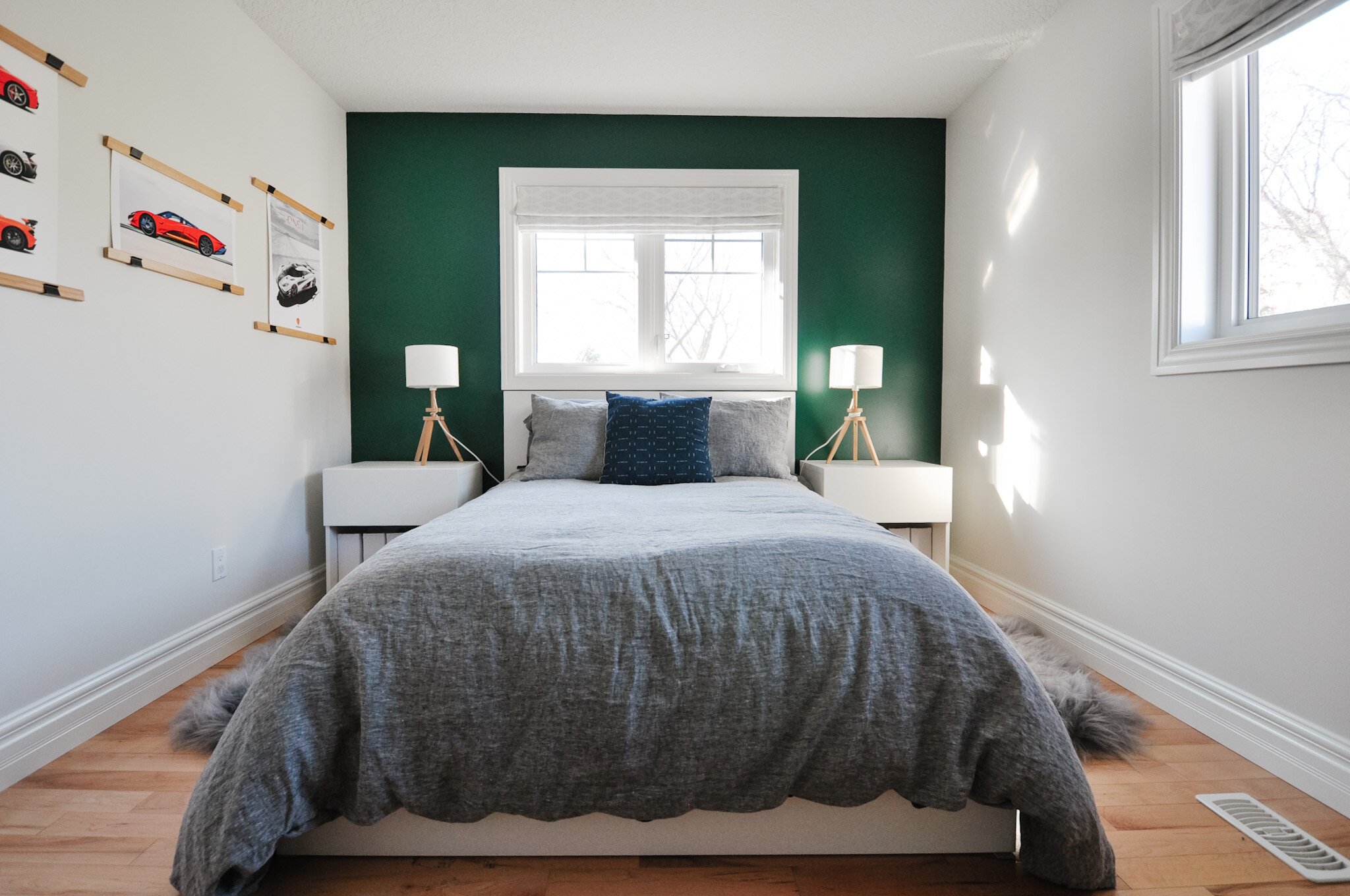
The other wanted to be able to feature his favourite cars on the wall (and was pretty impressed that I knew what a Koenigsegg is) but in a way that he could easily swap them out as his favourites changed. The space was meant to feel relaxed and also creative. Storage space was also a priority in his room.
BEFORE
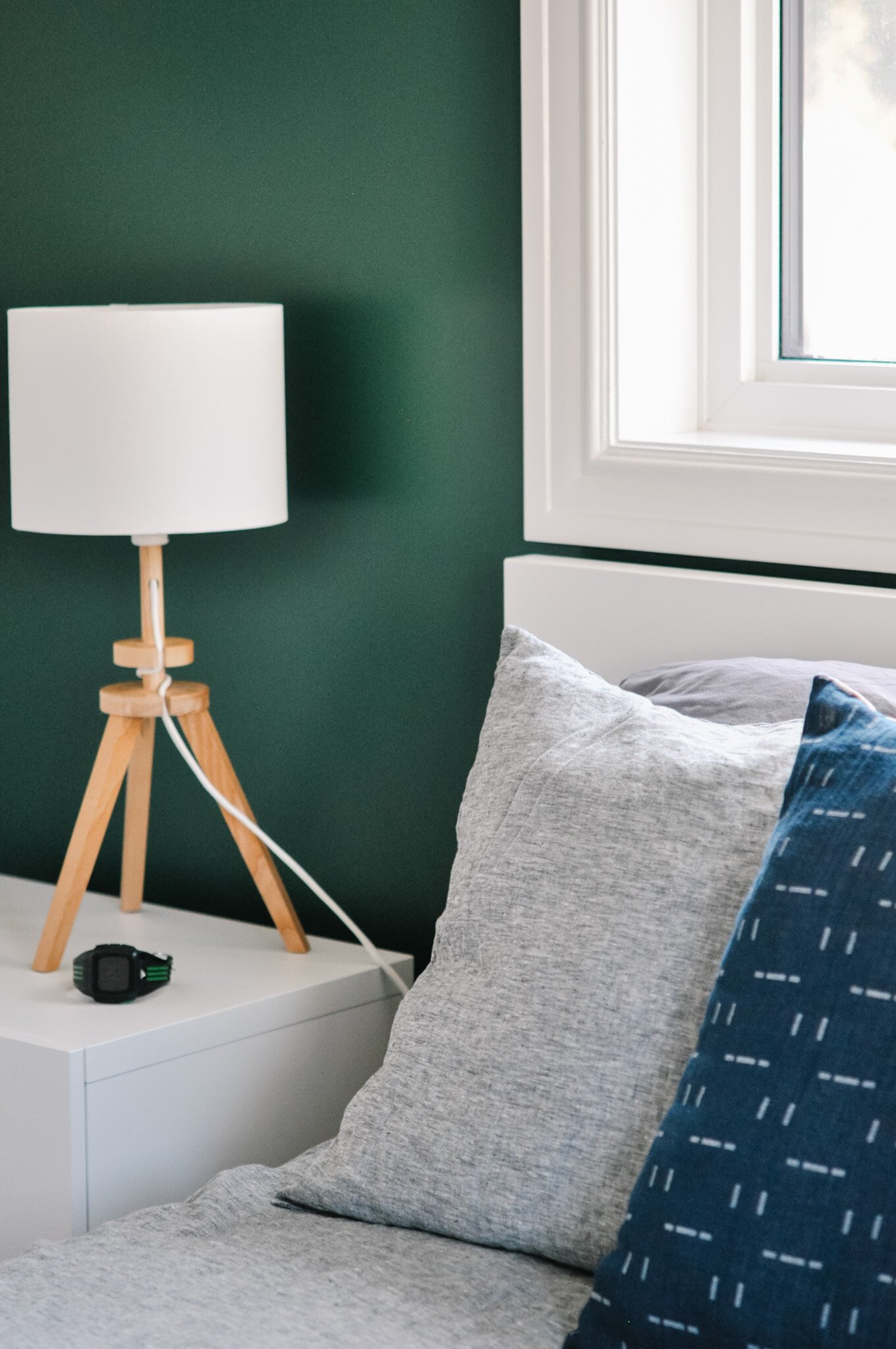
One of the must haves: British Racing Green. It was a no brainer to go bold with a feature wall in this colour. We let it really shine by keeping everything else neutral. Greys, whites and a little contrast with the pop of navy.
AFTER
It was so interesting to me that each boy had a rug preference. One preferred the rug to go fully under the bed, while this one wanted smaller rugs on either side. Have I mentioned how much I enjoyed working with these two?
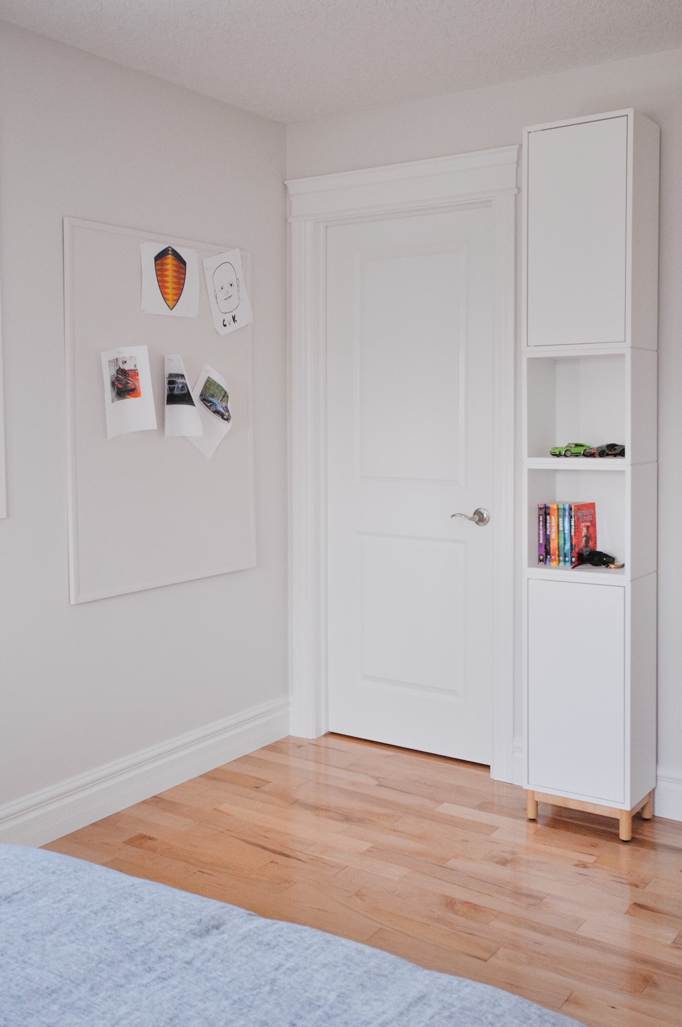
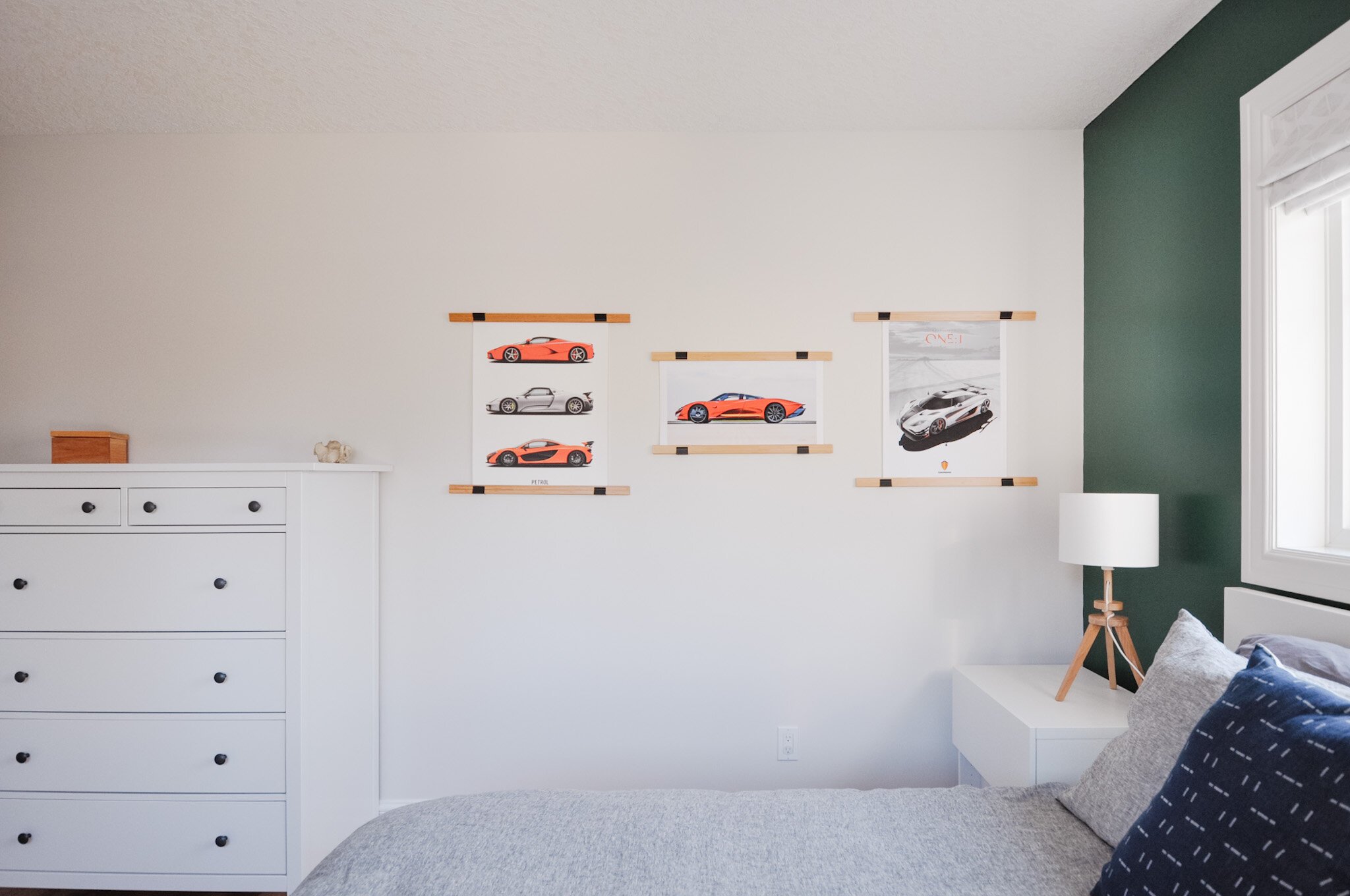
Another important aspect was storage. Large nightstands were used to house his magazine collections and another tall storage unit was added with some space for display and hidden away portions too. Because his choice of favourite cars can change frequently, I used poster hangers instead of frames for easy swap outs and made sure he had a large cork board to use for inspiration. Again, we painted it the same colour as the wall so it keeps everything clean.
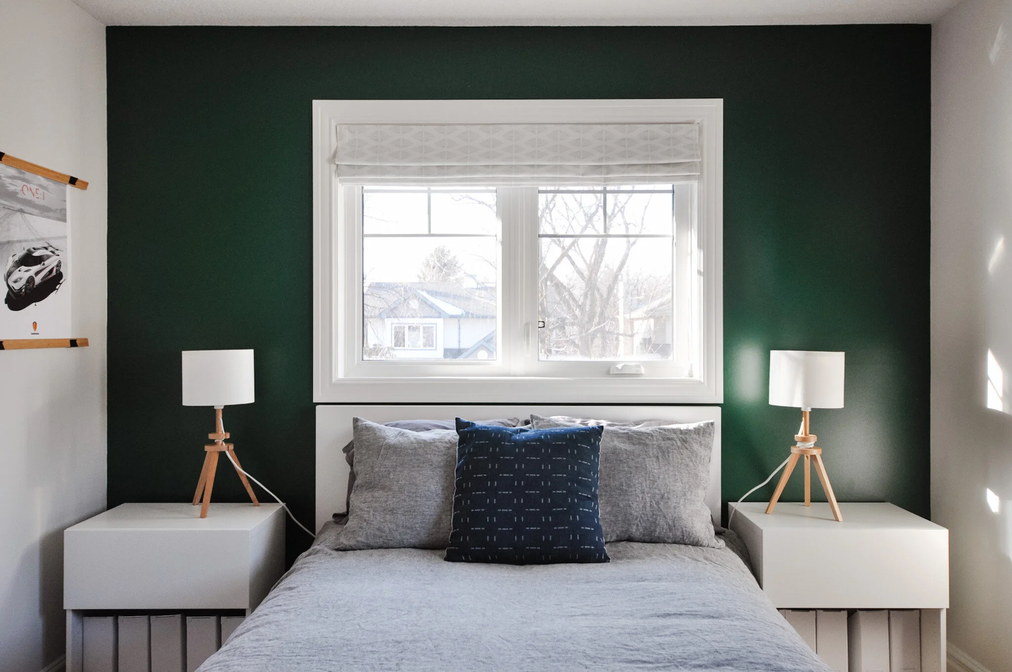
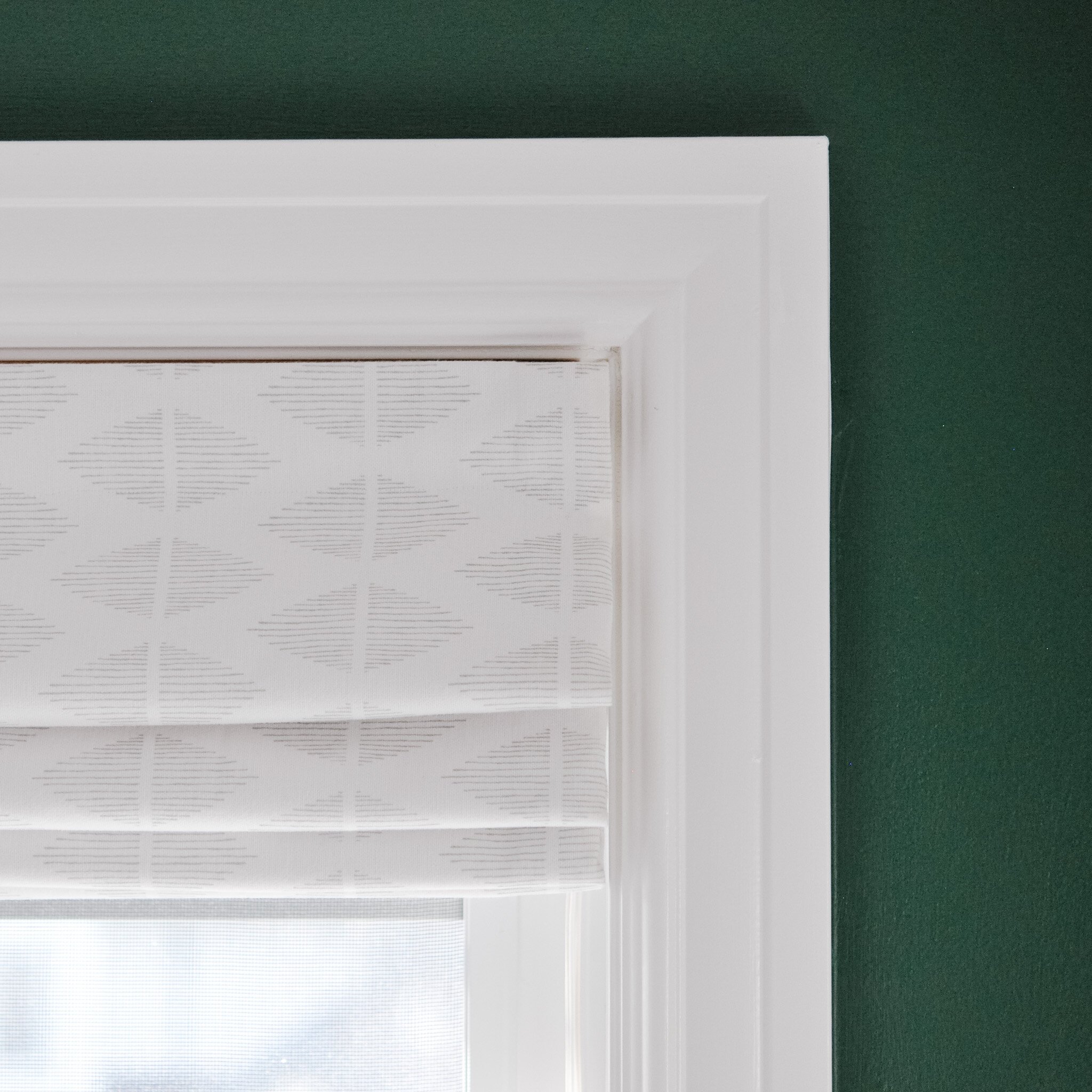
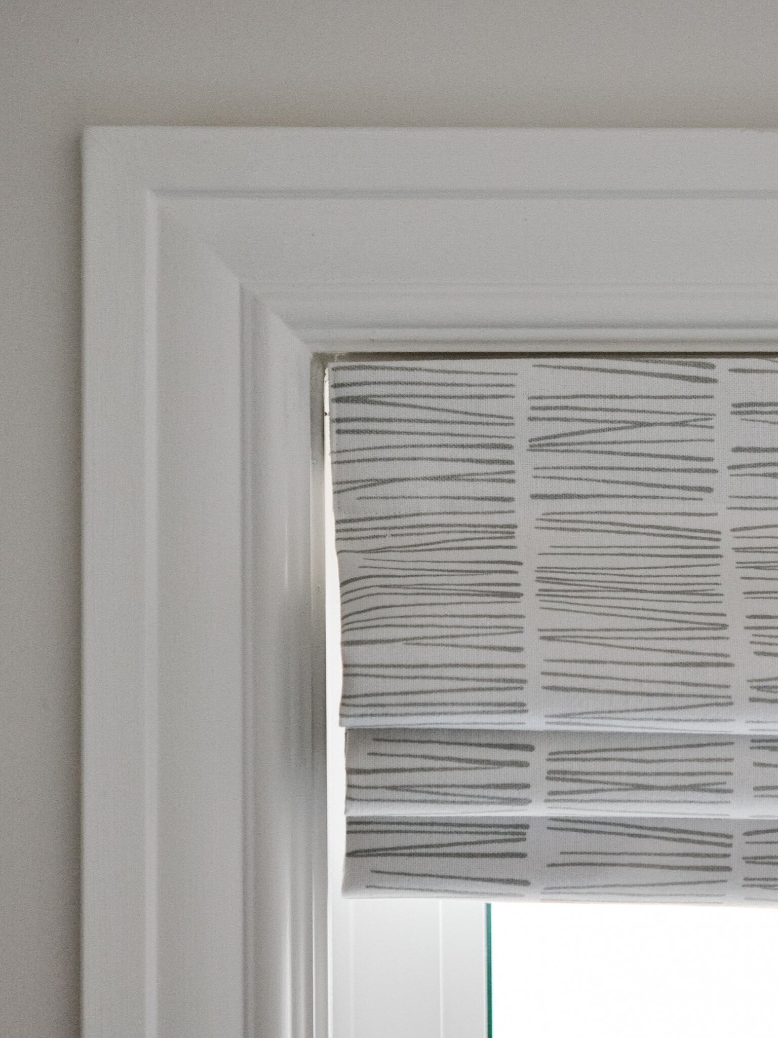
Both bedrooms also feature roman blinds that were made by my client. She had made their original blinds when they were young and wanted to have something in their rooms again that she had made. So we picked out some great fabric and she made it happen!
Main Floor Refresh
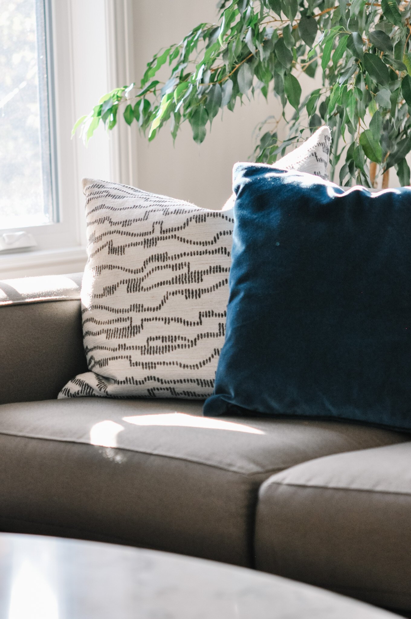
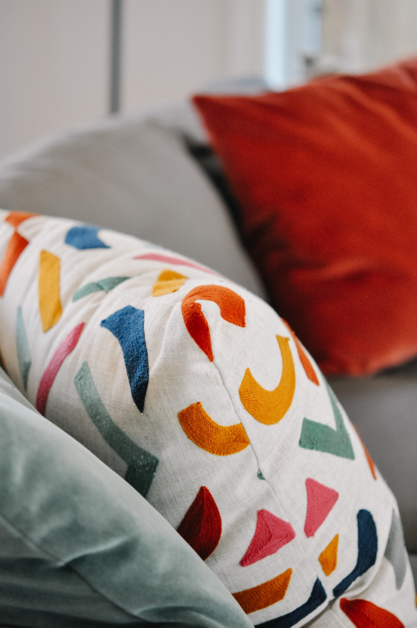
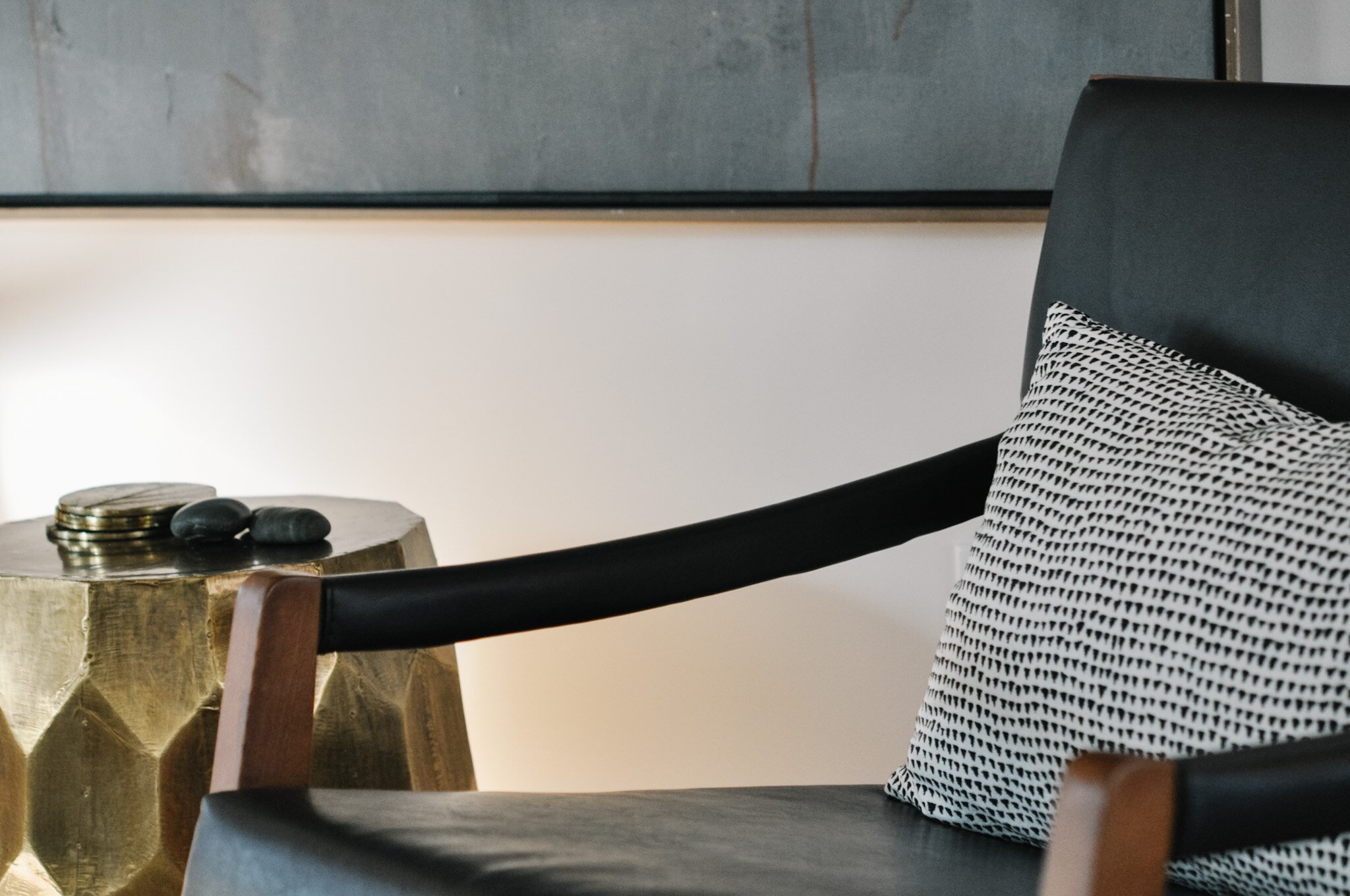
In the rest of the home we freshened it up with a new coat of paint throughout. The living room was brightened up and given a more lively feel with new pillows.
And the kitchen cabinets went from dark wood to white with new, modern hardware added as well!
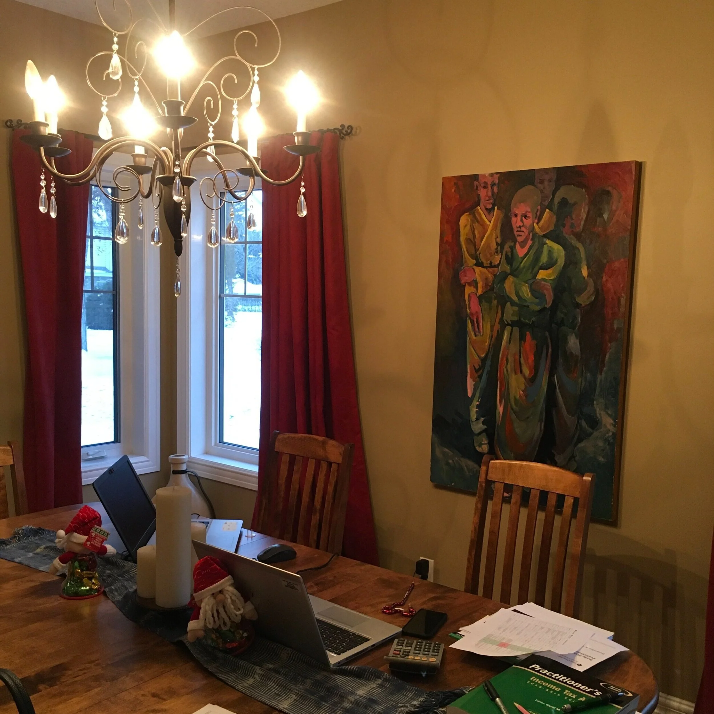
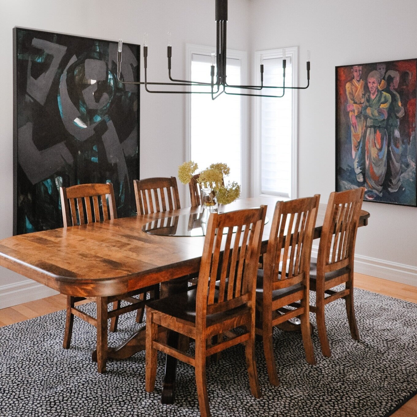
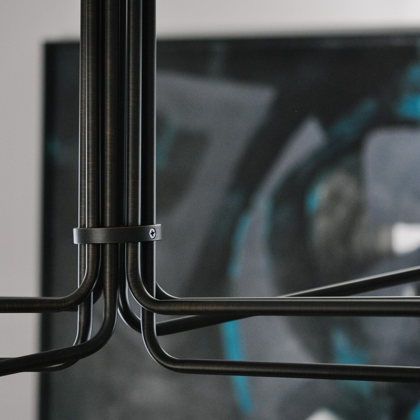
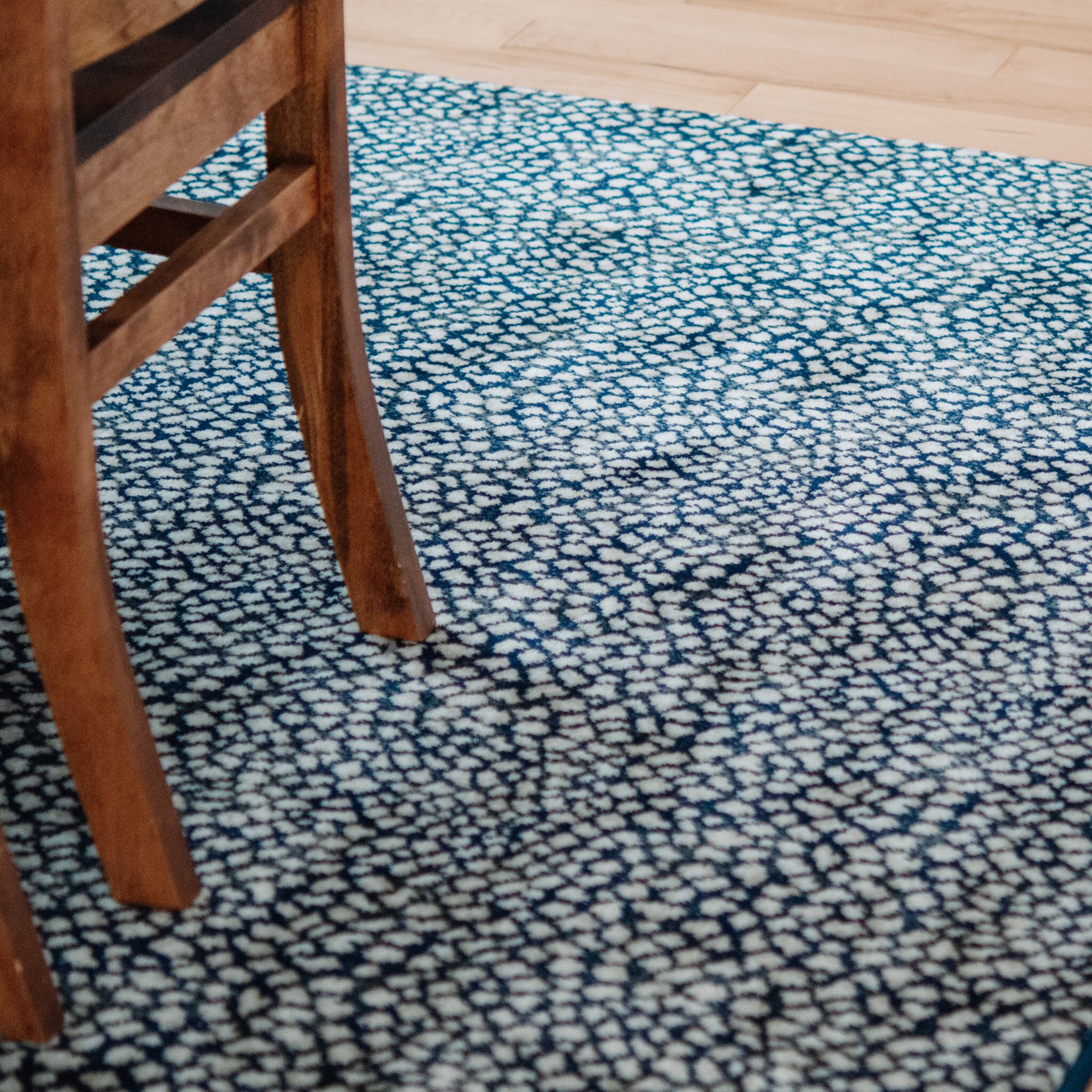
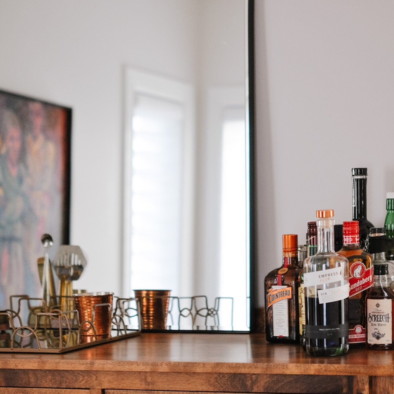
DINING ROOM
In the dining room, we swapped out the dark curtains for light filtering Hunter Douglas Silhouettes to match the rest of the home. And then to add more interest to the space, went with a printed rug, new light fixture and a mirror above the buffet.
BEFORE
AFTER
Powder Rooms
I love doing something bold in a powder room and this was no exception. And you all know how much I love the wallpaper from Hygge & West. So we took what was a rather bland washroom…
BEFORE
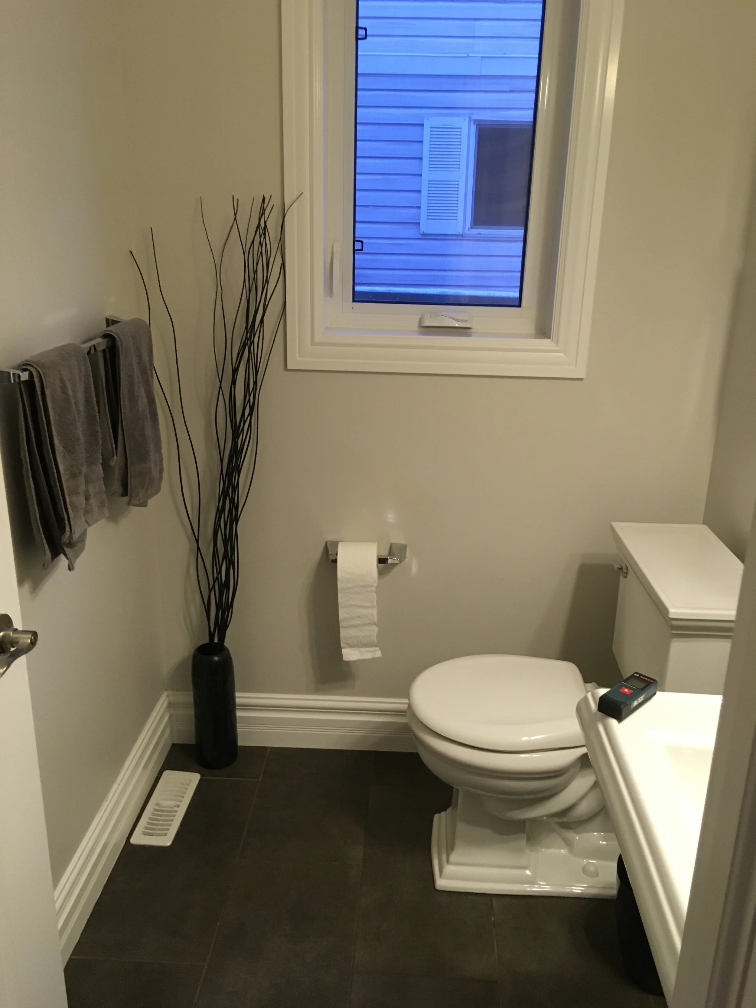
And created this! So much more fun, right?


I was also so happy to hear that the whole family is enjoying the updates and actually finding it easier to keep the home organized. It feels more like them (both as a family and as individuals) and that’s really all I ever aim to do.
Kierstin Smyth Design
Edmonton Interior Design Consultant