North Glenora Kitchen Transformation
I am so excited to finally share this wonderful kitchen transformation! This lovely home, in the Edmonton neighbourhood of North Glenora, already had loads of character but the kitchen needed some love. We actually started the design process while my client was overseas - despite the distance and the differing time zones we were able to get the overall design figured out so that we were ready to go upon her return.

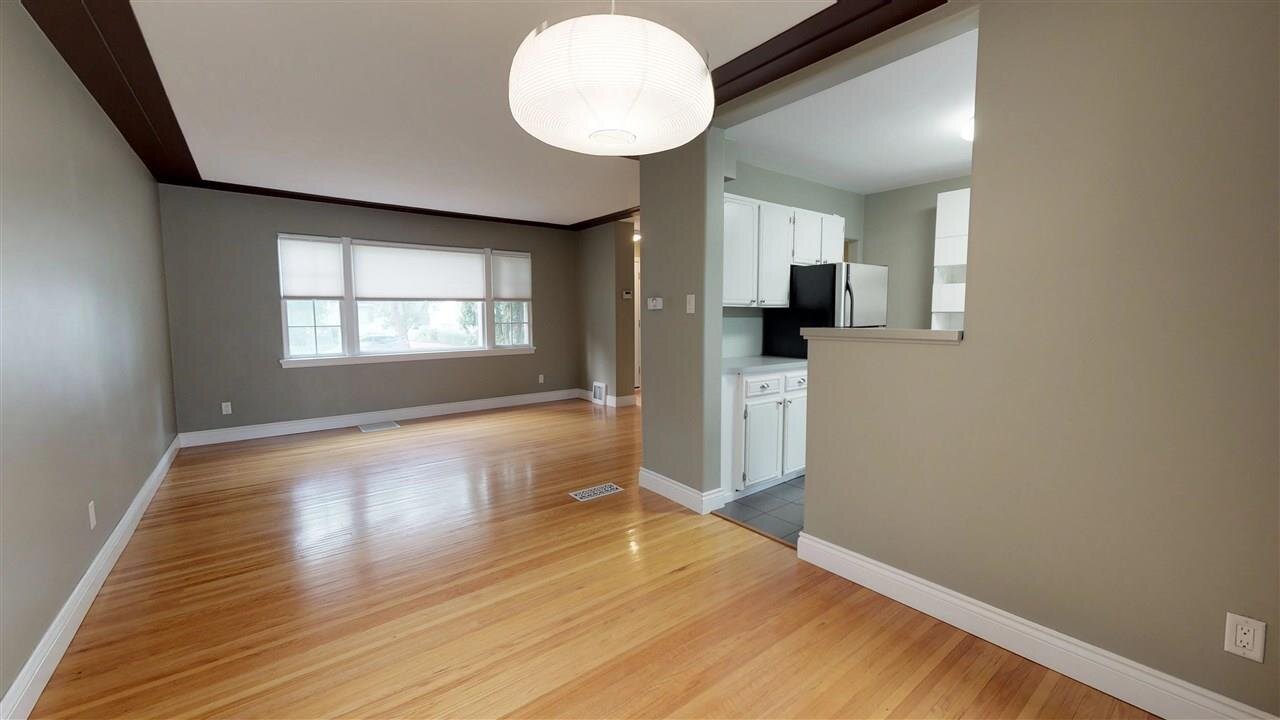
The existing space wasn’t in the best condition and the appliances and cupboards were awkwardly placed and not ideal from a function perspective.
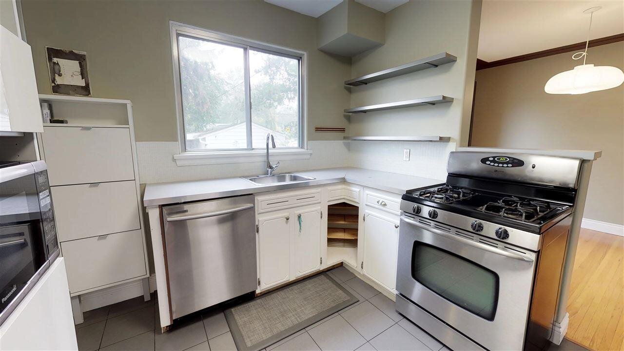
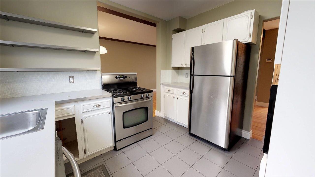
Before photos
Design process
The first step in a renovation project for a home of this age is the asbestos testing. Overall, the results were good with just some minor areas testing positive that weren’t ones we were going to be dealing with during the kitchen renovation. Win!
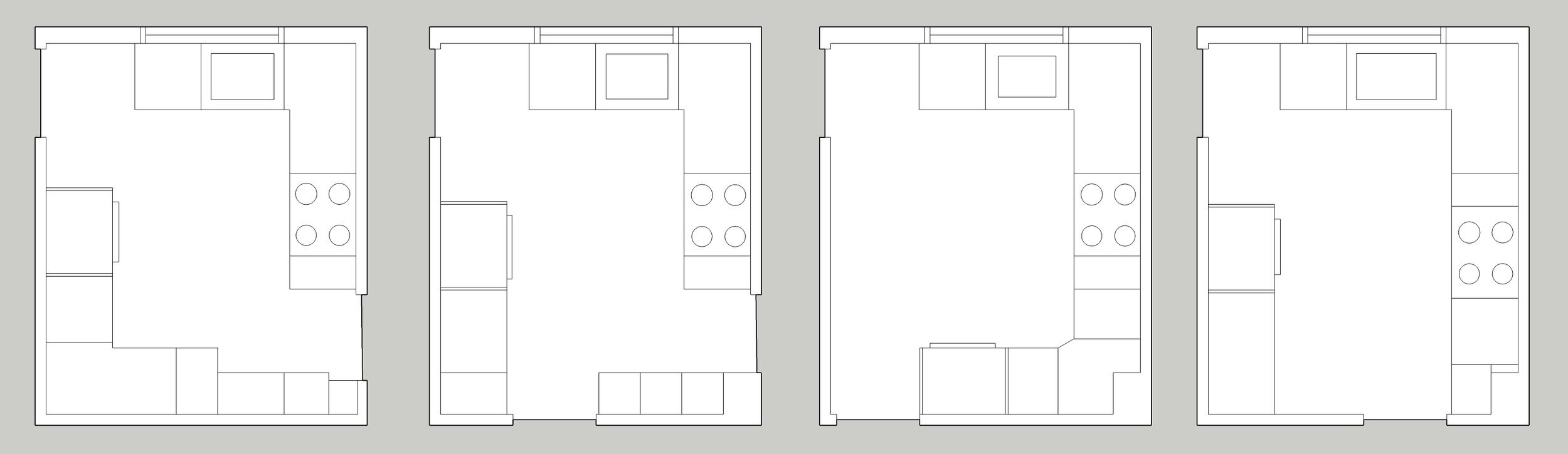
Although it is a small space, I still managed to come up with 4 options for the kitchen. Some were better from a flow perspective, others from a storage or workspace perspective. They varied in terms of keeping all 3 entry points or going down to 2. We ended up going with the 4th option with a slight change to the entry point from the living room. This meant that we closed off the opening between the kitchen and the dining room and adjusted the positioning of the entry into the living room so that it could better fit cabinetry, allowing for optimized storage, better prep space and better flow through the room.
The renovation
Plumbing and electrical needed to be updated so the space was gutted for a clean start. My trusty site inspector made sure everything was in order too.


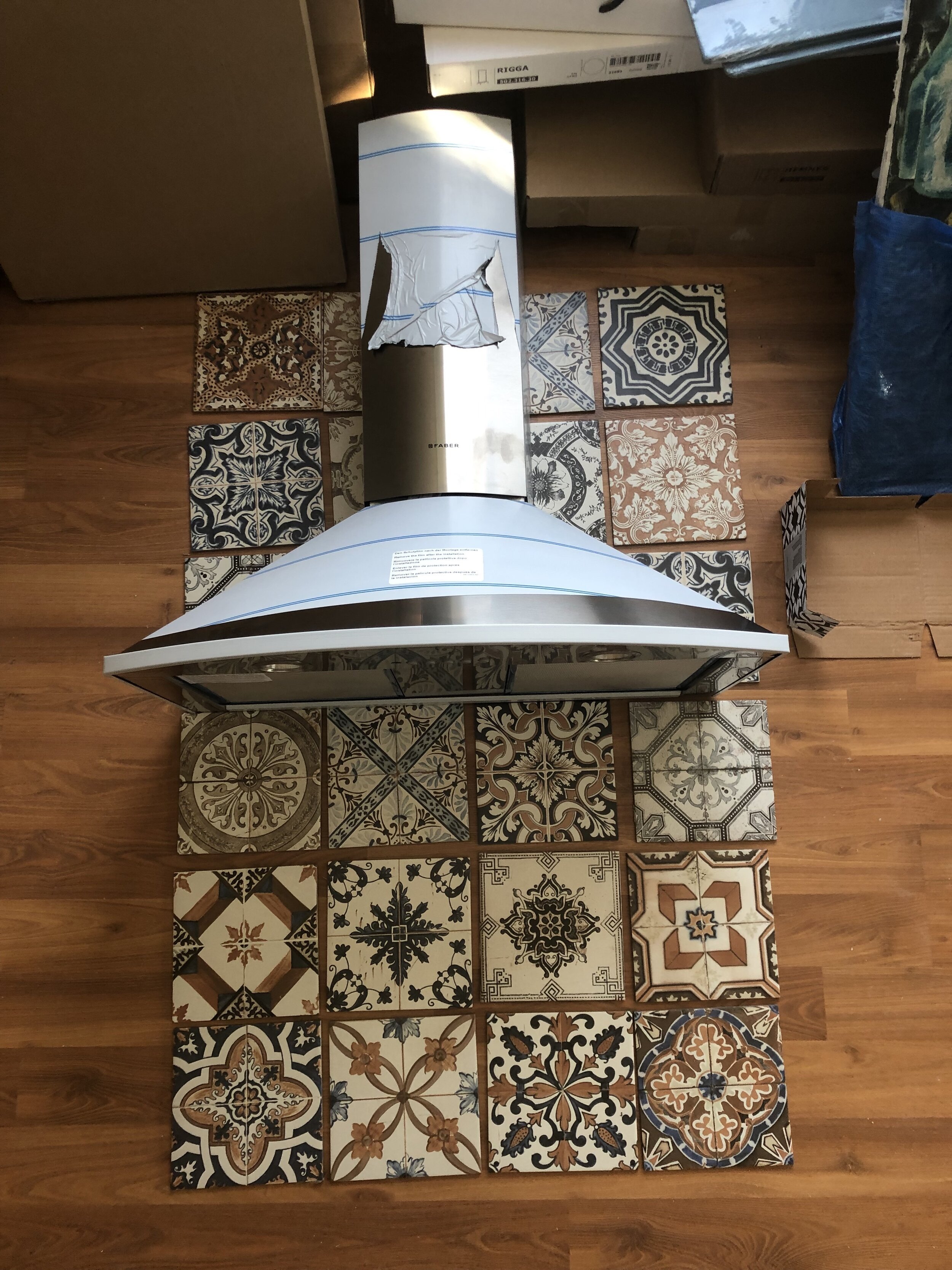
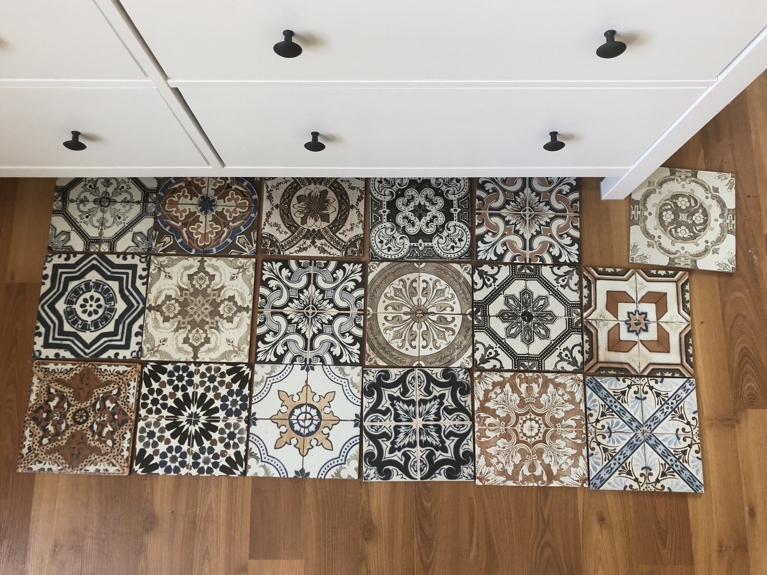
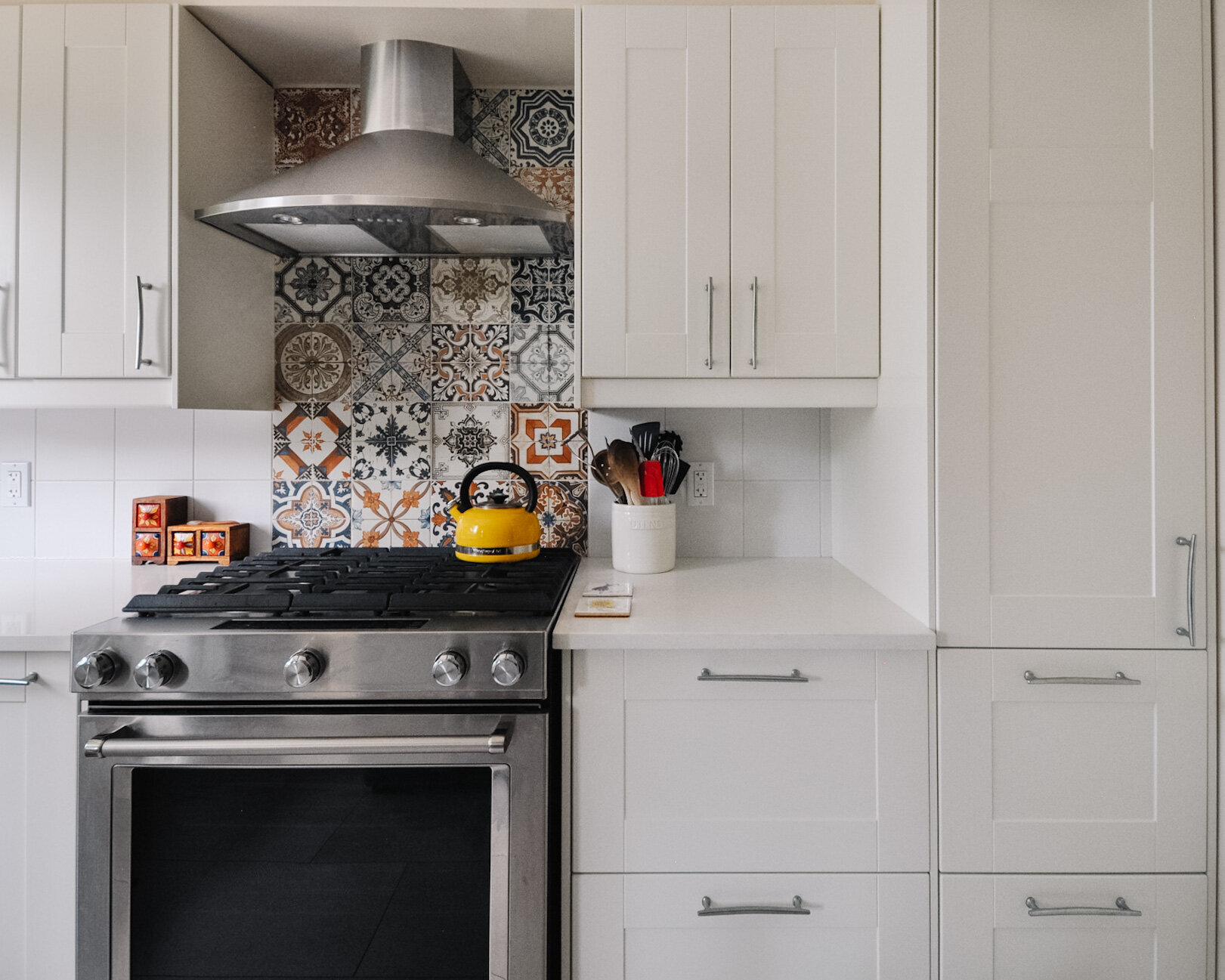
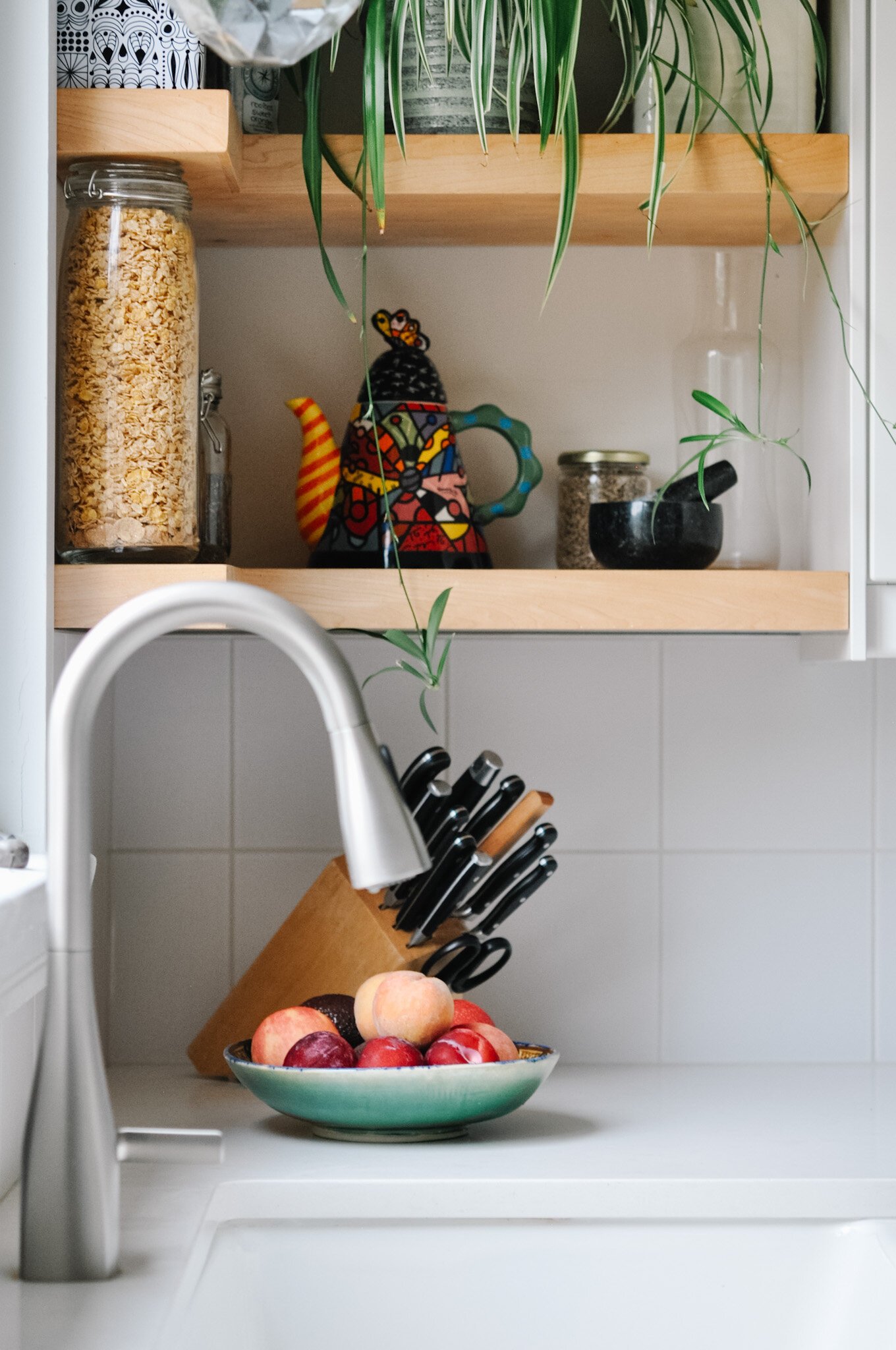
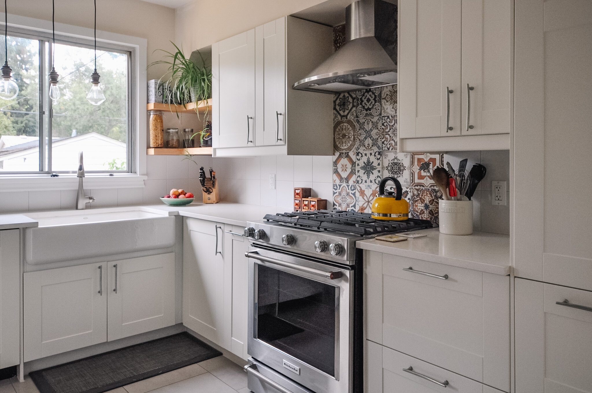
To ensure that the kitchen felt like it was meant for the older home, we kept the finishes traditional but added some additional interest (and a bit of an homage to my client’s heritage) through the patterned backsplash tile. We had debated doing the patterned tile throughout or doing wood cabinetry on the bottom, but decided to keep it more minimal. Although finding the perfect white tile that paired well (and was sized the same) with the patterned tile was a bit of a challenge - after a few attempts we found the one. The result is a clean, neutral, yet warm space. Inviting and functional.

Deciding which tile was going to go where was also a lot of fun. My client and I hauled all the tiles upstairs and then laid them out so that we could put the design together one by one. They were chosen based on balance, trying to not duplicate, and putting my client’s favourite ones front and centre.
The space was organized and designed for how my client works in the kitchen and she has told me that it feels so good to have a space that was designed just for her.
The cabinetry is from IKEA but was upgraded with unique silver handles and quartz countertops. The cast iron apron sink was the splurge for the kitchen; however, the weight and size of it did cause a few challenges when it came time to install. But it all came together with a bit of time and a few expletives from the install crew.


For lighting, we used recessed fixtures throughout the space and accented the window and sink with 3 wood pendants with different shaped bulbs. This looks incredible in the evening from both inside and outside the home.

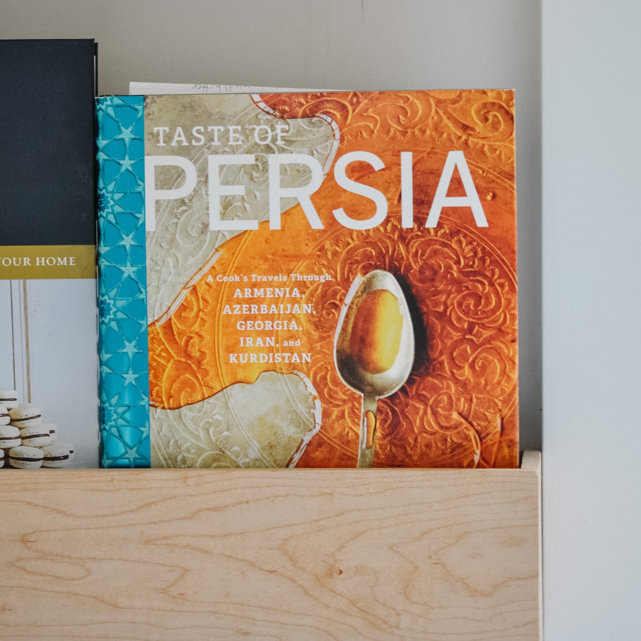
The custom designed shelving was the finishing touch on the space, adding even more warmth and character. We had to angle the bulkhead to the right of the sink which meant that cabinetry wouldn’t work in the space. The floating shelves add function and also help to draw the eye through the space and out the window. To balance it visually, two box shelves were designed. One deeper for displaying cookbooks, and the other with a shallow inset for displaying objects and containers.
The cookbook box shelf is probably my favourite element of the space. Such a fun way to show them off!

More than anything, I just love how this space truly reflects my client. From the overall design, to its function, to the unique and charming elements she’s added.


A bathroom update too
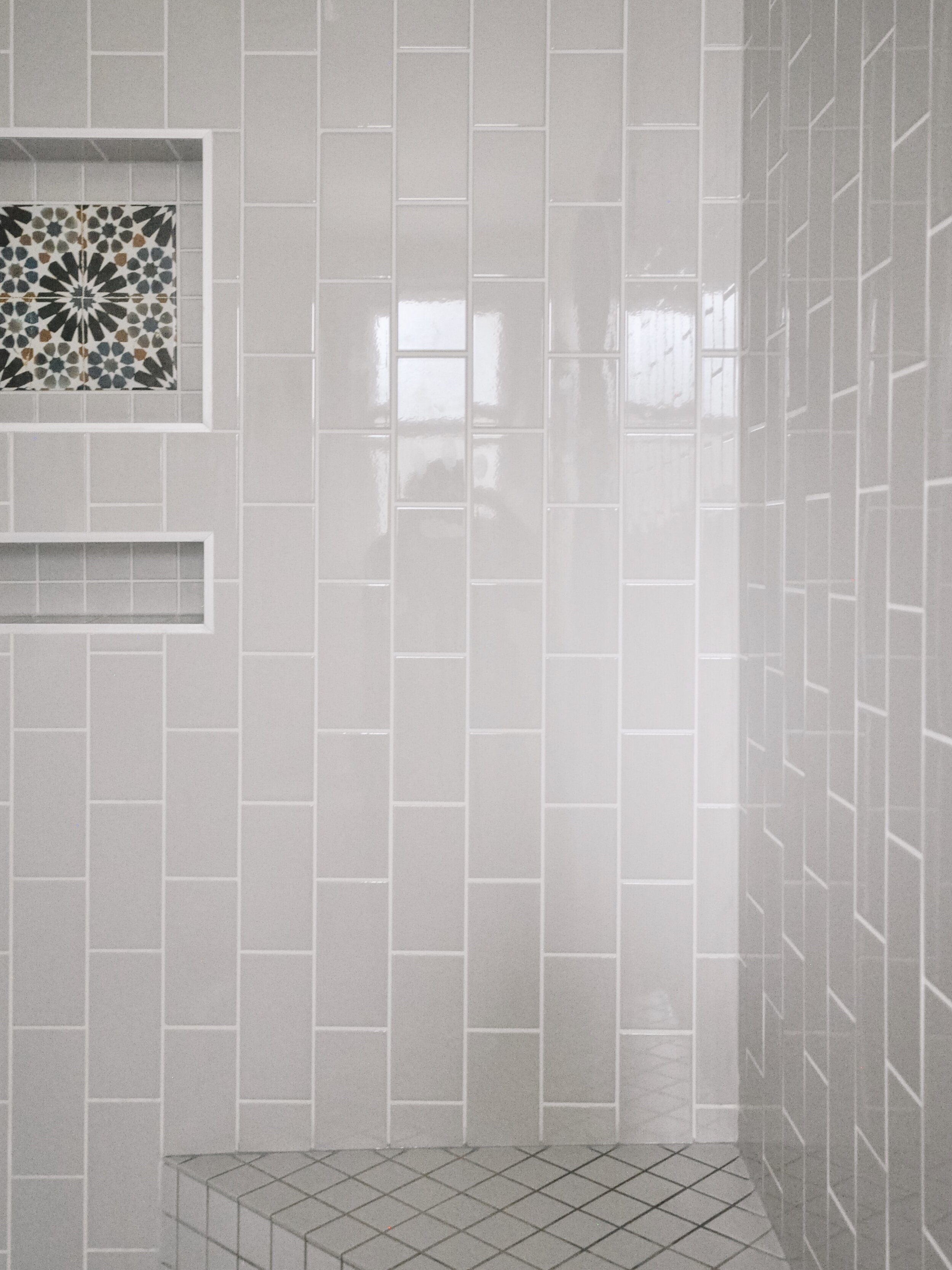
Oh and we also updated the 2nd floor bathroom as well! It was a bit dull and awkward so we switched up the position of the toilet so it was on the same wall as the vanity, moved the heat vent to under the window (near where the toilet was originally) and put in a larger tiled shower. So much better!


After
We used one of the patterned tiles as an accent in the niche. A small element that just ties it together with the rest of the house.


I’m incredibly happy with how everything turned out. It’s so important to me that renovations still stay true to the home and even more importantly, stay true to the homeowner. Modernized, functional and beautiful - what more could you ask for?
Kierstin Smyth Design
Edmonton Interior Design Consultant