Behind the Design: Glenora Court Condo Renovation
So by now, I'm sure you've all seen photos of the finished kitchen (if not, head here for the portfolio feature), but I often get asked what it looked like before the renovation took place. So here is your first "Behind the Design" post! Enjoy!

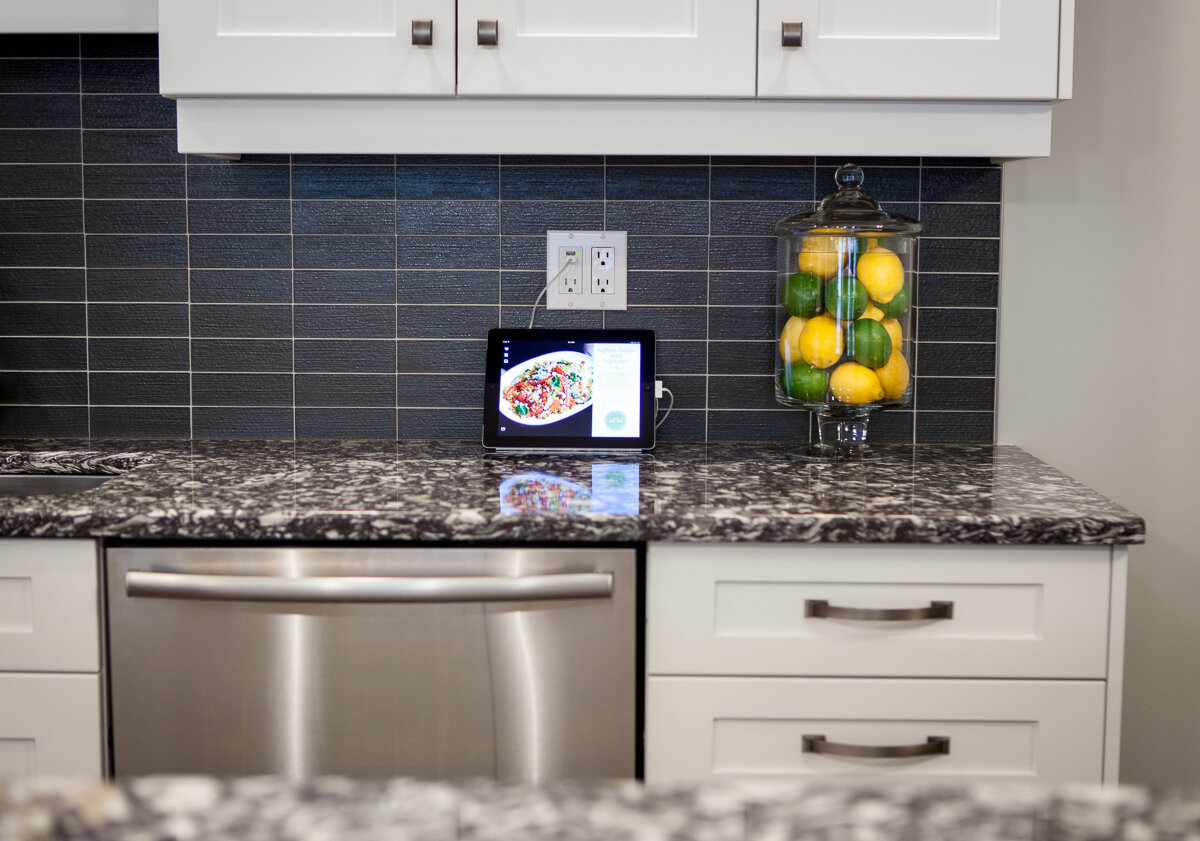
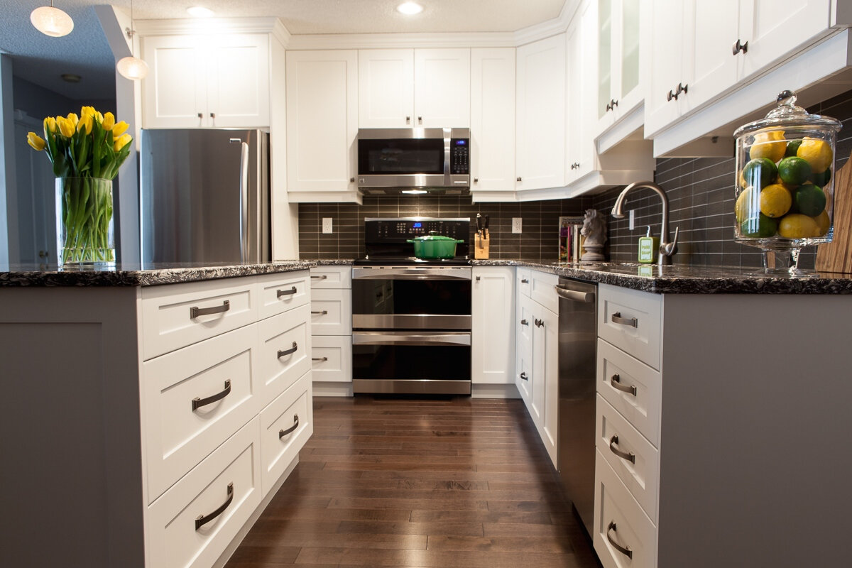
The end result, all done up!

Before (yes this is the same kitchen!)
This condo was built in the early 90s and featured some fairly typical features for the time such as a cloud light and the wood-lipped cabinets. It was definitely time for a refresh from an aesthetics perspective but there were also a few functionality problems we needed to solve. The flooring was replaced throughout the main areas and bedrooms with a dark, maple engineered hardwood and the major element in the kitchen design that changed was the peninsula. By adding a large island instead, we allowed for better flow and accessibility to both the dining area and the living area from the kitchen (previously, the U shape opened up to the living area, cutting off the dining space to the right). We also increased and improved the storage space by taking the upper cabinets to the ceiling and replacing doors with drawers on almost all of the lower cabinets. The dishwasher was moved to the other side of the sink so that it and the oven door wouldn't interfere with each other and the old microwave that took up valuable countertop space was replaced with a hood-vent version that could sit above the range.

The overall aesthetic was a kitchen that was both modern and timeless. In my opinion, white kitchens are always stylish, clean and elegant. We chose shaker-style doors and drawer fronts to continue with the timeless look. Because of the simplicity of the cabinets, the countertop was the opportunity for a bit of drama. A stunning quartz was chosen that, while neutral in colour, has a bold pattern that easily makes it the showpiece of the space.

The three pendants above the island are hand blown glass with incredible texture. This makes them visually interesting but again, classic and timeless. The textured glass also helps to diffuse the light and make them a little easier on the eyes, brightness wise. The backsplash we chose ties in a similar textured glass as the pendants but in a grey to pull out some of the tones in the countertop.

Overall, I think this was an incredible transformation (I know I'm biased but I think you'd agree!) and has left the owner with a beautiful and functional kitchen that has added an immense amount of value to the home.
After photos by Jens Gerbitz.