Gender Neutral Nursery in King Edward Park
Nursery design is trending “gender neutral,” even when gender is known in advance. While there are many reasons for doing so, I’ll focus on the design aspect. Choosing neutral colour pallets and patterns means that it’s easy to update as the little one grows up. Less expensive too. These items have a greater ability for reuse, including for future children, to pass along to others, and for transitioning within the space.
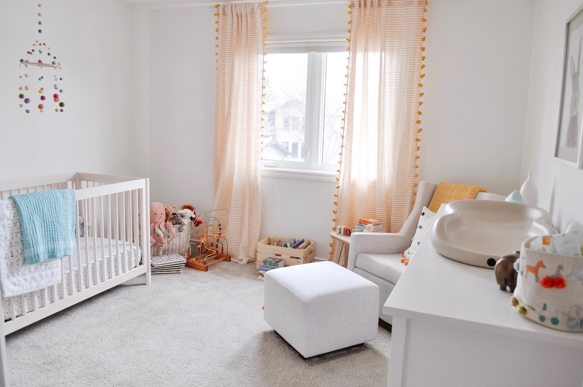
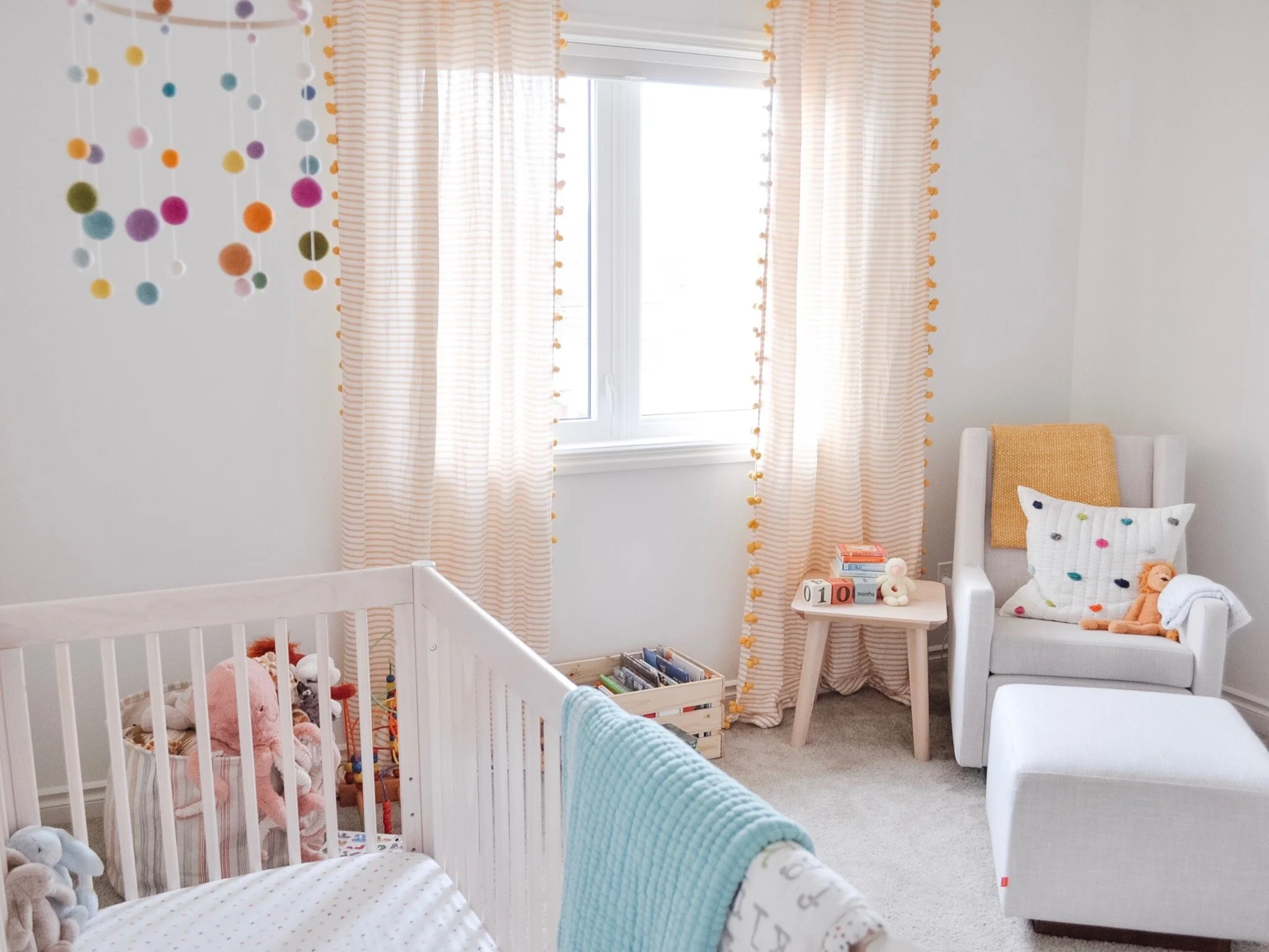
Neutral doesn't have to be boring. This nursery, located in Edmonton’s King Edward Park neighbourhood, proves that. The pops of colour and varying textures create a bright and cheerful space.
Originally their home office, the only work we did to prep was empty the space and paint it white. We chose Sherwin Williams Greek Villa - a warm white that is the perfect backdrop for all the pops of colour.
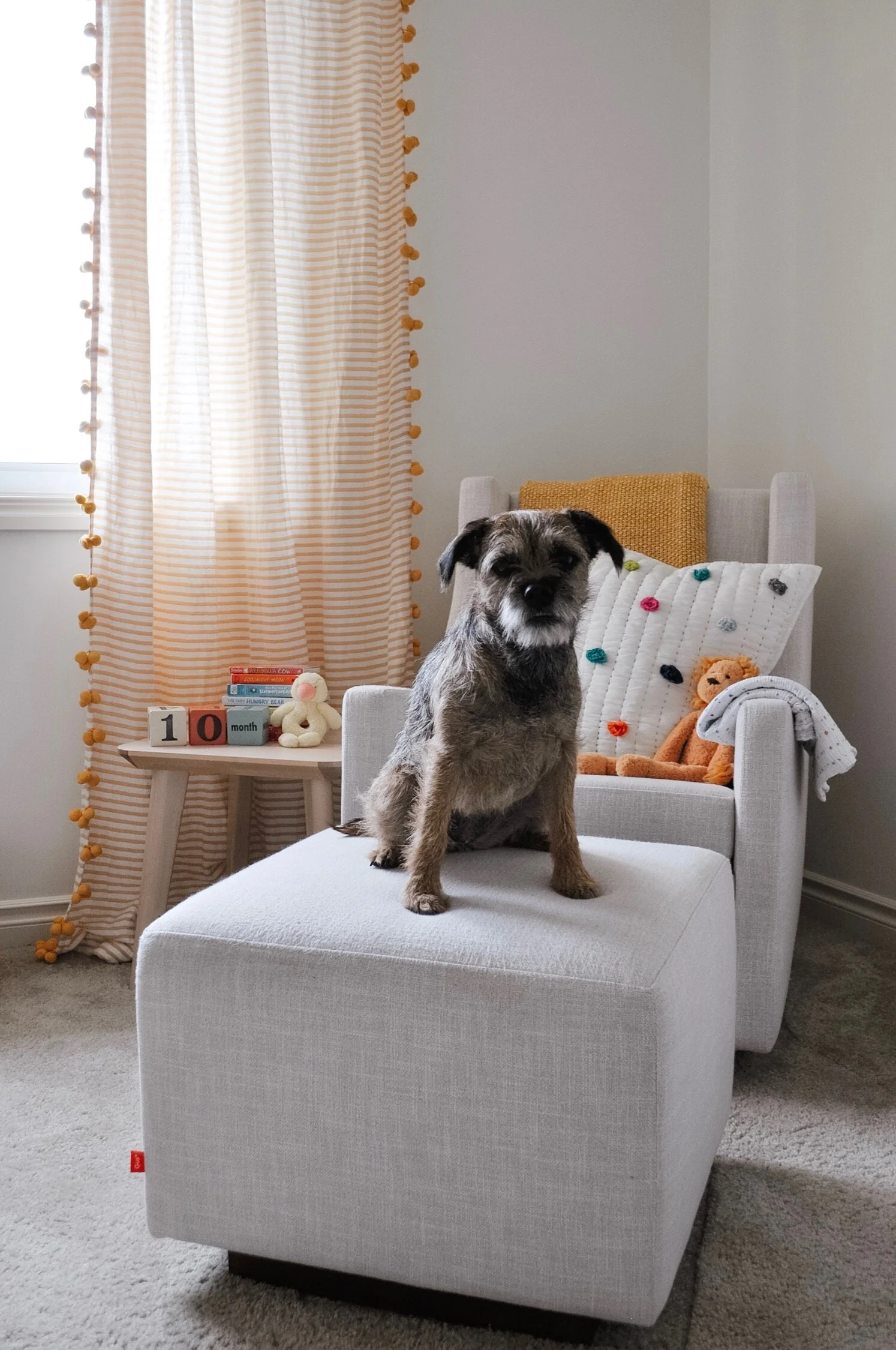
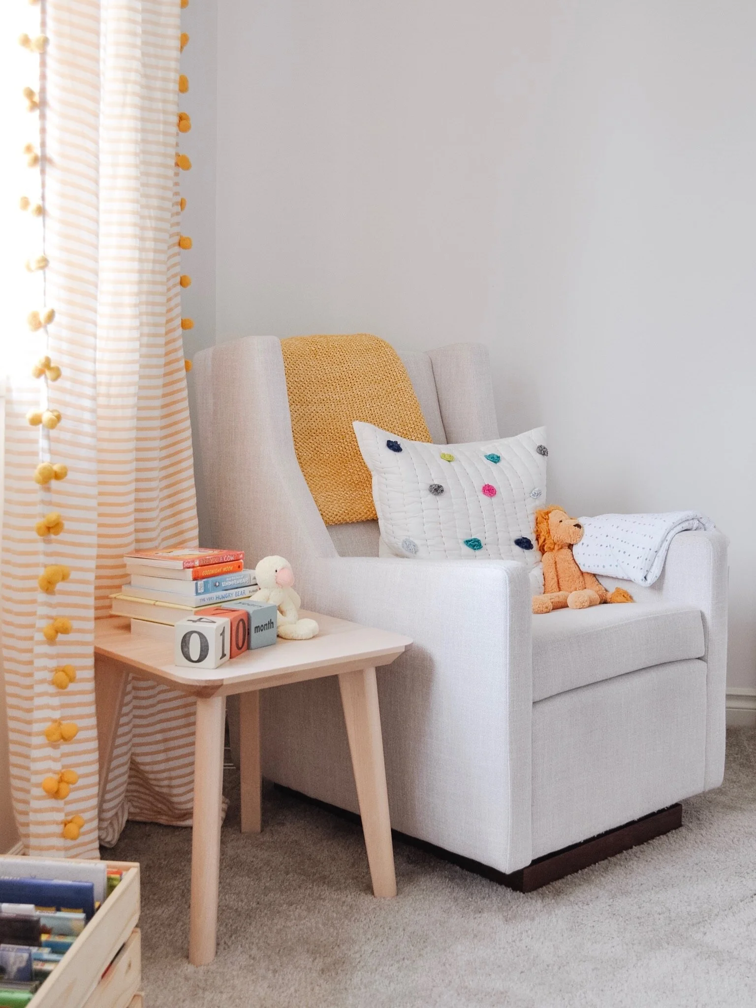
Choosing the right nursery chair is one of the biggest decisions and purchases for the space. We went with the Gus Modern Sparrow Glider with matching Ottoman in Cambie Parchment. It’s very comfortable! Even their pup agrees!
It can continue as a reading chair as your child grows and is equally at home in the family room or study.
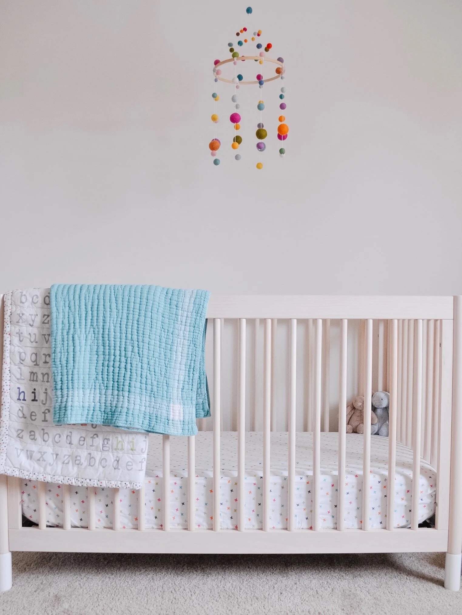
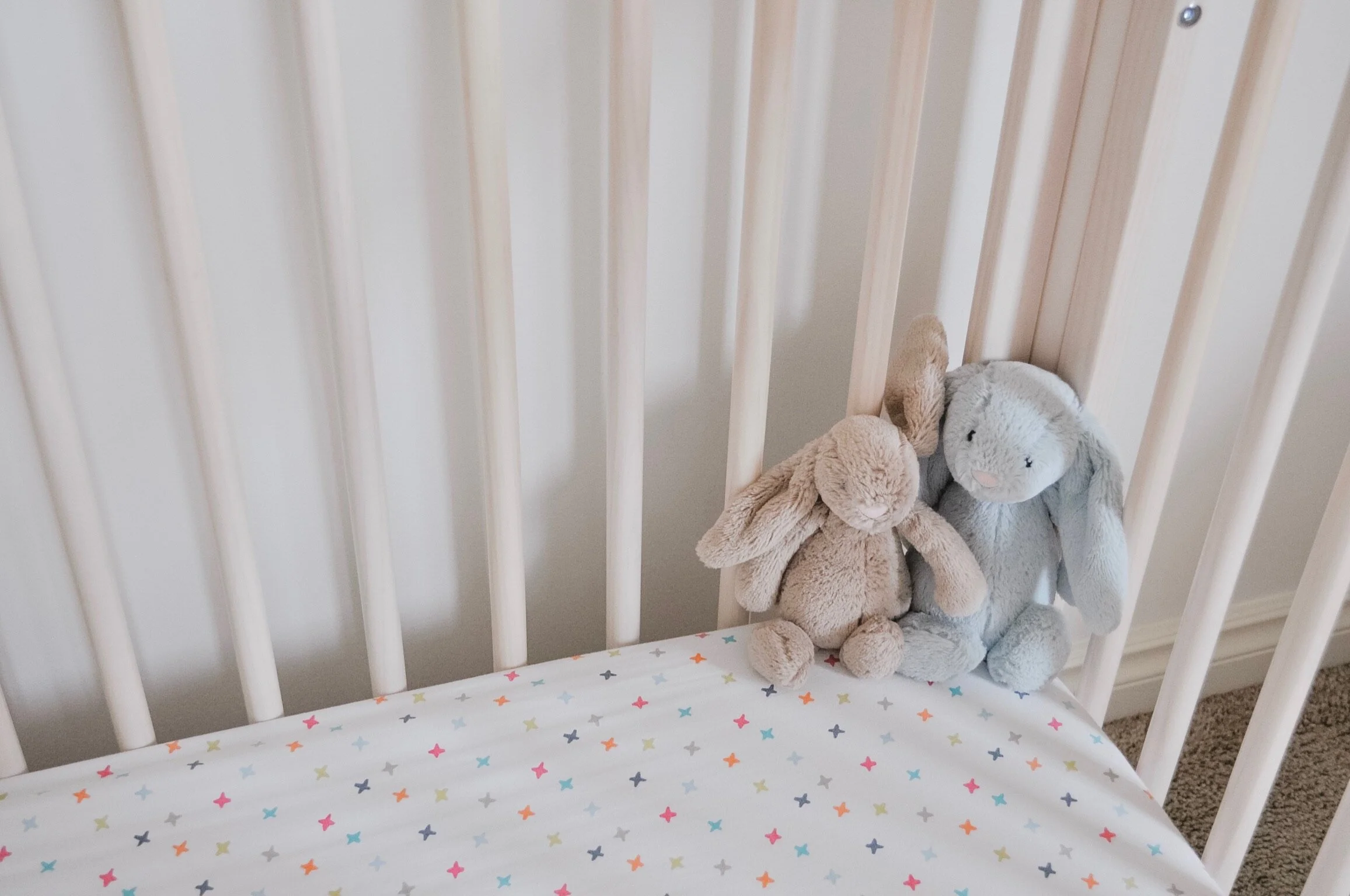
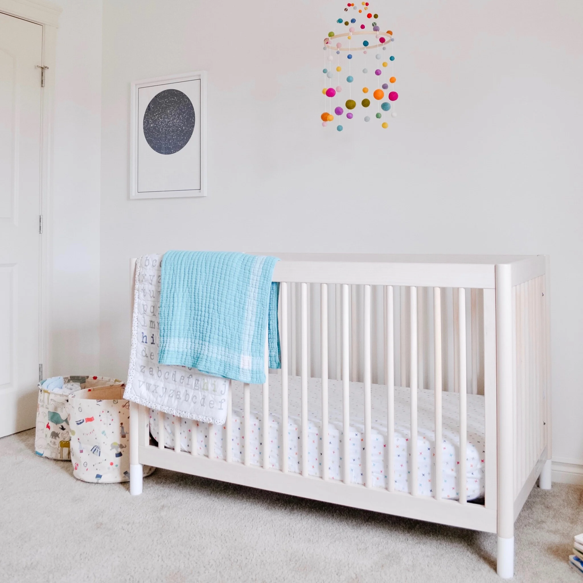
The Babyletto Gelato 4-in-1 crib chosen is a beautiful pine with white legs. Choosing a neutral crib that can convert as your child grows is another tip for expanding the lifespan of your nursery investments. The design and colour scheme will go with anything and everything. It doesn’t matter if your child ends up into:
green and brown dinosaurs
purple and pink unicorns
deep navy of outer space
pastel florals
bold contrasting colours of their favourite sports team
It all works.
Pehr’s felt ball mobiles were the inspiration for this one. The mom-to-be loved the look but wanted to make her own version. It looks amazing and she gets the extra bonus of knowing that she made it herself!
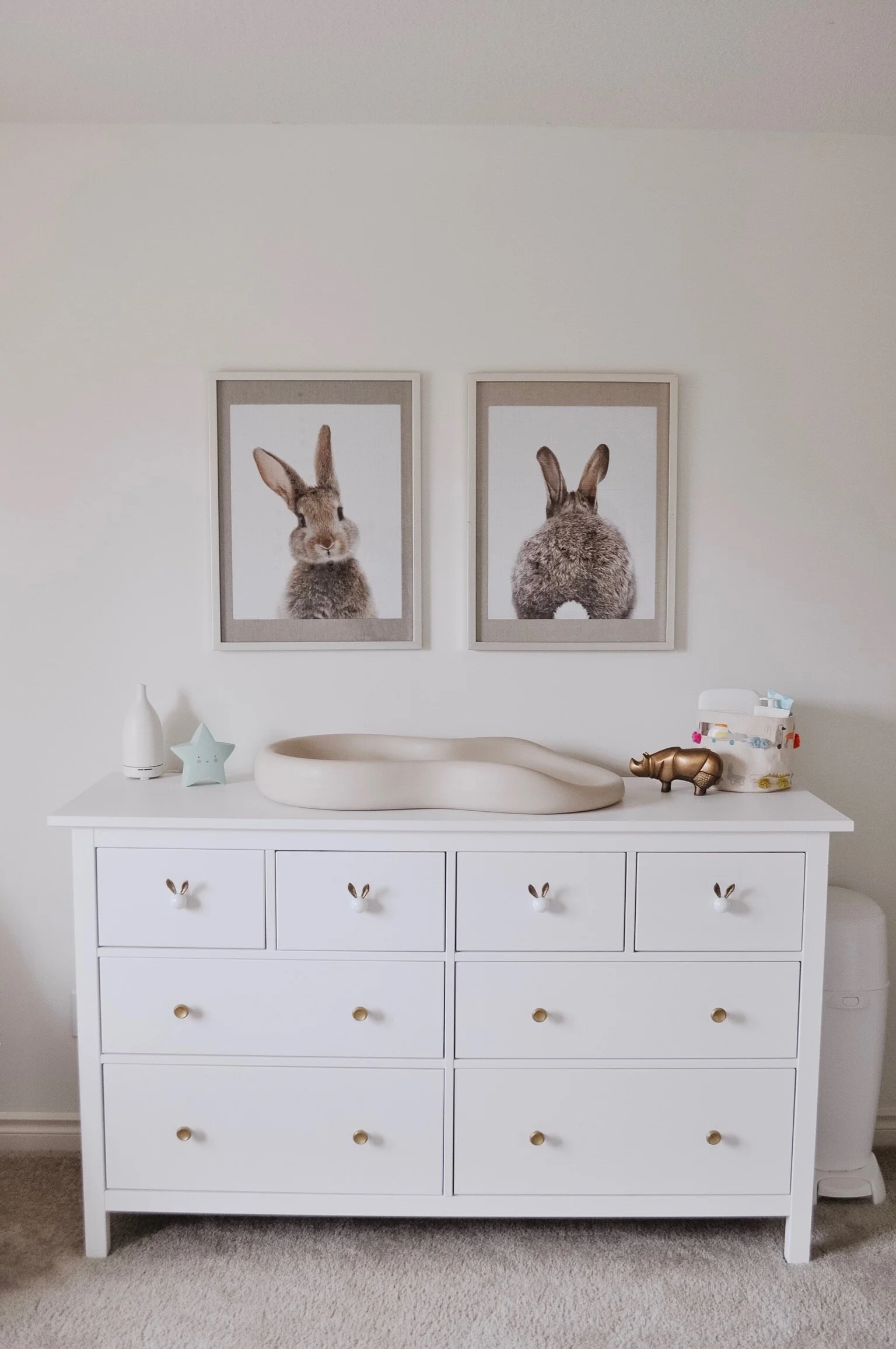
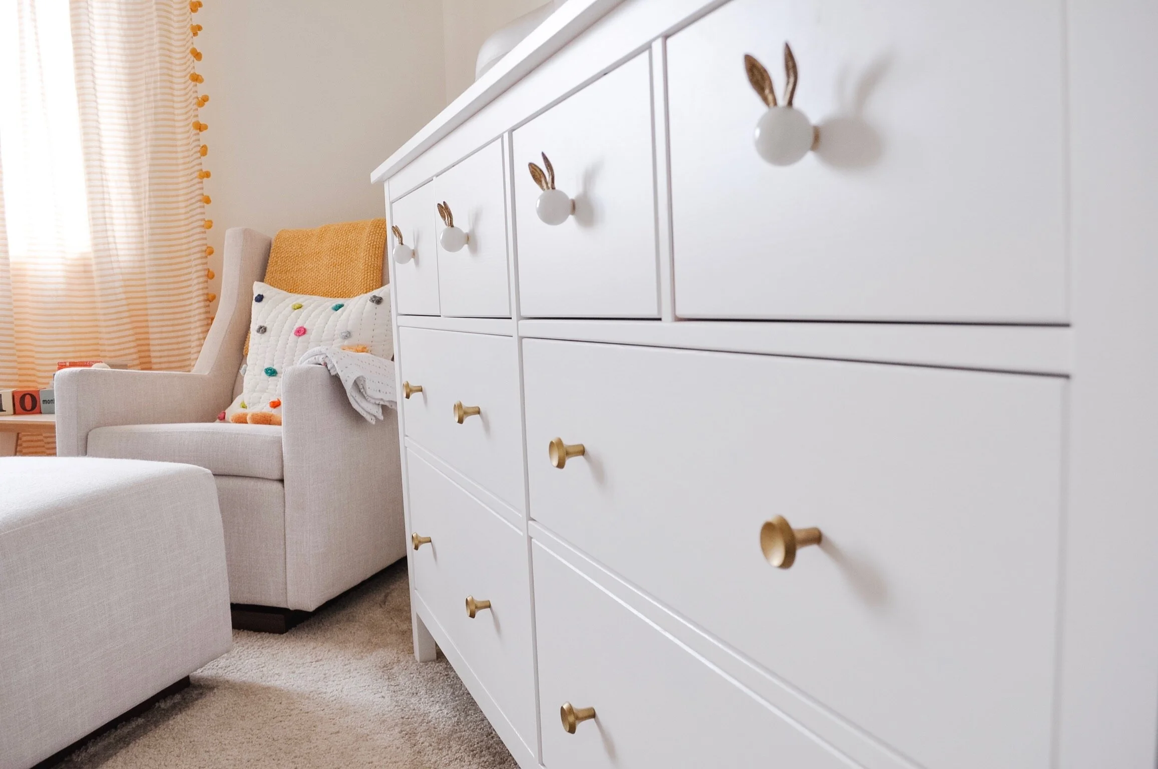
Using a dresser as a changing tables is another recommendation. Make sure it’s the right height for changing activities and when changing isn’t required anymore, it continues being a great dresser with lots of storage. Again, another piece that can easily transition as children get older. And who can resist that bunny?
Customizing that IKEA Hemnes dresser with new knobs instantly transforms the classic piece. We chose to pair the bunny knobs with coordinating gold knobs - both from Anthropologie (at the time of this post they are no longer available).
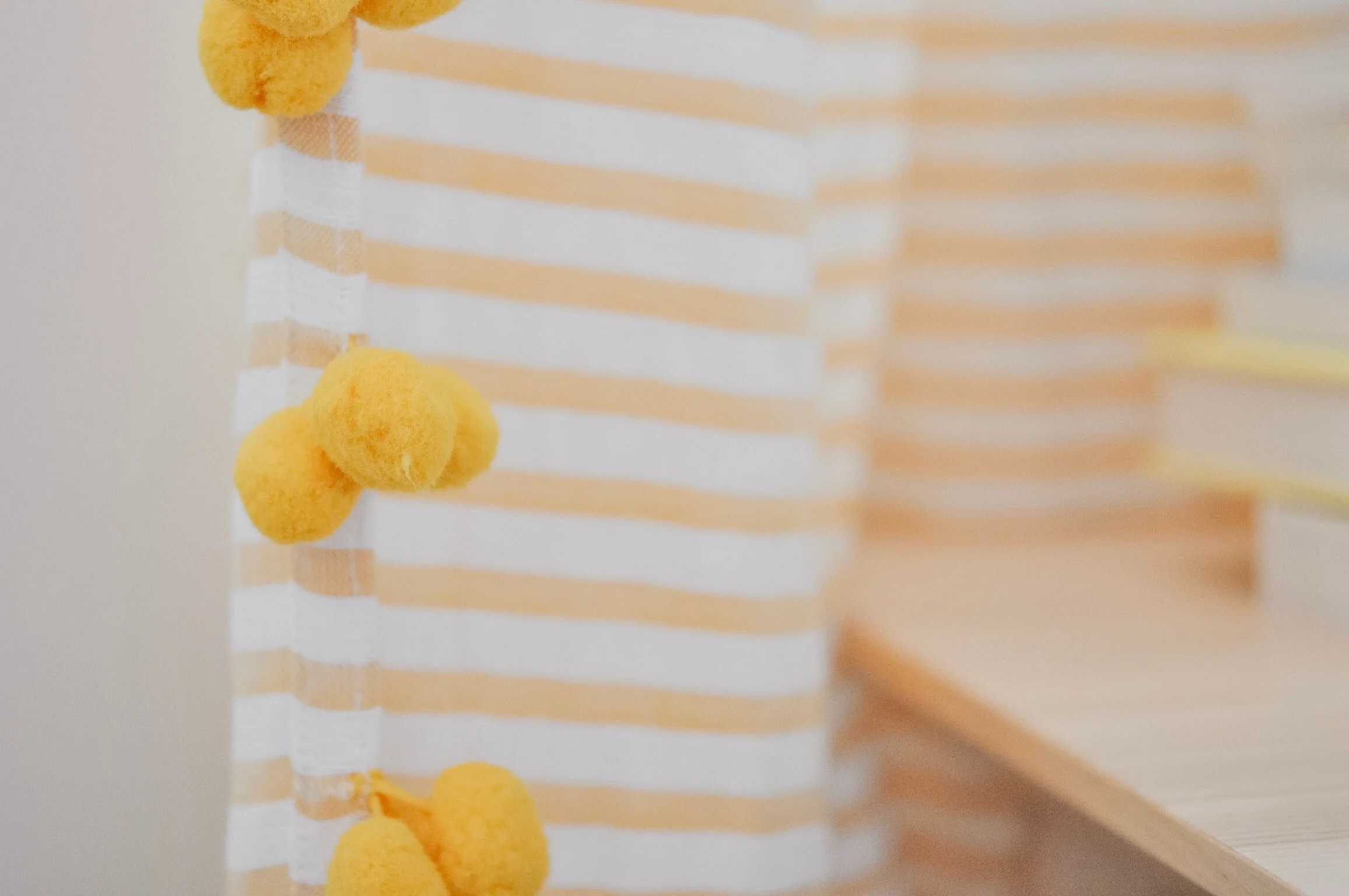
The largest hit of colour comes from the yellow-striped, pom-pom curtains. Bringing your colour in through the decor makes it easy to change in the future and it’s relatively inexpensive to do so. Beyond the colour, the pattern is also neutral, which means it plays well with other patterns. There are room darkening Hunter Douglas Duette Honeycomb shades on the window too - which is important for keeping a regular sleep schedule during the longer summer days. They are also cordless for added child safety.
The side table was going to be a light wood stump style, but to save a bit of money (and to have something more versatile) this IKEA Lisabo table does the job. It’s more functional as well with a larger (and level) top.
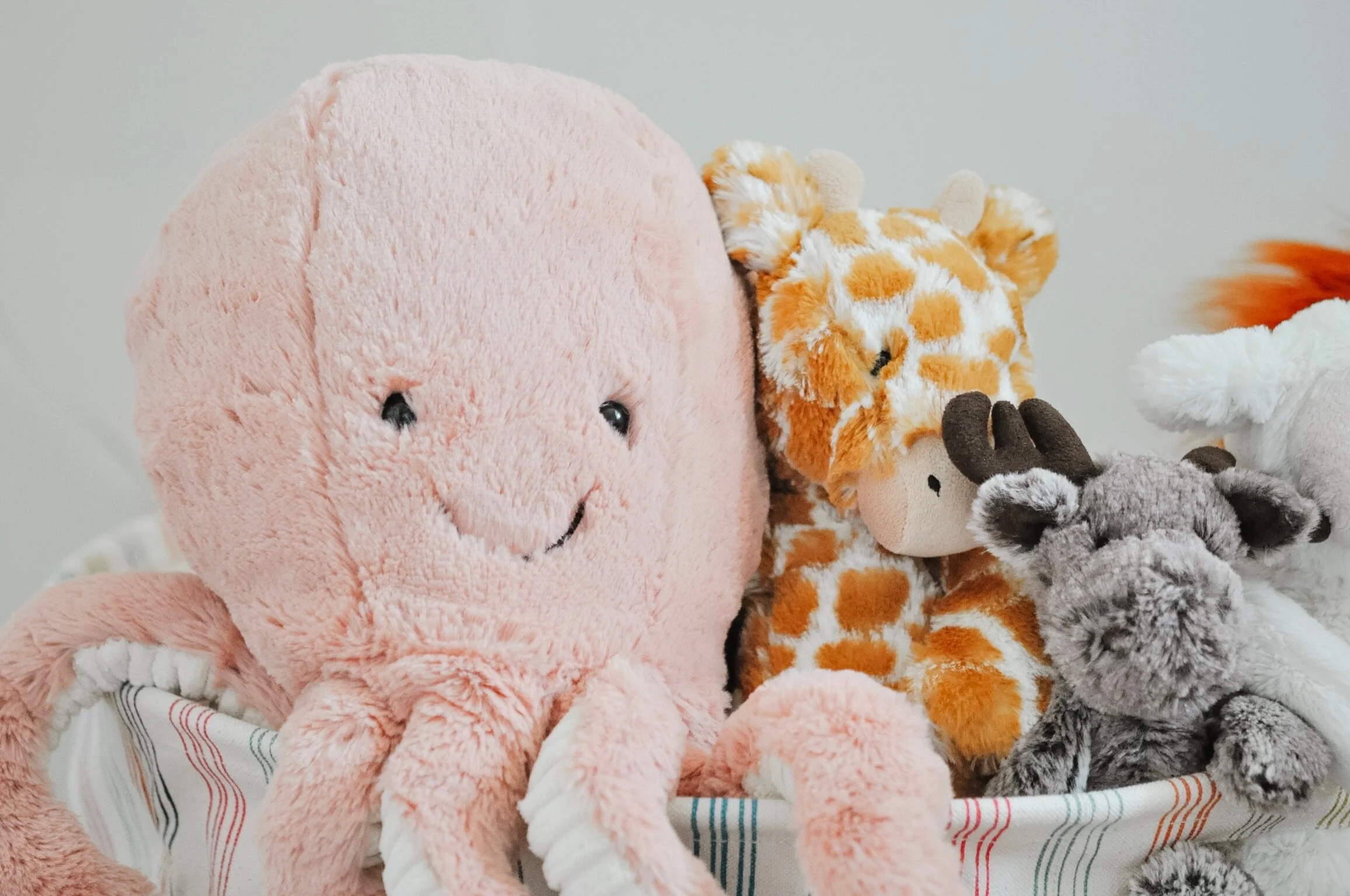
The octopus is my favourite of all the jelly cats. Granted, I’m biased since it was also a gift from me. All of the fabric bins, most of the linens and the pillow are from Pehr.
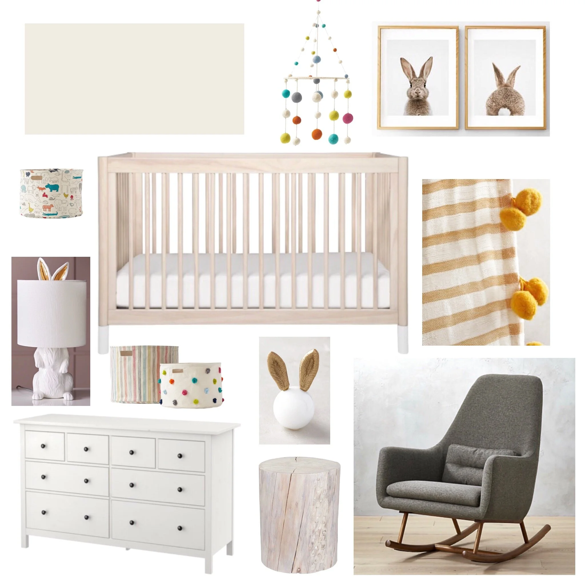
Here’s the vision board for the room:
And another shot of the final space.
Let me know what you think in the comments below. Is neutral the way to go?
Kierstin Smyth Design
Edmonton Interior Design Consultant

