Forest Heights Basement Suite
This basement suite is in a new infill duplex and we got really lucky in terms of timing. The City of Edmonton had only approved legal secondary suites to be built in duplex residences a few weeks prior to our development permit application! The homeowners originally brought me on to consult on their build in terms of layout and finishing. Once it was built and the builder handed over the keys, we got right to work designing the basement suite.
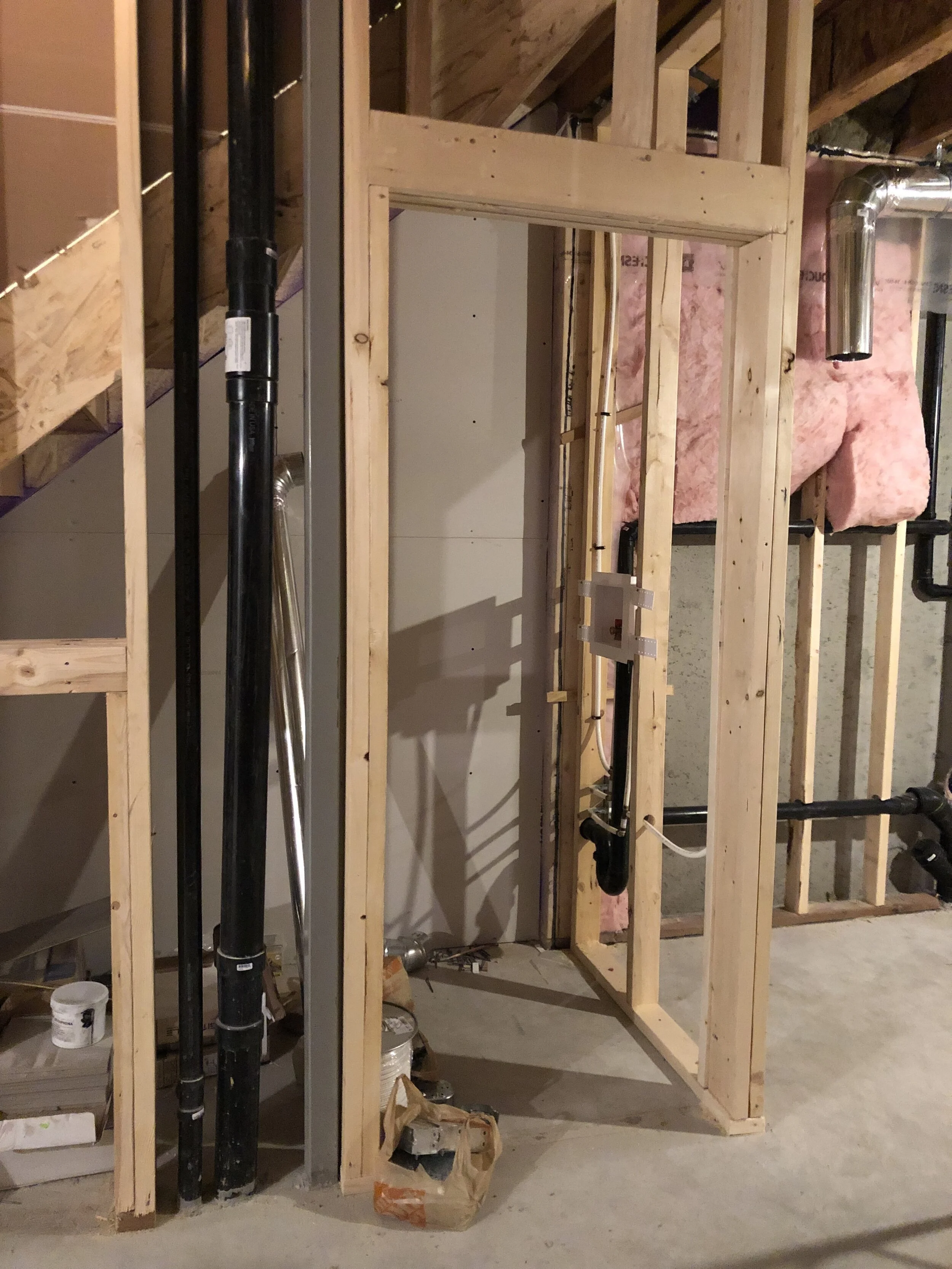
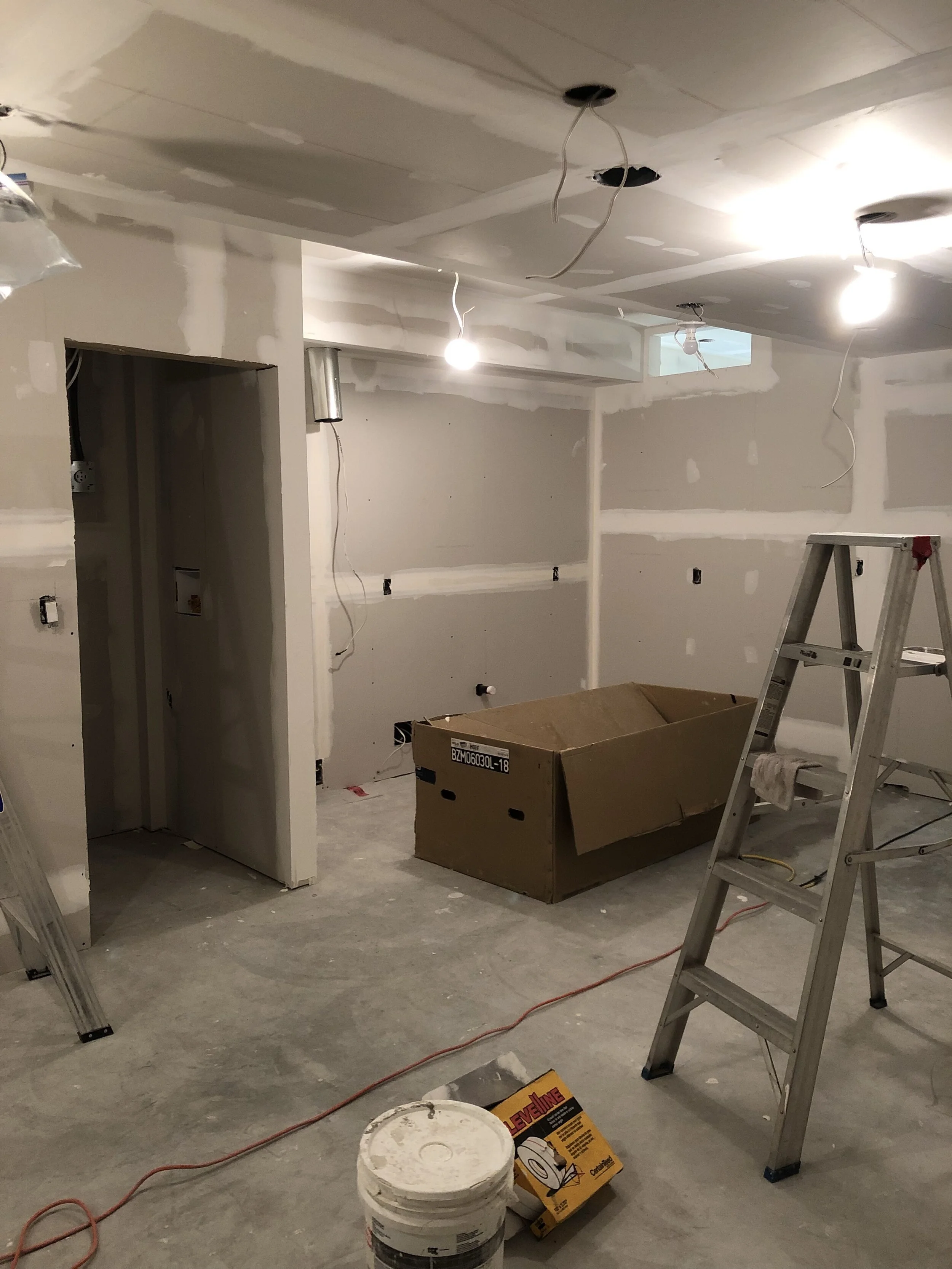
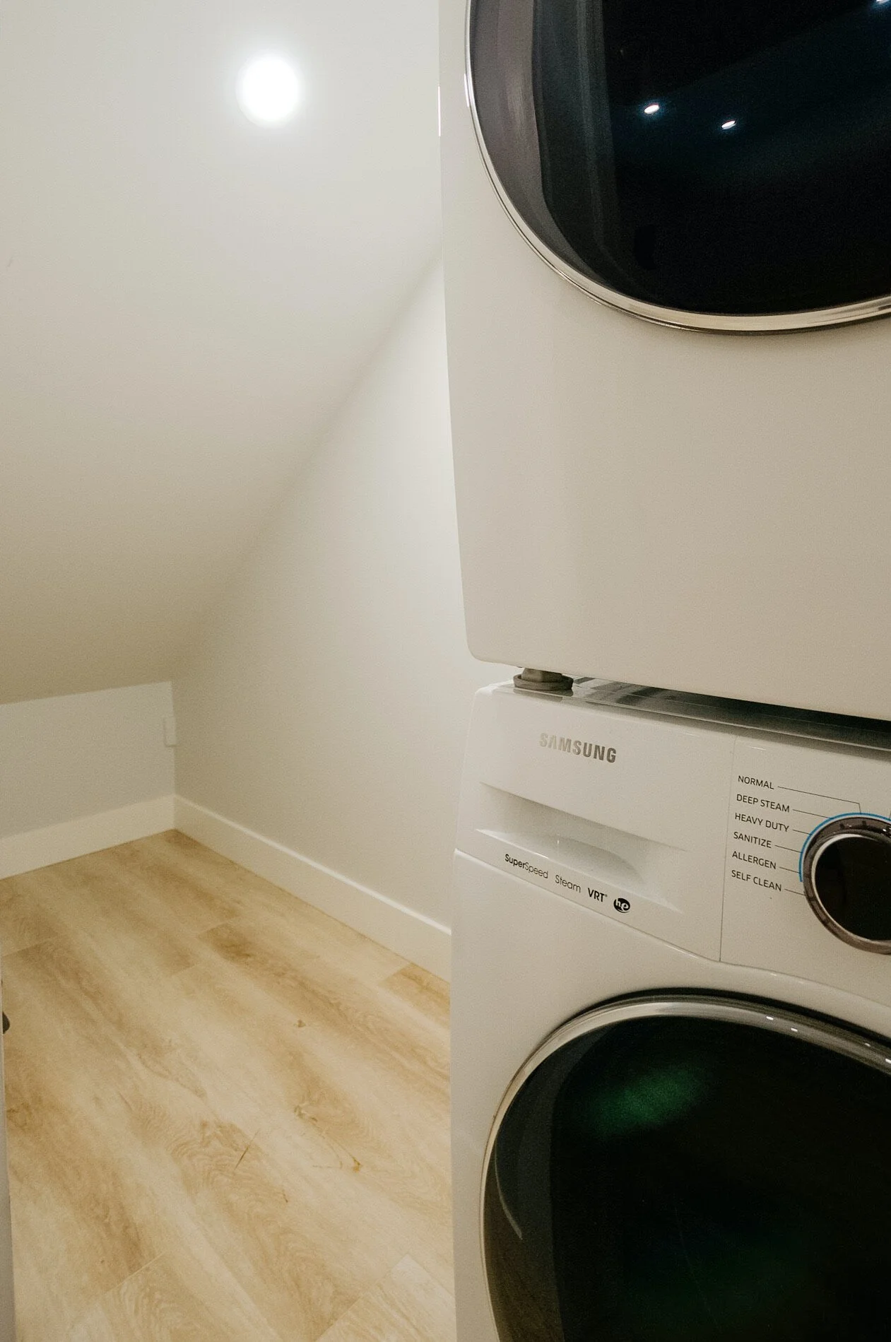
We ended up deviating somewhat from the original drawings and plans from the builder / architect. My philosophy when it comes to rental suites is that the more value you can provide your tenants, the better tenants you’re going to attract. In that interest, one of the first changes we made was to move the laundry into the suite instead of leaving it in the “shared space” of the mechanical room. I believe another benefit of this arrangement is that most landlords who are in a shared space don’t want to allow access to their own home’s main systems. As such, we also moved the main electrical panel into the mechanical room (it was originally placed in what would be the basement bedroom). This meant the mechanical room could stay as a private space accessible only to the homeowners, and the tenants wouldn’t have to leave their suite as the laundry was now tucked away under the stairs.
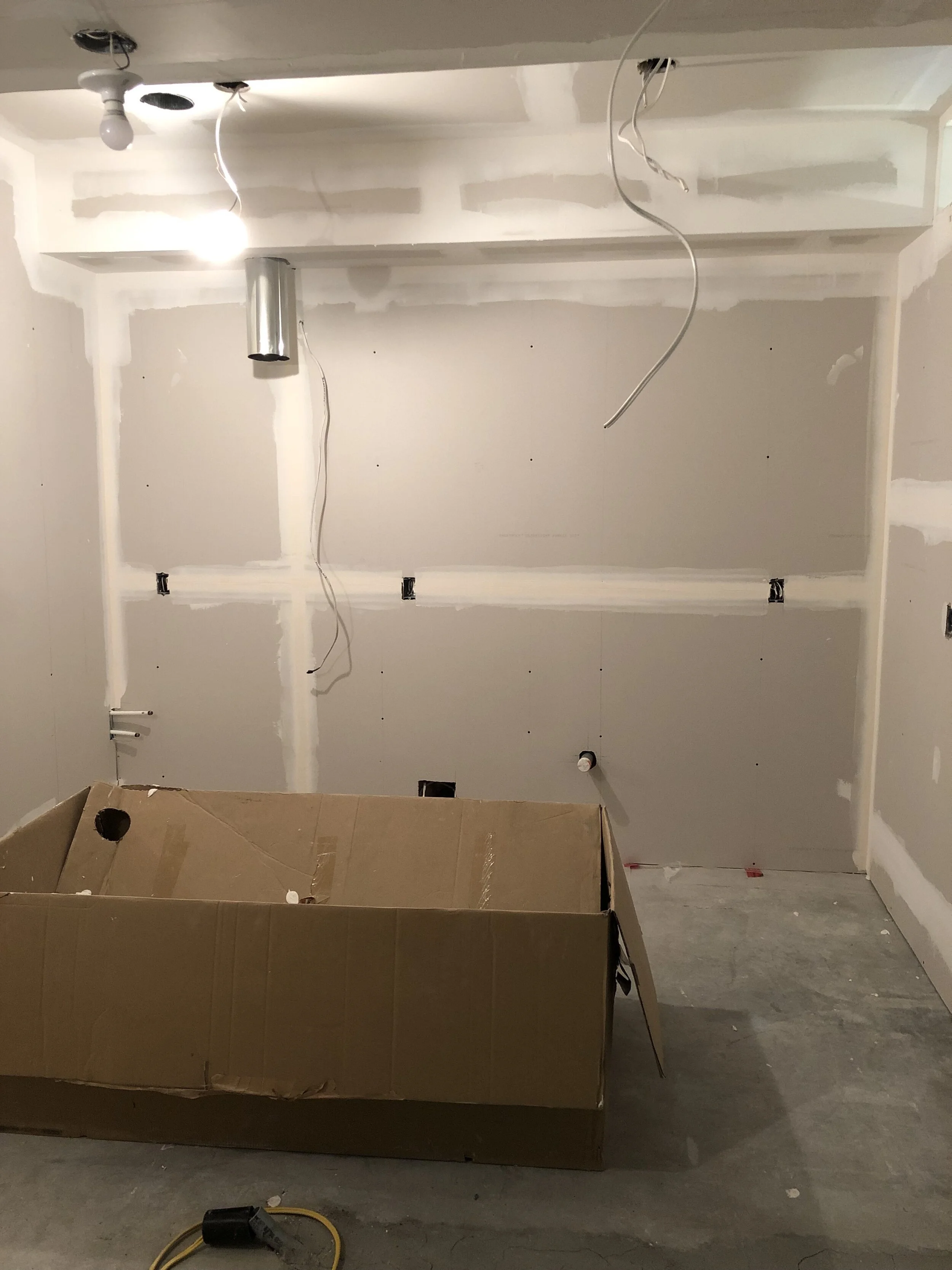
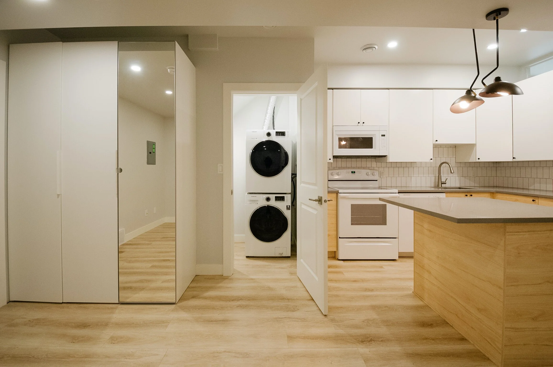
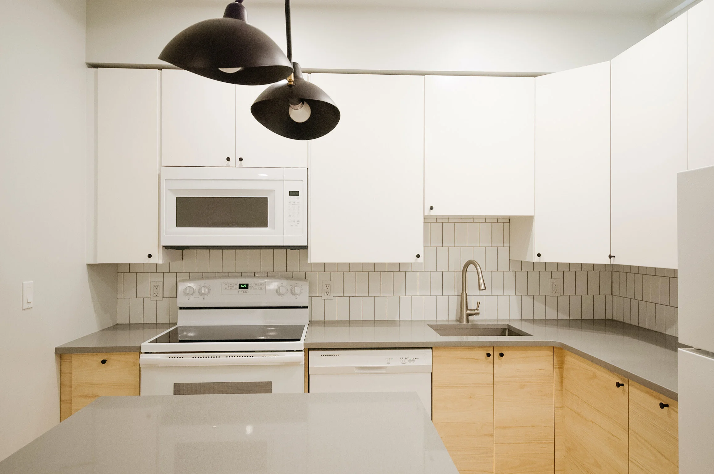
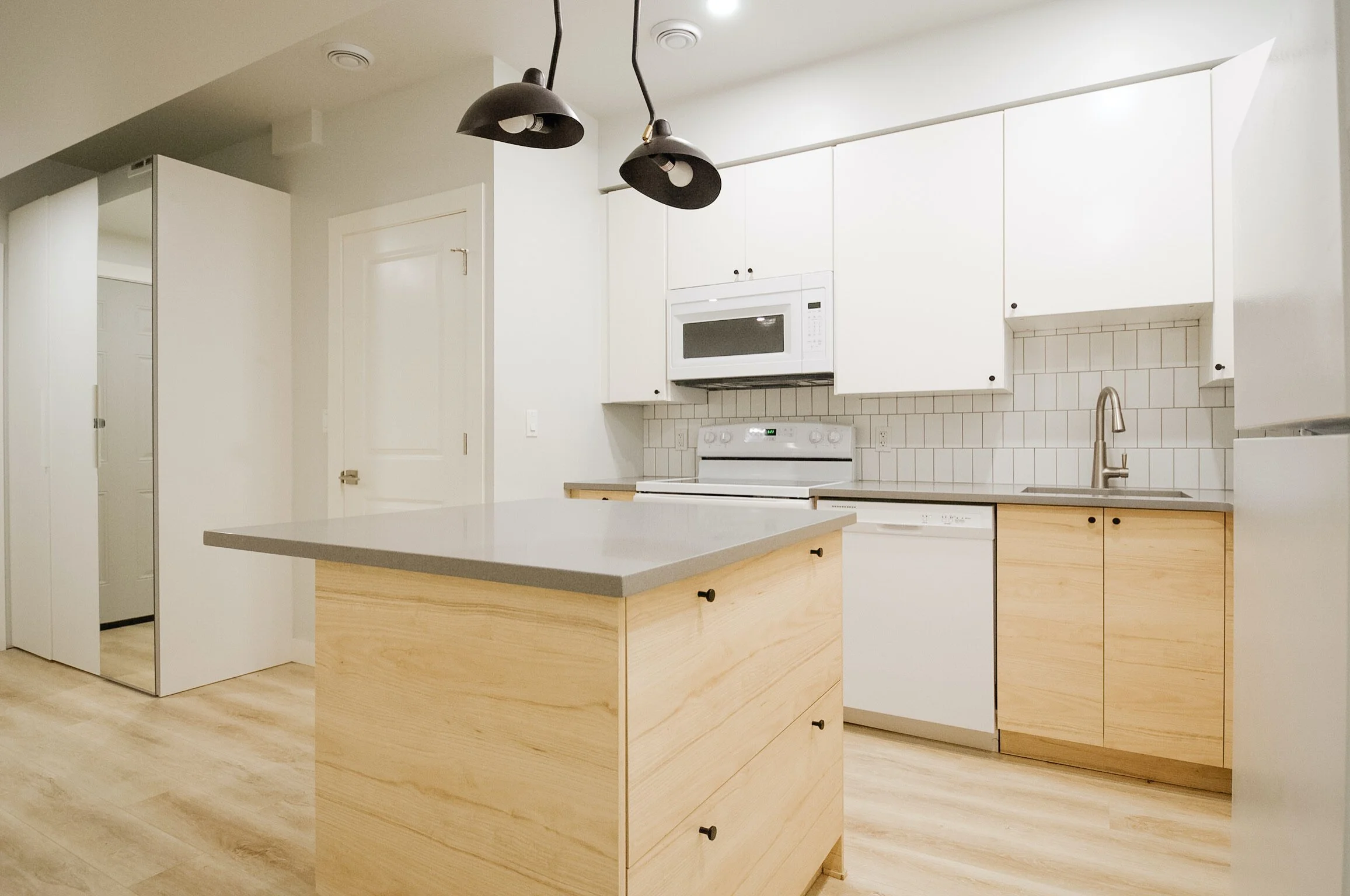
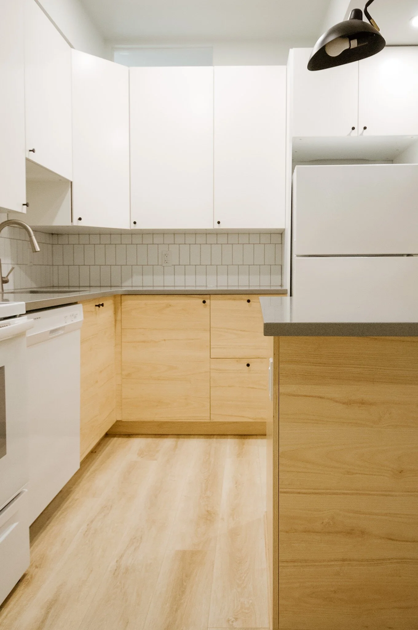
We also modified the kitchen layout slightly. We placed the range on the outside wall so that it could be directly vented out, as we didn’t want to have a bulkhead on the wall between the bedroom and the kitchen. The reason for this is that we wanted to add a small window above the cabinetry to let some natural light into the main areas of the space (the only other window is in the bedroom). We also added an island to the kitchen to allow more prep space, storage and the ability to have an eat-in space.
The build
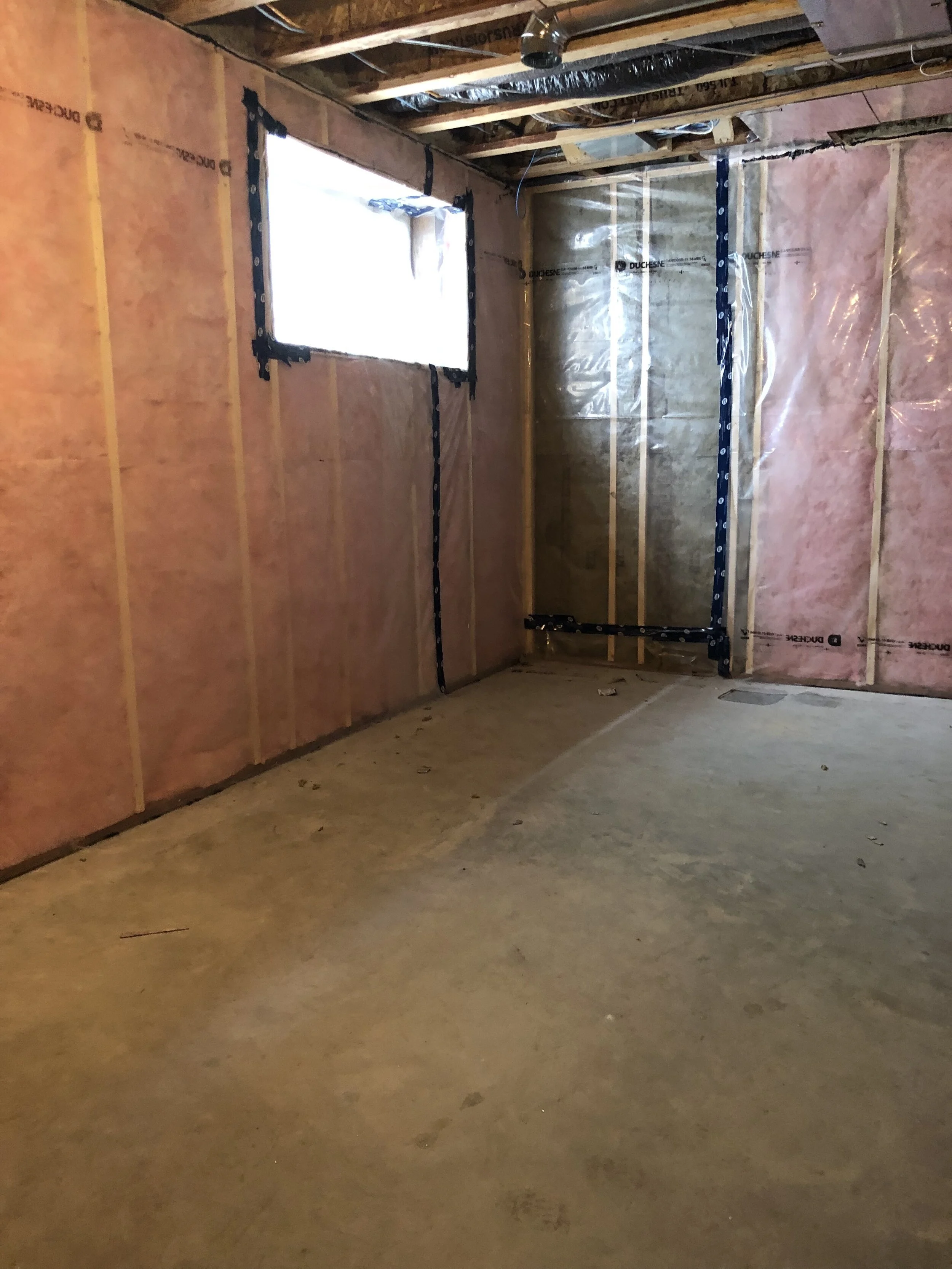
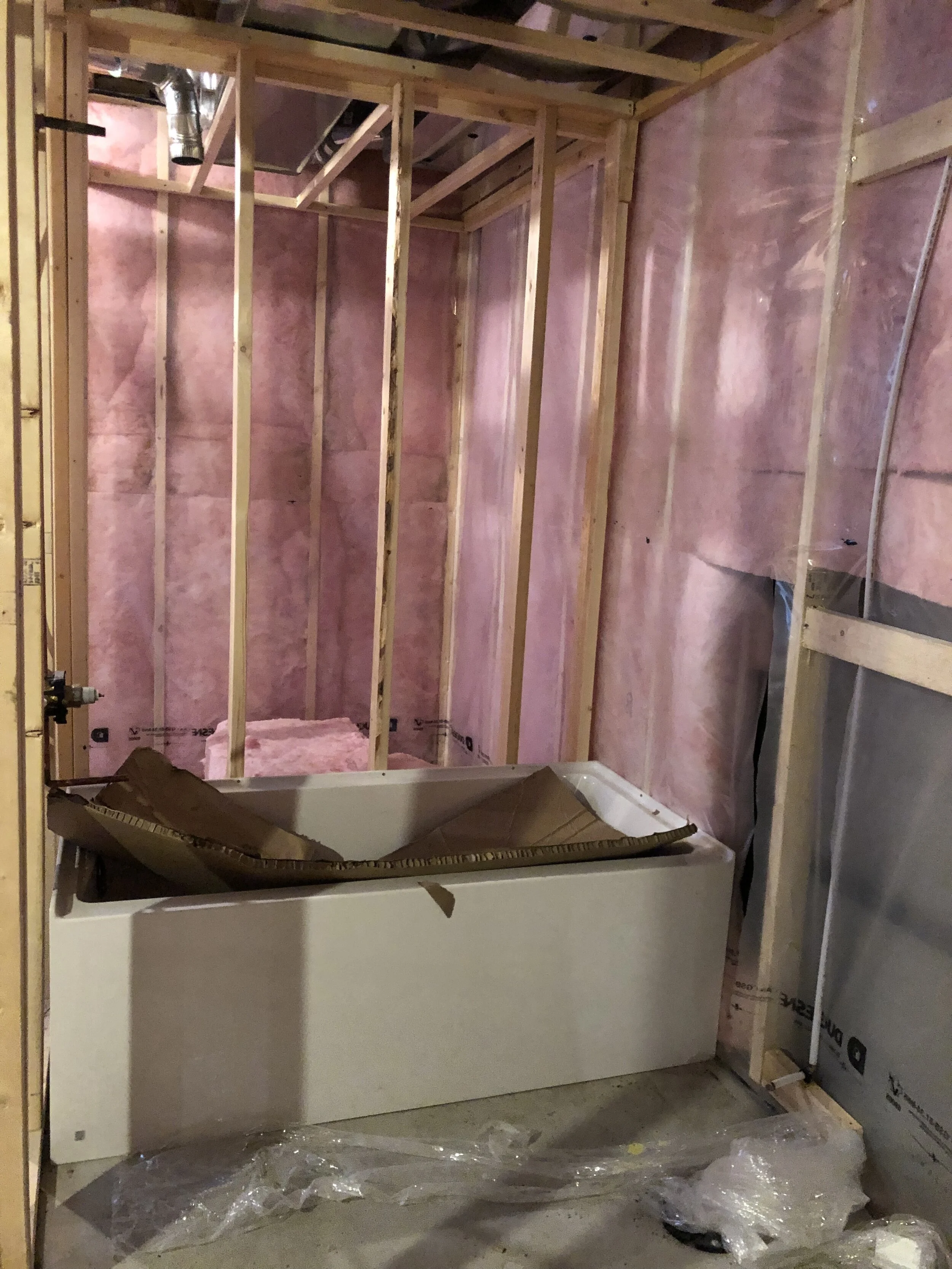
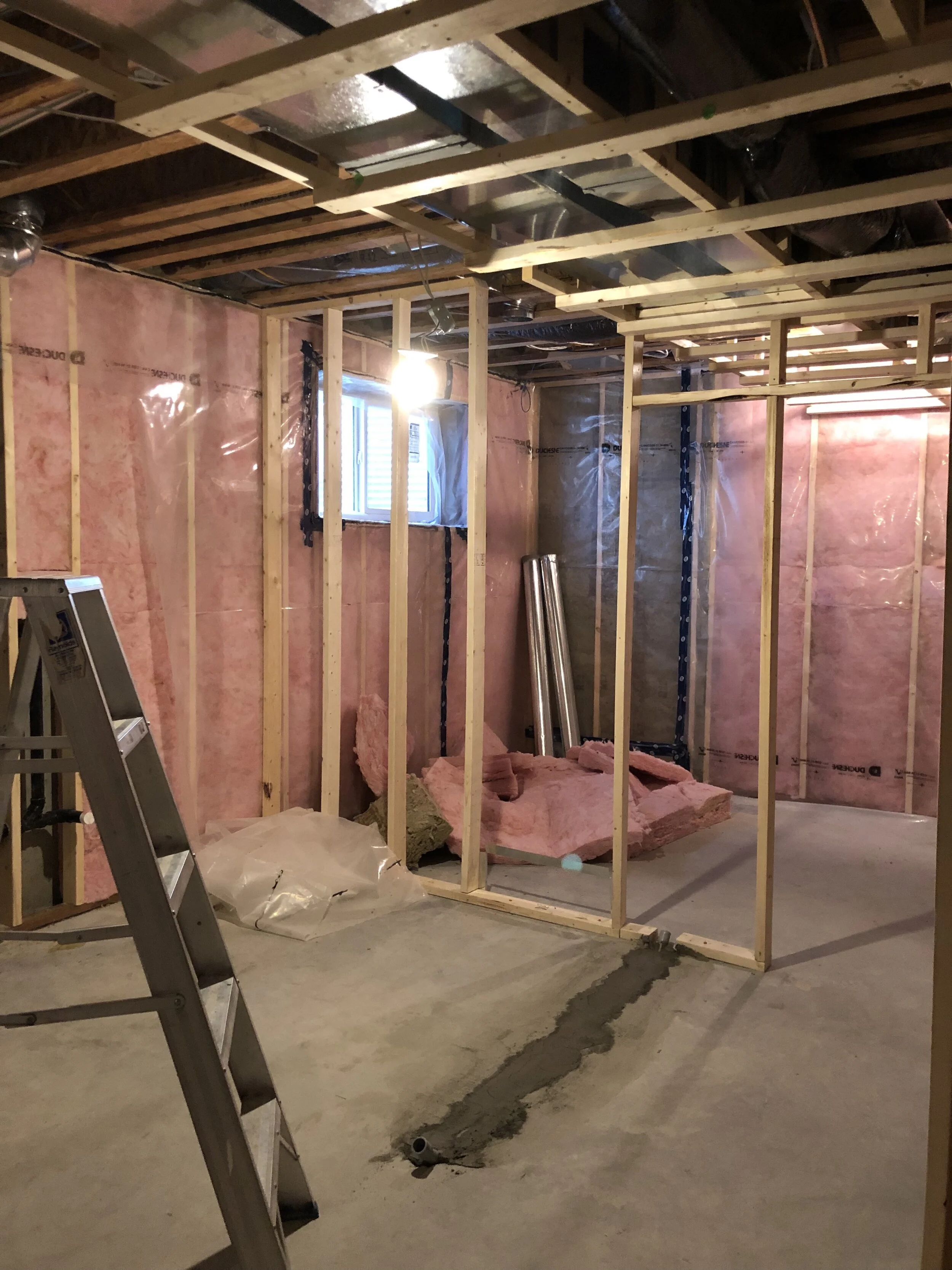
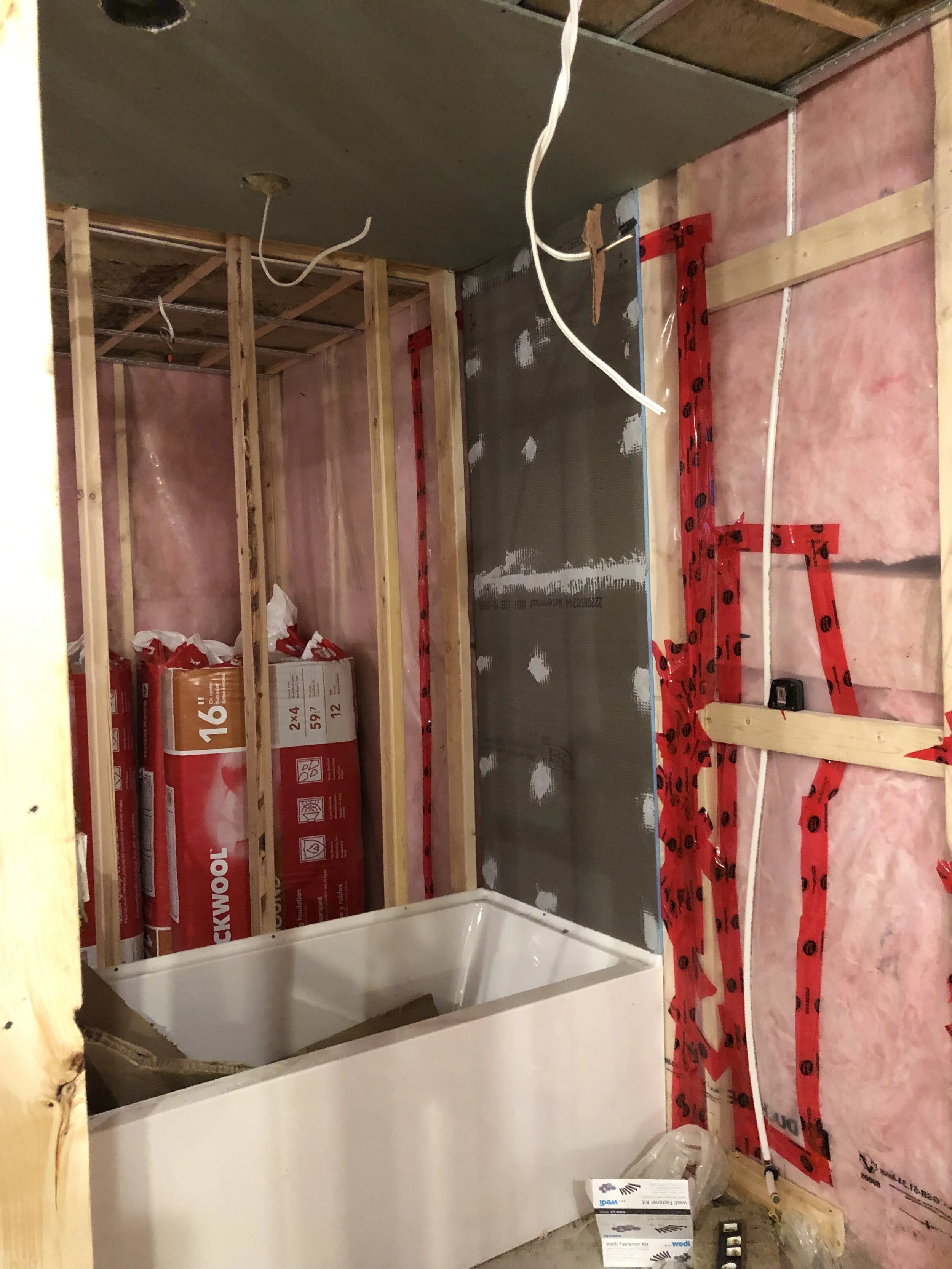
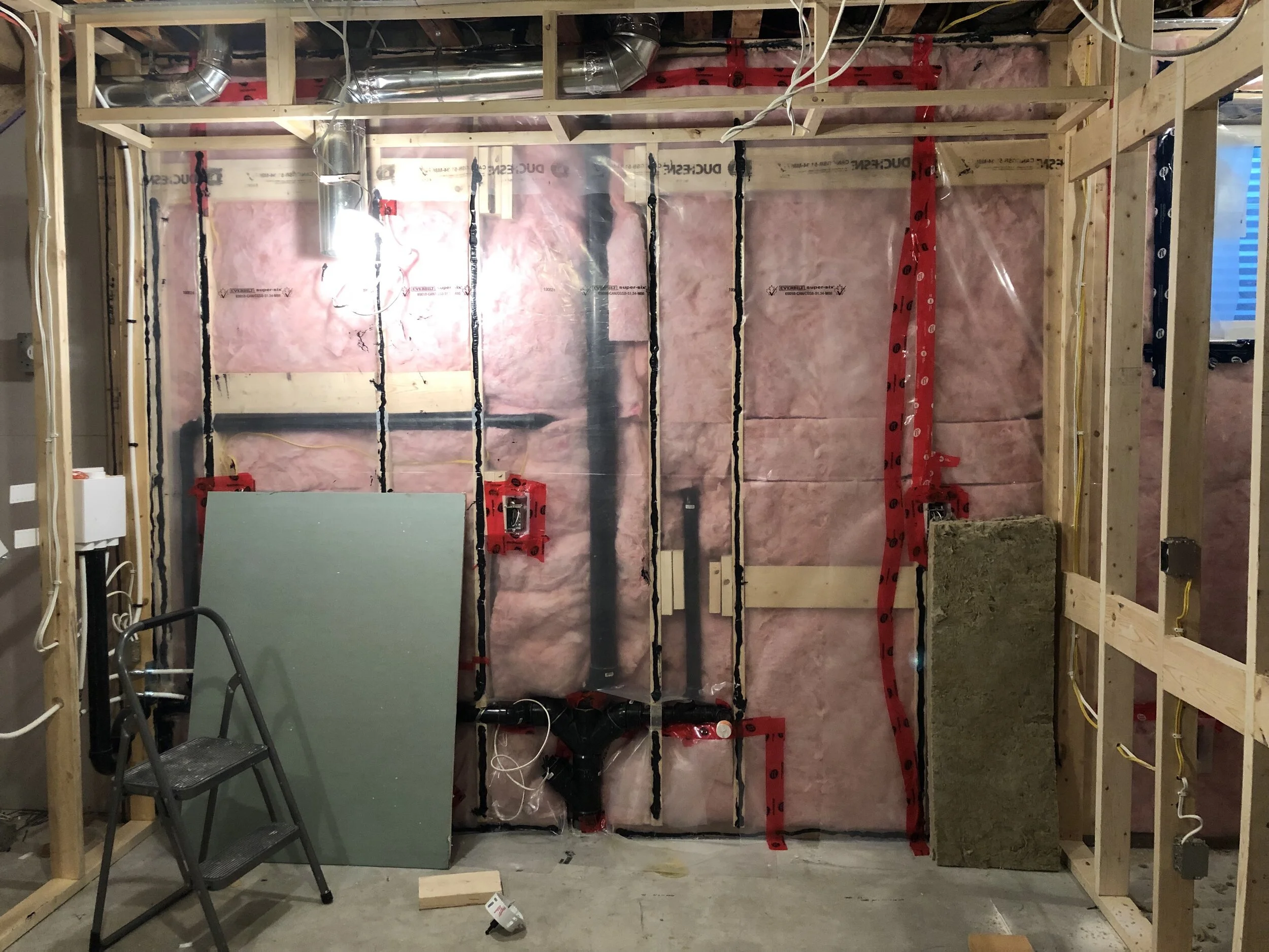
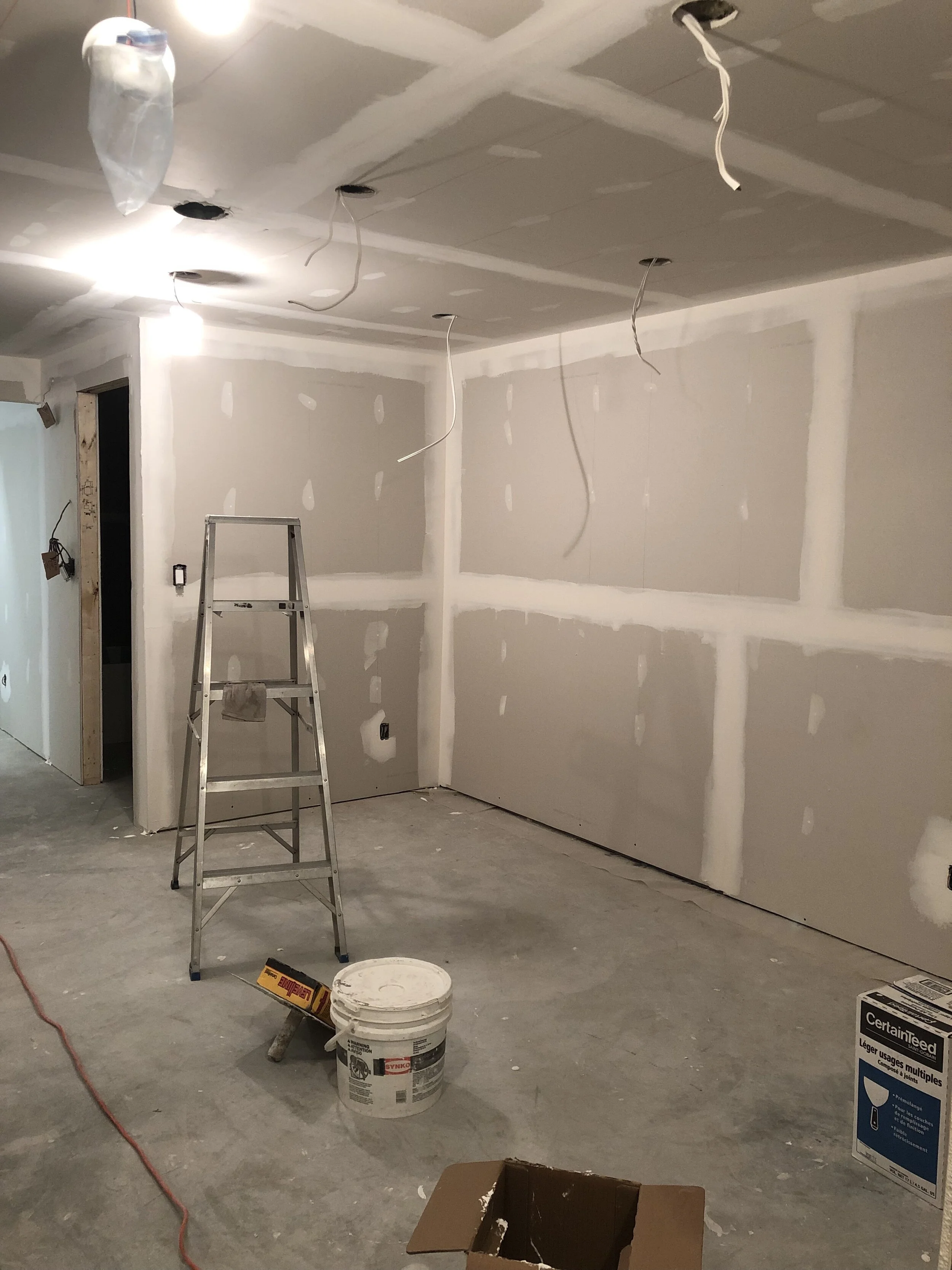
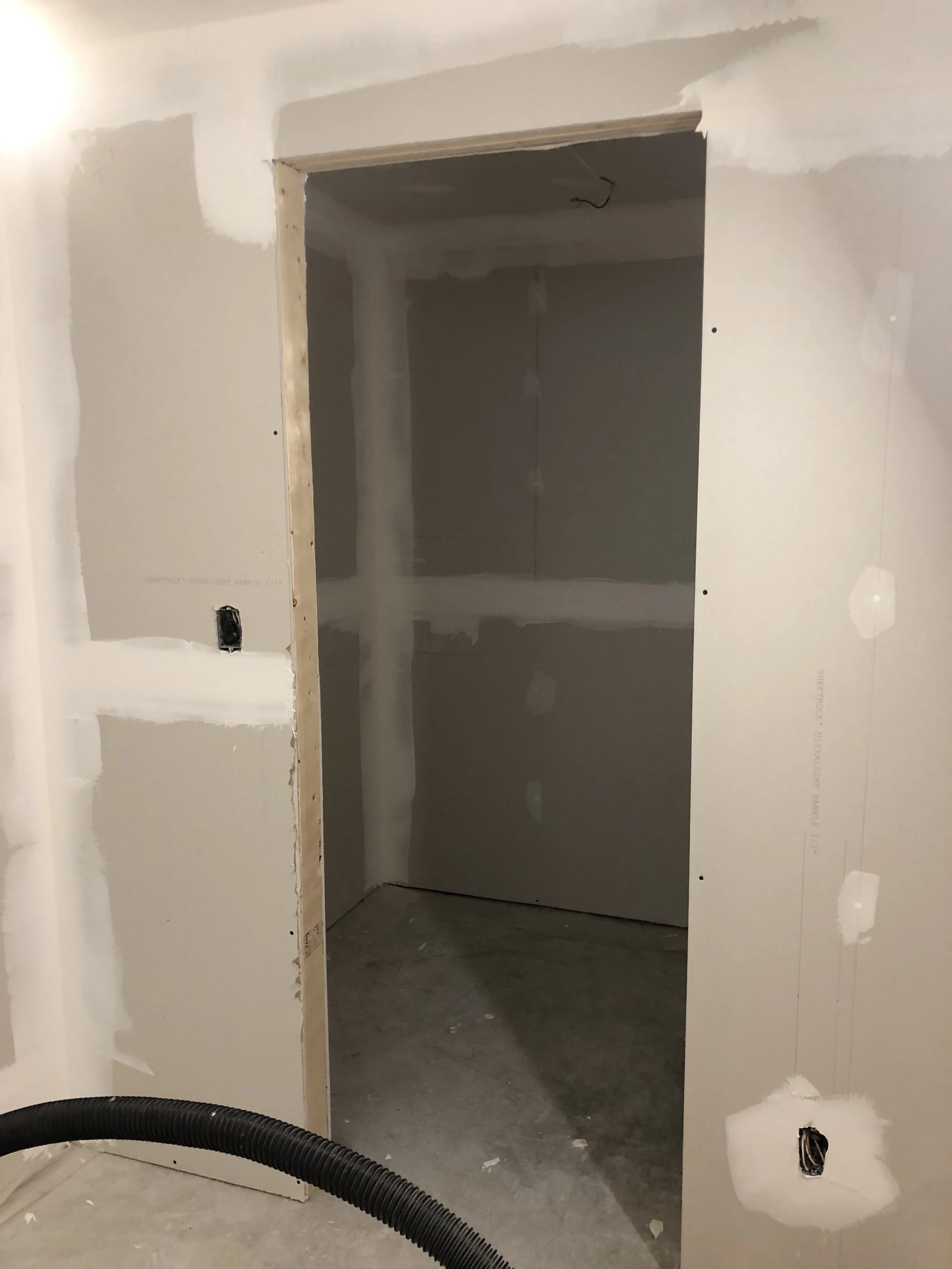
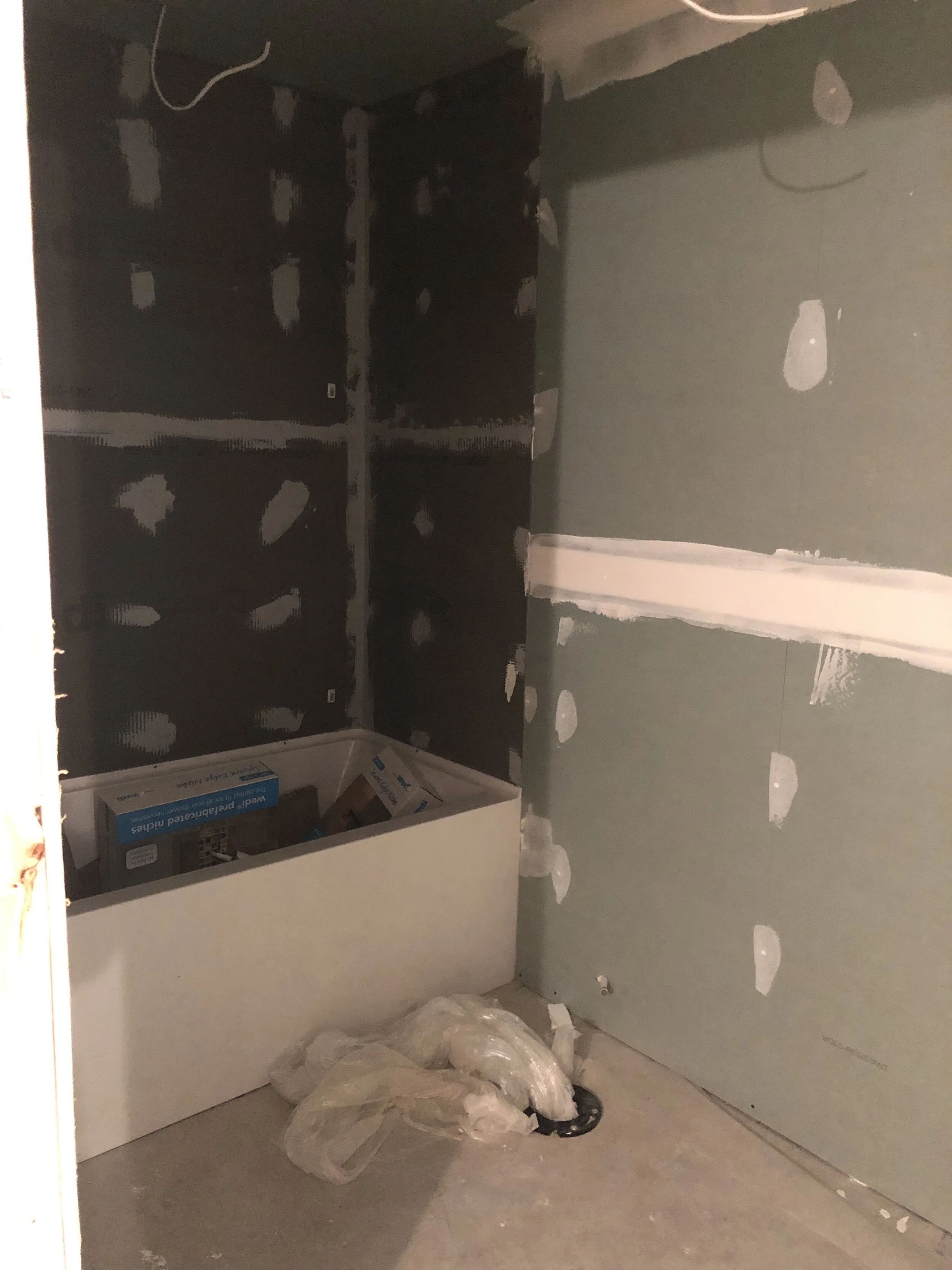
The homeowners did a lot of the work themselves and we hired out the other aspects to my preferred trades as needed. The majority of the original rough-ins were used, but moving the laundry area meant tying in the plumbing to the kitchen area, and adding an island meant a small trench needed to be dug into the concrete so electrical could be run.
The Design
The goal for any basement area, whether it’s a tenant suite or additional core living space, is to make it not feel like a basement. Because the only source of natural light came from the bedroom, it was important that the design maintained a bright and natural feel. The overall colour scheme was white, light oak, and grey, with pops of black and brushed nickel.
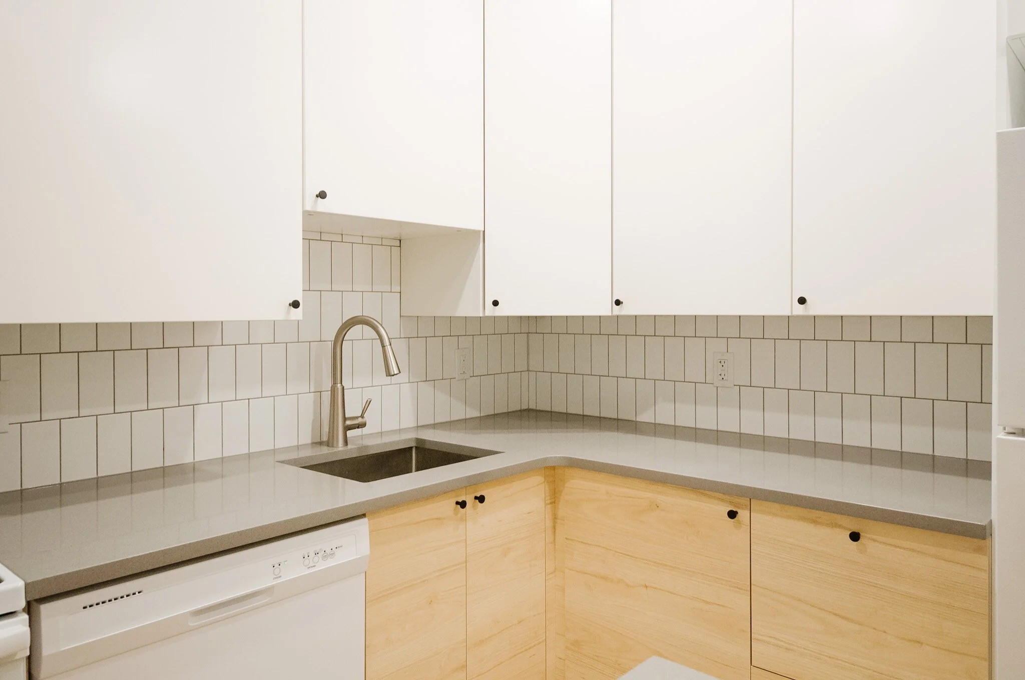
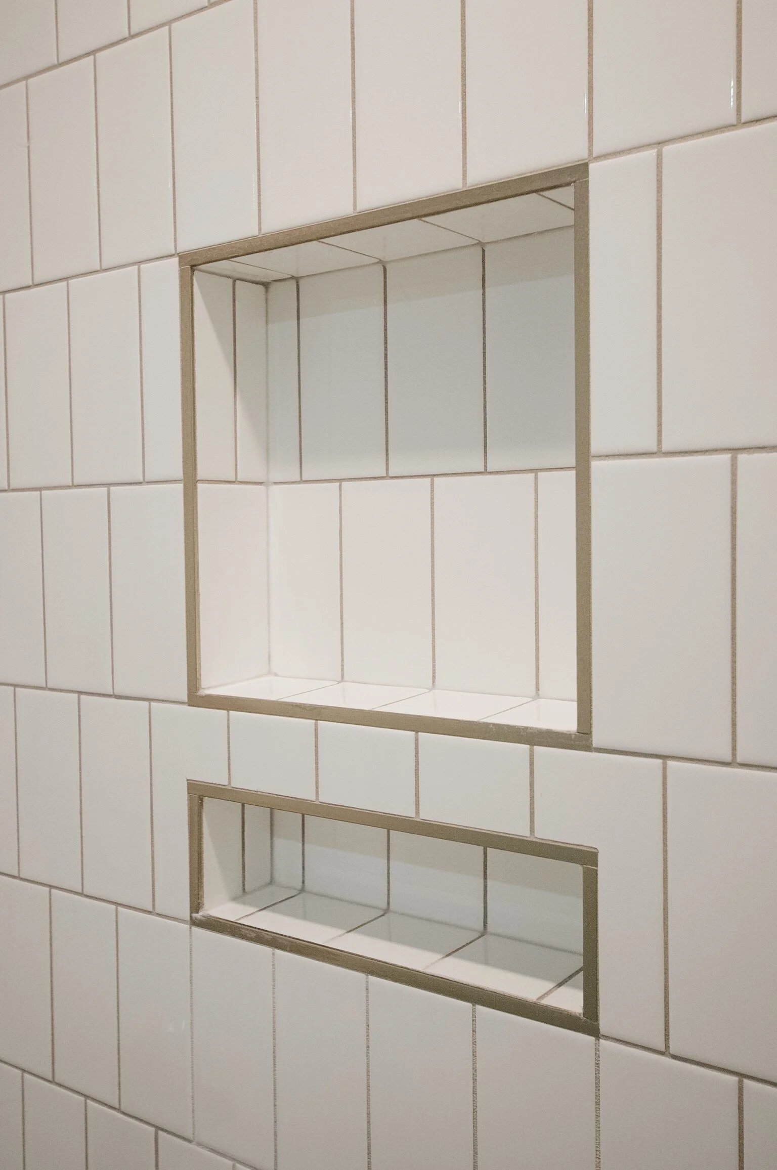
Since the space is an investment, we saved where possible and splurged on a few key items like quartz countertops, some statement lighting and the tiled shower surround (including a built-in niche). Utilizing an IKEA kitchen, wardrobes and bathroom vanity helped to save on the overall finishing costs while still providing excellent functionality and a beautiful design for future tenants.
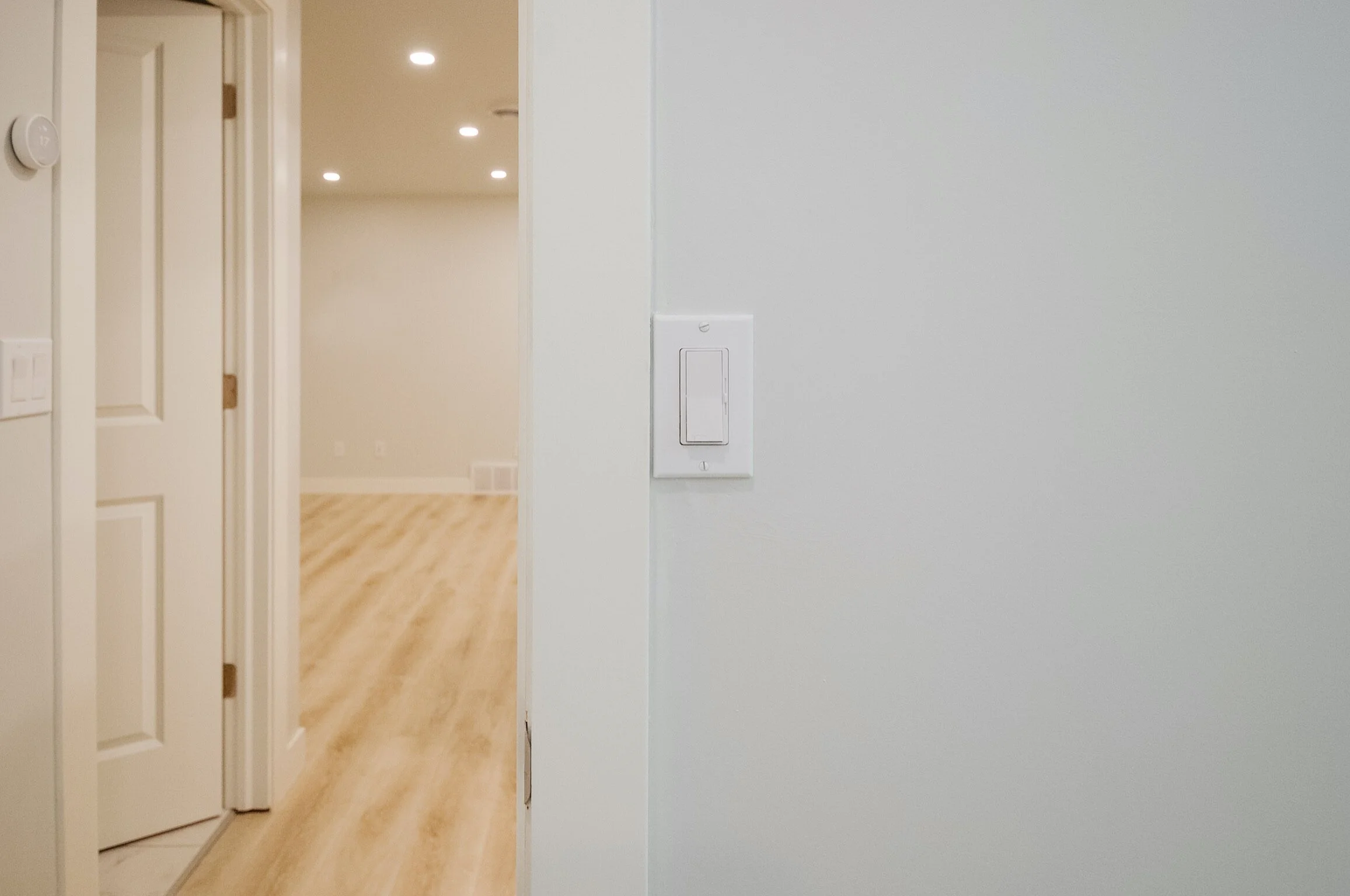
We installed recessed lighting throughout in order to keep the space nice and bright. As recessed lighting can be a bit harsh when you aren’t using it as task lighting, we also installed dimmers in the living room and bedroom for added lighting control. It’s really about those small touches that make a rental space desirable so that the occupancy rate is high and the tenants love the space as though it were their own.
The finished basement suite
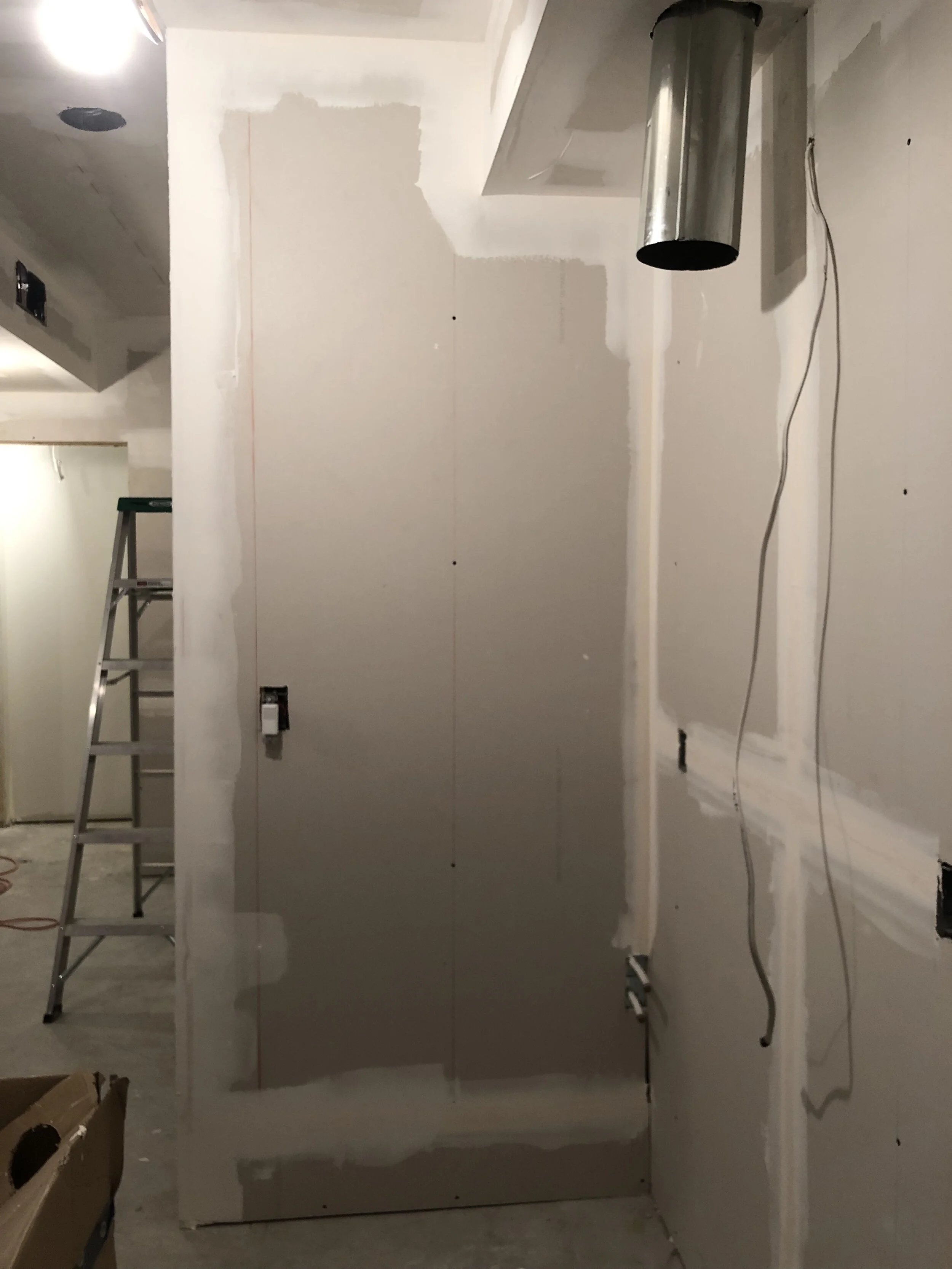
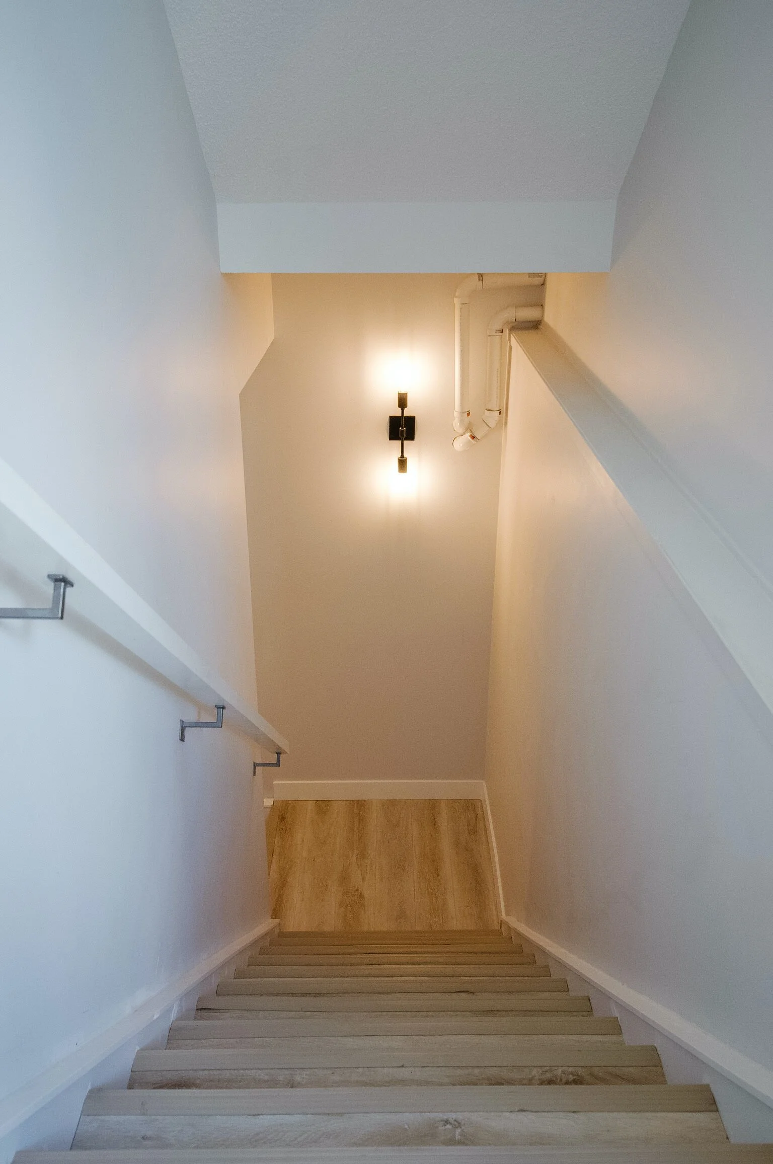
The suite is accessed through a separate entrance at the side of the house. While I don’t love that the builder left the pipes exposed, we decided it wasn’t worth it to frame them in. We did have to frame in another section where ducting was left exposed which took priority. The luxury vinyl plank flooring was used on the stairs with vinyl nosing for extra durability.
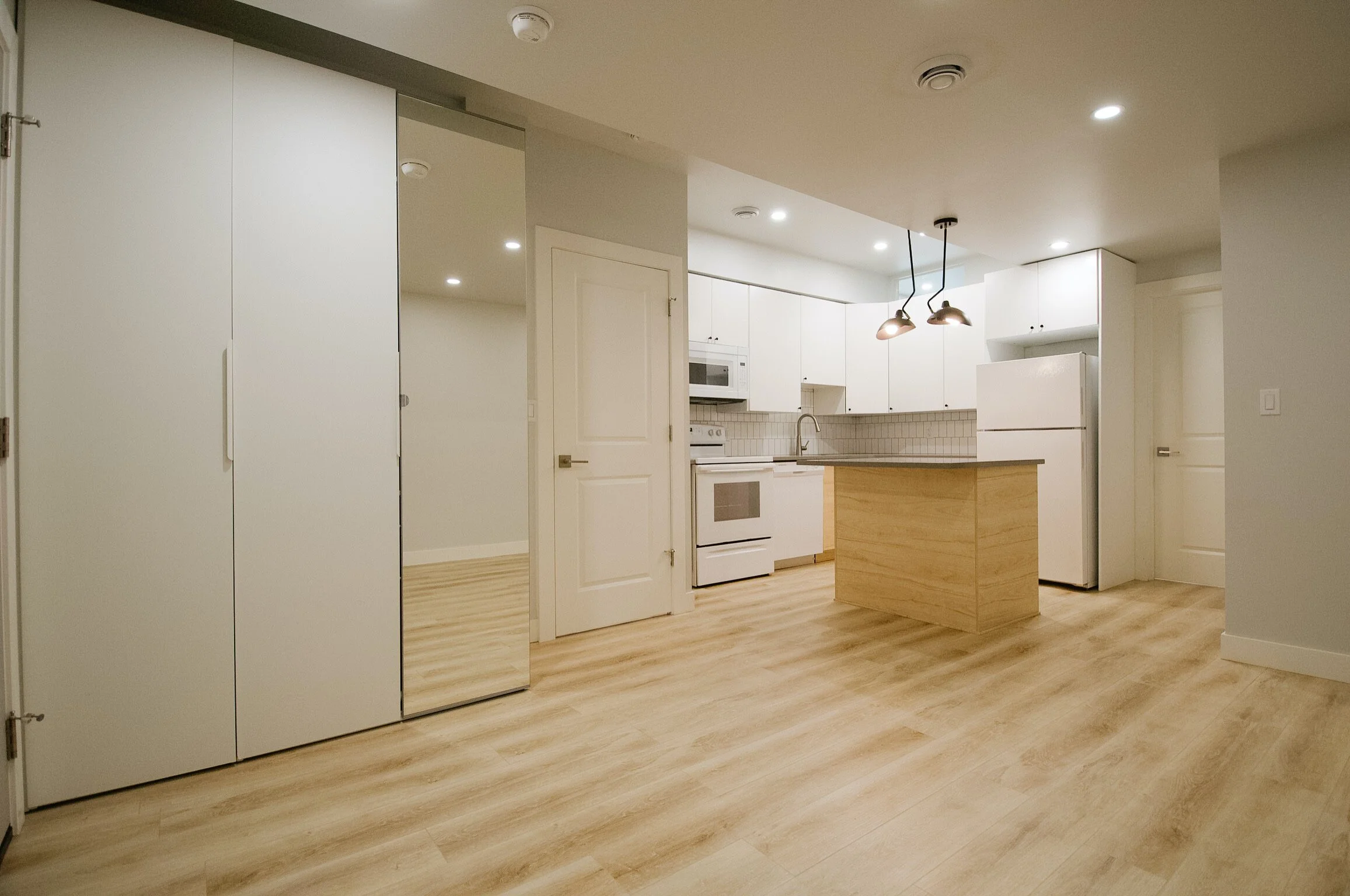
We added a large wardrobe with functional inserts to the entryway for convenient storage of outerwear; on the right is the main living area.
I always recommend adding laundry to your rental suites. It makes them so much more attractive to potential tenants. And with an apartment-sized, stackable set, you really don’t need that much room at all! We tucked it under the stairs and finished the rest of the space to create additional storage for tenants.
I also like to include a dishwasher in the suites - another great selling feature when it comes time to list. Other elements that really give this kitchen a lift are the addition of an island, and the quartz countertops. Read more on why I almost always specify quartz for rentals.
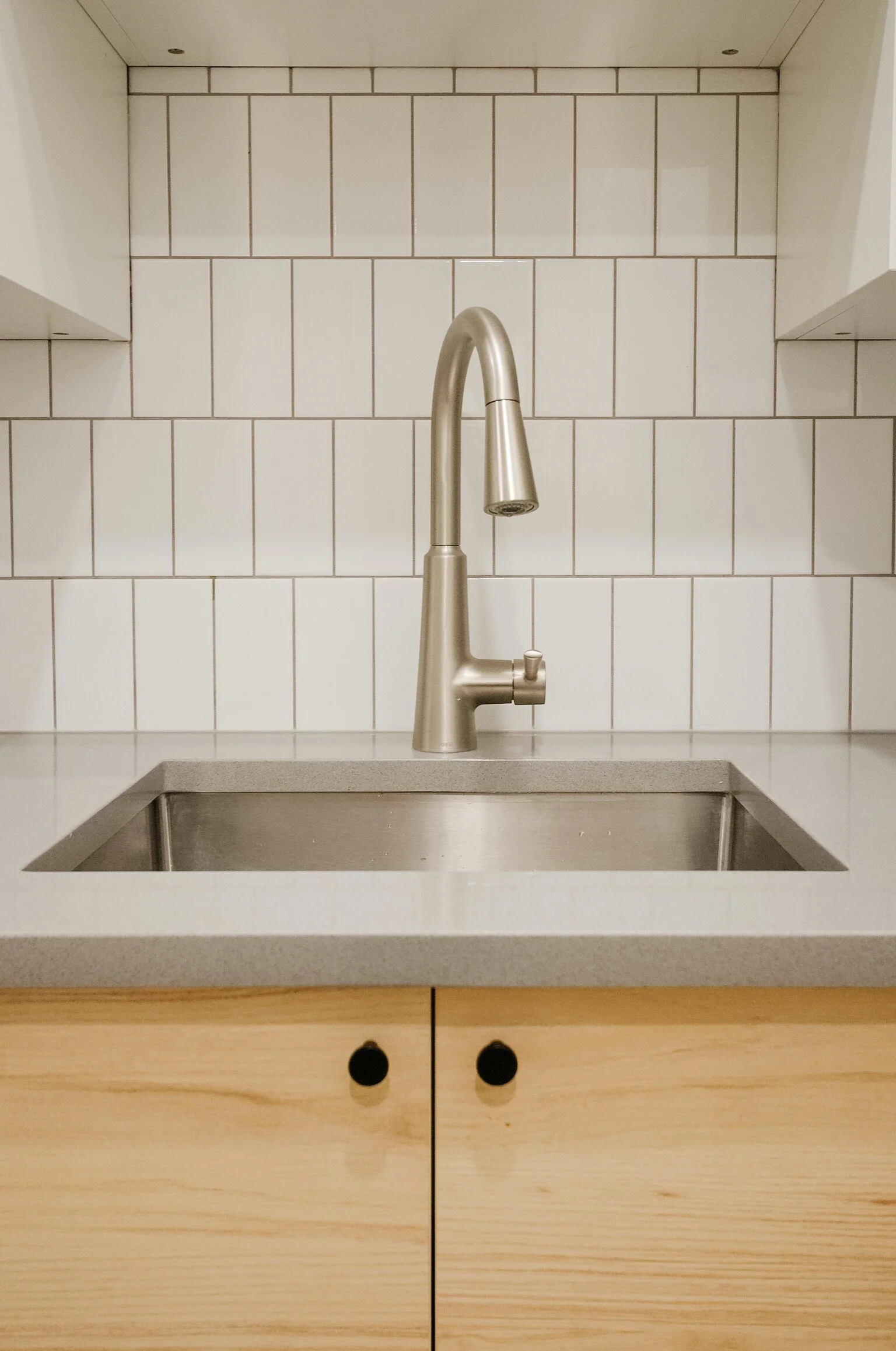
Because there is a dishwasher, we were able to go with a single bowl sink, and leverage the added space for storage and counter space. We used IKEA cabinets to reduce costs, while also providing great functionality with hidden drawers and pullouts within the cabinets.
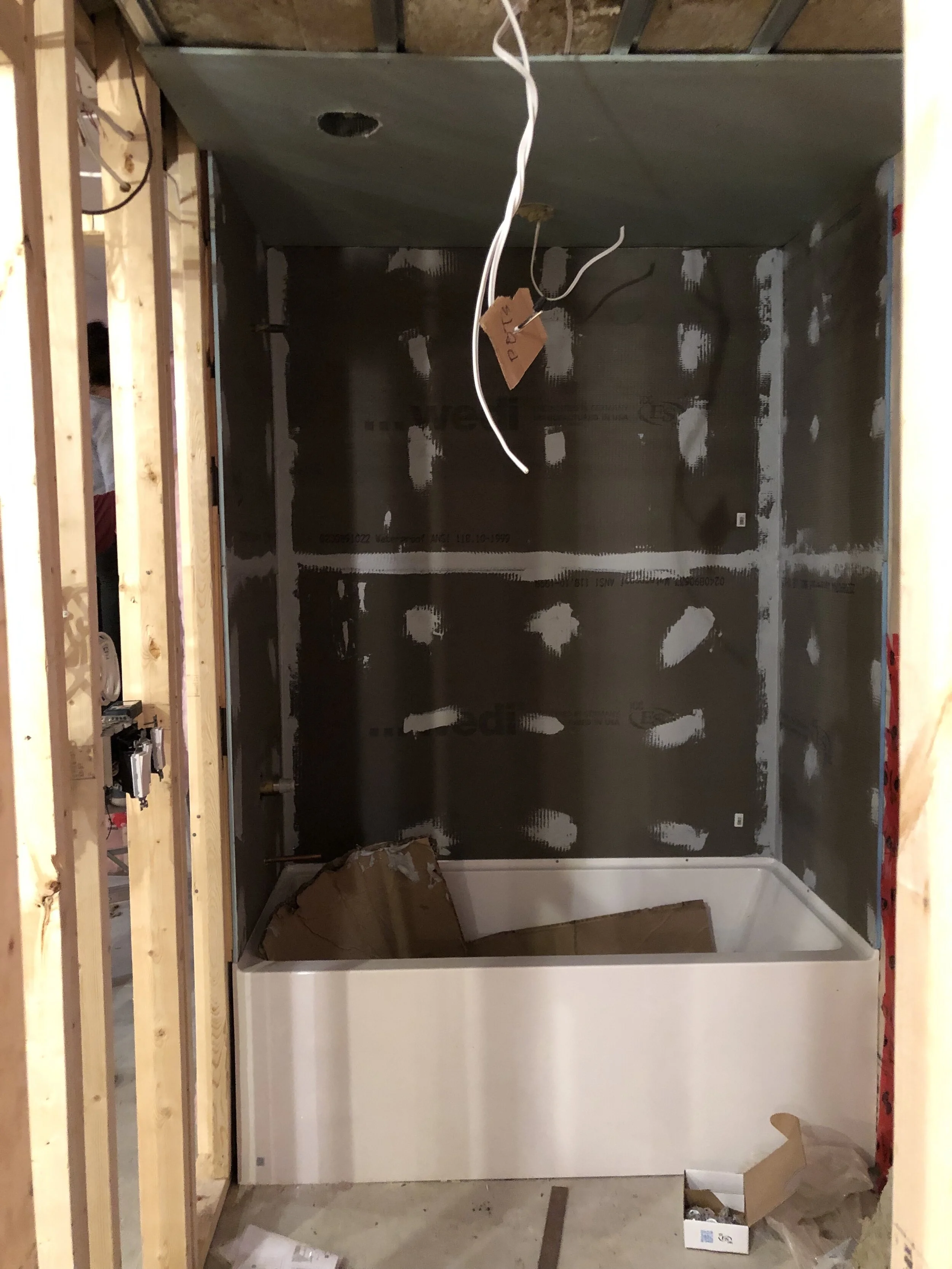
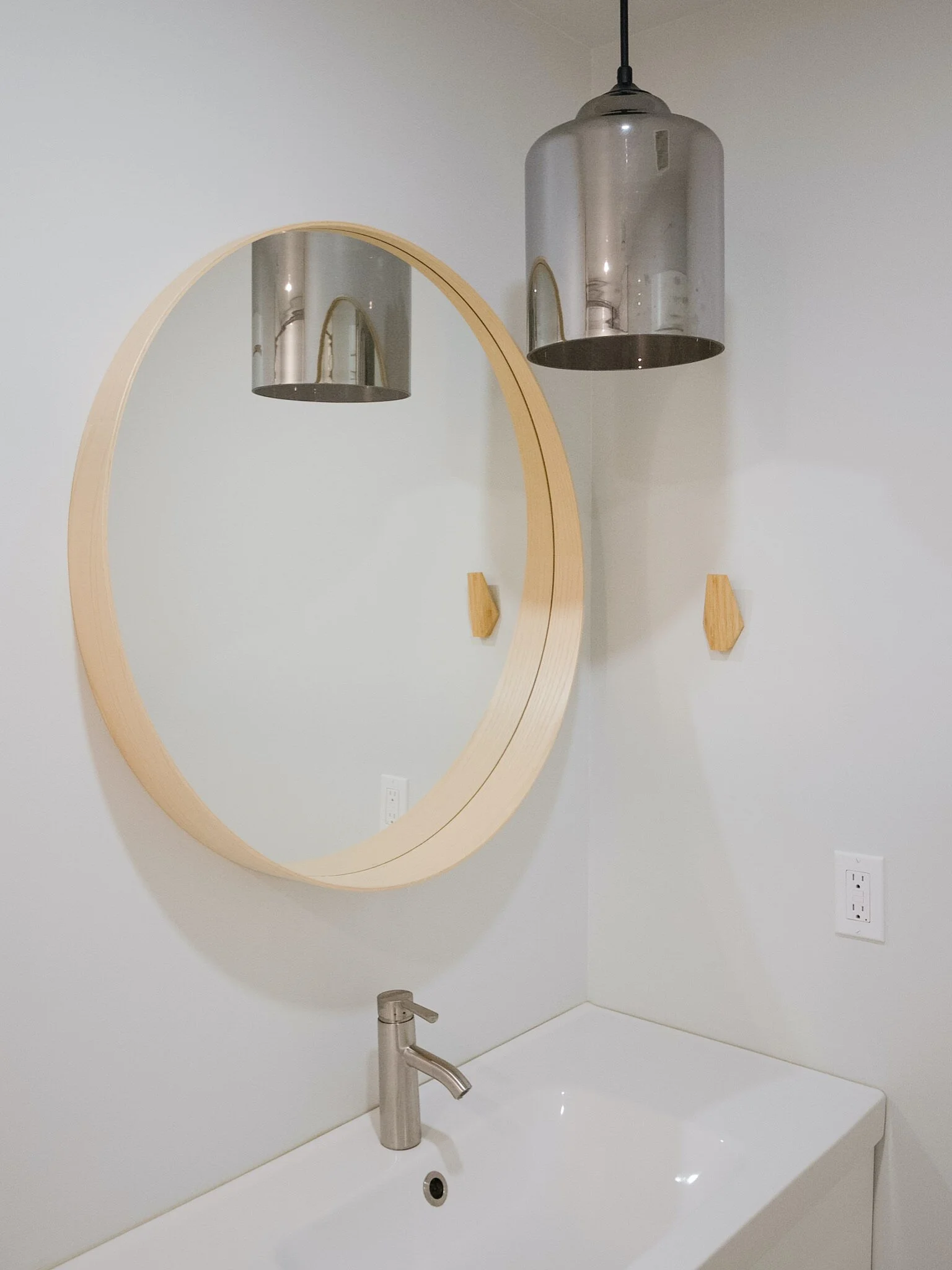
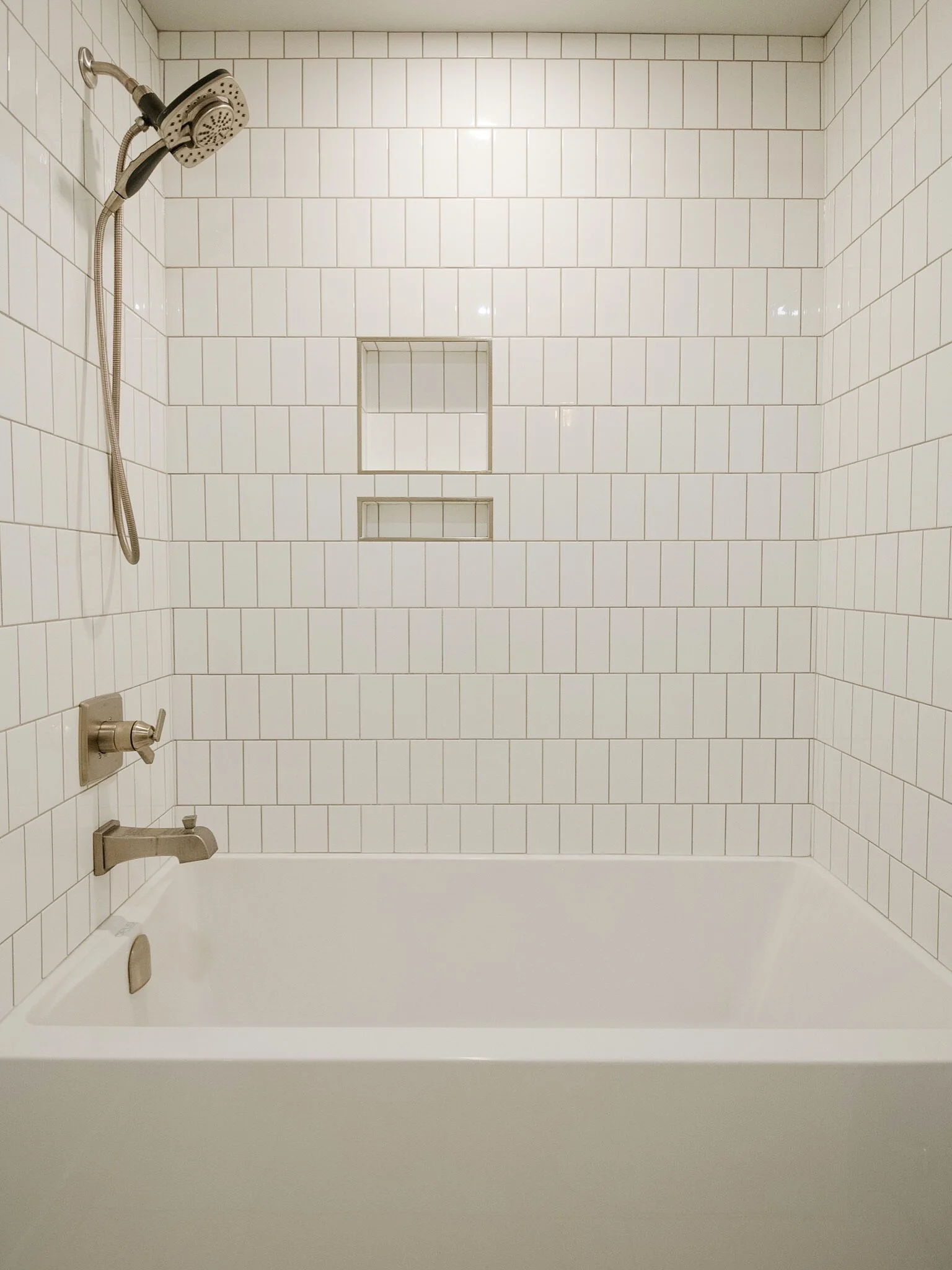
The bathroom features a tiled tub / shower combo and a statement pendant. I also love using IKEA bathroom vanities because they really maximize storage space (and are cost effective!). We added oak legs for a bit of extra flair but also for more stability to reduce any issues resulting from wear and tear. As I mentioned, doing a tiled shower surround is that extra bit of luxury - especially with the built in niche. Using subway tile keeps it classic, while the vertical brick pattern keeps it unique. The oak detail is further tied in through the mirror and the unique towel hooks.
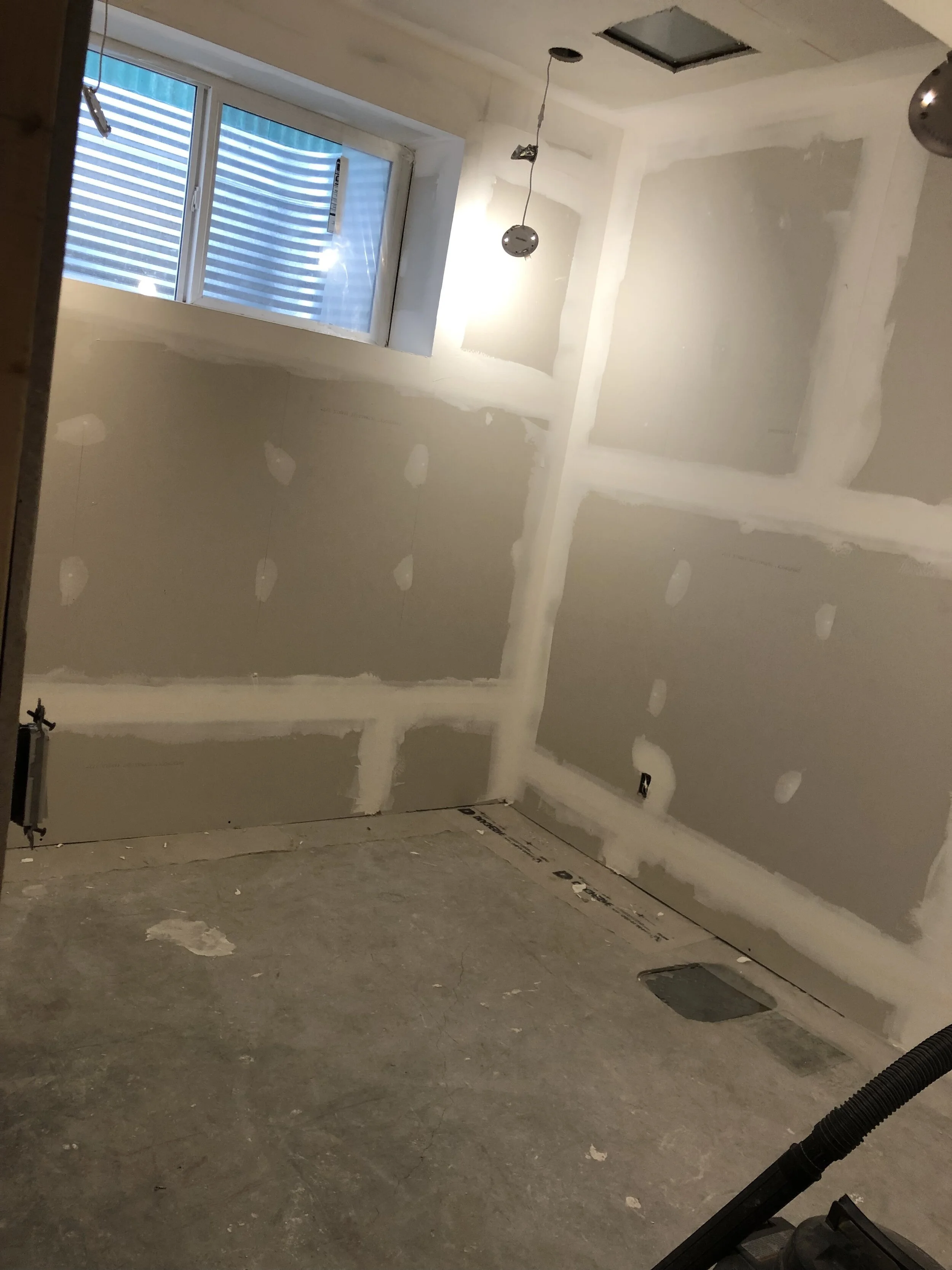
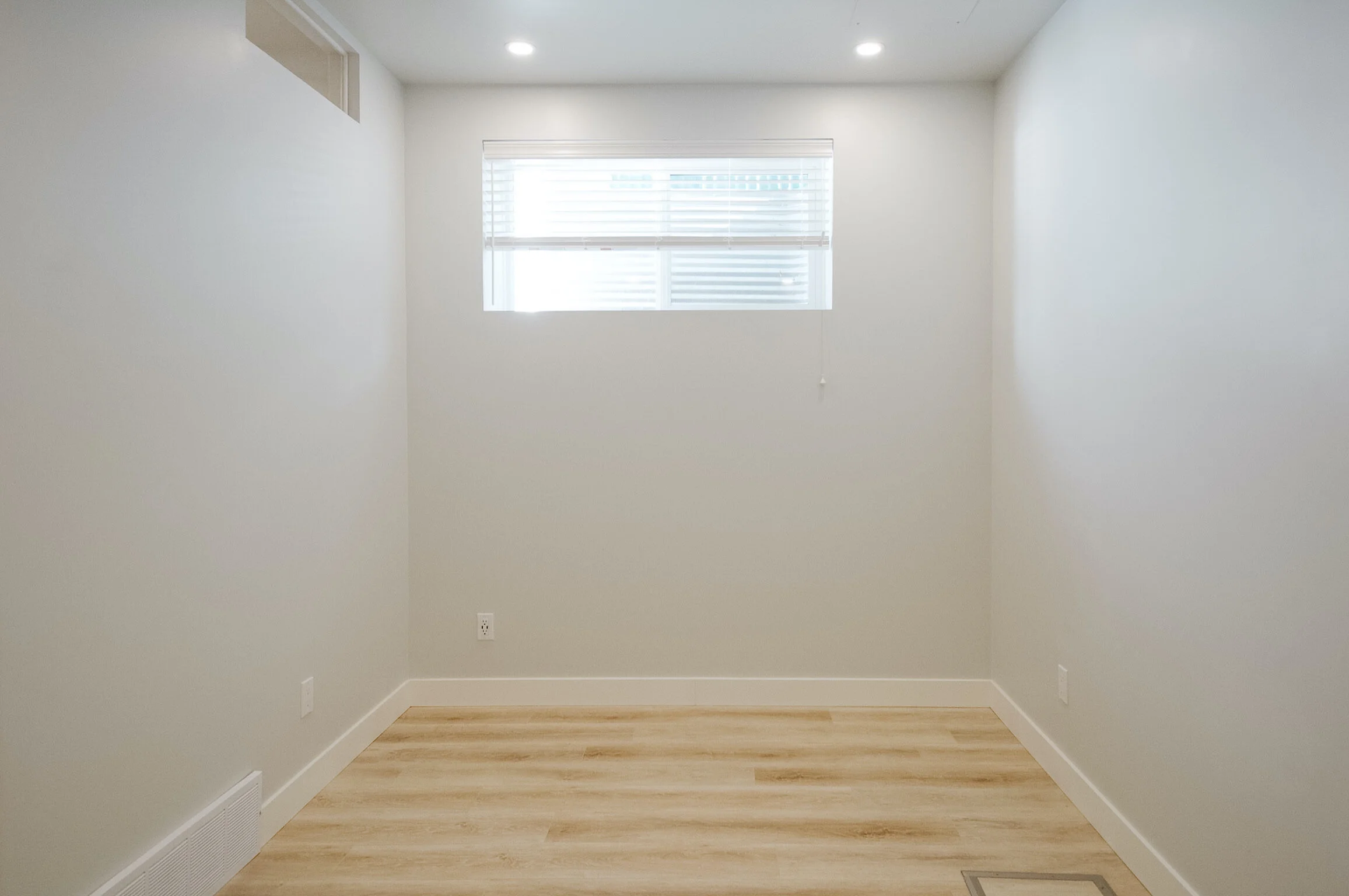
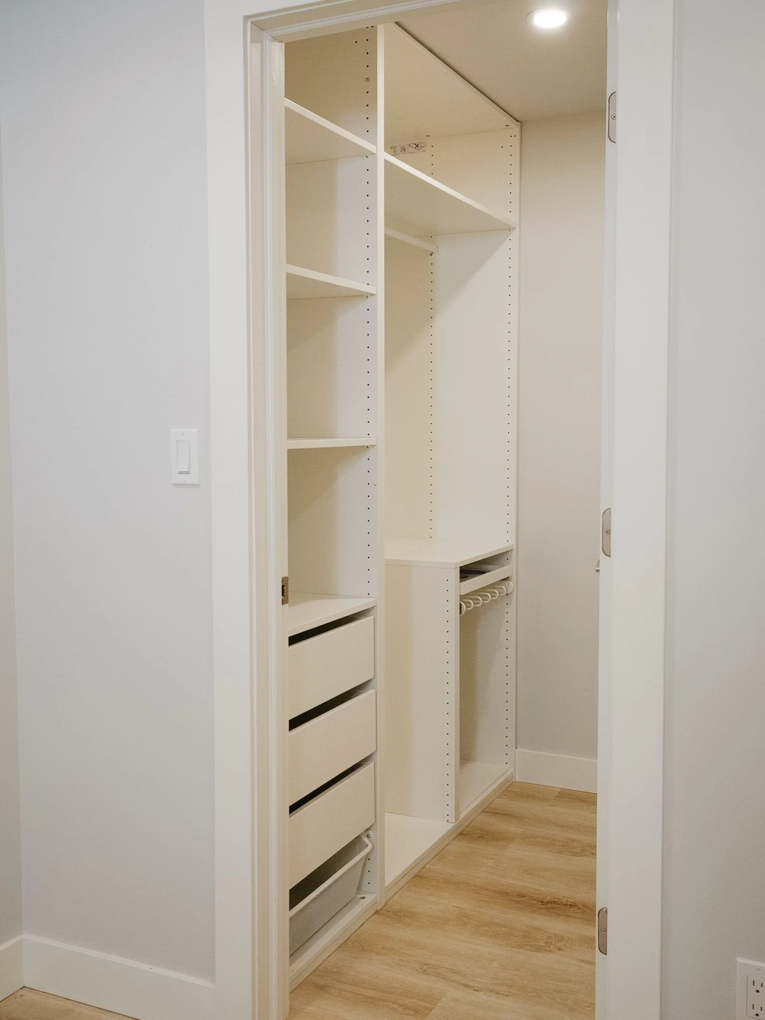
Finally, the bedroom. Since this is the only room with natural light, we added the internal window into the kitchen to draw some of that natural light into the main space. The bedroom easily fits a queen bed, two nightstands and even a dresser. We made the walk in closet extra functional by framing it to fit PAX wardrobes. The backwater valve access is in the bedroom, unfortunately, but we made a custom cover for it using the luxury vinyl plank flooring and some transition strips so that it isn’t obtrusive.
Hunter Douglas Everwood blinds were installed as they are (once again) highly functional, aesthetically pleasing, and cost effective. Blinds are a high-use, high-value item, so I don’t recommend choosing based on price over quality. You want the items you select for your rental to last through multiple tenants. Less breaks and repairs also contributes to a more positive tenancy experience for everyone.
The suite was finished in early 2020, posted by the homeowners as soon as it was ready, and snapped up by tenants right away - so quickly that I wasn’t able to get in for photos. I had to wait an entire year and then sneak in during the 12 hours between tenants! I truly love being able to create rental and investment spaces that help my clients achieve their financial goals. I’m also a very firm believer that if you provide a beautiful space as a rental, you’re going to attract renters who will treat it as their own home. It’s a fine balance between the upgrades and maximizing the return on investment, but when you get it right, it’s so worth the time and effort.
If you are planning on creating or renovating a rental suite, I offer full design and consultation services. Please reach out if you’d like to discuss your project further!


