Belgravia Kitchen Renovation
The other night, the bookclub I’m part of met in person at one of our group member’s homes. As is often the case when someone knows what I do for a living and I see their space for the first time, they make a comment about how they are worried I’ll judge their home. My response is always that there is no judgement from me, but I may come up with a couple designs in my head should you ever decide to switch things up (I just can’t help it!). This project, in Edmonton’s Belgravia neighbourhood, is totally one of those homes where I’ve had ideas ruminating around in my head about the possibilities for years; since the day I saw it for the first time during our client’s home inspection. So you can imagine that I was pretty pumped when we were told it was kitchen renovation time!
After Photos: Sharon Litchfield | Contractor: Revive Developments
Where it all Started
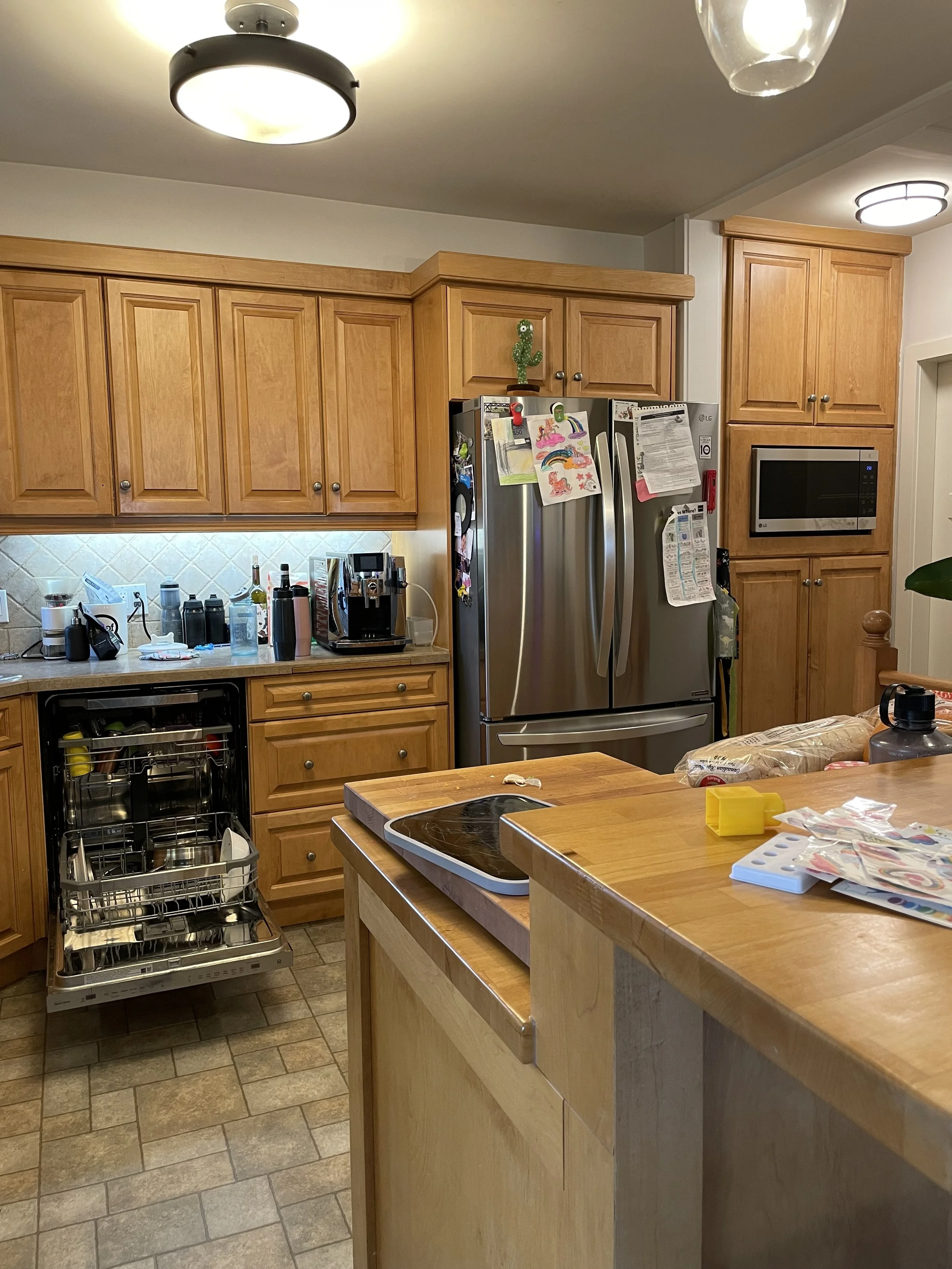
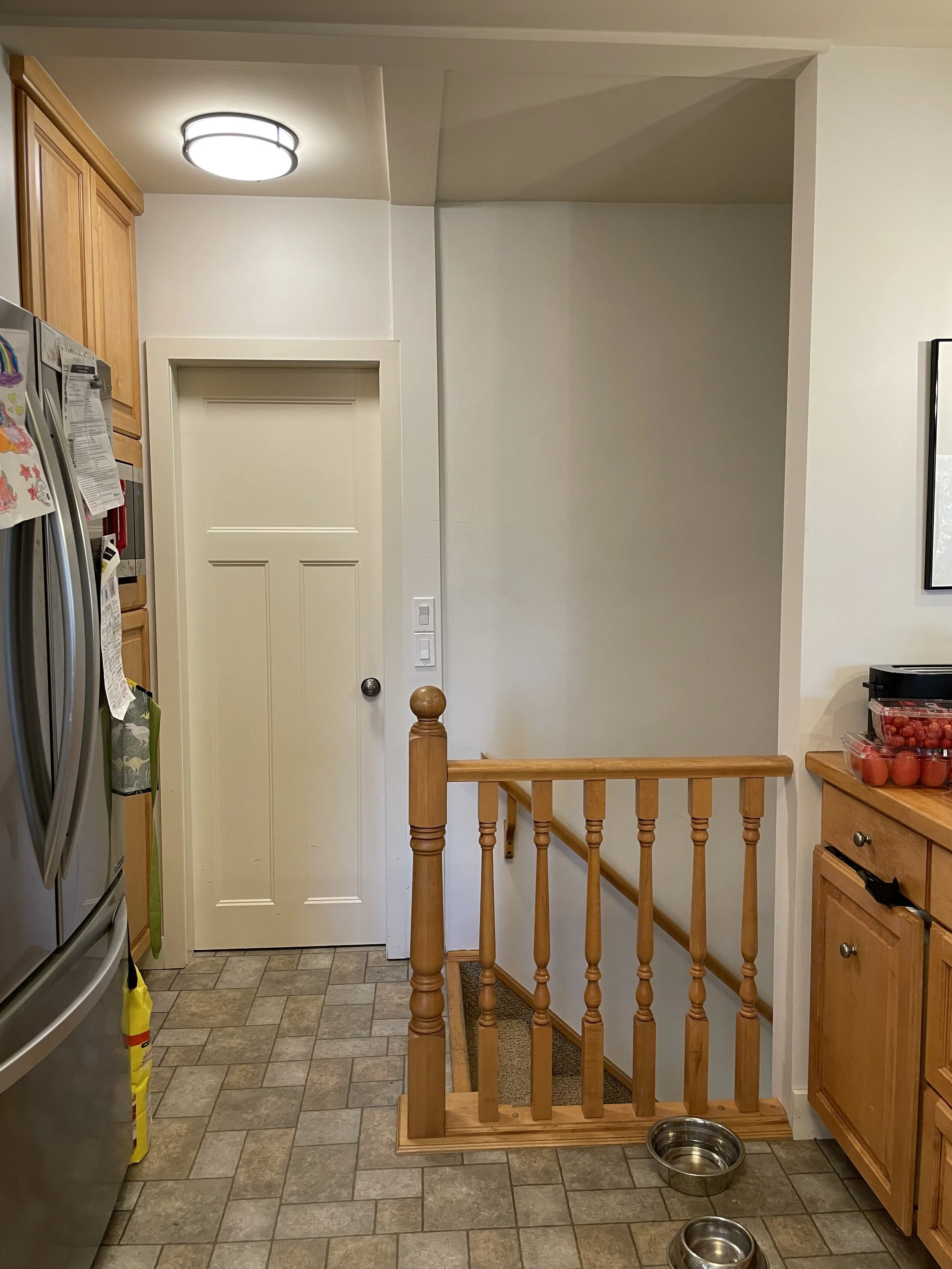
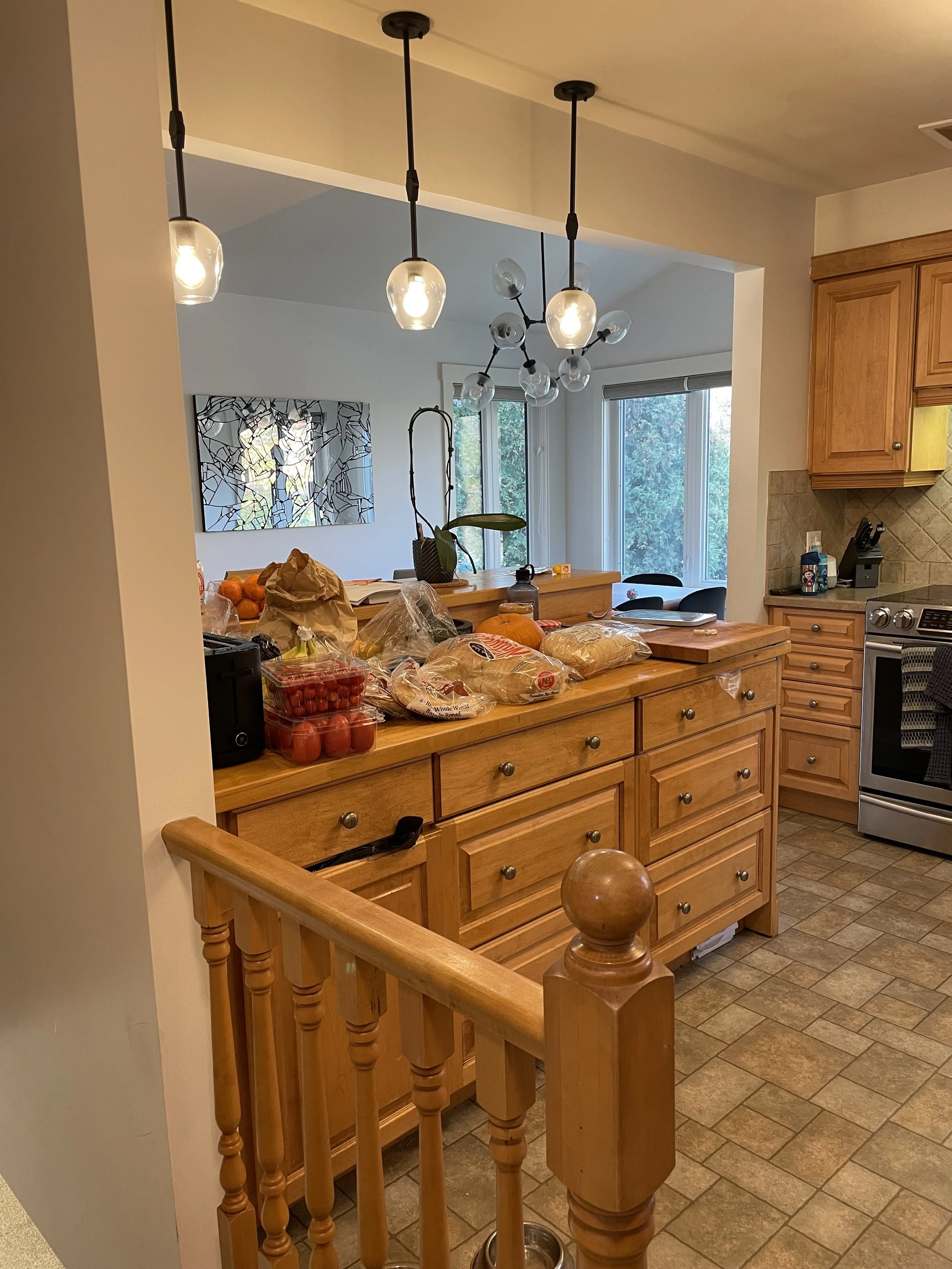
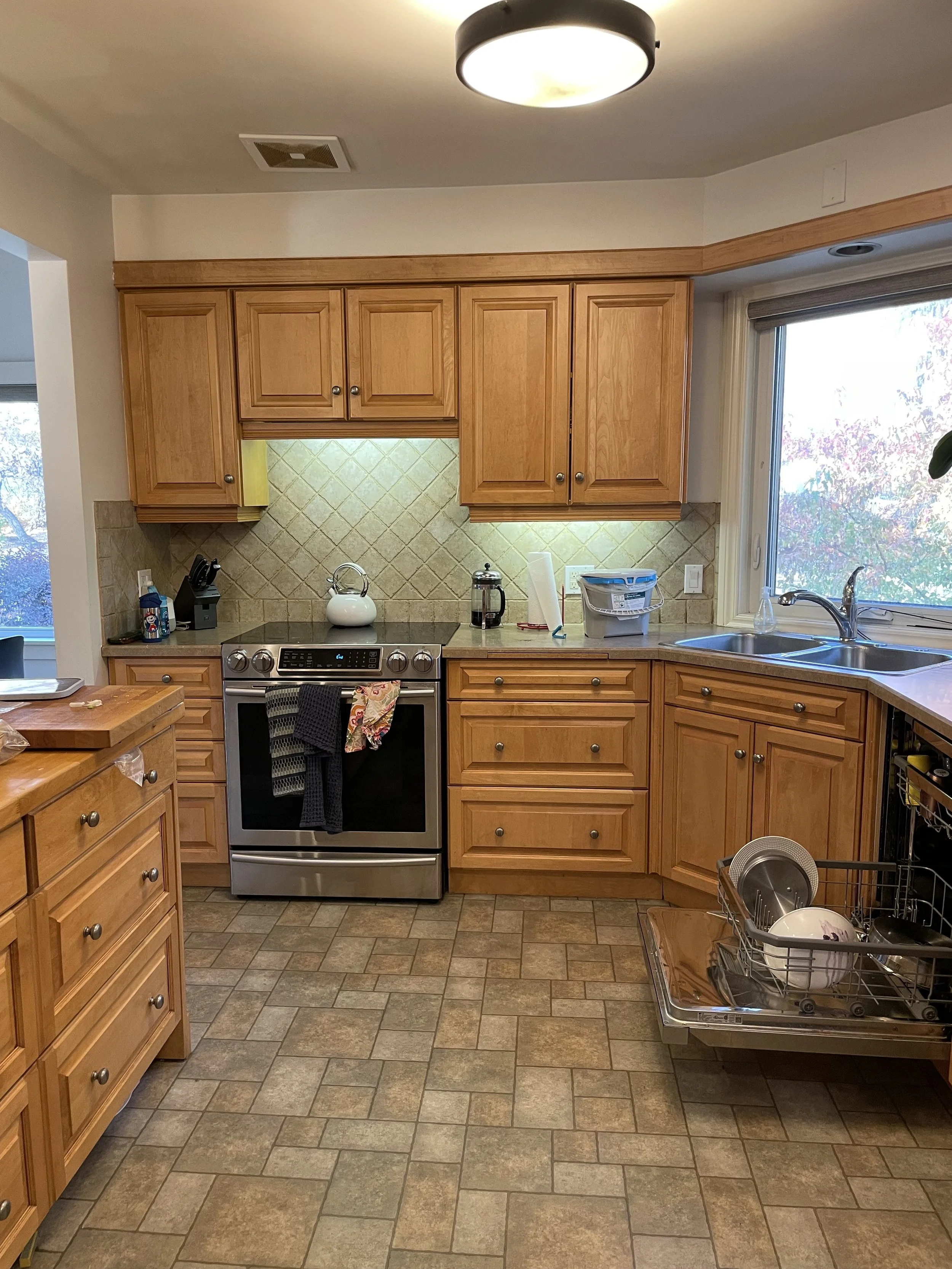
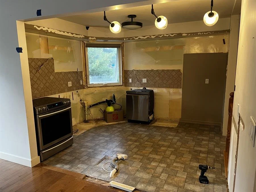
The kitchen in this home had been renovated by the previous owner and while it was a great kitchen in terms of the quality of the cabinets, it was also feeling dated and dark. We knew that a few key changes could make a big difference to how the space functioned and felt.
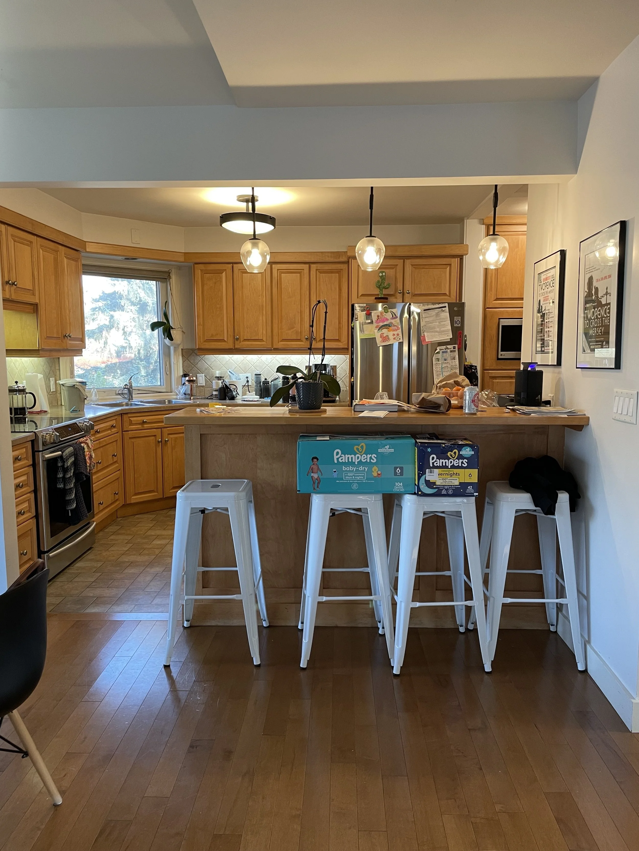
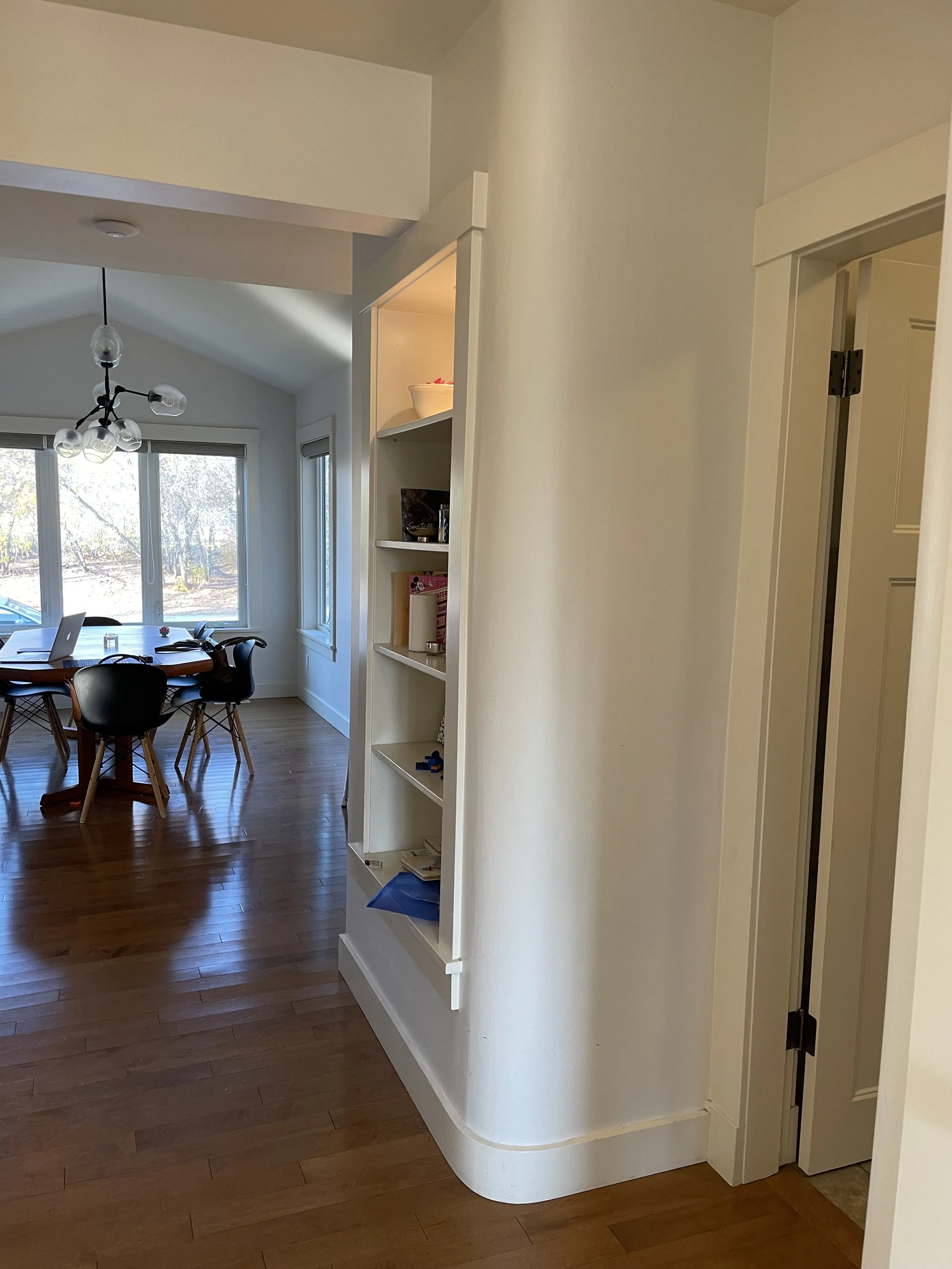
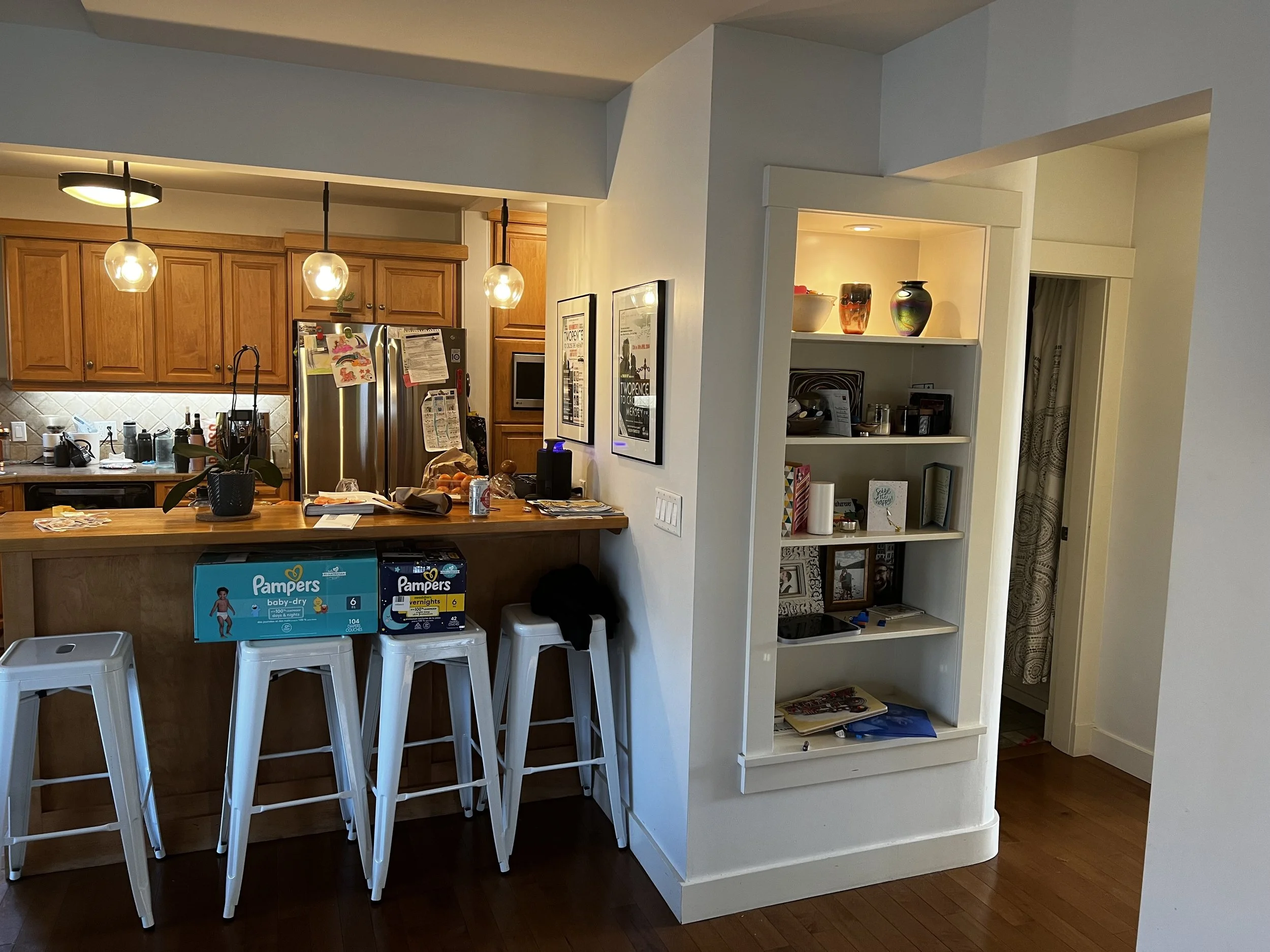
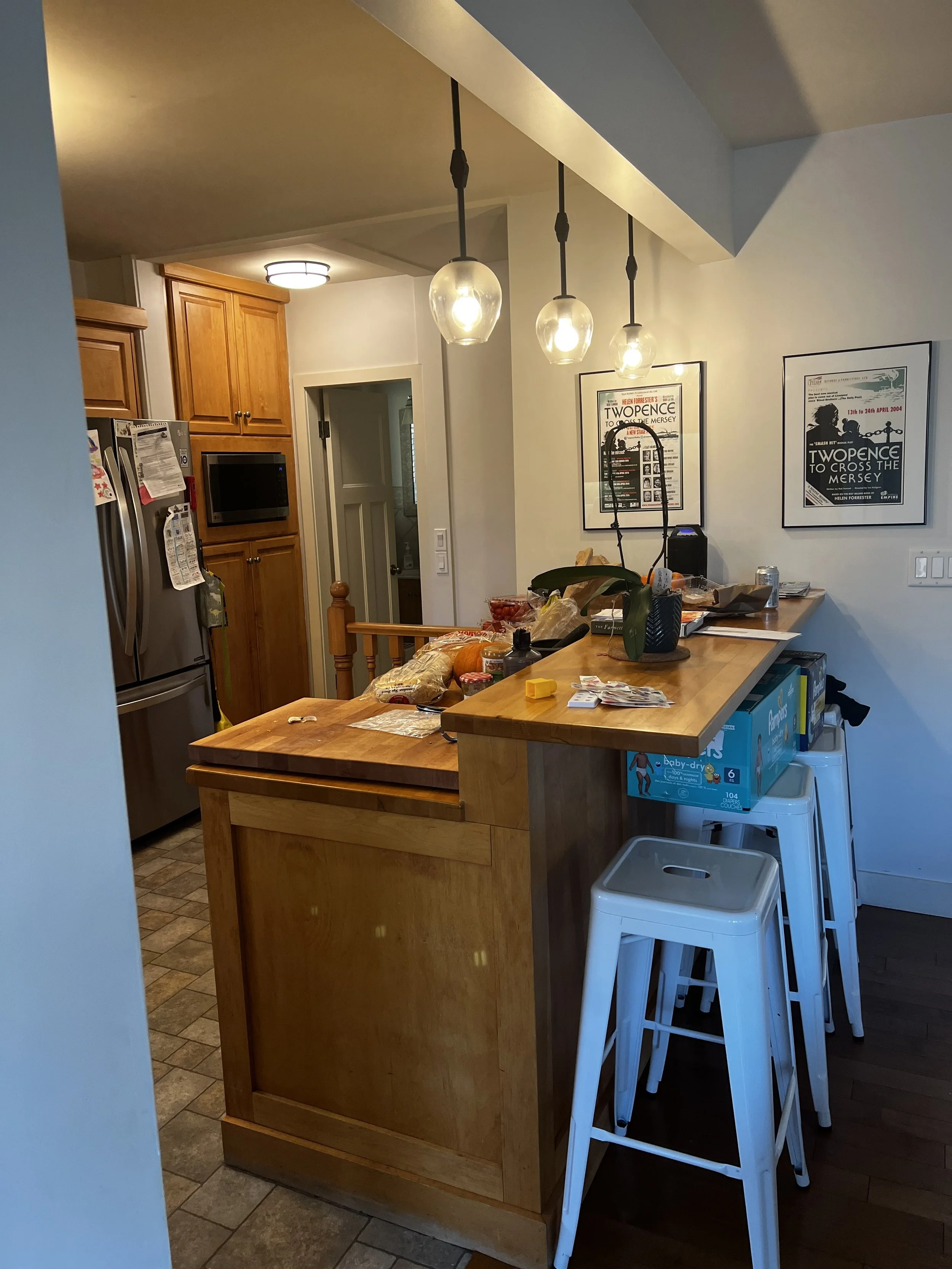
Here are the before photos:
While the overall layout of the kitchen stayed relatively close to what existed, the 4 key items that really made the difference were:
Removing all of the unnecessary bulkheads and other structural remnants from the original home.
Adding an additional window to the left of the sink to add light and allow for more of a view of their beautiful front yard.
Removing the built-in shelving and opening up the stairway wall to connect the kitchen to the rest of the home.
Removing the second entry to the main bathroom via the kitchen.
In addition to those changes, we were also able to install proper ventilation above the range and we increased the size of the peninsula which resulted in the addition of a beverage fridge.
The Design
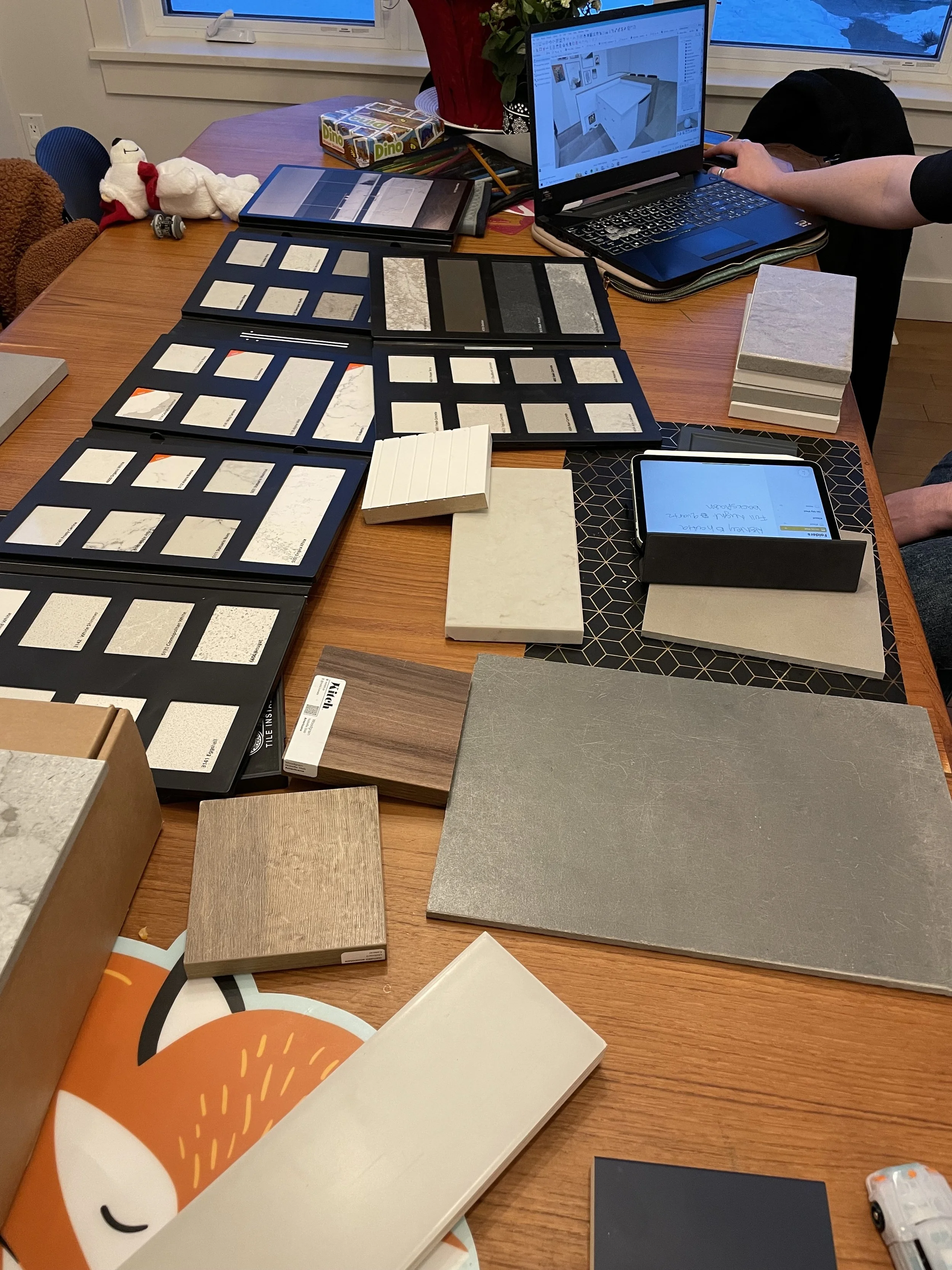
As always, we put together a few options for the look and feel of the space and also presented varying details for smaller changes to the layout. Our clients wanted to reuse their existing appliances, so they were incorporated into the design with the addition of a new over-the-range microwave and beverage fridge. While this was our final look and layout, we also considered options where we kept the wall to the left of the range or where we positioned the peninsula in a slightly different way.
Removing the wall and adding the window required additional permits and consultation with our engineer. So many details had to be sorted out before we could begin construction but having everything ready to go meant we could move through the project with relative ease… except for one small issue…
The Renovation
As mentioned, this renovation ran quite smoothly overall. Demo went as planned with no major surprises and since we had ordered our fixtures and appliances ahead of time, we didn’t face any product delays. But when it was time to install the footing for the new beam we discovered that there was ground water sitting right below the basement floor. This ended up delaying the project by about 2 months while we consulted with engineers to try to determine our options and installed a second sump pump to help reduce the water level.
Once that was sorted we were back on track (and the day that concrete was poured we all celebrated)!
The End Result
We are so pleased with how the space came together. It now feels so light and bright, but also welcoming at the same time. And most importantly, it is a true reflection of the family that enjoys the space every day.
We happily said goodbye to the “bathroom fan” that was previously installed for ventilation and brought in this sleek over-the-range microwave. It allowed us to free up space in the pantry where the microwave was previously and install proper ventilation.
Our clients wanted to maintain a bar height portion to the peninsula so we tied it into the overall design by repeating the wood along the new half wall and in the accents by the sink. And while the new window isn’t large, it has a huge impact in terms of the additional natural light that is let into the space.
Little changes, like switching to an undermount sink and adding the garburator switch create such a seamless feel in the space. The backsplash throughout is done in the same quartz as the countertop making for an easy to clean surface (a key feature for this young, busy family) and a cohesive look.
And of course we can’t ever forget about the furry members of the family. We designed a nook to help keep his water bowl from being pushed around the kitchen. Its interior is clad with a basic white tile to keep it easy to clean. Since we did the photos, he now has a custom made dish and holder to fit the nook.
Other little details included the custom made magnetic knife block and angled shelf (thanks Sunder Woodworks).
The pantry features vertical storage, along with a pull out shelf for the small appliances. Fun fact, the original butcher block countertops were repurposed to create the surface for this pull out and a portion was even made into a beautiful cutting board that our clients gifted me at the end of the project (seriously so sweet and meaningful).
Our clients weren’t keen on having pendants above the peninsula, so we opted for 3, small statement lights to highlight the area and allowed the fixture above the sink to be the highlight.
In our initial questionnaire our clients wrote that they wanted to walk into the space and feel calm, relaxed and energized. I think we achieved that, don’t you?
If you’re pondering your own kitchen renovation, here are a few things to keep in mind:
Kitchens are the most involved designs we do, so the design phase typically takes several months to complete - so reach out sooner rather than later.
Working with a kitchen showroom will give you a well designed kitchen, but working with an independent designer will give you a customized and well designed kitchen that is based on how you want to live and feel in your space - and you get an unbiased opinion on where to upgrade and where to save.
Kitchens are also one of the most stressful renovations but we love being able to alleviate some of that stress by guiding you through the process, managing all the decisions that need to be made, advocating for you throughout implementation - and we’ll be there to commiserate with you when you hit that point in the reno where you’re just over it.
We’d love to chat about your ideas for your kitchen renovation. Get in touch via our contact form and we’ll set up a 20 min Discovery Call to discuss!


