My Home Tour: Kitchen & Mudroom
Most of the main floor of our home remained as it was - except for the kitchen and mud room space. It went full-on gut job.
To say I struggled with this kitchen design is an understatement. I had two kitchen suppliers do up drawings for me but neither of them created quite what I was looking for. Not to mention they were above my budget. All I knew was, the space had to change and had to improve to meet our needs.
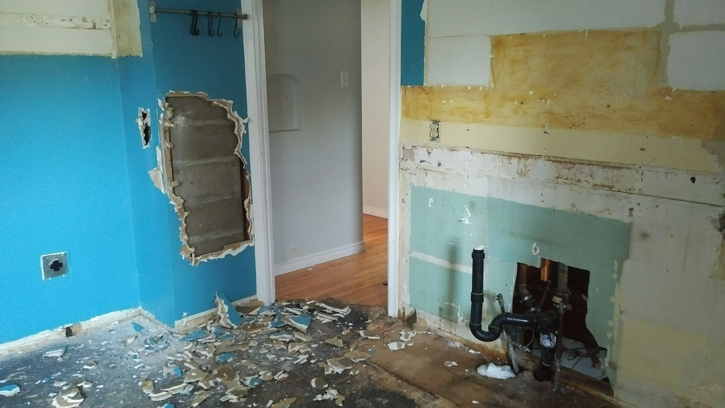
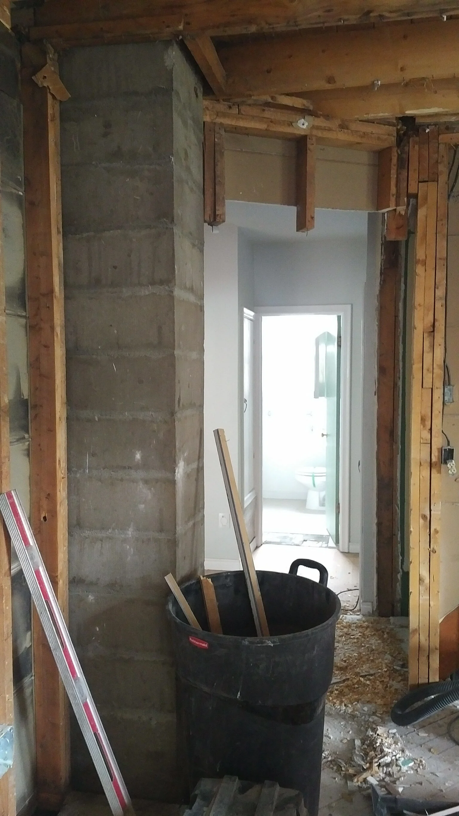
The kitchen was almost original. It was likely redone at the same time the addition (mudroom) went on the back of the house. Once opened, we could see where a staircase used to be - coming from the now basement door into the kitchen. The amount of nails used to put this kitchen together was also excessive. It took some effort to get it out.
Let’s take a look at some before photos!
I mean it wasn’t terrible!
But there is no way I was living with that fridge / stove situation - and without an extractor fan…
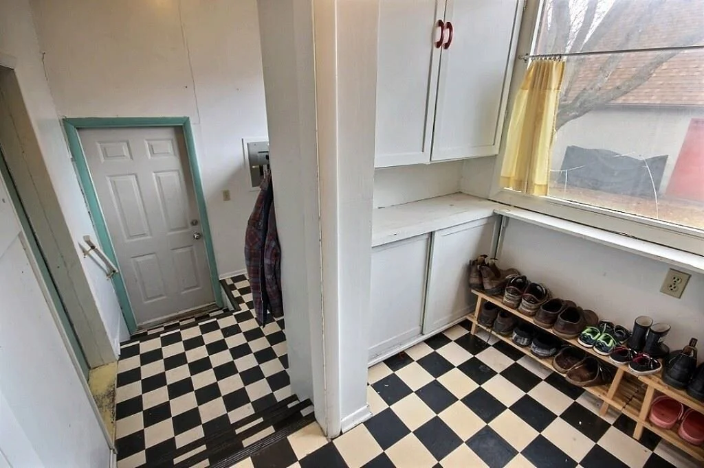
The “lower” and “upper” mudrooms. Not terrible but definitely room for improvement!
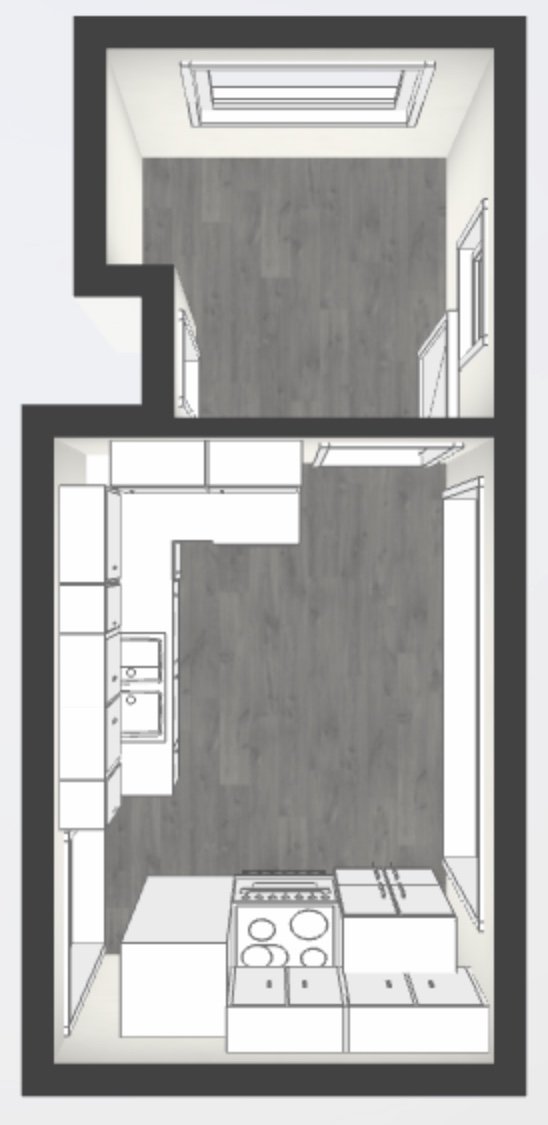
The kitchen layout was not particularly functional and also lacked ventilation. As I do like to cook, I needed more prep space and I also needed a lot more storage. Here’s a rough before and after of the layout.
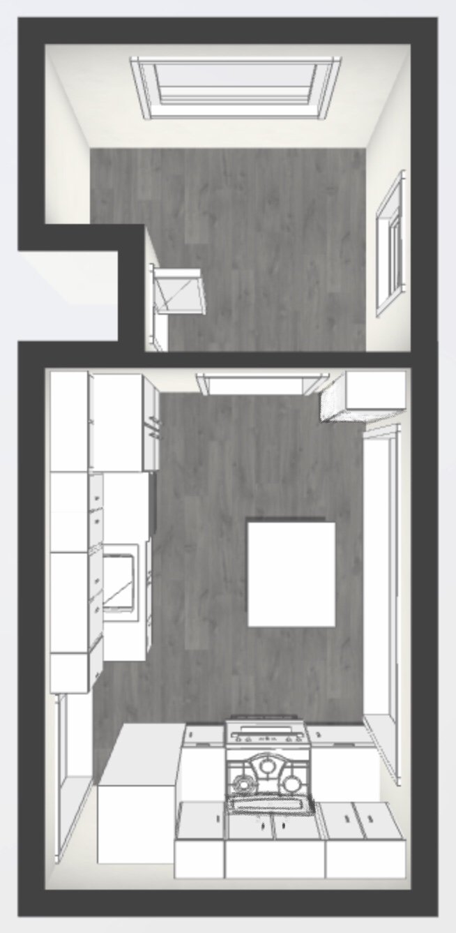
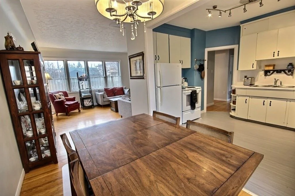
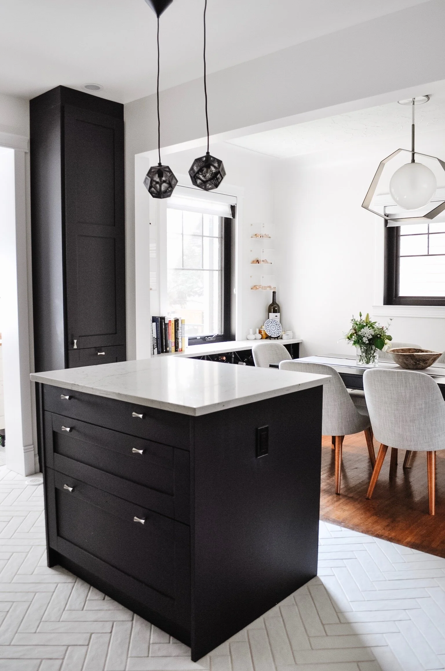
Let’s step back a bit though and discuss the demo and the changes. As you can see with the layouts, we moved the entrance (and left it open) between the kitchen and mudroom. We then made the opening to the dining room a bit smaller so that we could fit a full height pantry cabinet in the space. We also removed the header between the kitchen and hallway to create one smooth ceiling.
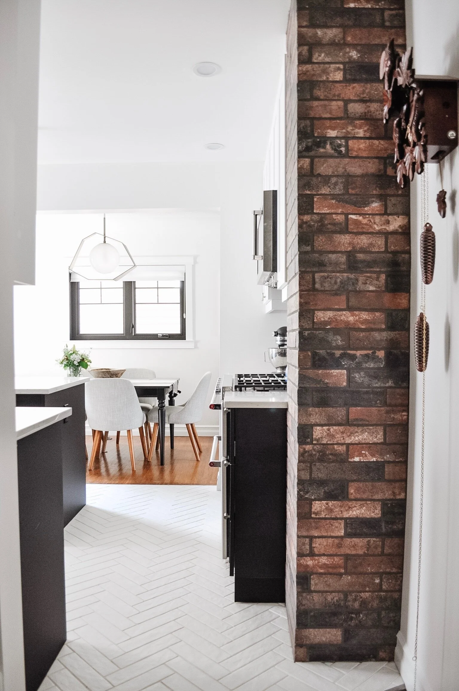
Gaining inches by exposing the chimney!
Adjusting the opening between the kitchen and mudroom
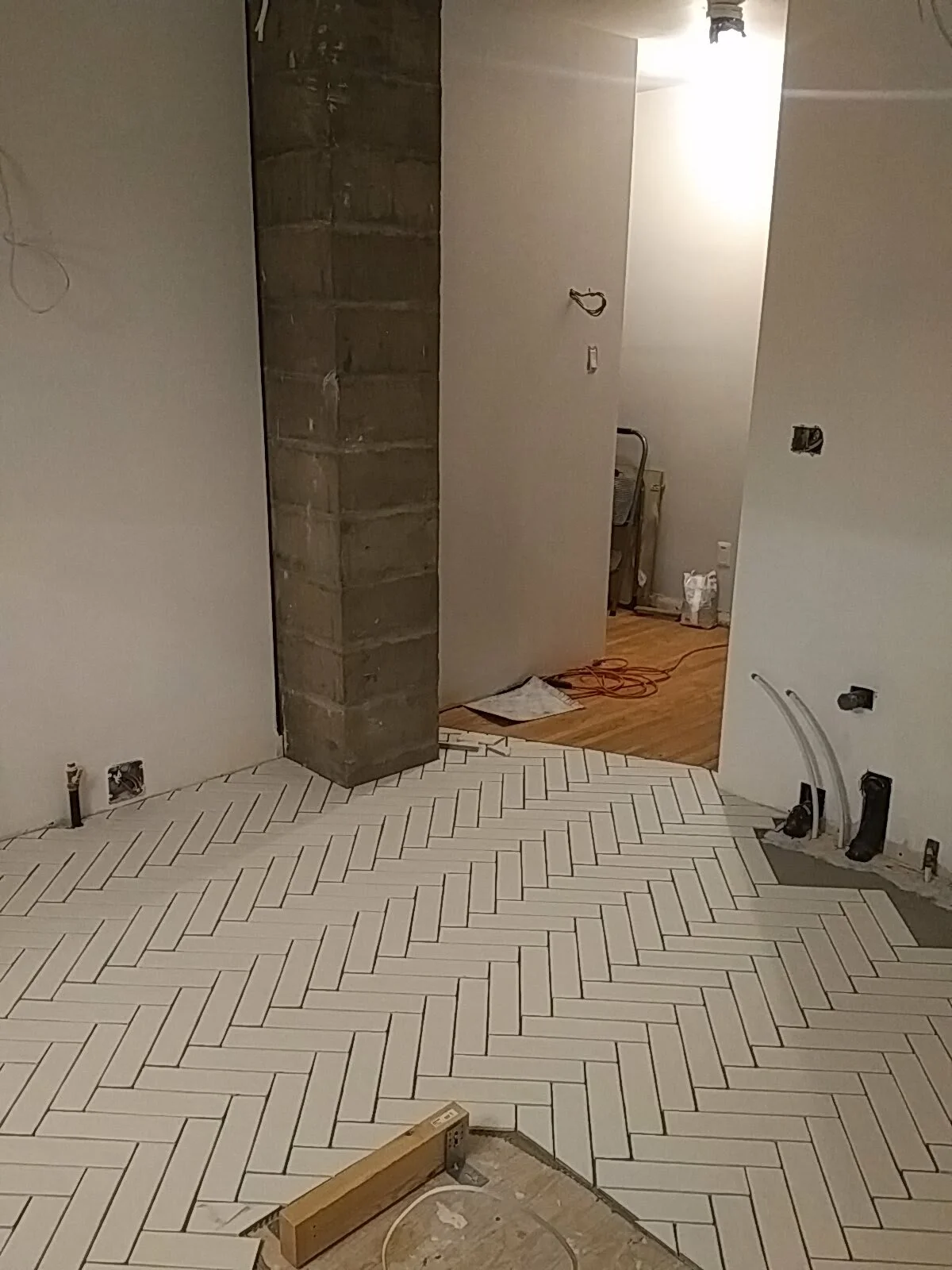
The subfloor was replaced so that we had better structure for tile and we also removed the drywall around the original cinderblock chimney (which gained 3” in cabinetry!). We tore out the ceiling to install new lighting (recessed and pendants) and range venting. The lack of a ceiling was also useful for moving large pieces of wood upstairs (we removed the subfloor up there too)!
Since everything was open anyway, we ran a gas line to the range too.
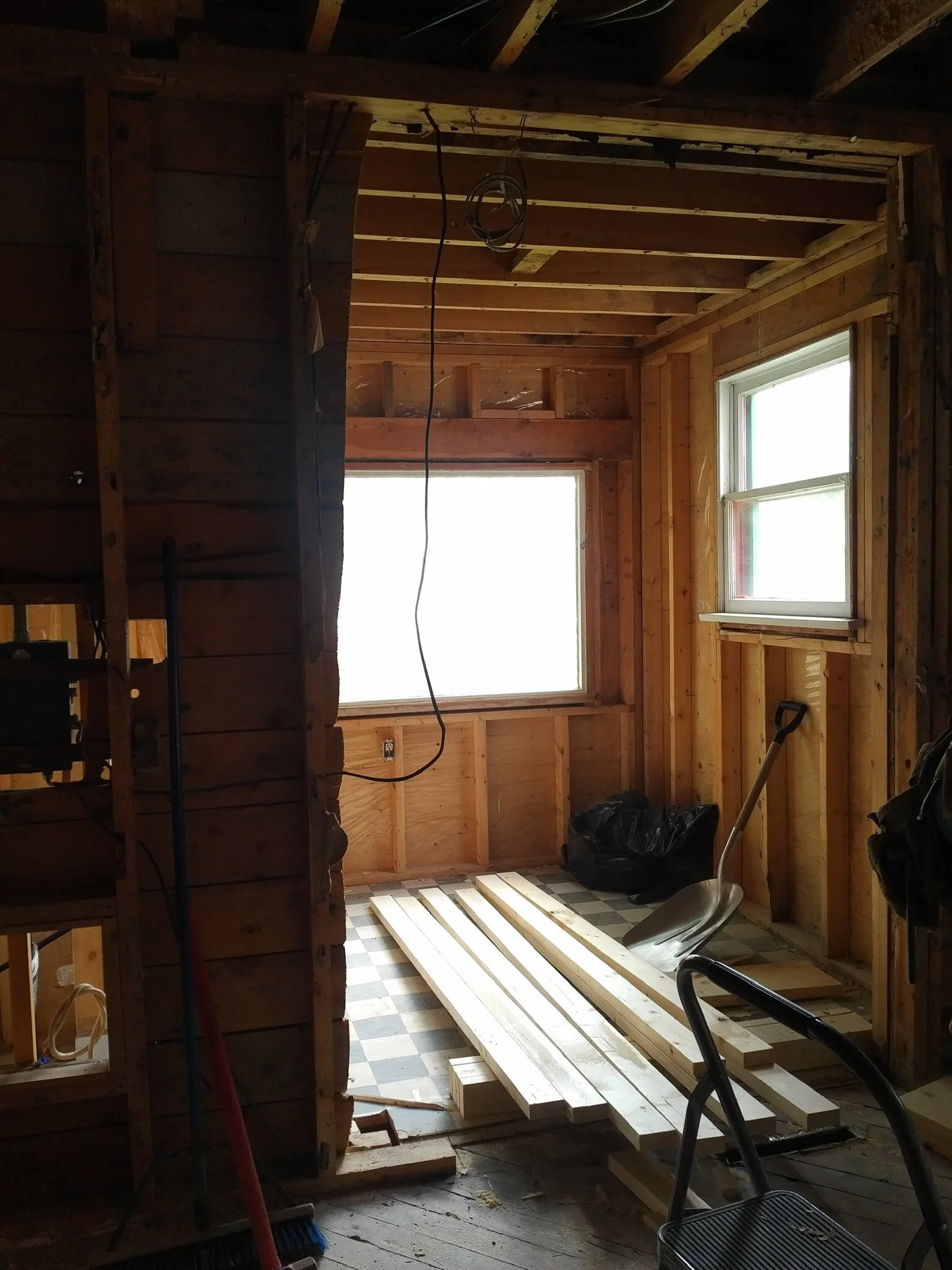
In the mudroom, we pushed back the wall to the left of the window so that we would have enough depth for an open closet. We added a door to separate the main floor unit from the basement unit (the “lower” mudroom is common space). We replaced the windows in the mudroom at the same time as the rest of the house. We also added heat runs to the space as it had no heat before. Oh and we insulated it correctly. If you look at the mudroom demo photo you can see the vapour barrier against the outside wall. The insulation had been put on top…
The previous flooring was a Marmoleum and didn’t work with my aesthetic. I debated a few options for tile but ended up deciding on these white Olympia brick tiles set in a herringbone pattern. The white on white ensures that the herringbone pattern is interesting but not overwhelming. It’s carried into the mudroom, making the space look more like one and like it is larger. And yes - it does get dirty. And yes - it is a bit of a pain to clean. Would I do it again? Yep.
Tile before grout
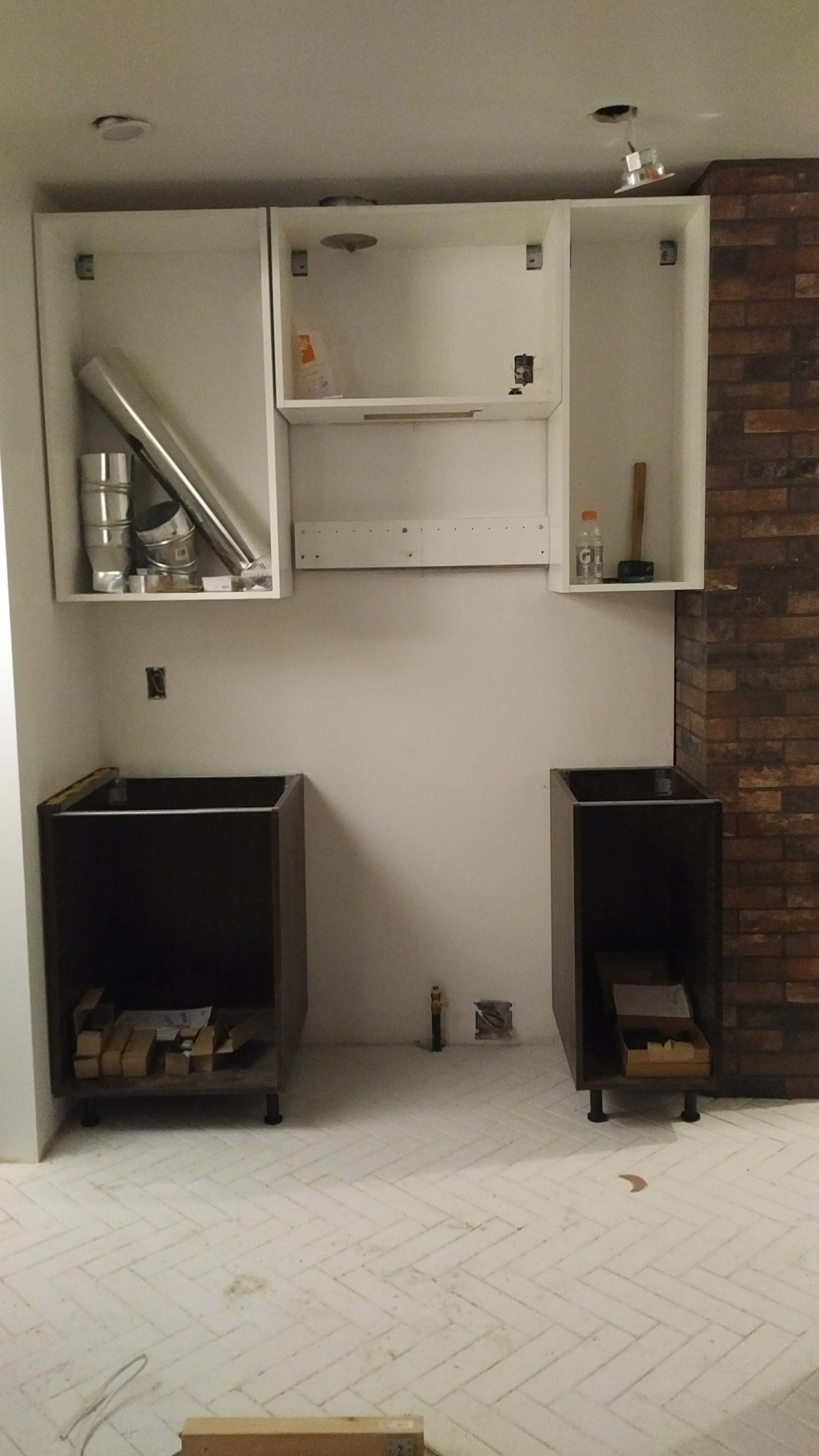
IKEA boxes going in
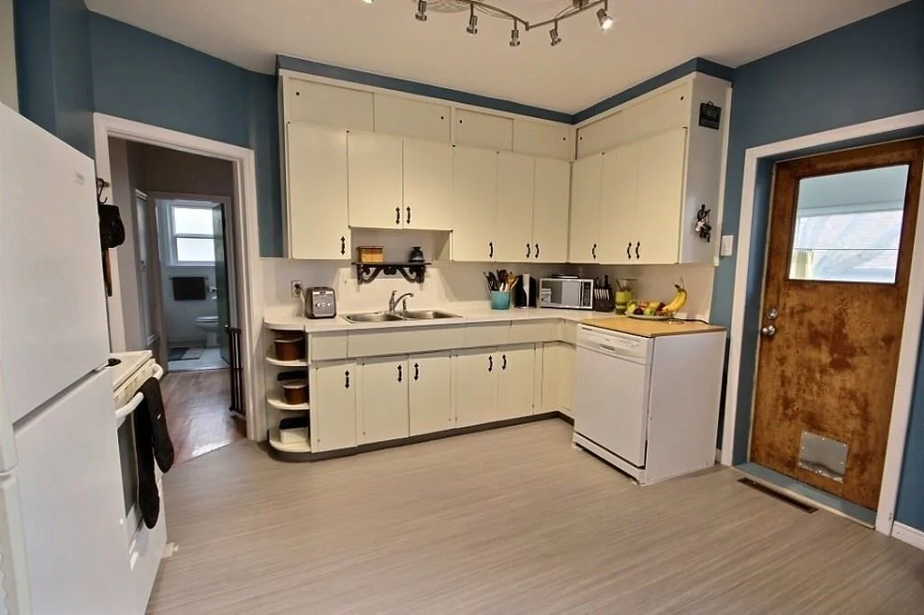
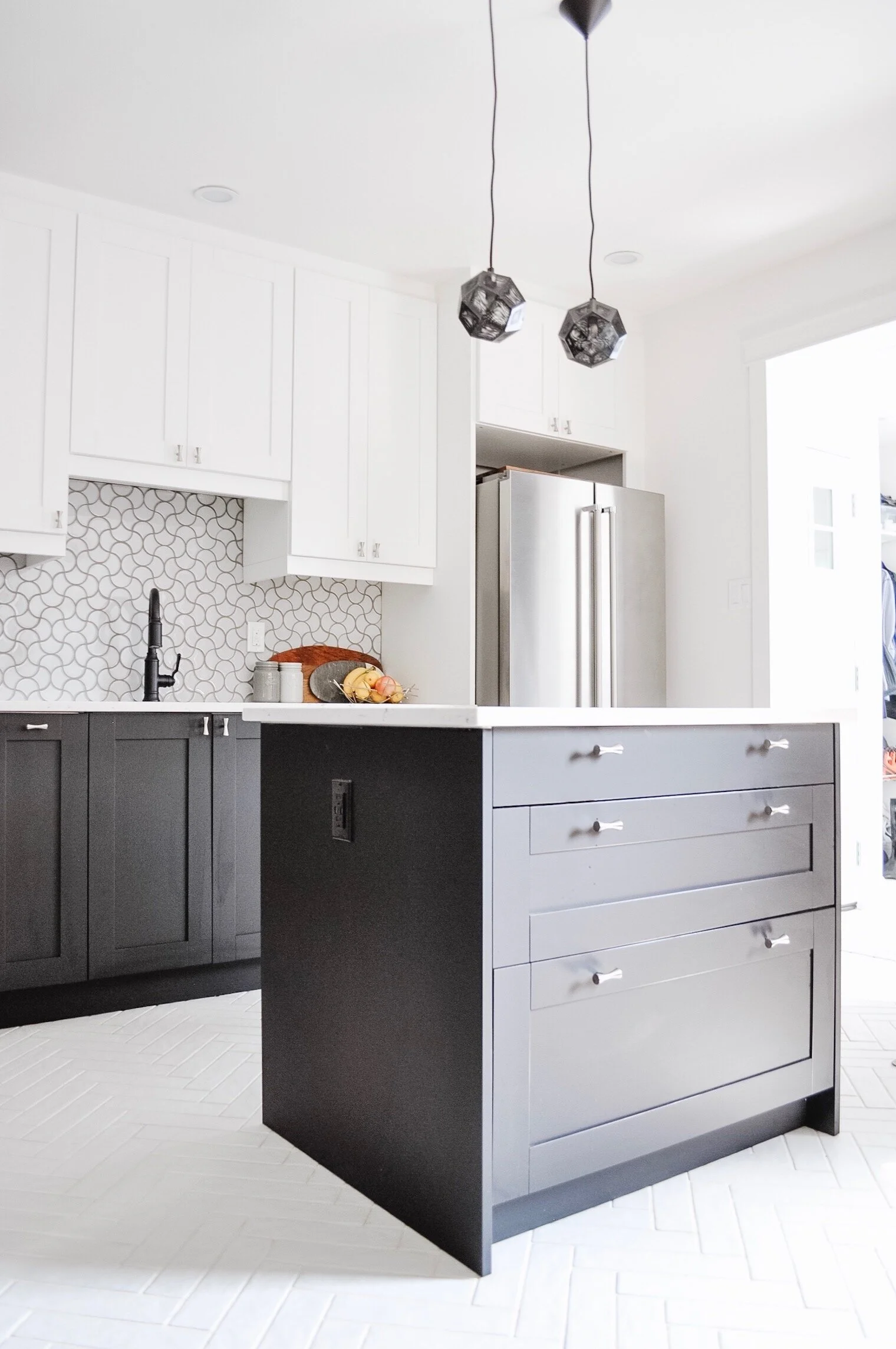
As mentioned, we looked at a few semi-custom options for cabinetry but couldn’t justify the expense for the size of the space. That and we weren’t happy with the layout options proposed. We decided to go the IKEA route but chose to do custom white and black Kitch shaker fronts. They are the Fenix NTM Shaker in Bianco Kos and Nero Ingo. We finished it off with silver Ballast Knobs from Anthropologie. I love the IKEA + Kitch combo since it gives a custom look without the cost of going custom.
And what I know you’ve been waiting for! The after photos!
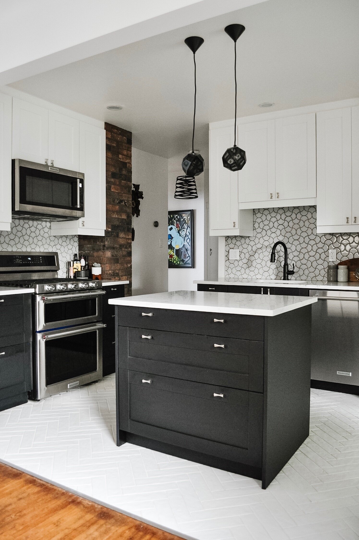
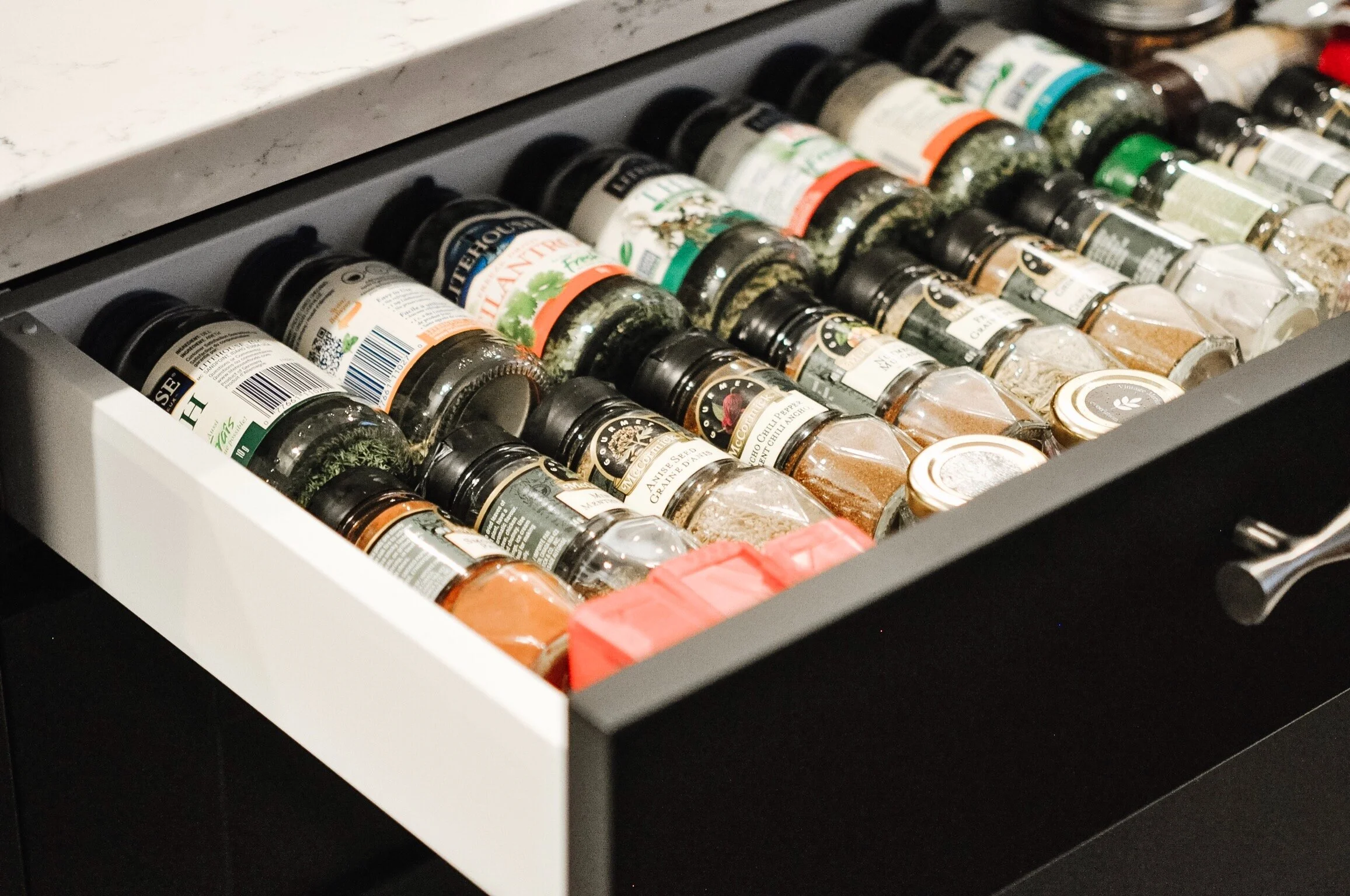
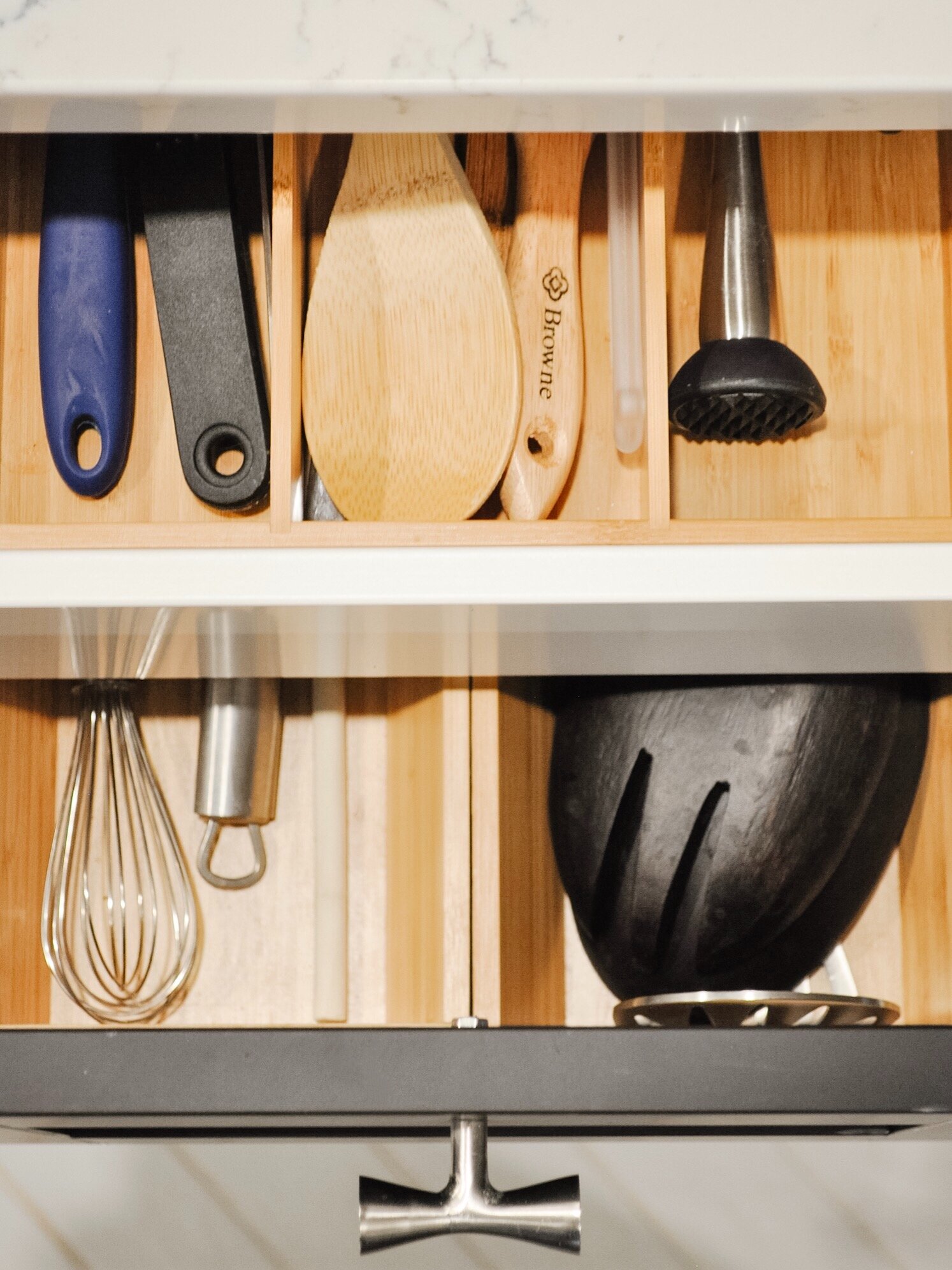
As the space wasn’t large enough to incorporate an island with seating, I chose to do two back to back, half depth (15”) cabinets to maximize the storage while creating a 36” x 30” work surface. On the dishwasher side the drawers house utensils, mixing bowls and pots. The dining room side has a spice drawer and then two drawers for small appliances and containers.
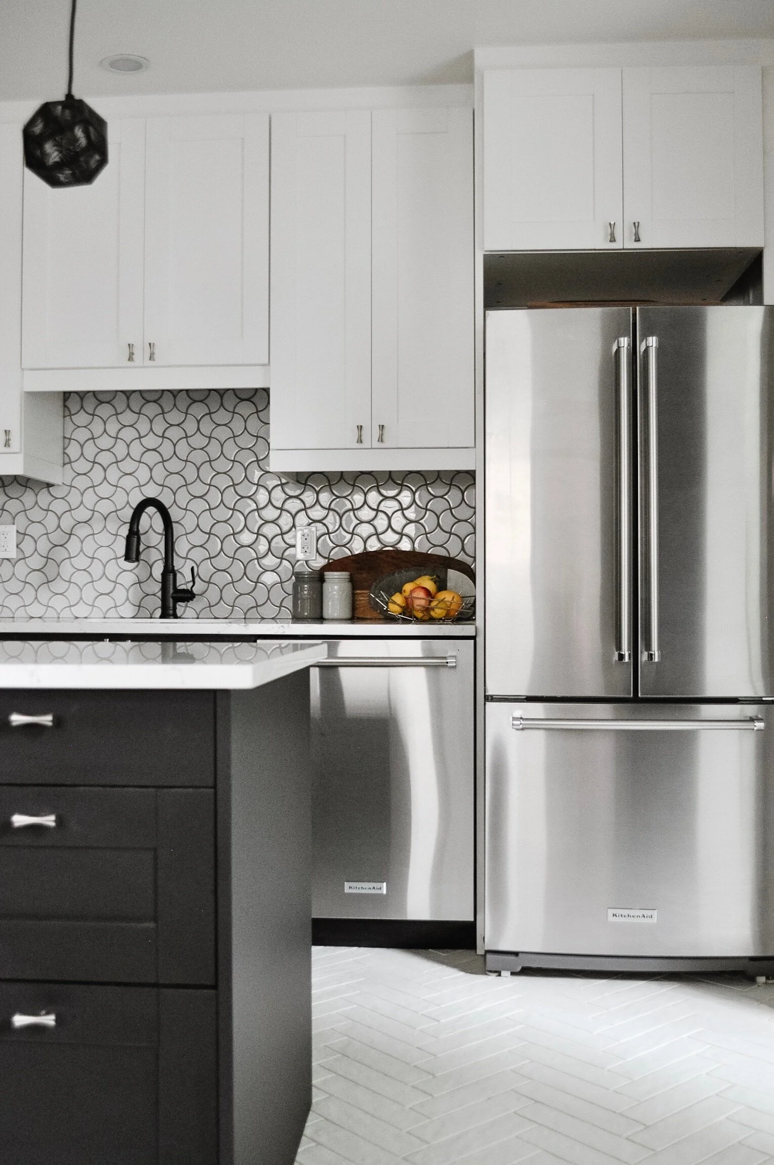
We went with a french door fridge so that the doors were smaller and didn’t interfere with the pathways. We debated going with a counter depth option as well but with only the 30” width to work with, the extra depth is helpful. At some point in the future I’m going to add a shelf above the fridge to finish that area a bit more. We placed the dishwasher beside it for the counter space it creates. This way there is a landing area for items going in and out of the fridge.
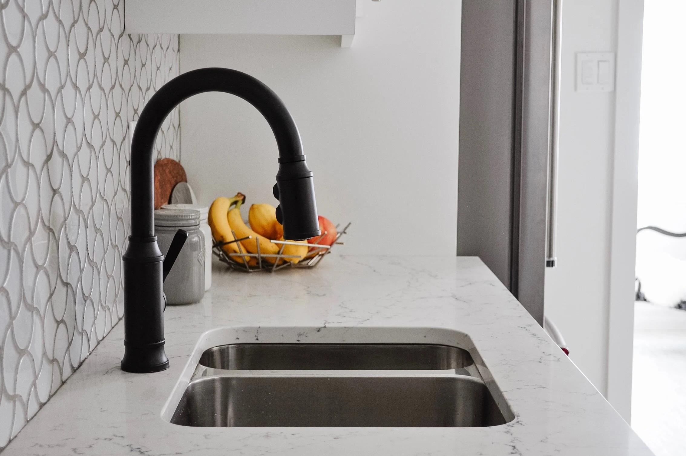
Another choice we made to get more storage was downsizing to a 1.5 bowl sink. We have no regrets about this one. We use the dishwasher most of the time anyway. Plus when we’ve had a full 2 bowl sink in the past, the second bowl ended up as storage for clean dishes. We use the half bowl for the same purpose but because it doesn’t fit as much, we’re forced to put items away much sooner. The black faucet ties in the black pendants and adds some contrast to that wall.
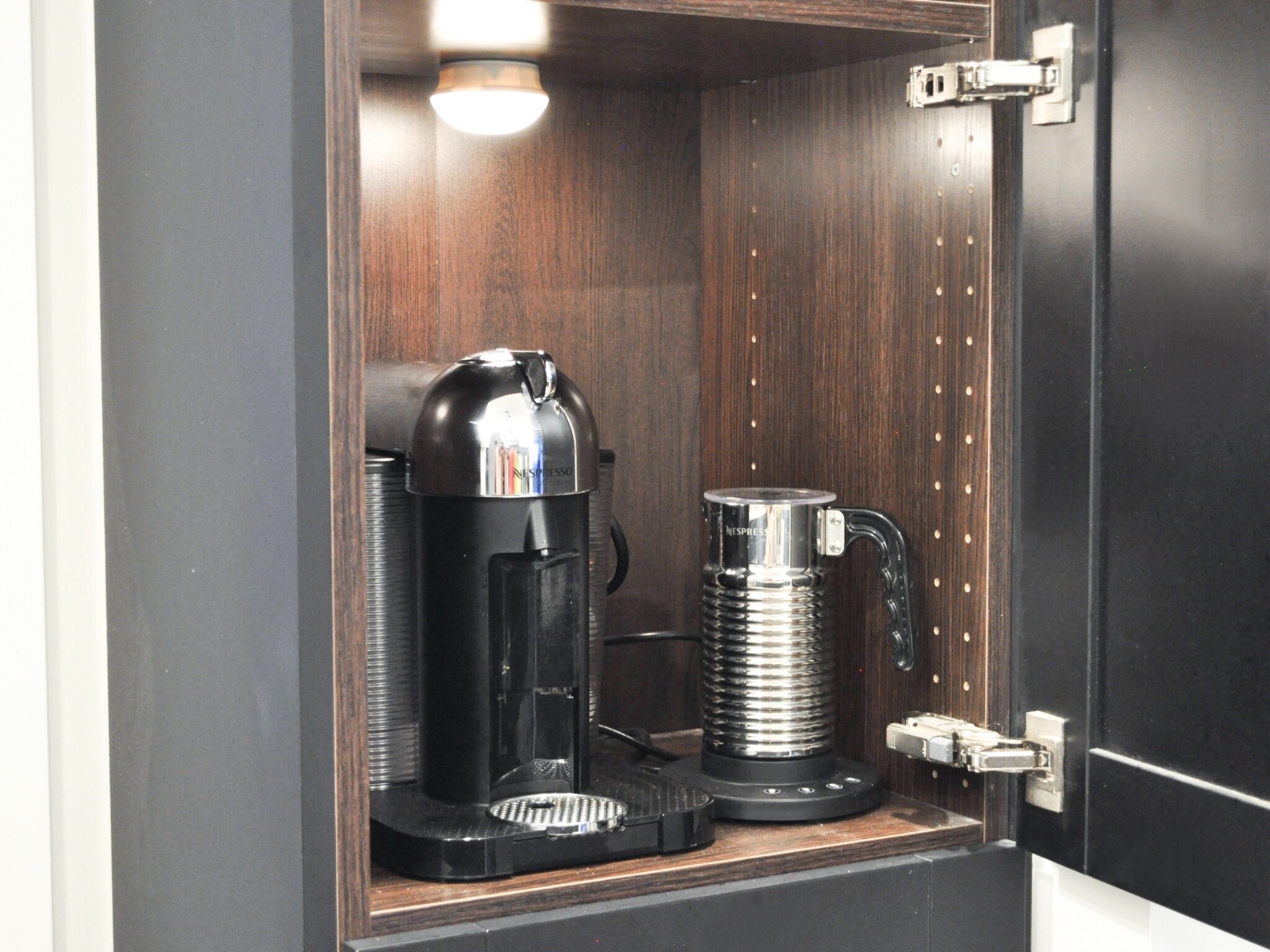
Having the full height pantry cabinet was a must. We needed the storage! It’s only half-depth (15”) but makes a big difference for us. My favourite feature of it is that we created a hidden coffee station. And the drawer below houses all the Nespresso pods. We added a motion detecting light inside for extra ease of use.
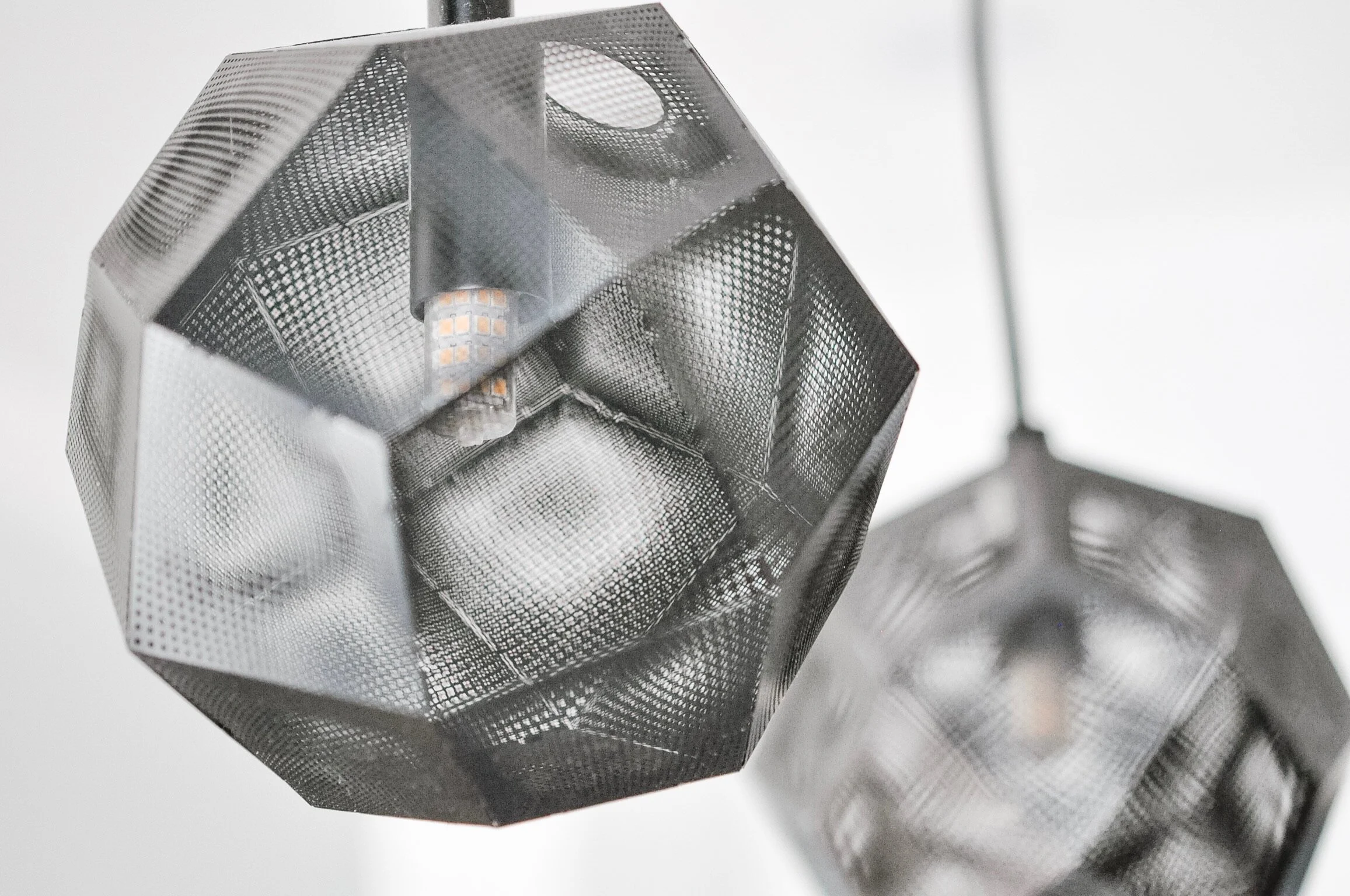
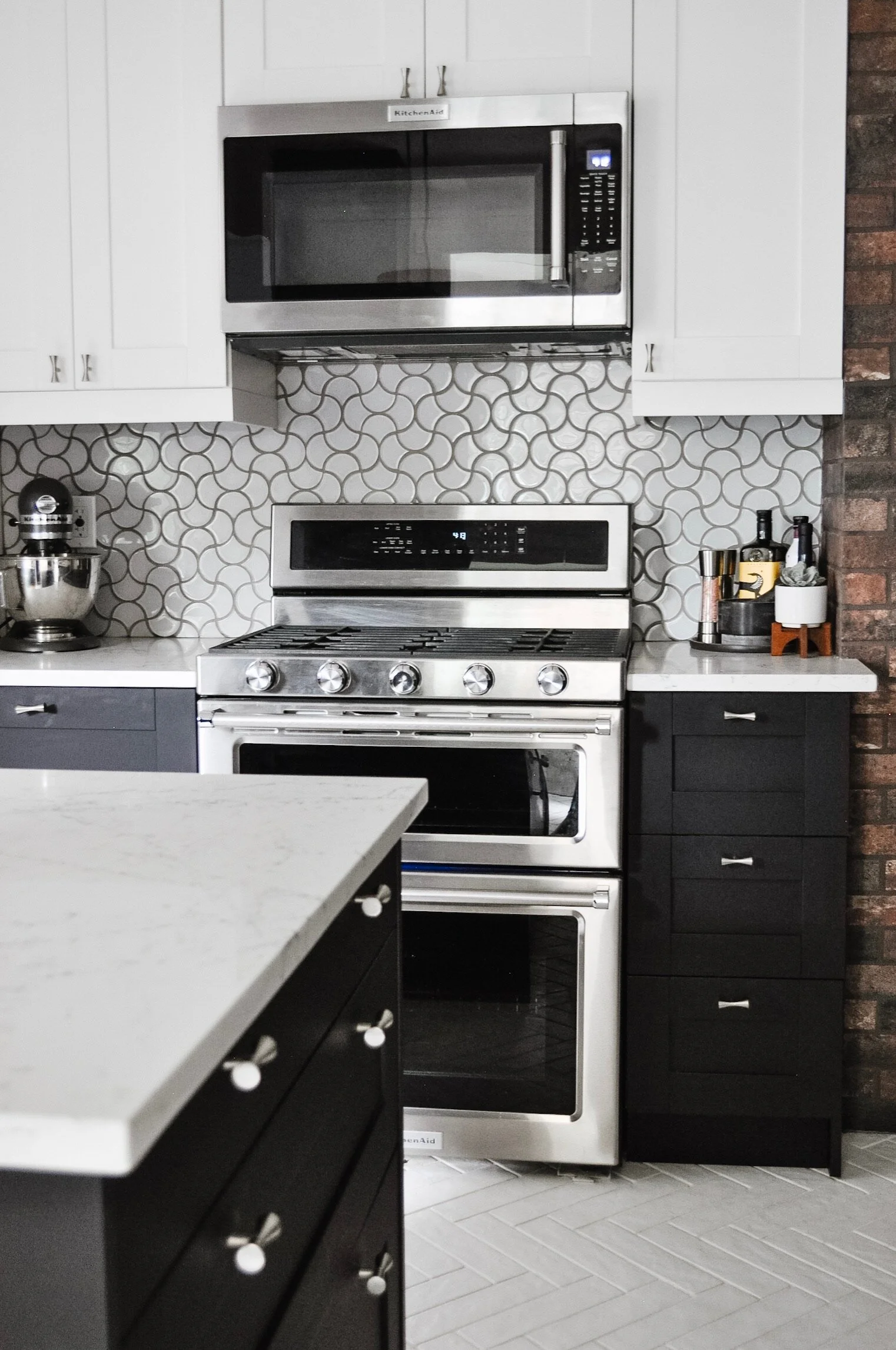
As the kitchen is smaller, we couldn’t afford to give away storage space for a standalone range hood. Nor did we have any other space for a microwave. The best option was the "microhood".
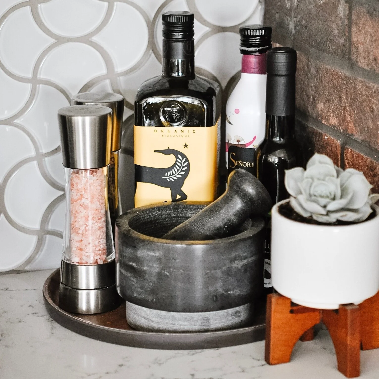
I also love the small hidden drawers. They are the perfect way to add extra storage for smaller kitchen items. We have one to the left of the range with a fitting that houses our knives. I find it easier to use than a knife block, and I like not having them out on the counter too.
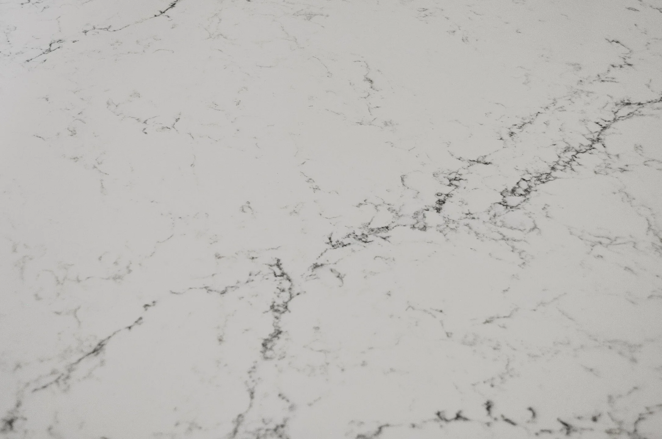
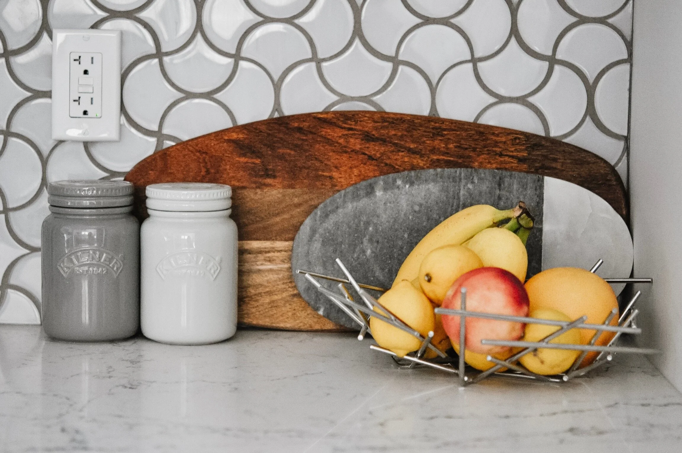
I almost always recommend quartz to my clients. I love it for its durability and the fact that it’s low maintenance - that and it looks so good. We went with Caesarstone White Attica throughout. Side note: I’ve used this same countertop in two other kitchens I’ve worked on. It’s definitely one of my favourites at the price point.
The chimney was definitely one of our little splurges. Since the cinderblock is not particularly enjoyable to look at, we used a brick tile to add a ton of character. Our tile setter did a great job at positioning and cutting the tiles so that they look like real bricks.
The other challenge I gave to our tile setter was the backsplash. We went several months without a backsplash because I couldn’t make a decision. I pondered continuing the brick theme. I had a desire to do a fish scale pattern. I had so many different samples that I considered. Then one day I came across this pattern while I was browsing for inspiration. I was sold. The next decision was what type of tile to go with. I had a matte finish ceramic and a glass tile to choose from. I decided on glass to add more reflectiveness to the space which features a lot of matte finishes. This tile actually comes by the sheet and not in this pattern. So we sat and pulled each tile off the sheets and then the tile setter put each one in place by hand.
The grout colour has a hint of warmth to it. It ties in with the brick and matches one of the subtle colours in the countertop. I love how the curves of the backsplash contrast with the more linear look of the rest of the kitchen while also complimenting the curve of the knobs.
The mudroom chair was actually one of the first pieces of furniture we purchased for the space. The moment I saw it, I knew I wanted it in the mudroom. And that was before I’d made any other decisions on what was going to happen in that space. The artwork are photographs of Taíno cave paintings from the Dominican Republic. I’d purchased them from the photographer, Daniel Duvall, while I was living in the Dominican.
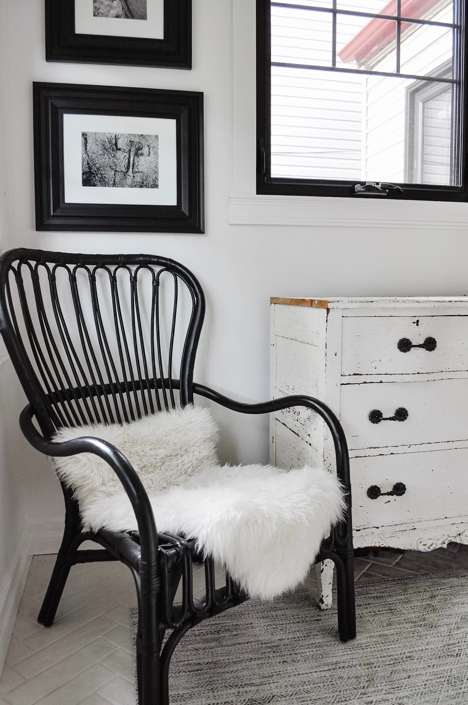
The dresser is an antique that has been in my family for a few generations. It’s definitely seen better days and I may fix it up one day, but for now we like it as it is. I did put new handles on as it was missing a few which made it difficult to use. We use it to store things like our reusable grocery bags, recycling and garbage bags, and of course, lots of dog gear.
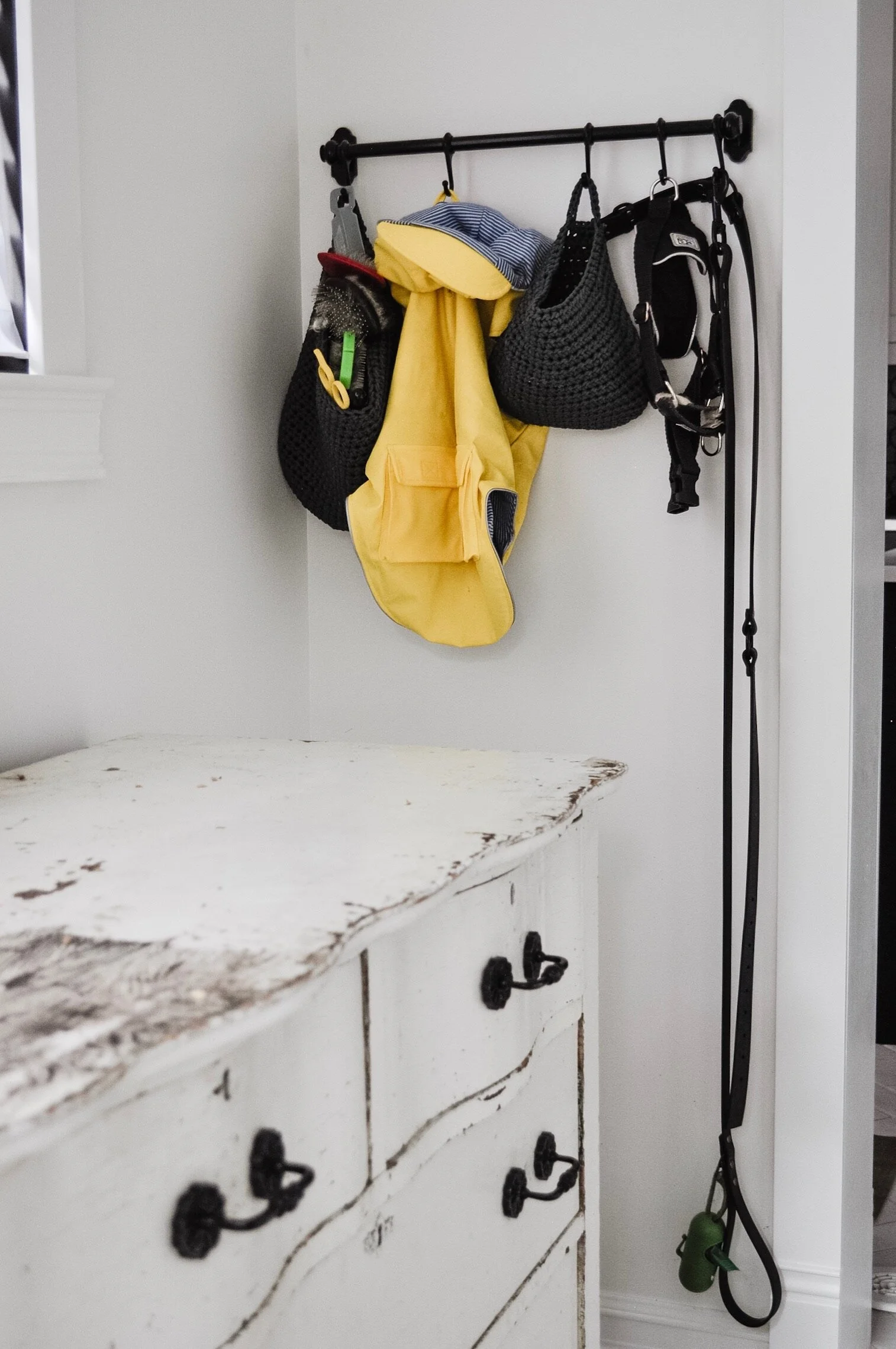
The most used dog gear gets hung up on an IKEA FINTORP rod and hooks. The woven soft baskets are great for holding the grooming gear and dog booties.
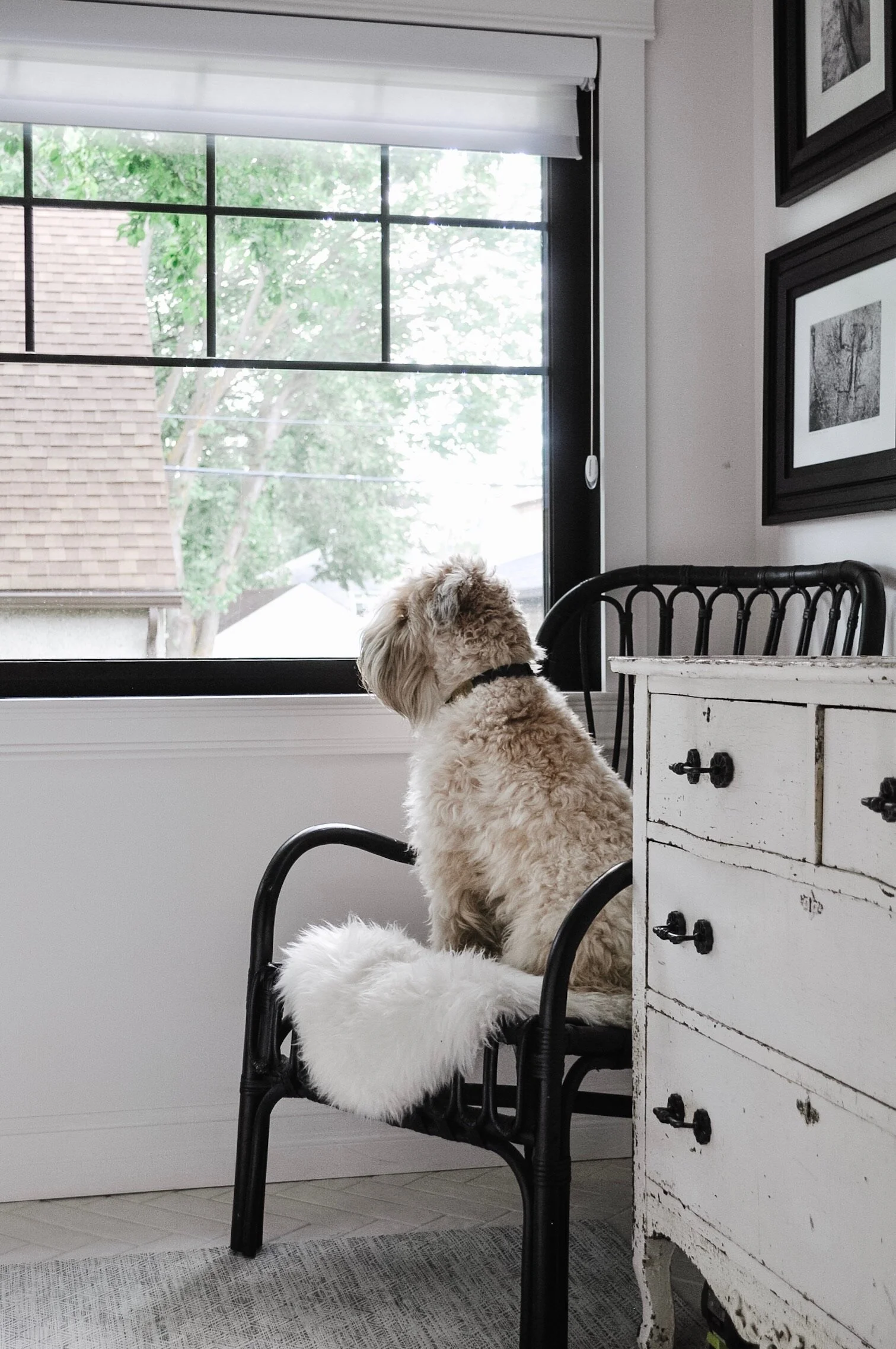
I wanted a chair in the mudroom because it has the best view of the backyard and some of the best light in the house. I’ll often sit here, sipping my coffee, while watching Wallace run around in the backyard. As you can see, he also likes the chair and the view.
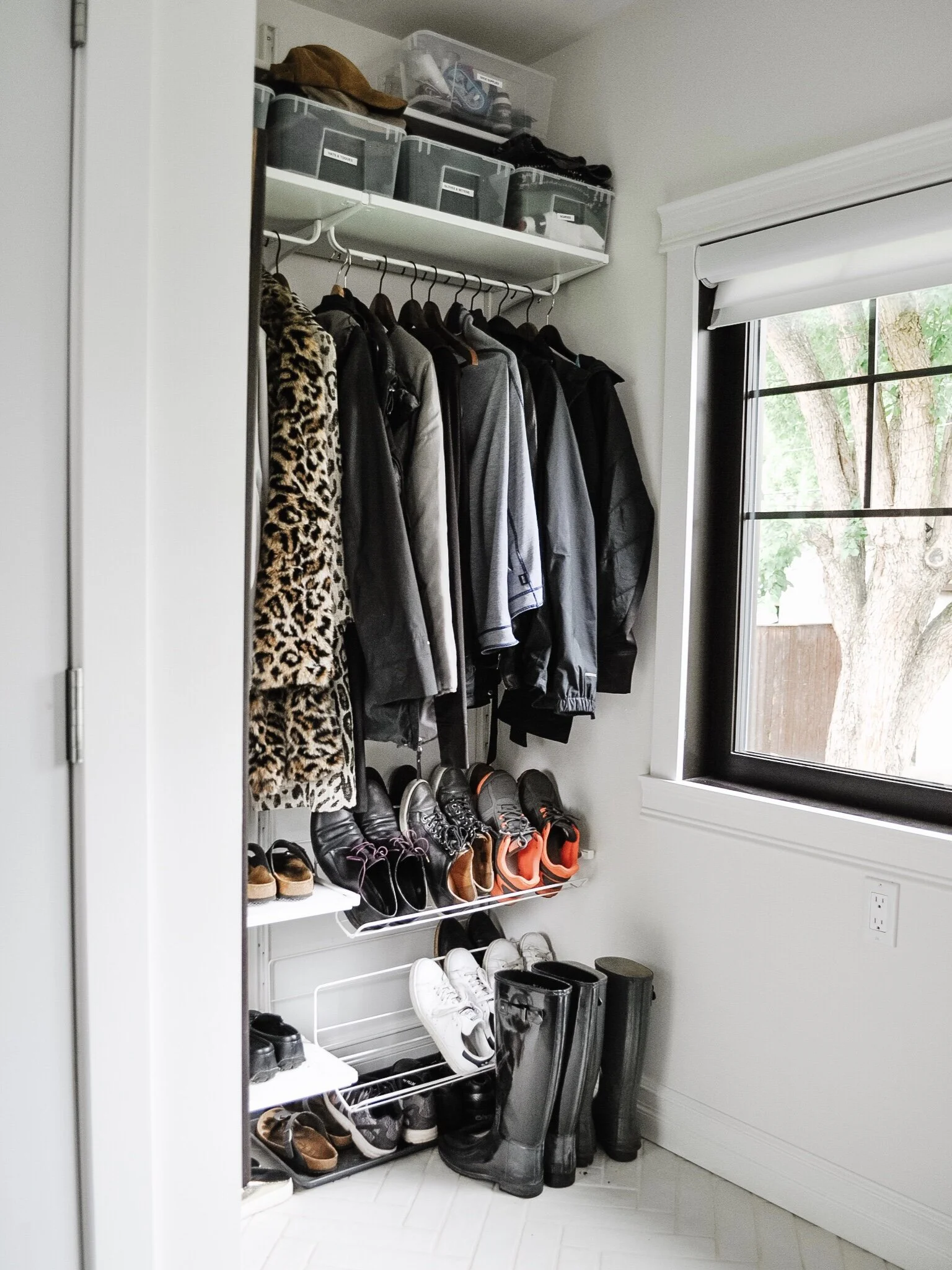
As mentioned, we added a bit of extra space to the mudroom so we could fit in an open closet. Because of the position of this window (and the one in the lower mudroom) we couldn’t create an enclosed closet. We created this setup with IKEAs ALGOT system.
And there you have it! Our cozy but beautifully functional kitchen and mudroom space!
I’ve still got several more spaces to show you so stay tuned!
Kierstin Smyth Design
Edmonton Interior Design Consultant