Canossa Kitchen Renovation
It’s time for another Edmonton kitchen renovation! I’m so excited to do the full reveal on this project – the transformation is pretty epic, if I do say so myself. I first met with the homeowners in the fall of 2020. They were ready to update their kitchen to be more functional and current, and also wanted it to feel more spacious with better lighting. When I saw the space, I knew there were a few different directions we could go. There were simpler updates that would look great and meet their goals, but I also had another vision in my brain. To be completely honest, I was nervous to present it; it was a big change and it meant a bigger budget, but it was too good to not share. I’m so glad I did, because they loved it!
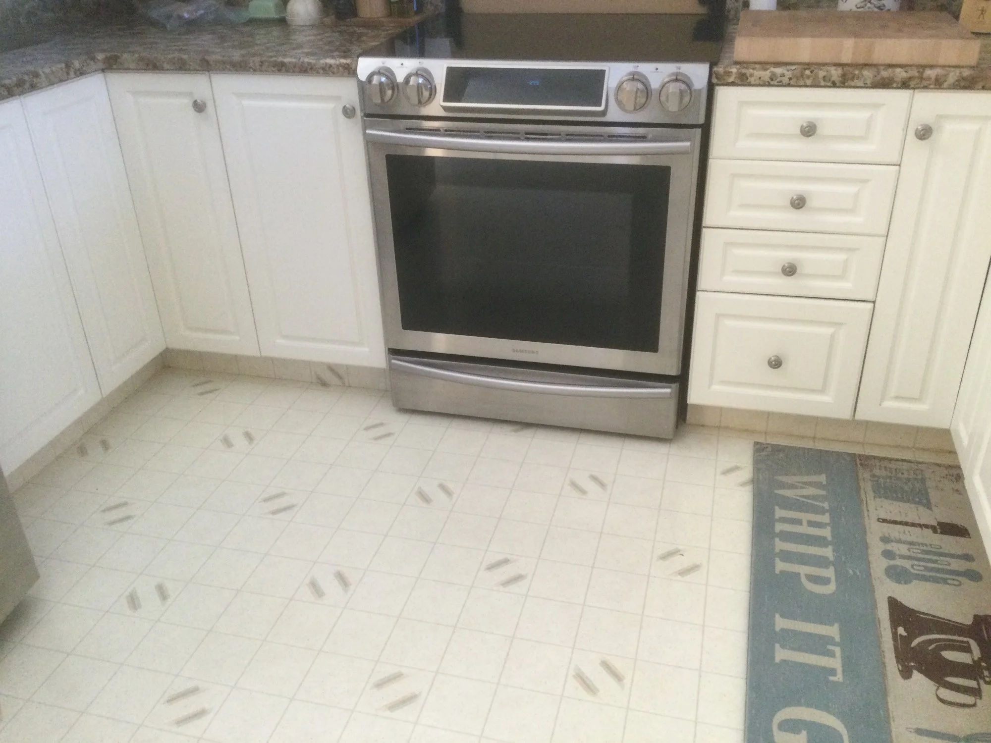
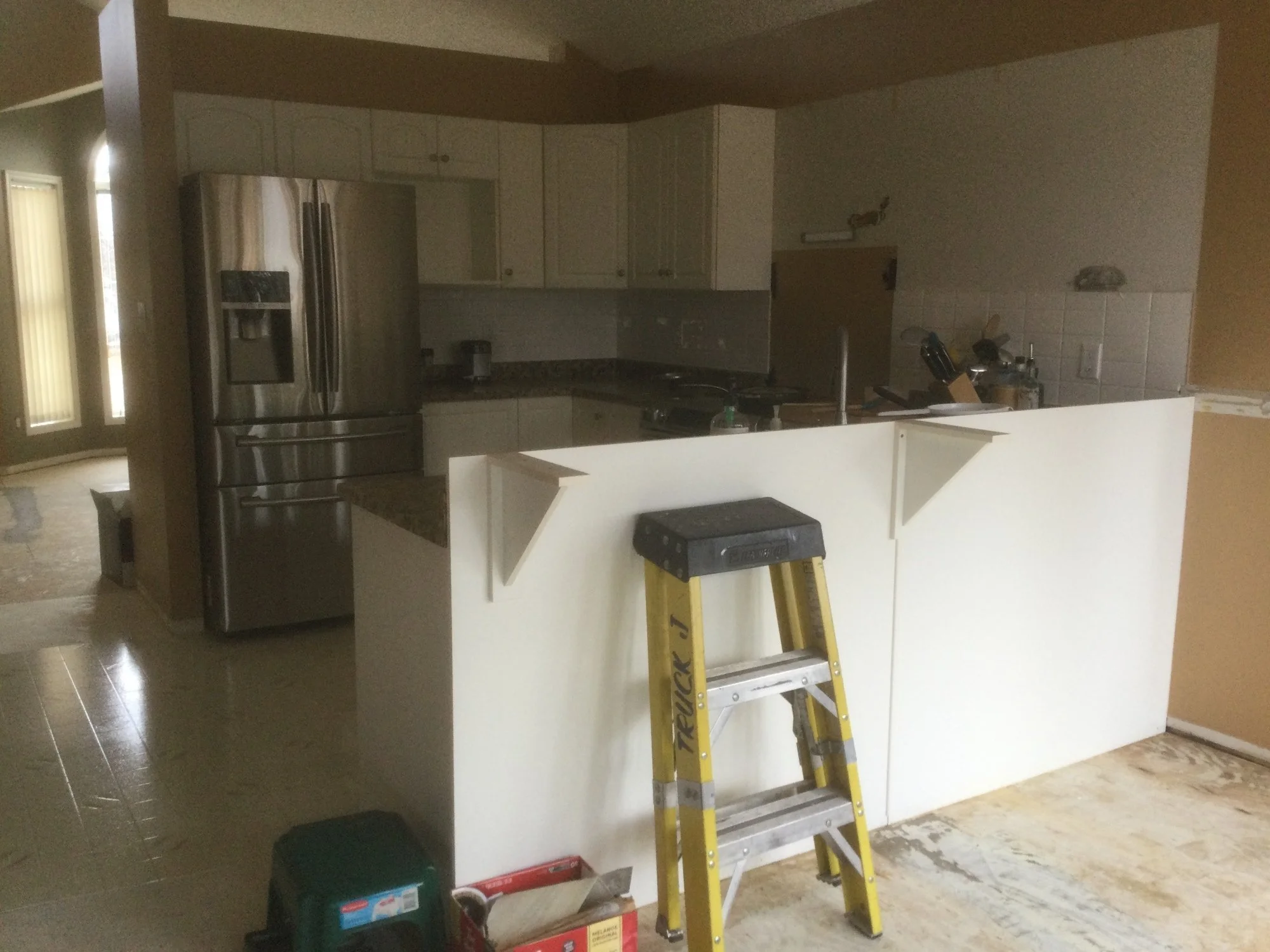
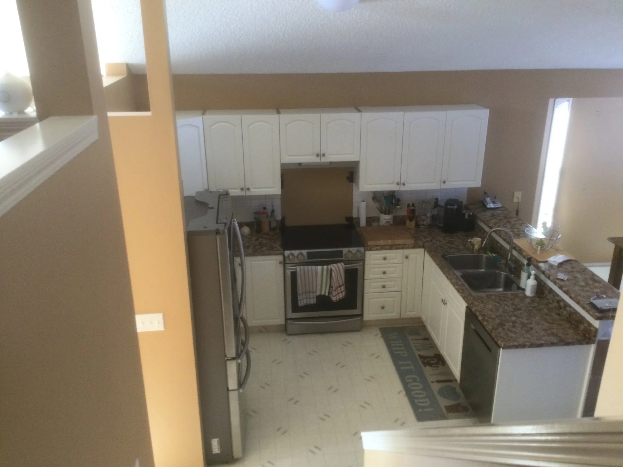
What We Started With
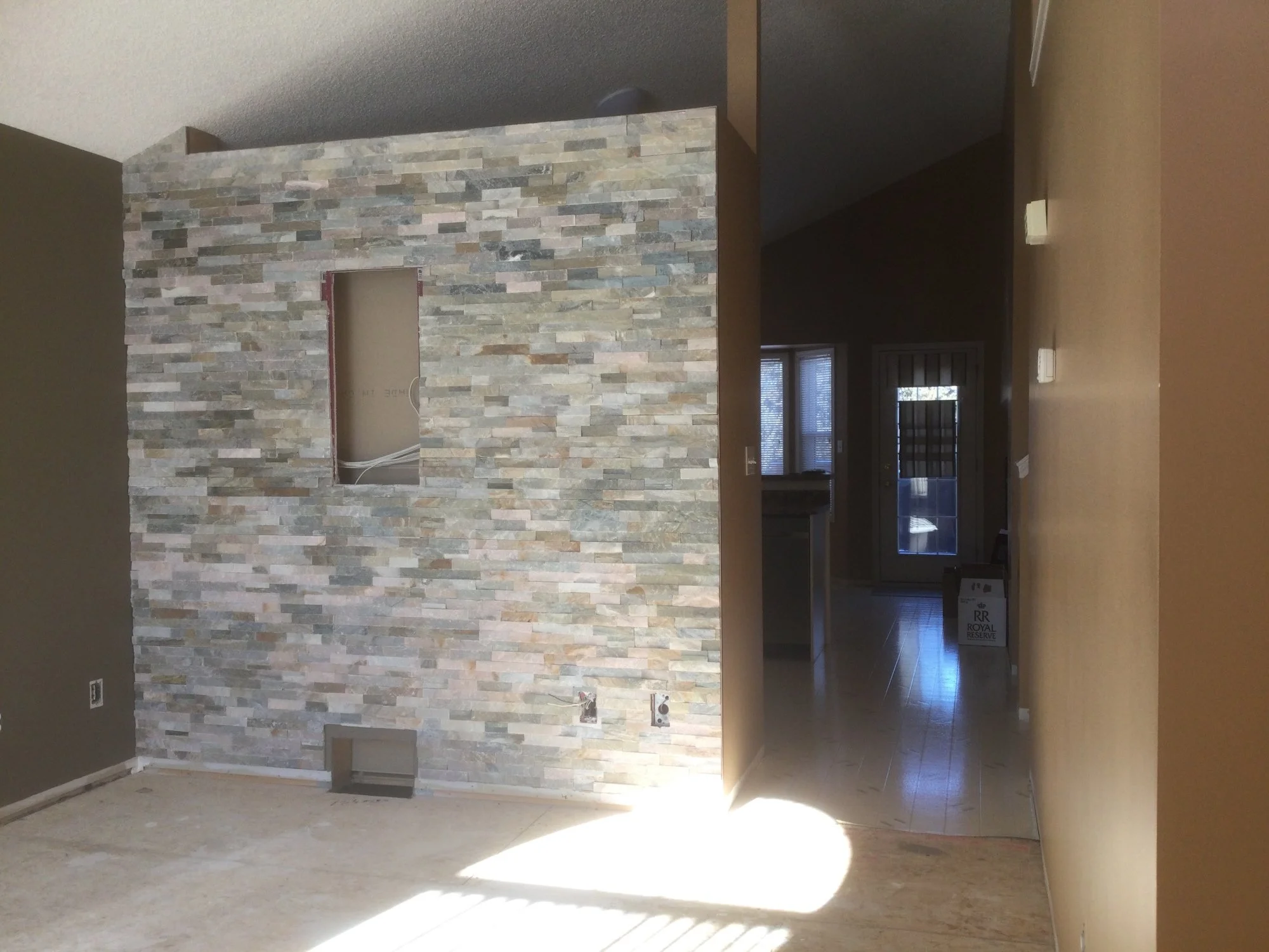
The existing kitchen was showing its age and, while my clients had done updates to it on their own over time, it was ready for a big change. The wall that divided the front sitting room and the kitchen meant a lot of the amazing south facing light didn’t make it into the rest of the house. So the kitchen was dark and not as inviting as it could be.
The Design Options
The goals for the space were:
more light and an updated design
increased function, better storage, more counter space
a space that felt warm and inviting, a space you want to spend time in
a space where family and friends would feel comfortable, welcomed and at home
Option 1 kept things essentially the same but with more storage, added functionality and a nice range hood.
Option 2 was where we got crazy (well not too crazy, just the right amount of crazy)! Goodbye wall. Hello beams and extra-long island. Opening up this space allows light to flood through, and we could easily add more storage and more seating to the space.
You might be thinking that Option 2 was a no-brainer, but don’t forget about the work needed to achieve that look: removing a wall, repairing drywall, moving plumbing, electrical and HVAC – and the additional investment that it would require.
The overall look and feel of the space stayed pretty consistent throughout the design process. My clients already had a room in their home that they had updated and loved, so we used that as the inspiration for the kitchen. We settled on flooring, cabinetry, tile and countertop quite quickly, and then proposed a few options for the lighting, hardware and plumbing fixtures. We ended up with a blend of what you see here in options 2 and 3:
Let’s renovate!
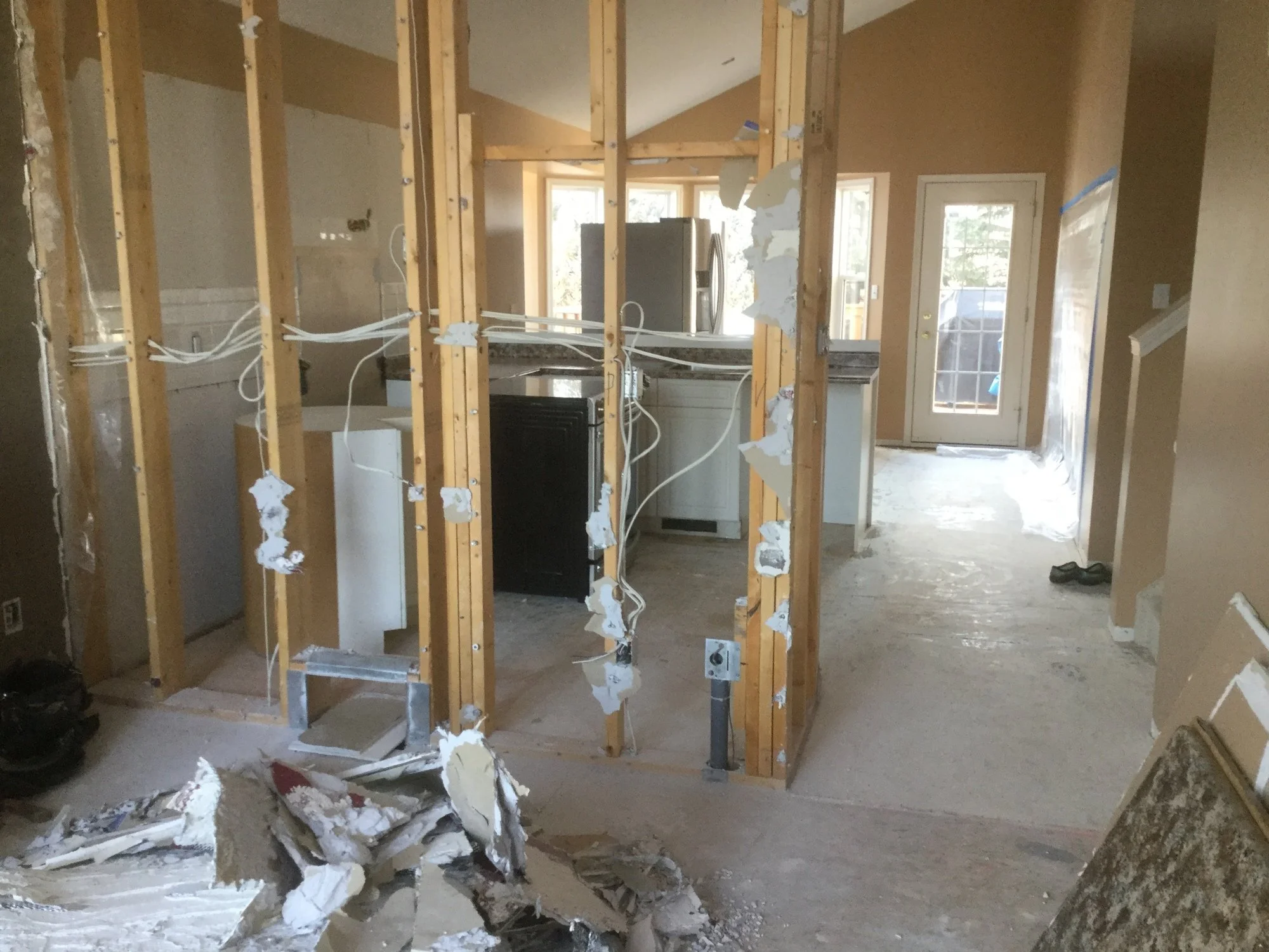
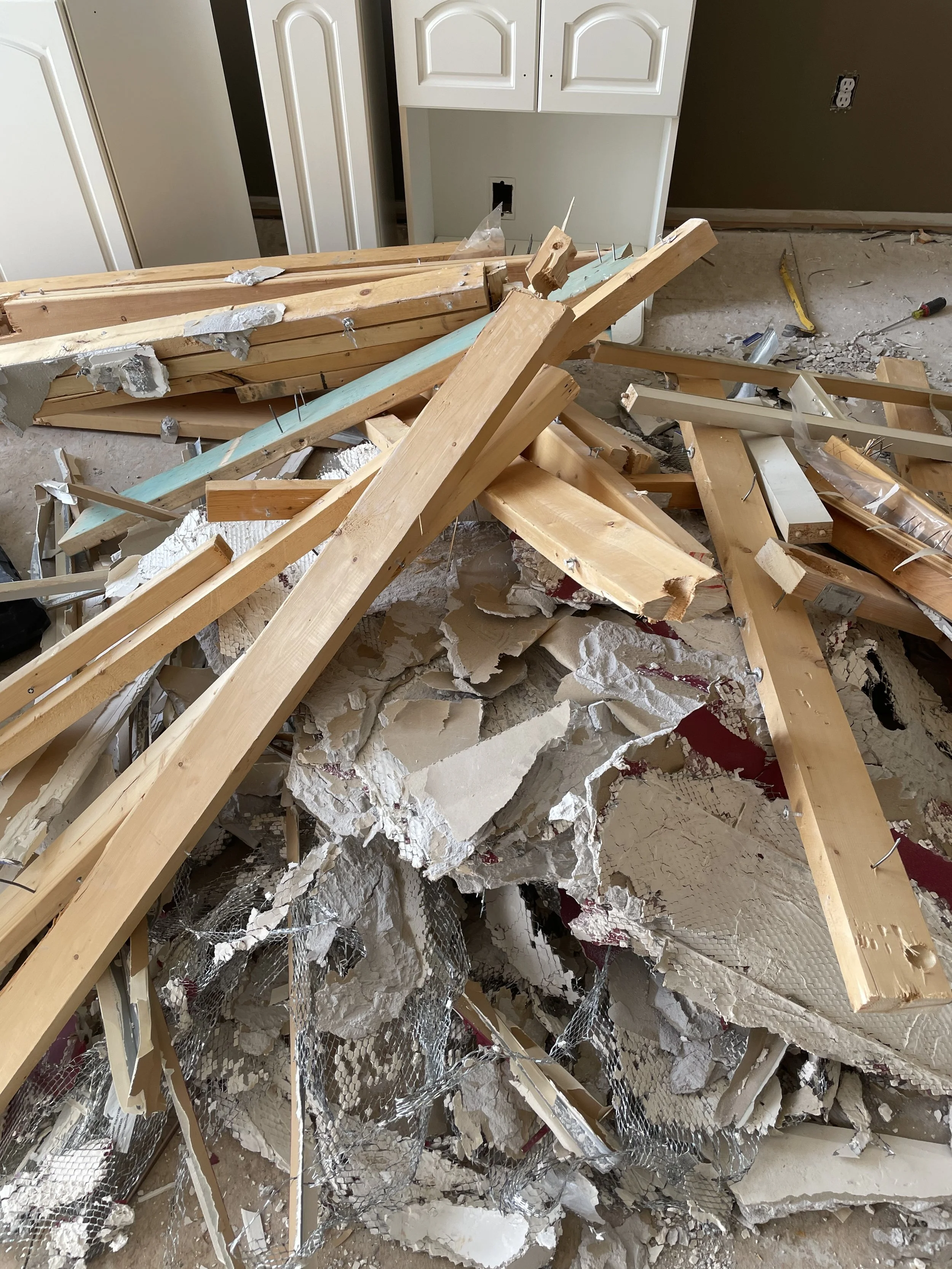
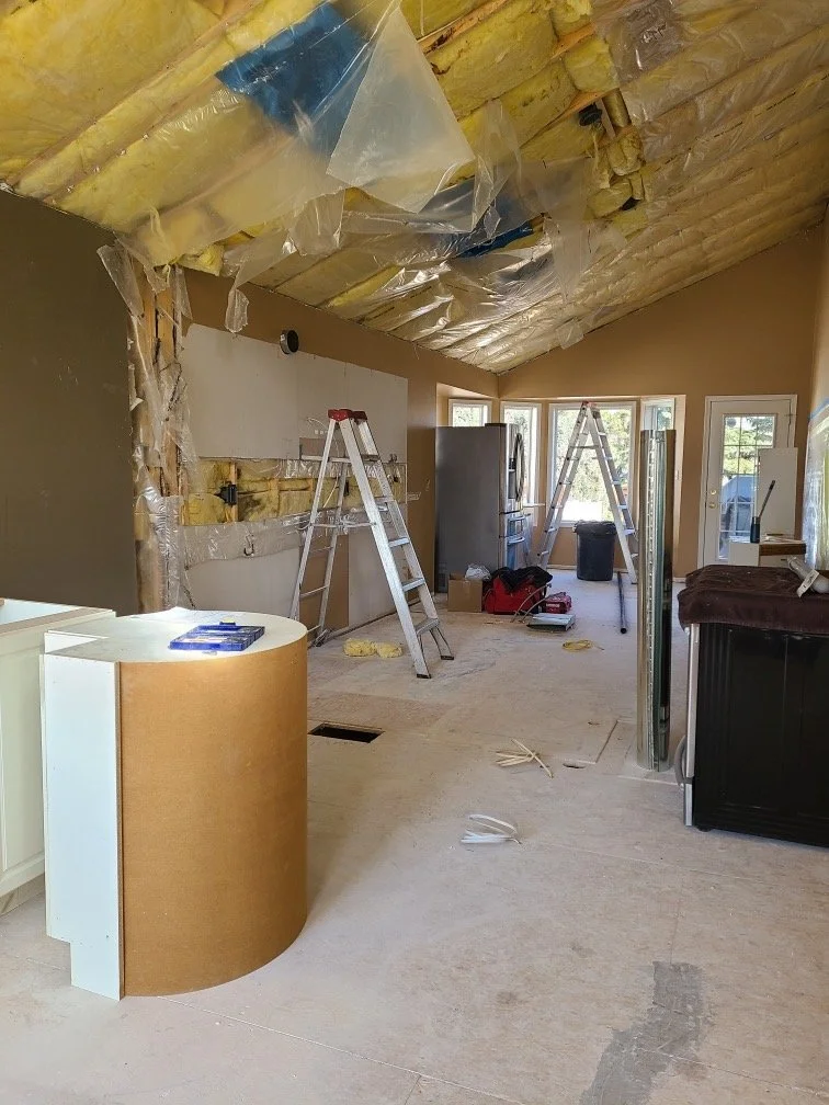
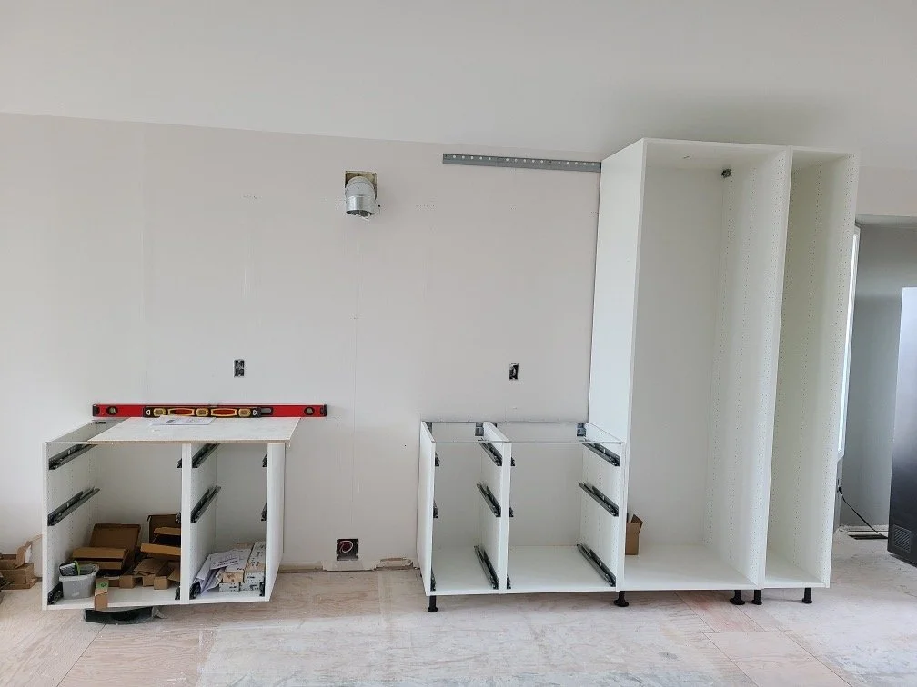
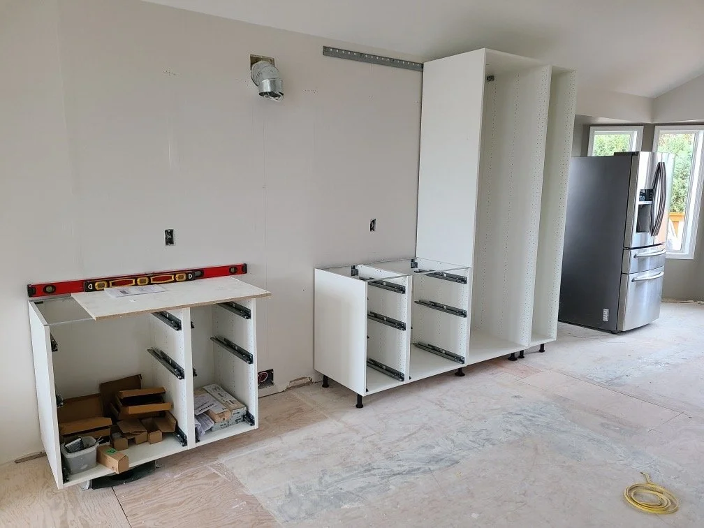
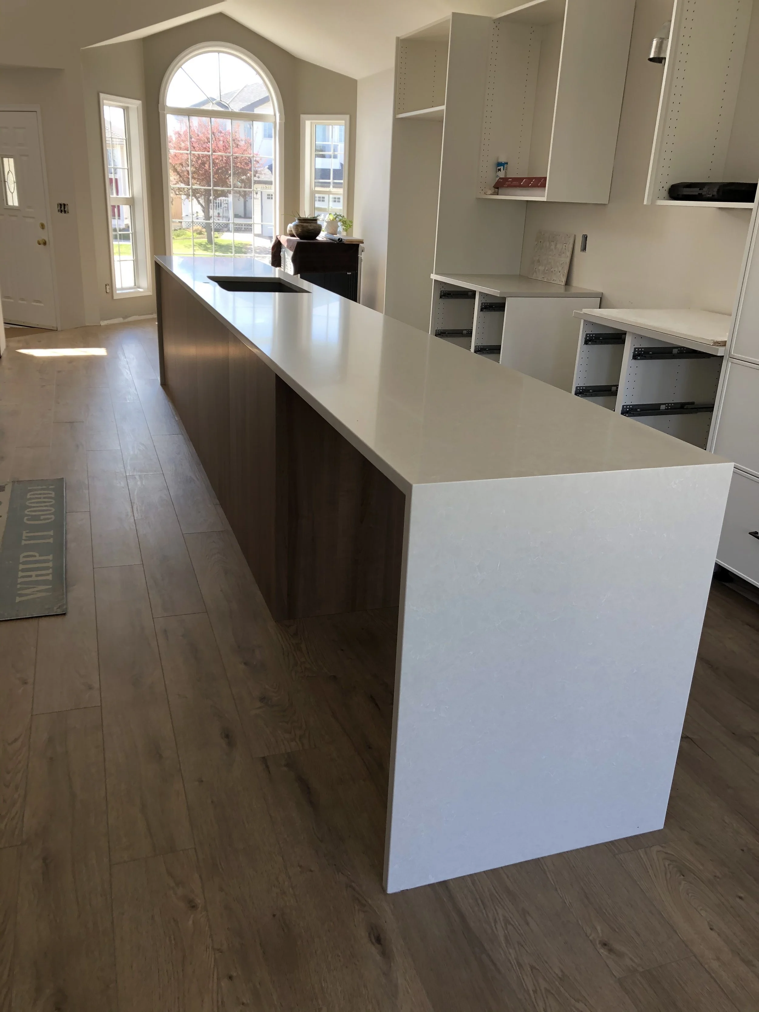
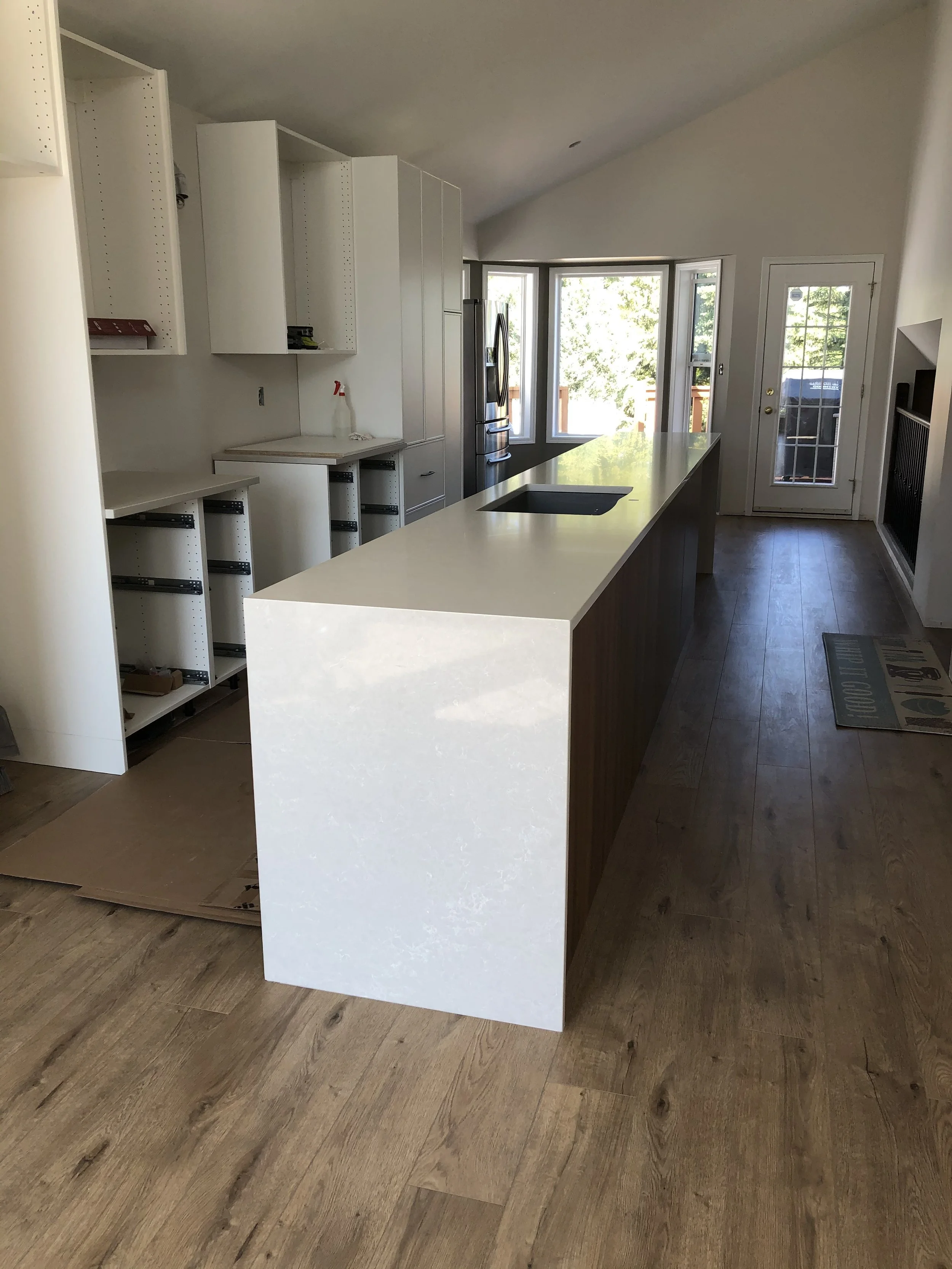
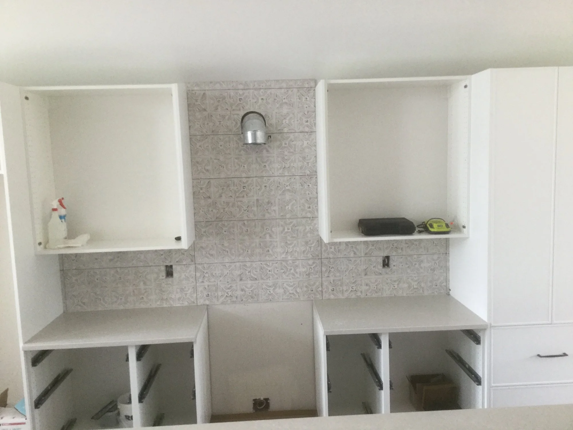
My clients took care of the first stages of the renovation on their own, ripping up the existing flooring (and exposing the old linoleum in the process!), removing the cabinetry and appliances. We were also very lucky that the area under the kitchen was unfinished, as this made it much easier to make the adjustments to the plumbing, electrical and HVAC.
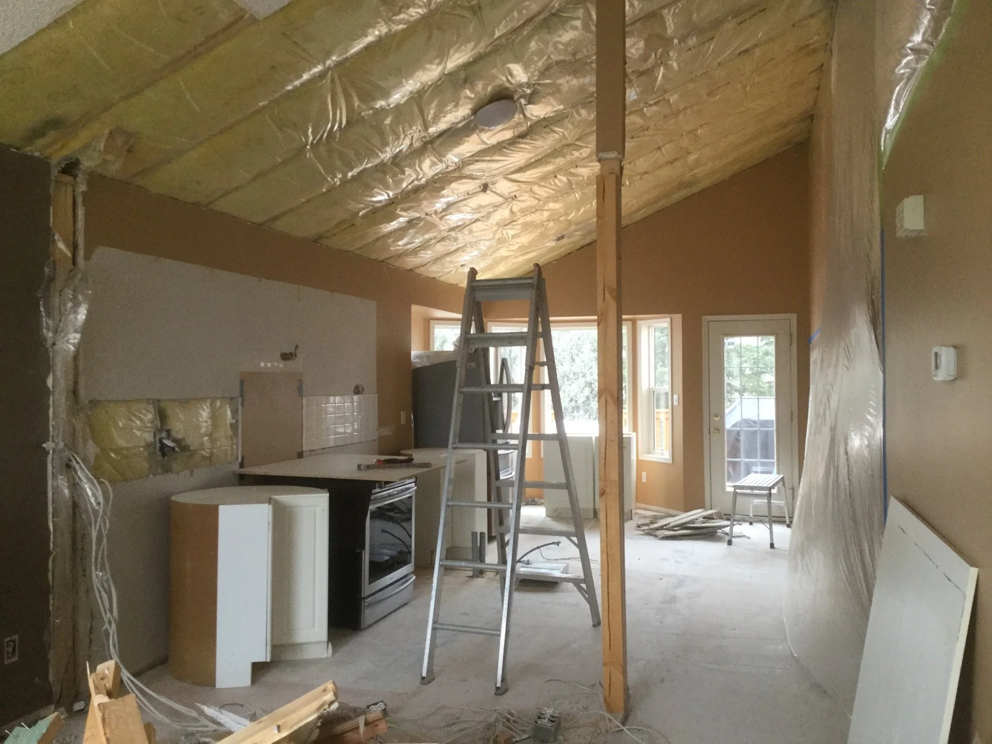
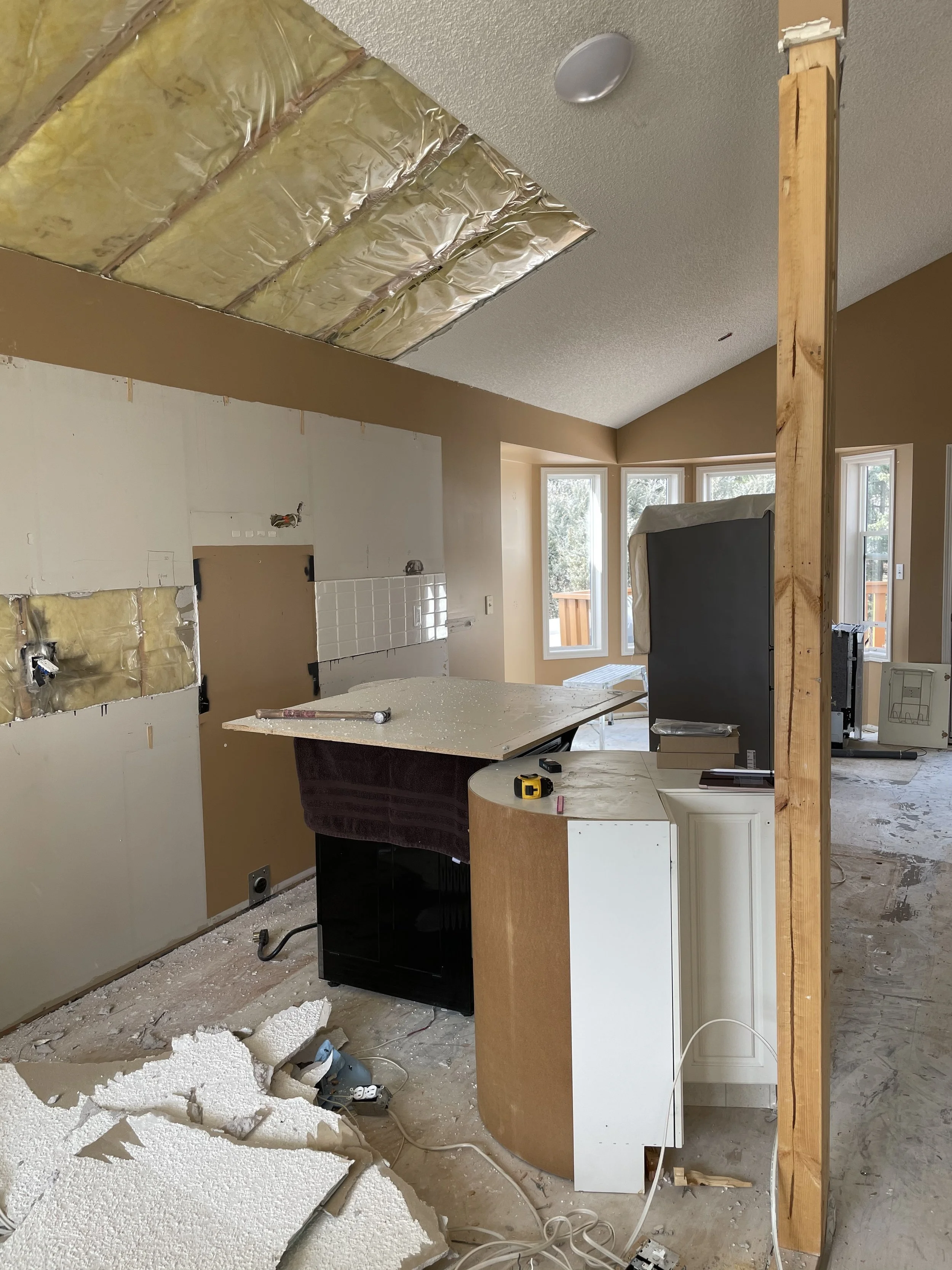
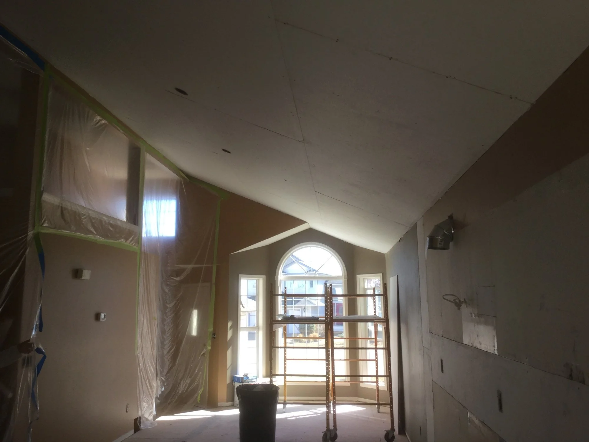
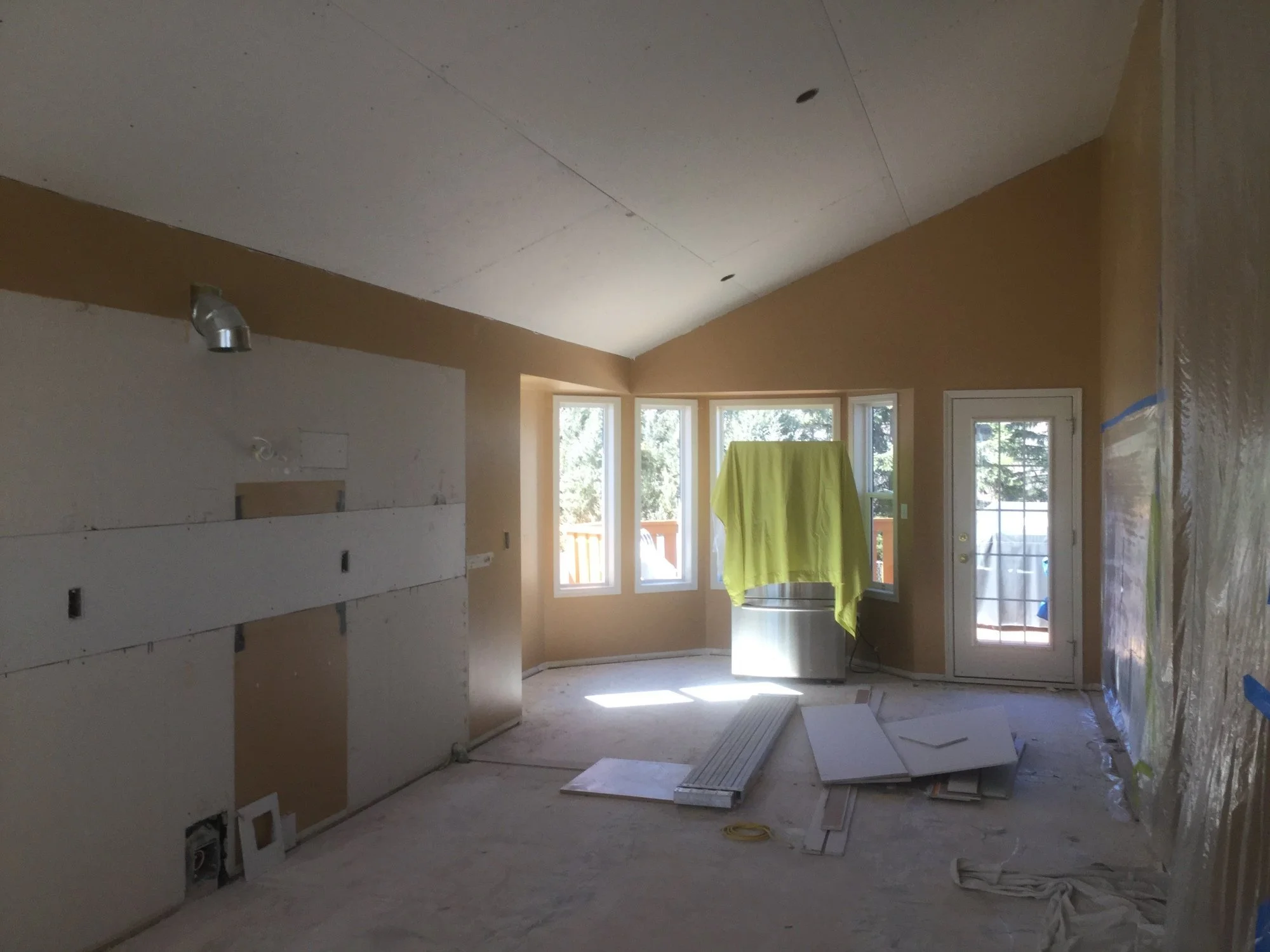
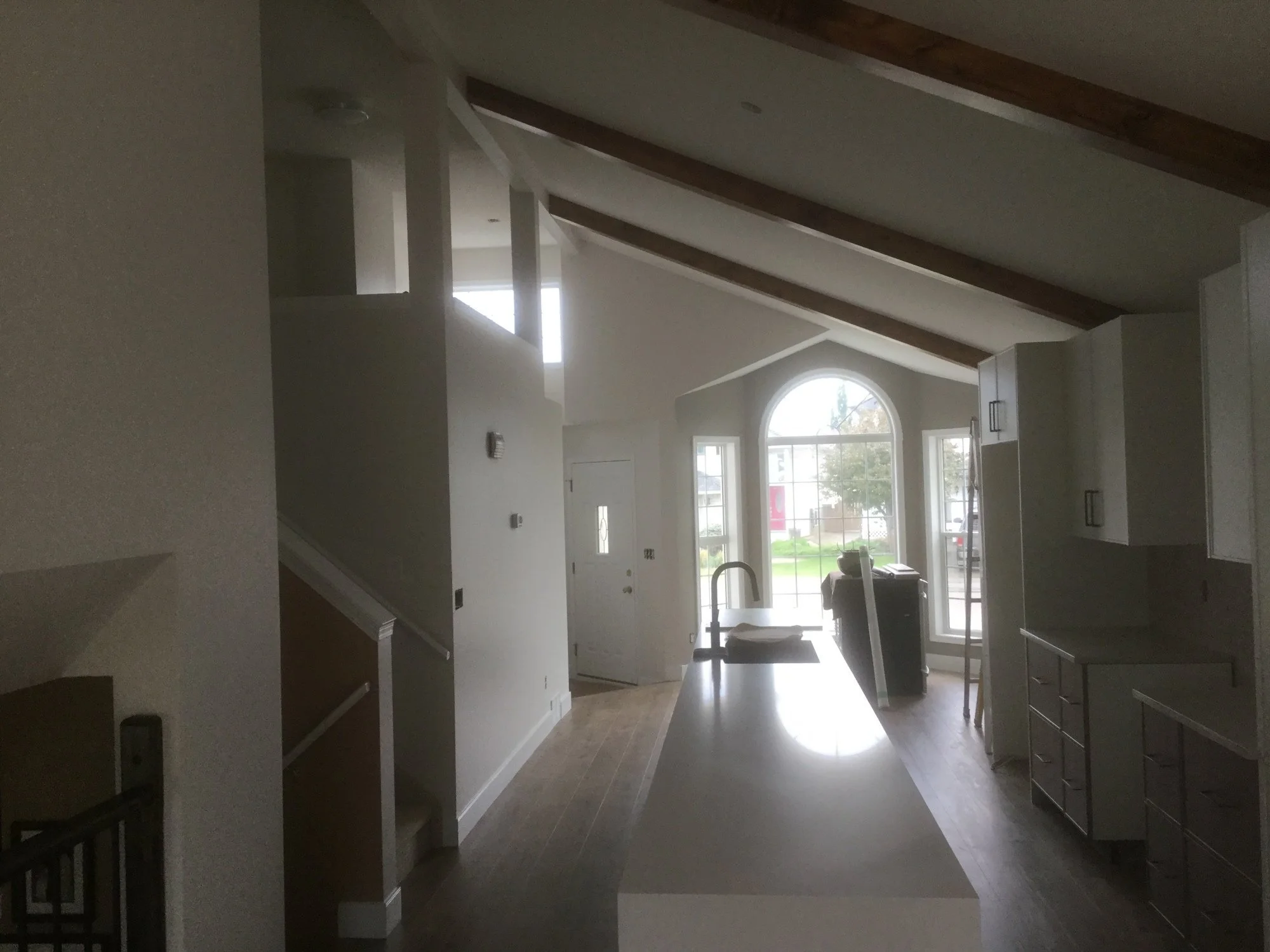
Then the rest started coming down. How satisfying is it to see that wall and the popcorn ceiling come down? The answer is: very satisfying! And that clean new drywall on the ceiling? So good.
I know I’ve said this before, but every renovation has some sort of a hiccup. The two major ones that we dealt with this time were the decision to remove and re-hang all of the drywall on the ceiling which was not part of our original plan but was the right decision based on the state of things once we had started the work. And then a very tragic event happened when one of our trades passed suddenly. This was not an easy moment for any of us. It meant grief and sadness for our team members who knew him well. It meant a halt to the project while we found someone who could take on the job right away and for the same price. It wasn’t anything we could have planned for and felt like an impossible situation for several weeks. But we all got through, the work got done, and we took the time to remember as we worked and moved forward.
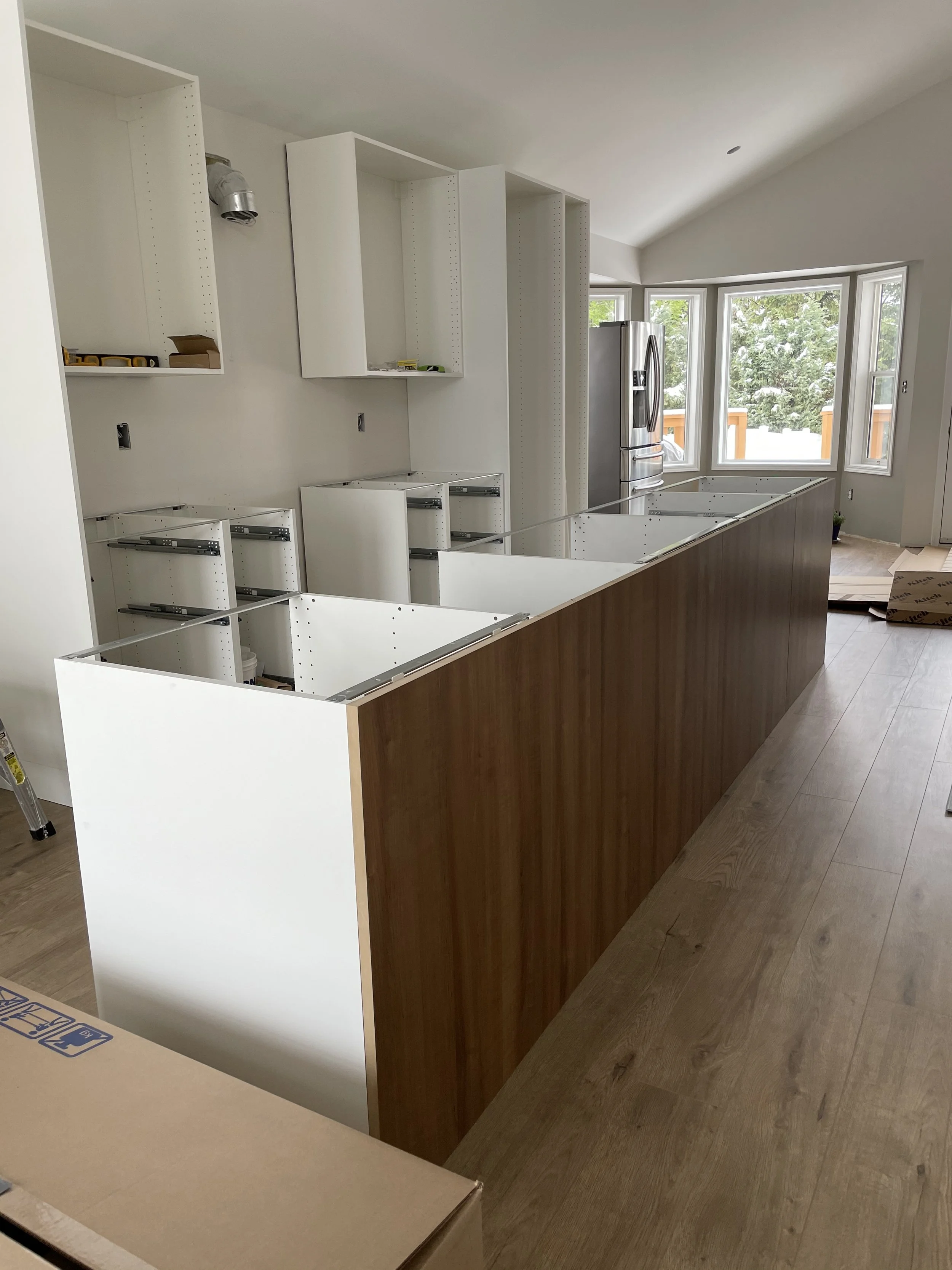
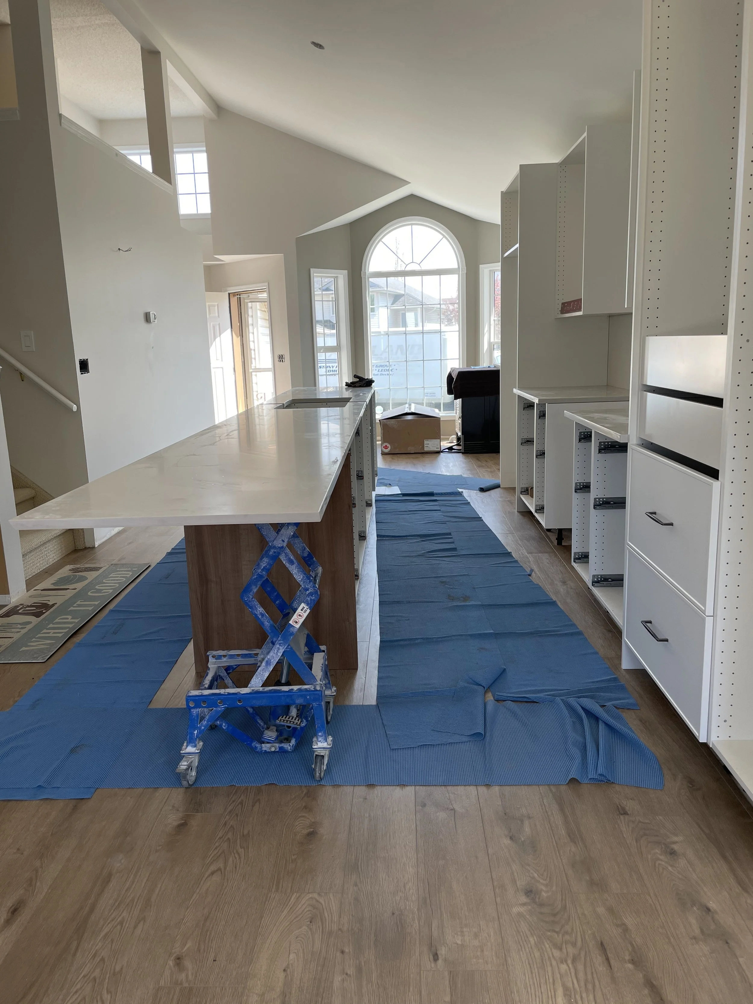
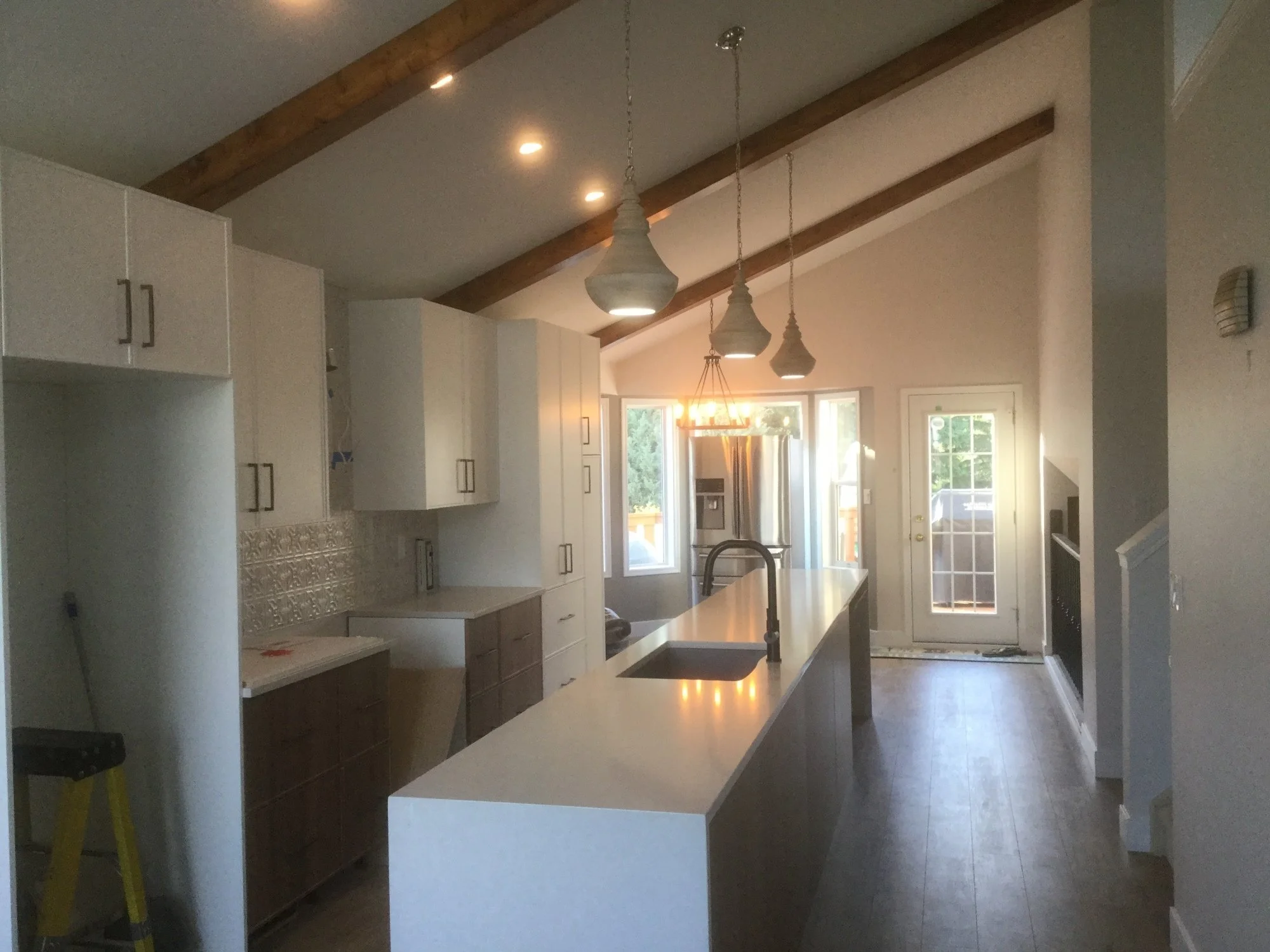
And then it was bright! We went with one of my favourite whites (remember: just because it’s one of my faves doesn’t mean it’s right for your space), Sherwin Williams Heron Plume, as well as a darker accent in the alcoved windows at either end of the space to add depth. Once that paint was on the walls it really felt like the transformation had begun. Next came the cabinetry and flooring, then the countertops, plumbing, backsplash, beams, light fixtures and finally, appliances!
The end result
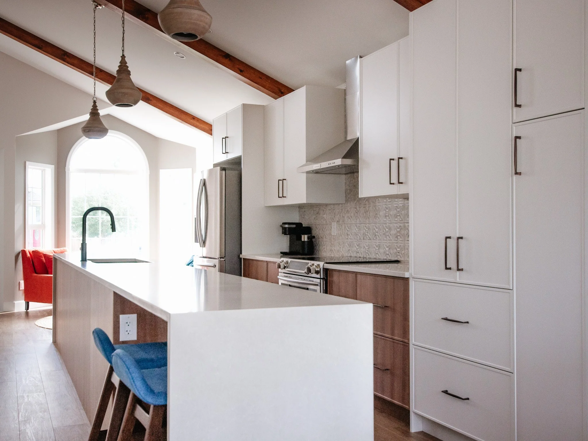
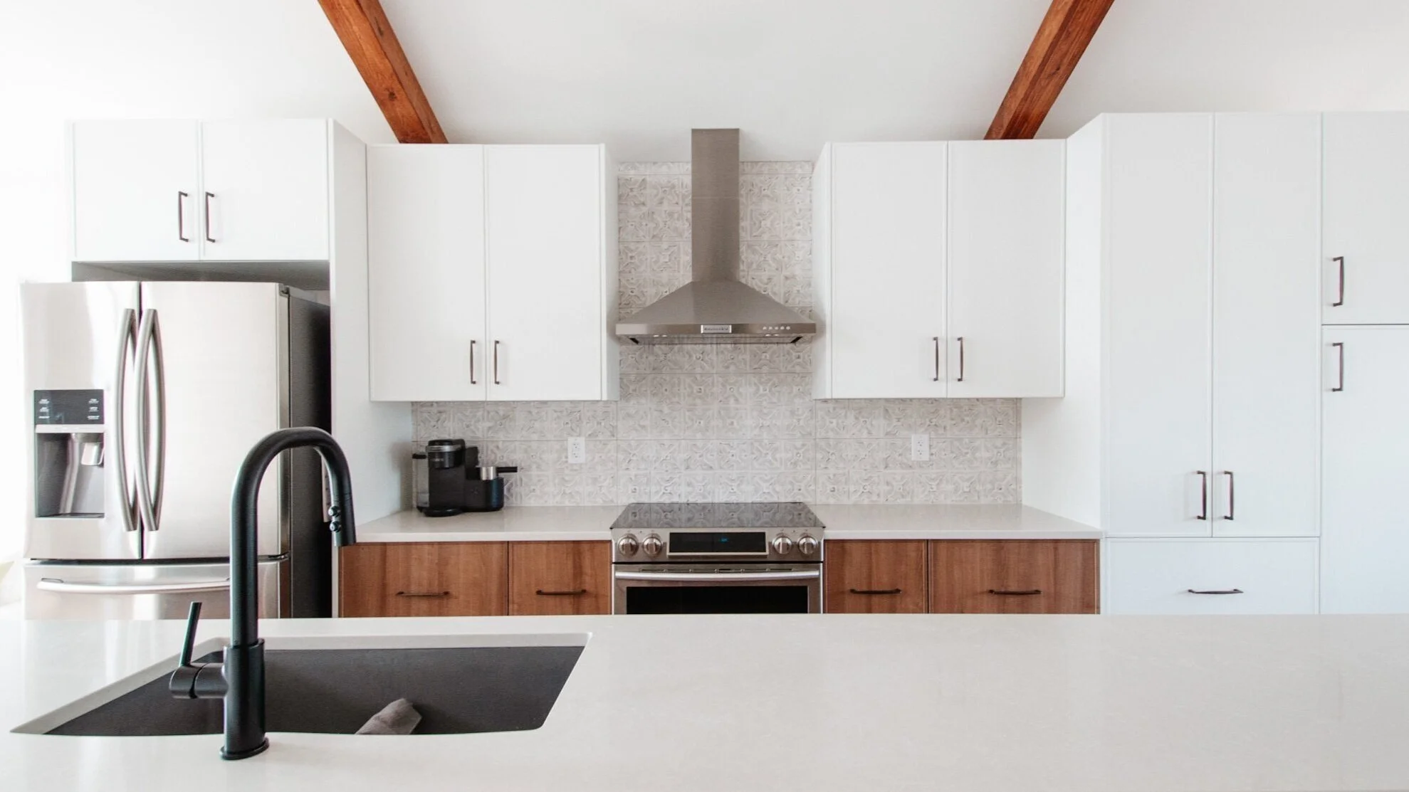
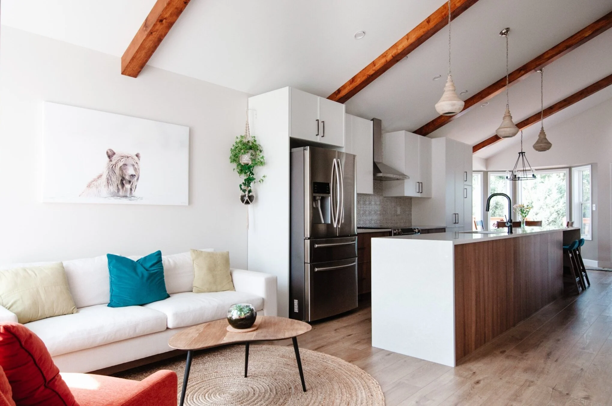
I really love how sleek and clean the kitchen is while still being very warm and inviting. This is another IKEA x Kitch - which is truly one of my favourite combos. The island (which is just shy of 16’ long) is the showstopper in beautiful quartz. The waterfall edges just seemed necessary to really finish it off and also reflect the how the white cabinetry frames the wall side of the kitchen. The decorative beams help to balance the island visually and add a lot of character to the home.
The south end of the kitchen is focused on the food prep and cooking aspects of the kitchen, and the north side focuses more on storage and gathering. We moved the sink, dishwasher and microwave into the island, with large main drawers and smaller hidden drawers inside to keep everything organized and easy to find.
The original kitchen didn’t have an externally-vented range hood, and this was one feature my clients were very excited to have. It’s also the only new appliance that was purchased.
It was important that the kitchen didn’t feel too modern or cold. So in addition to the warm wood cabinetry, we also used a more traditional backsplash, Verona bronze hardware and curvy, wood pendants.
In addition to removing the wall that separated the kitchen and sitting room, we also took away some of the space dedicated to the sitting room. I really enjoy the proportions now, as the sitting room just feels like a natural extension to the kitchen – a great spot to sit down with a warm drink and take in the sunshine that streams in through those windows.
Maintaining spare seating was also important, as my clients have several grandkids that enjoy hanging out in the kitchen too. Dedicating the end of the island as a spot to pull up a stool was the perfect addition. We kept the space in the dining room as it was so that their table still had plenty of room to expand when hosting family gatherings.
Of course, the only thing that matters in the end is that my clients love the space and that it brings them joy. And that’s exactly what they shared with me when I stopped in to photograph the space. It functions so well and has allowed them to keep everything organized and clutter-free. They spend more time in the sitting room now that it’s all one large space, and they are loving the natural light that now flows through.
Of course, these amazing transformations don’t just happen magically. We had a great team of trades, installers and suppliers, including:
Veeray Contracting Ltd.
Quinn’s Plumbing and Heating Ltd.
Timtech Electric Ltd.
Spago Tile & Stone
iPaint Painting
Kitch
Damato Granite & Marble Inc.
Divine Flooring
Ames Tile & Stone
Robinson Lighting & Bath
Berenson Hardware
An update
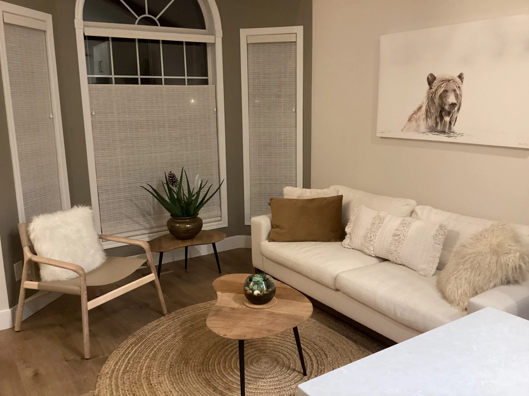
And before I wrap up, I just had to share these two photos of the space in the evening (several months later) that my clients sent over. We went with Hunter Douglas Provenance window coverings to bring in even more warmth and texture, and my clients have switched up a few items in their sitting area too. It just looks so cozy and inviting!
Ready to update your kitchen? We’d love to hear about your kitchen dreams and desires! We provide interior design and project management services in Edmonton and surrounding areas.
Live elsewhere in Alberta or even further?
We also take on select projects for onsite work within Alberta and can also support clients virtually through the planning and design process. Contact us here.

