My Home Tour: Living Room and Entry
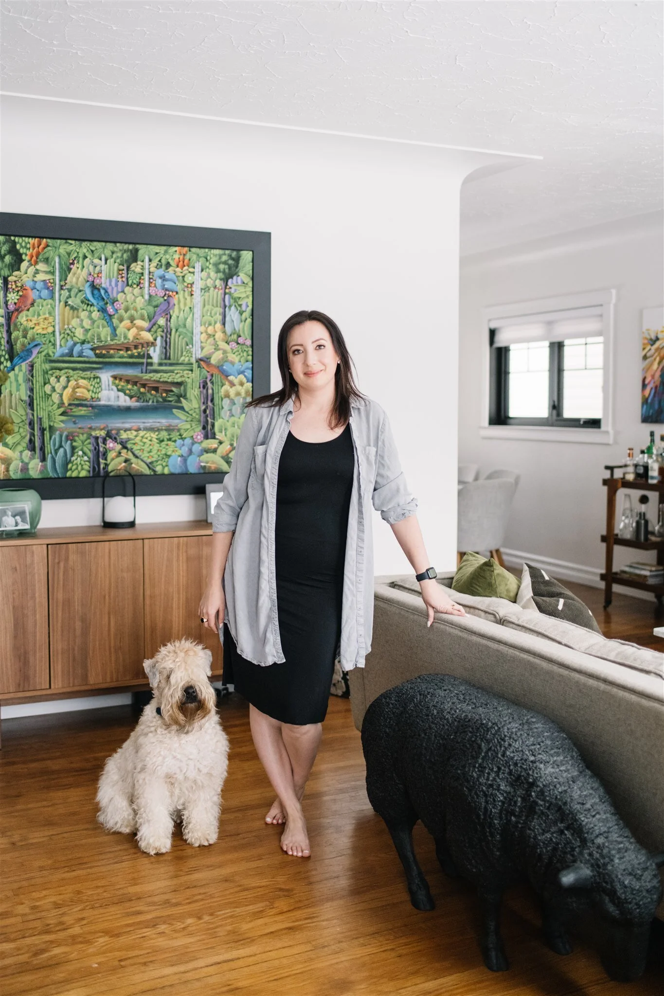
Photo: Tracey Jazmin
Next up in my house tour is the Living Room and Entryway!
By now I’m sure you’ve seen bits and pieces of it on Instagram but here is the full tour!
Keeping it Original
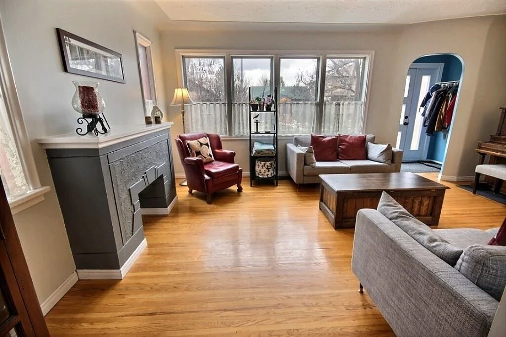
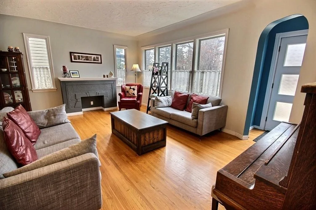
Arguably, the living room was one of the spaces that had the least amount of work done to it. Although by a lot of standards, we still did quite a bit of work.
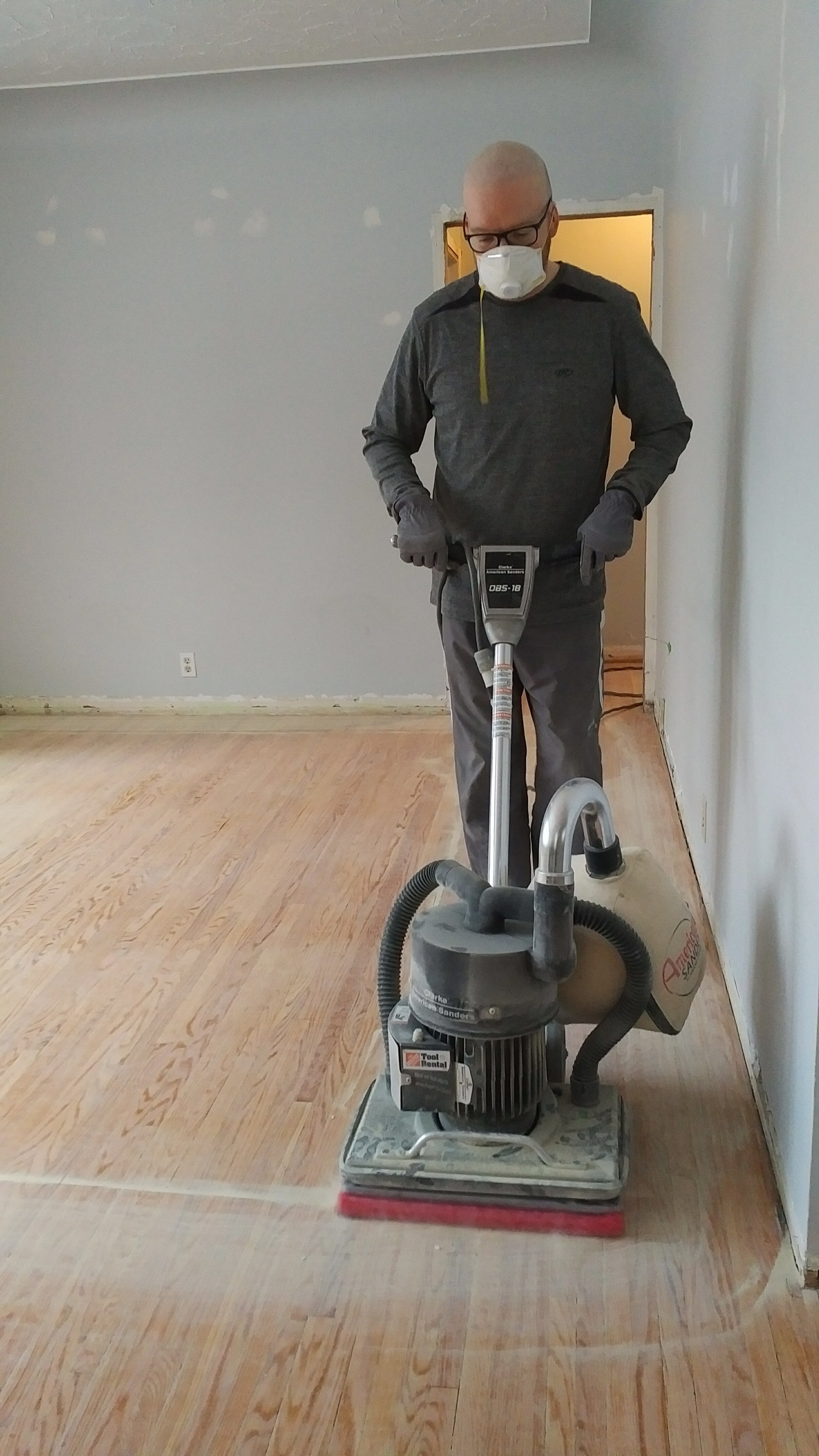
A fresh coat of paint (Sherwin Williams Snowbound), refinished hardwood, new windows, new lighting, new trim and a new mantle were the major changes.
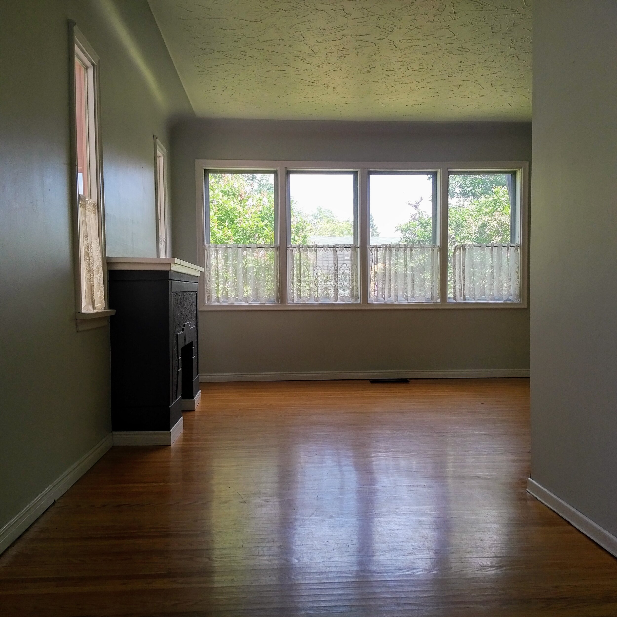
This space was one of the selling features for me. With so many windows, the light is just beautiful in the living room. And the cove ceiling and plaster work is a great original detail that I had to preserve (and I annoyed everyone by constantly telling them to be careful with the ceiling since we fully pulled up the subfloor above it!
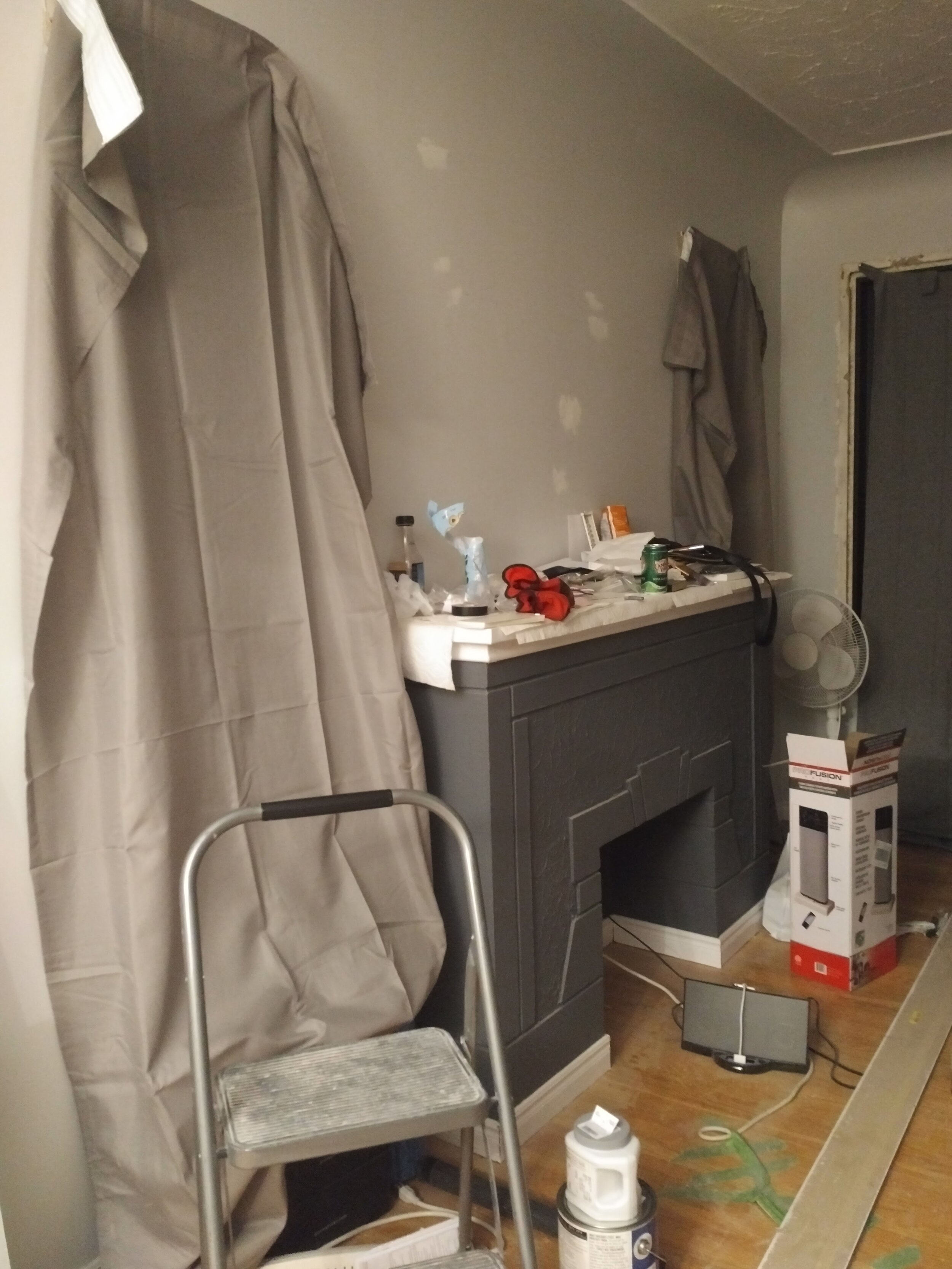
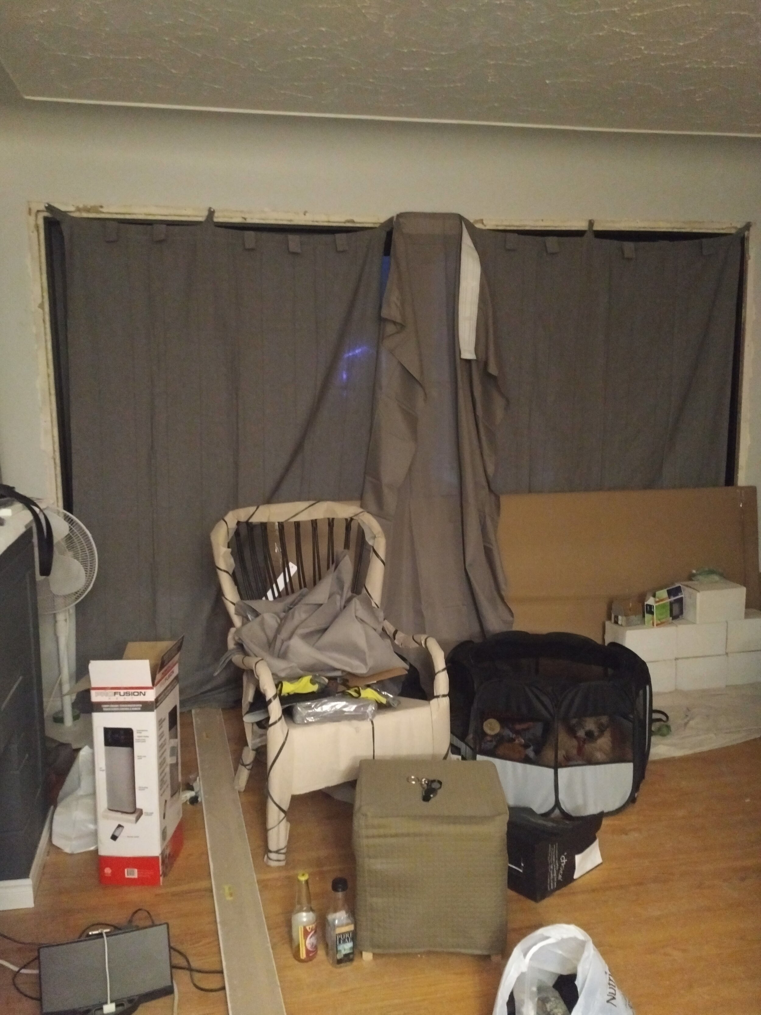
The Before
The During
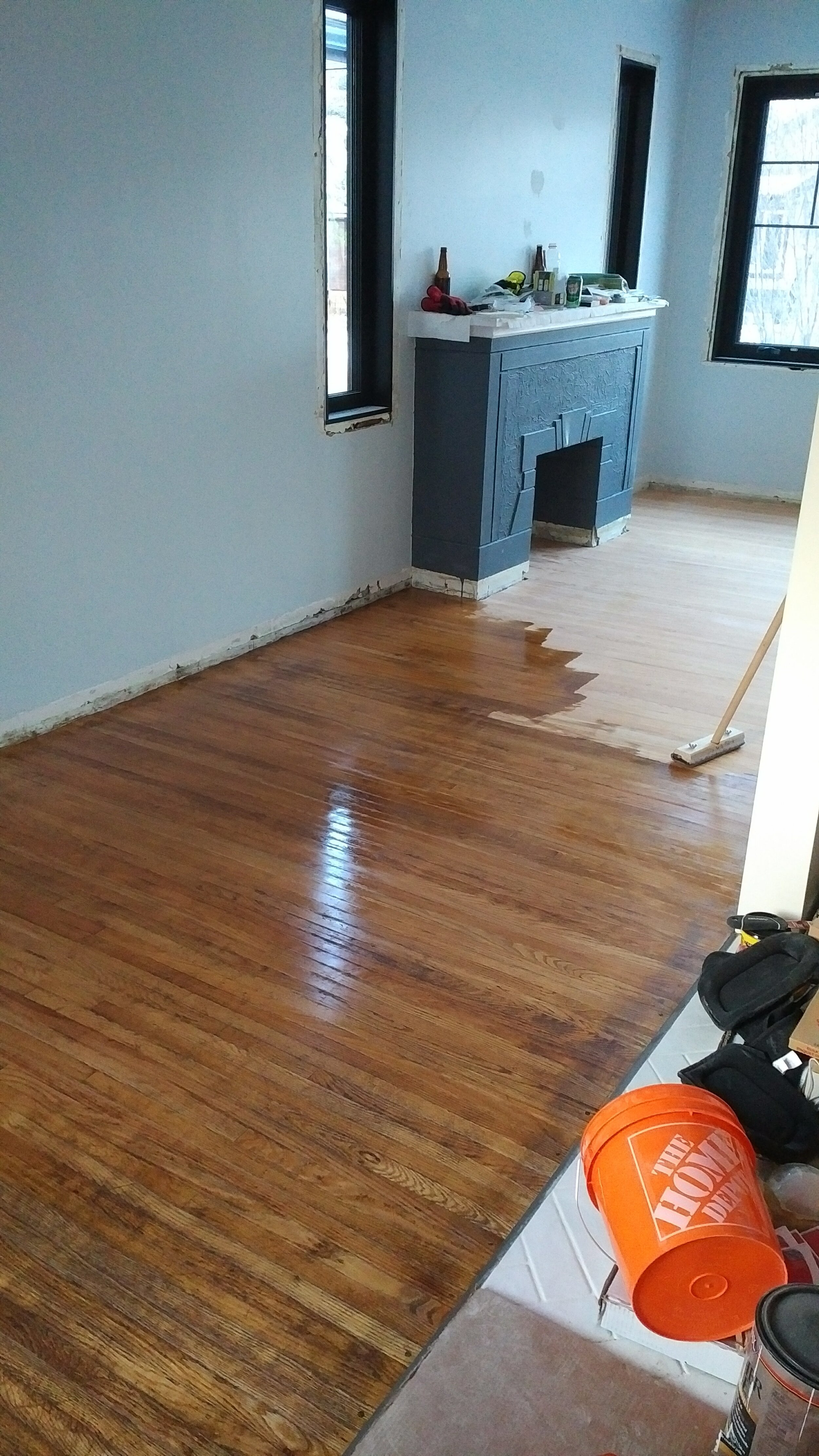
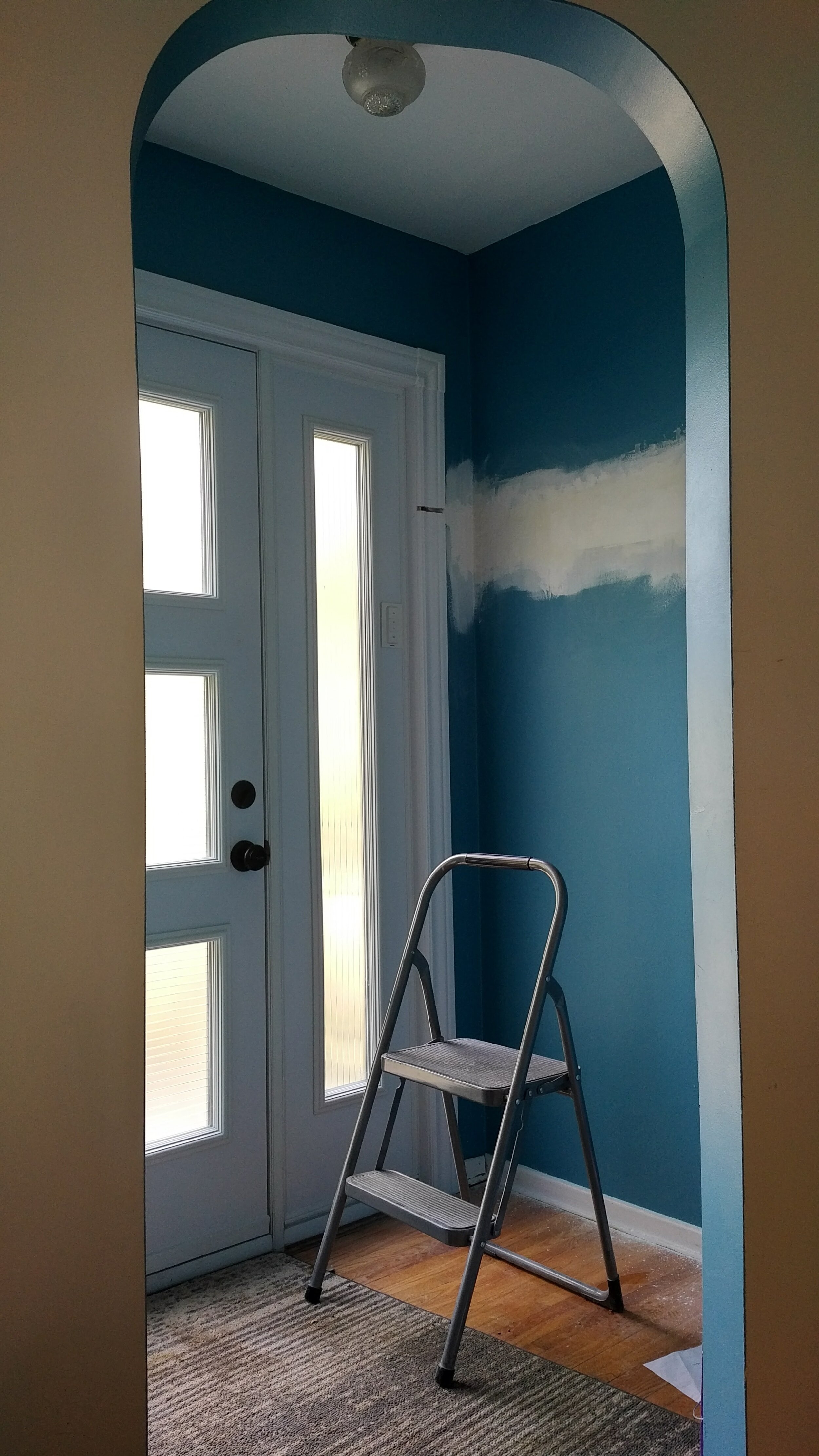
The After
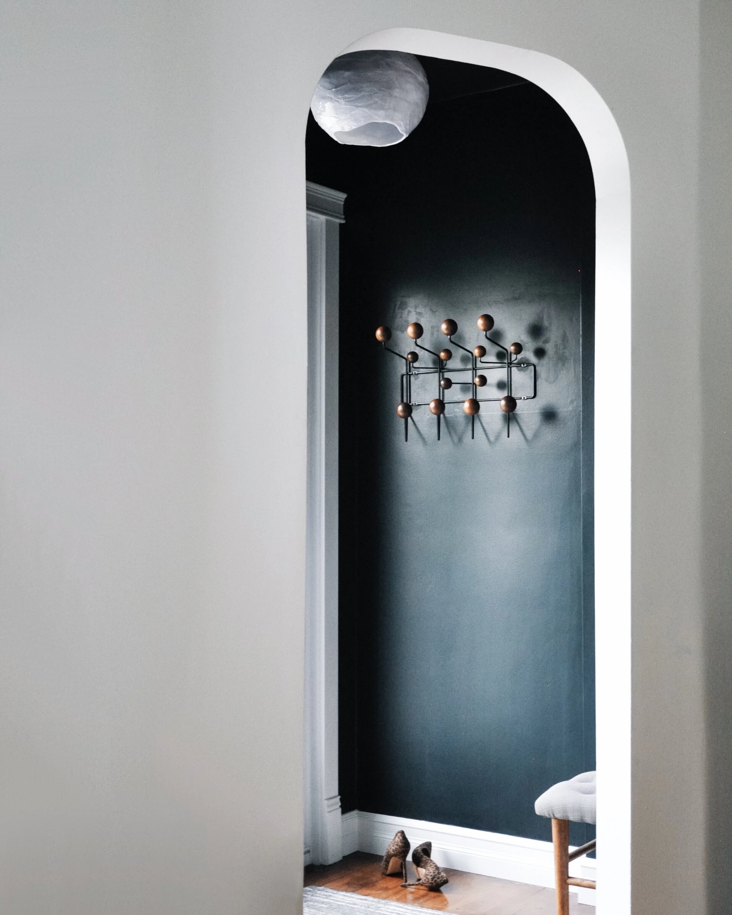
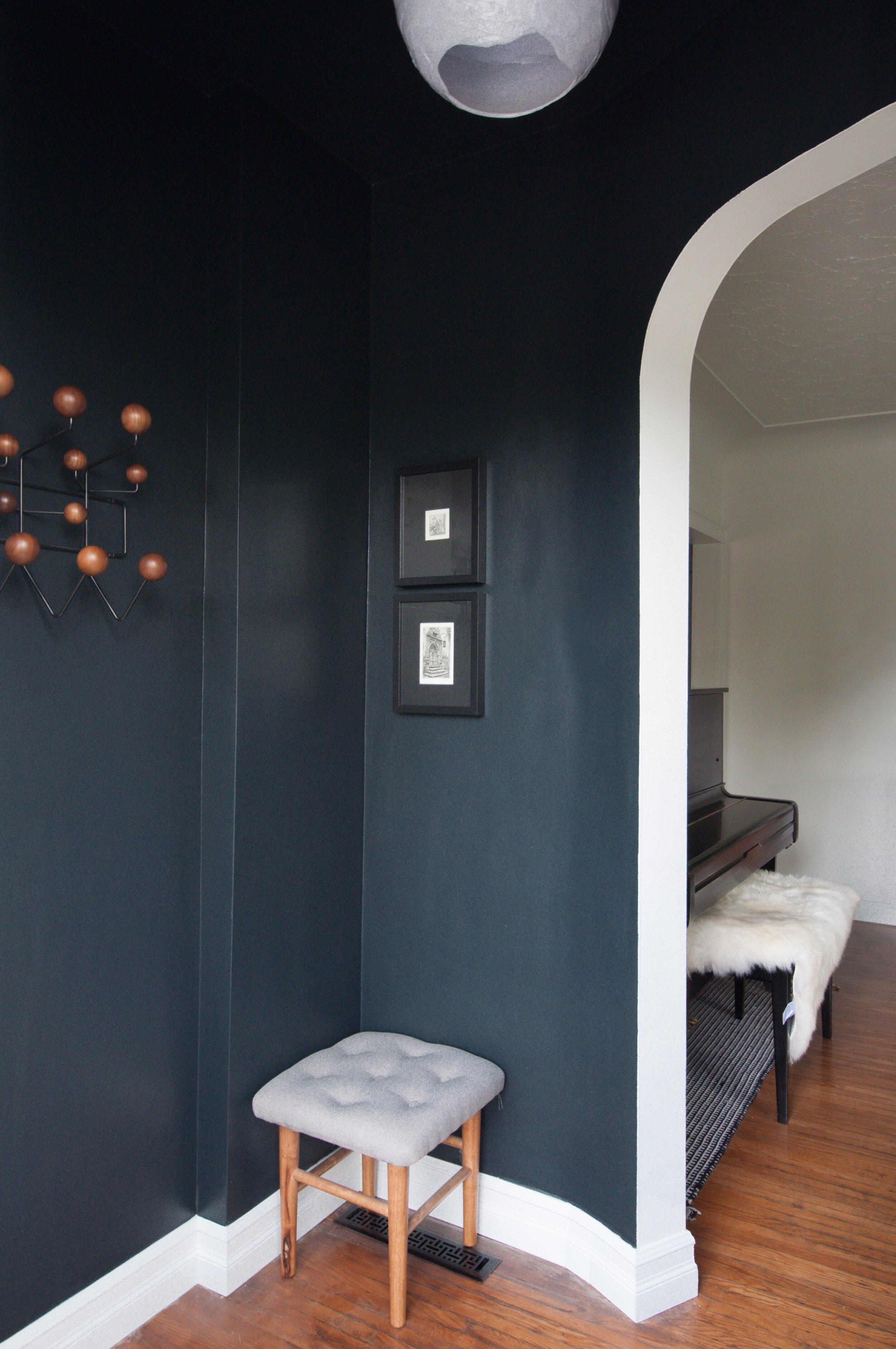
Let’s start with the entryway. The previous owners had hanging space installed but it made the entry feel really tight and as you can see in the during photo, it cut into the trim. Because we were expanding the back entry, we didn’t need the storage upfront. So out went the shelf and rod and in went my Eames Hang-it-all. Much better.
It was a pretty big repair job and working with original plaster isn’t much fun. The wall isn’t perfect, but I don’t think too many people notice since there are other more interesting things to look at.
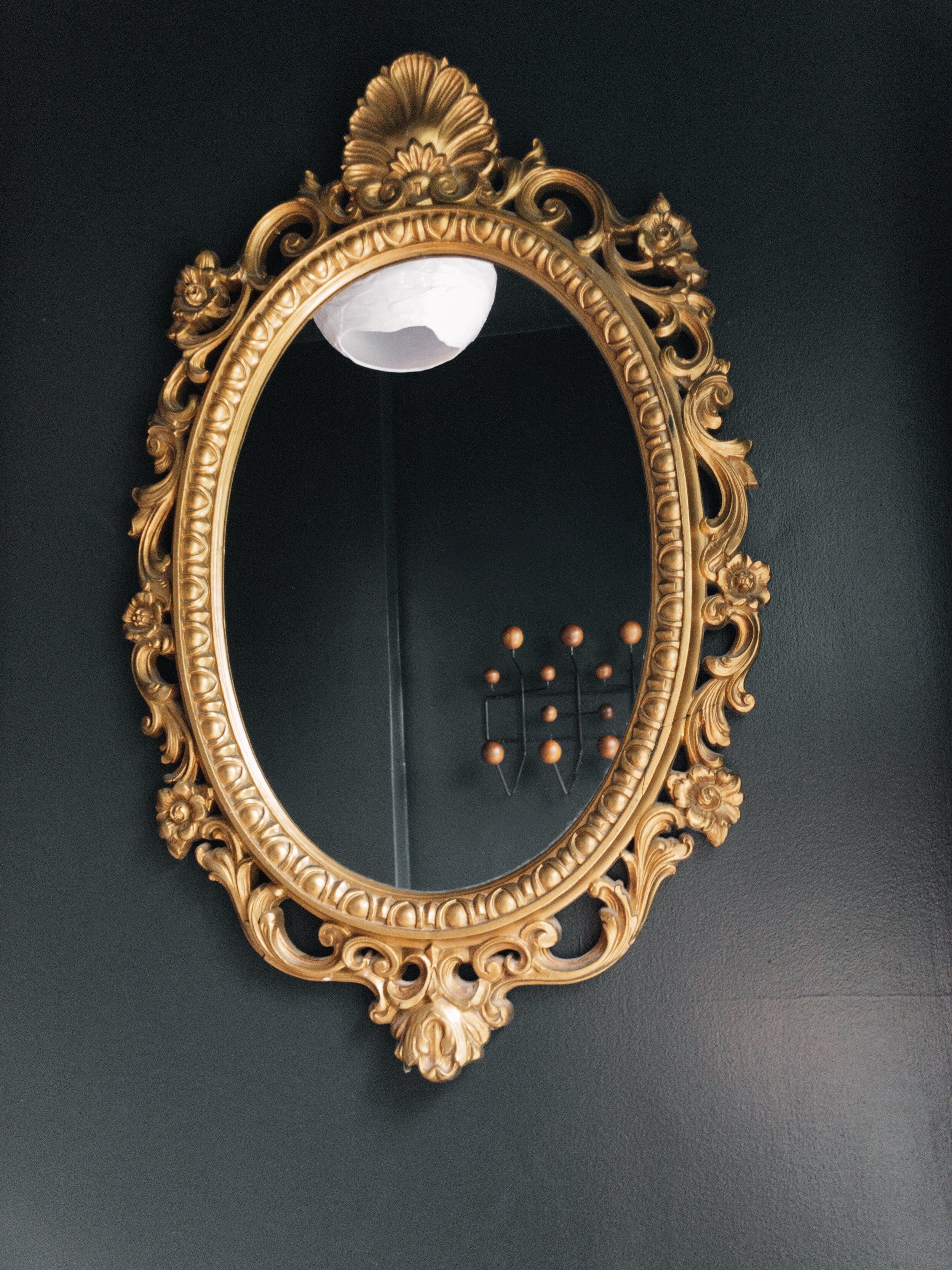
As you may have figured out by now, I love black, so it seemed like a no-brainer to me to give the entry some extra drama by painting it black (ceiling included). The black in this small space actually works to expand it visually. I added a new light fixture for more interest, an antique mirror, some art, and a small stool - voila! Oh, and who doesn’t love that arch?
When you come into the living room, you are greeted by our black sheep. When Bart and I were vacationing in Germany in 2015, we had the pleasure of spotting the Blue Flock of Peace throughout the country. We loved seeing them pop up here and there and thought it would be fun to have one in our garden one day. I decided to surprise Bart and ordered in this black version for our space. It was a lot of fun to see his reaction (and Wallace’s haha) when it arrived.
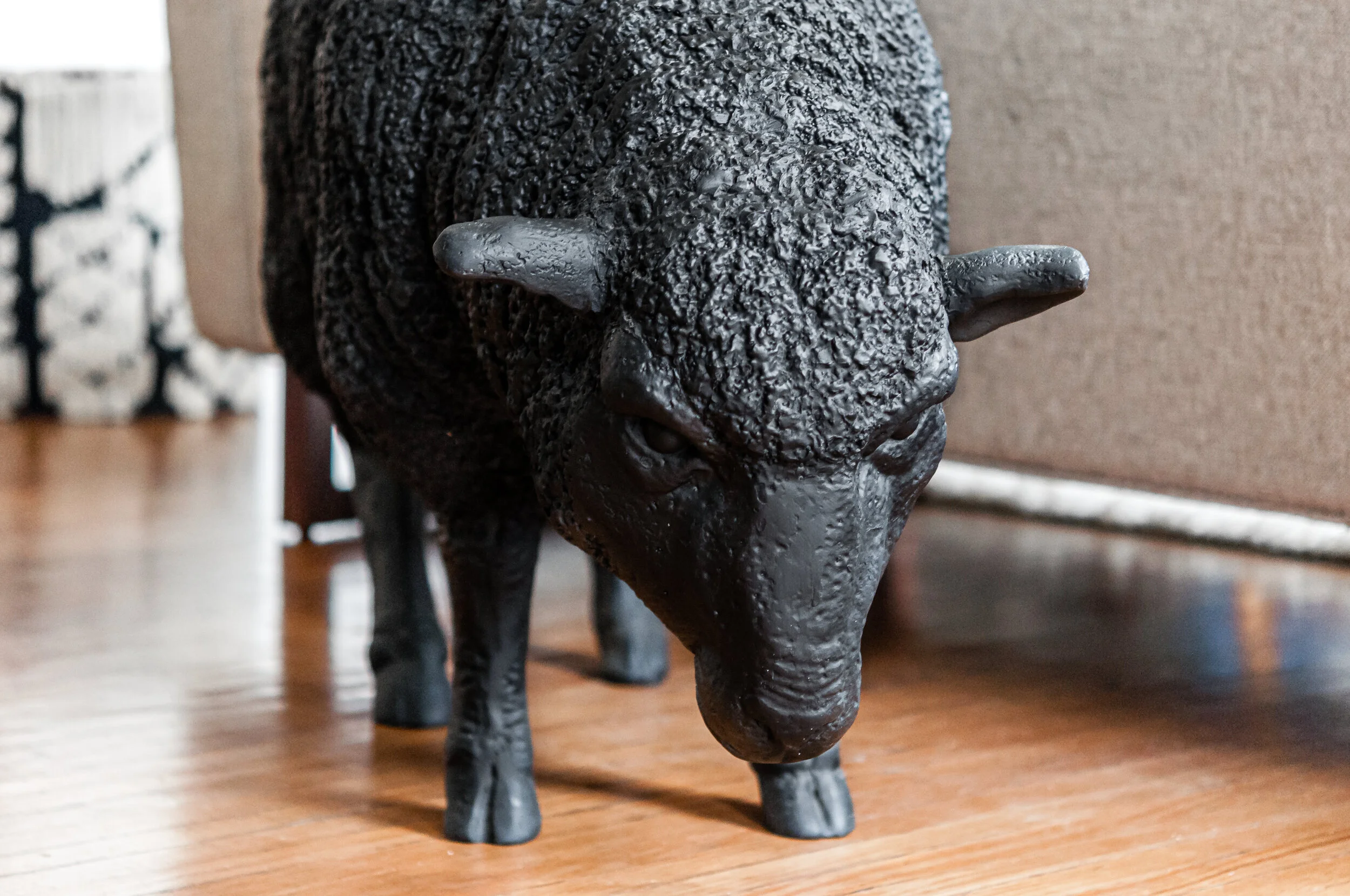
I also LOVE using humour in my own decor and design. I want people to know when they walk into our home that we don’t take things too seriously here and that we have a sense of humour (and that we love sheep!).
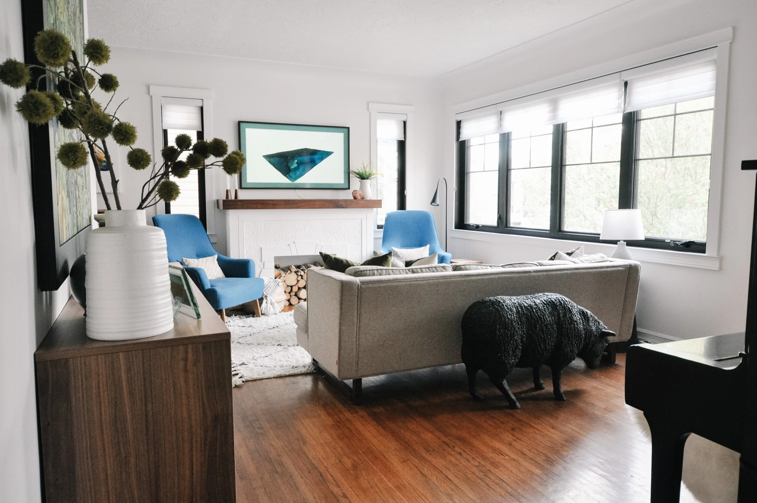
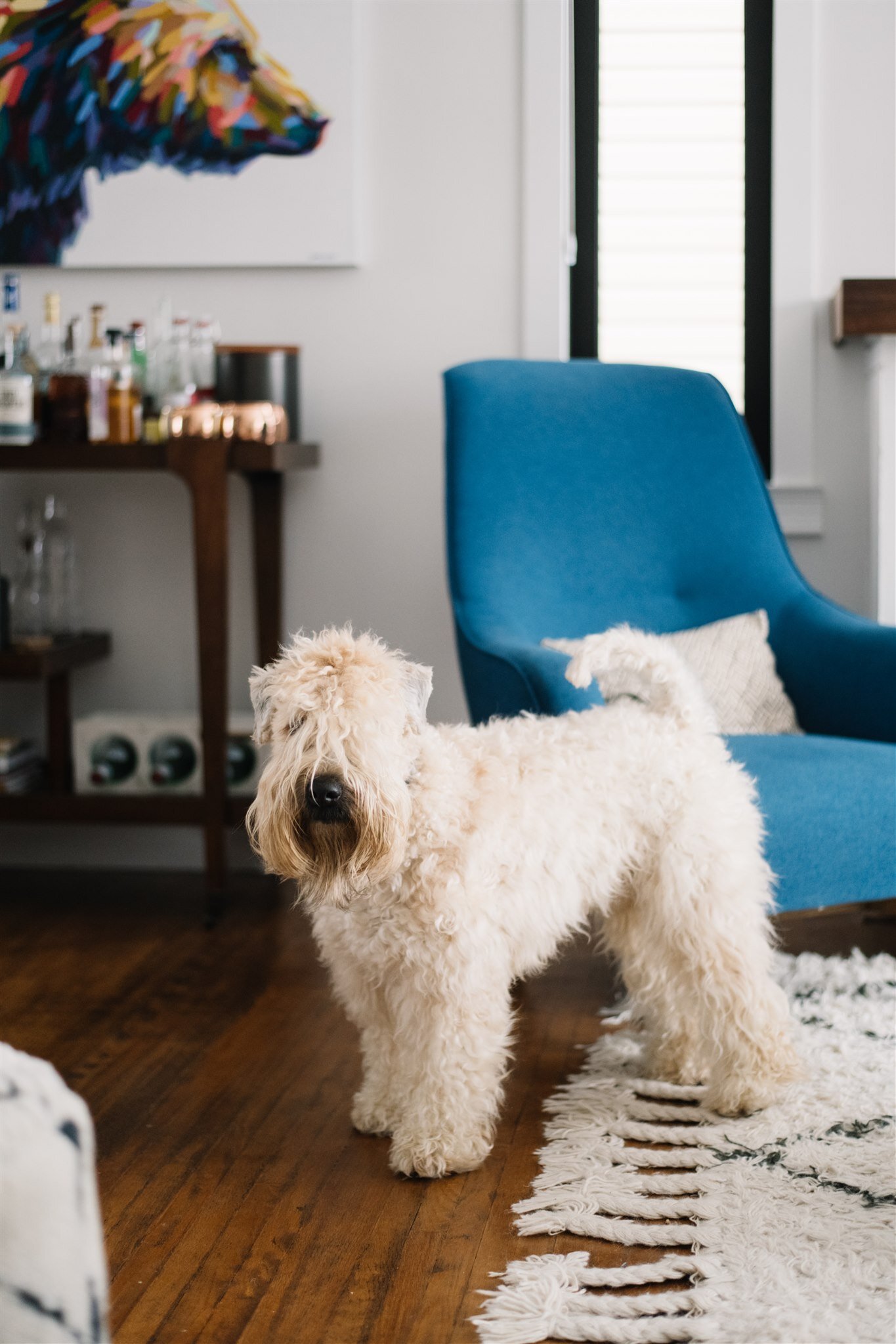
Furniture layout was also tough. I wanted it to feel cozy and intimate without feeling full. The way that the previous owners had laid things out was fine but felt too spaced out and it actually made the room feel smaller. It’s incredible what a large rug and some well-placed furniture can do to make a space instantly feel bigger.
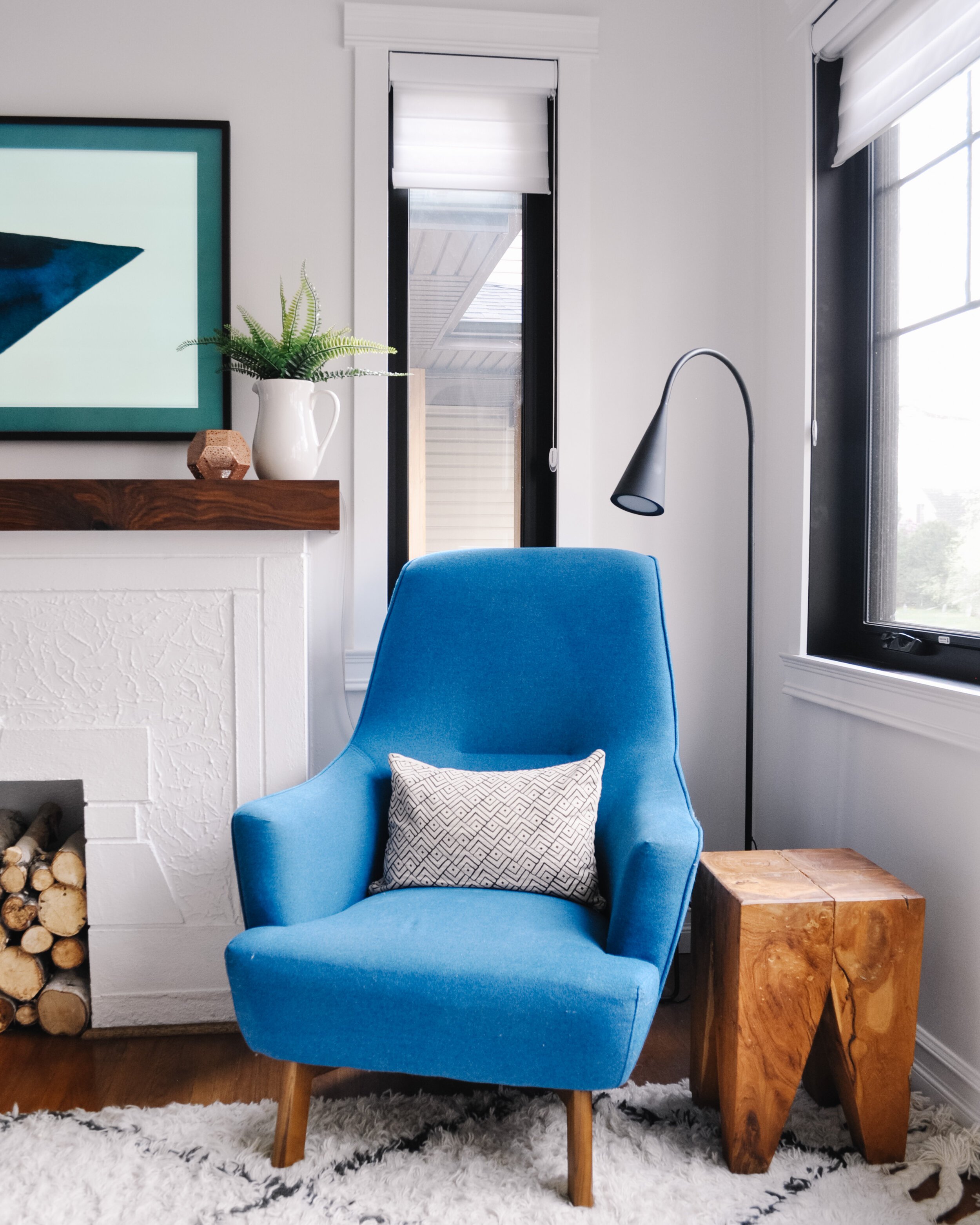
The sofa and chairs are both from Gus Modern. The blue chairs were a bit of a stretch for me as I had originally planned on keeping it more neutral. But they really help to tie in our colourful art and just add that extra bit of life to the space.
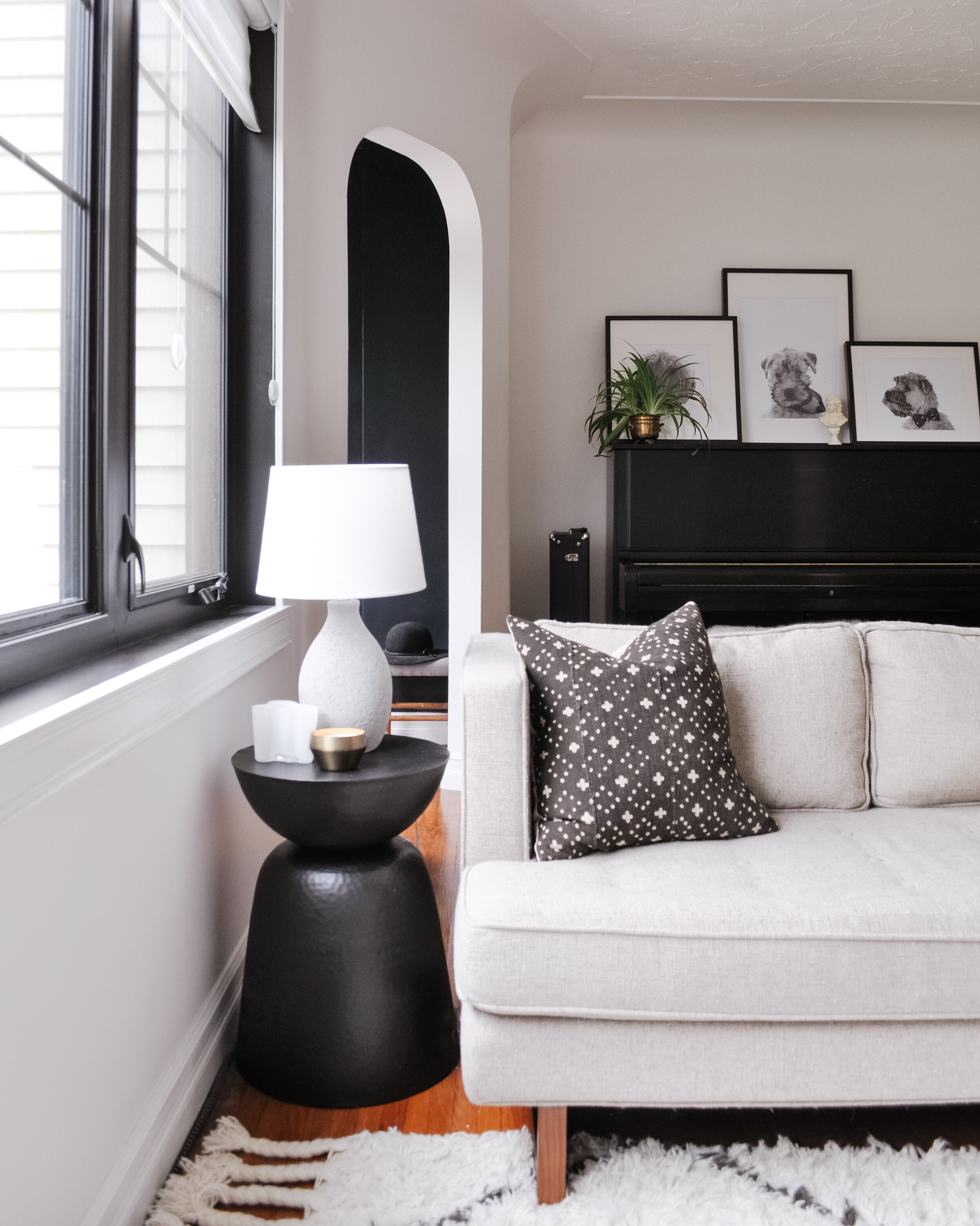
I was also so excited to FINALLY be able to have my piano in my home again. It had been about 16 years without it! And of course, it wouldn’t be our house if Wallace wasn’t front and centre. I adore these photos that we had edited by Perkie Prints that show him in 3 life stages. Alongside the photos is the Beethoven bust that I’ve had for forever and a spider plant given as a housewarming present from one of my long-time friends which is in an antique brass pot (oh and my trombone sitting on the floor beside it).
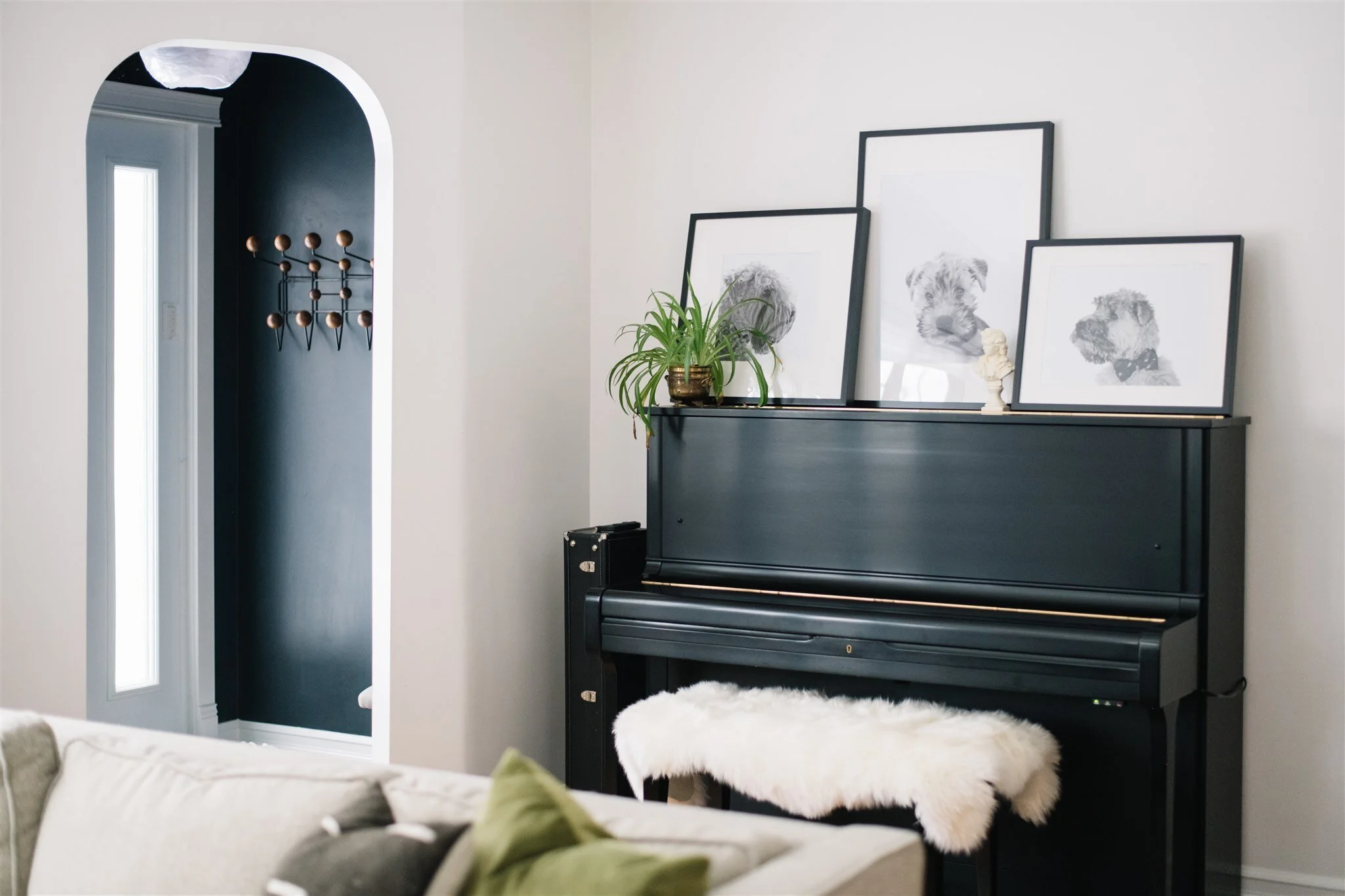
Photo: Tracey Jazmin
The “fireplace” was made cozier with the addition of the birch logs and the walnut mantle. And since I really didn’t want a typical TV above the fireplace (but there wasn’t really another spot for it), we compromised and got the Samsung Frame TV so that it could look like art when it is off, instead of a black void of a rectangle.
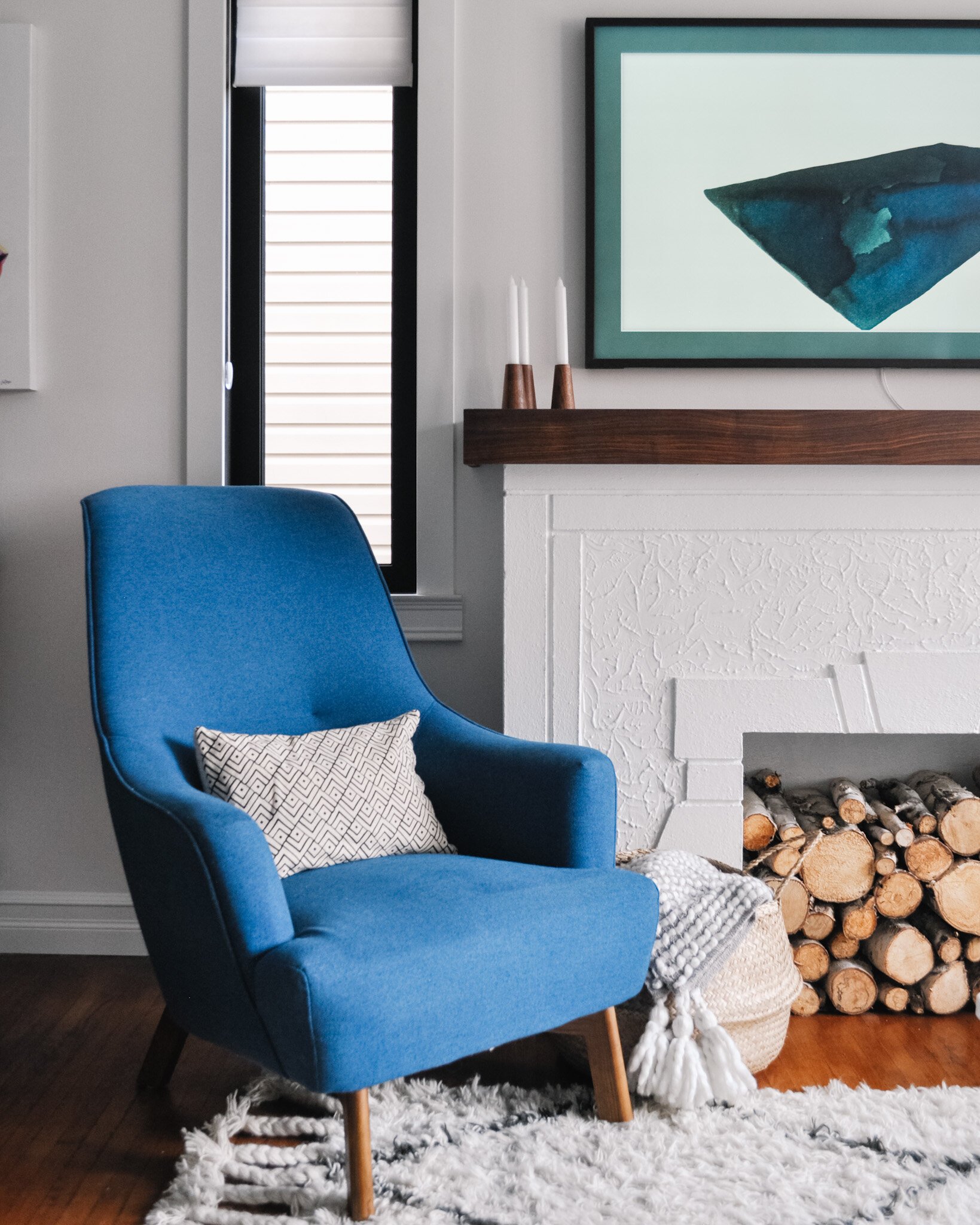
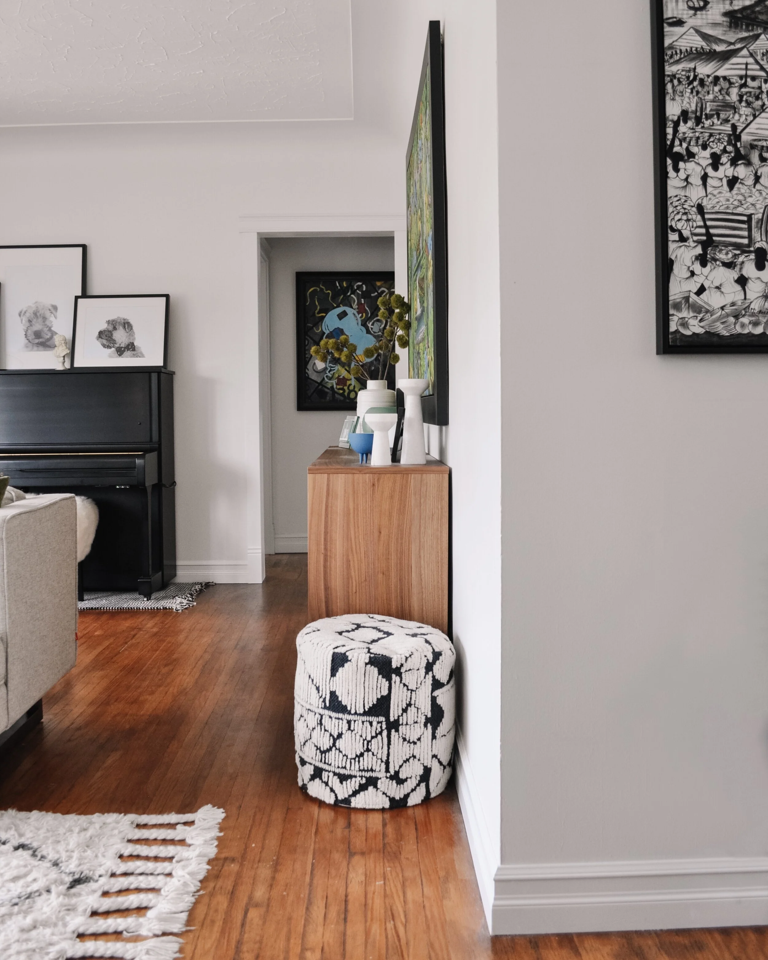
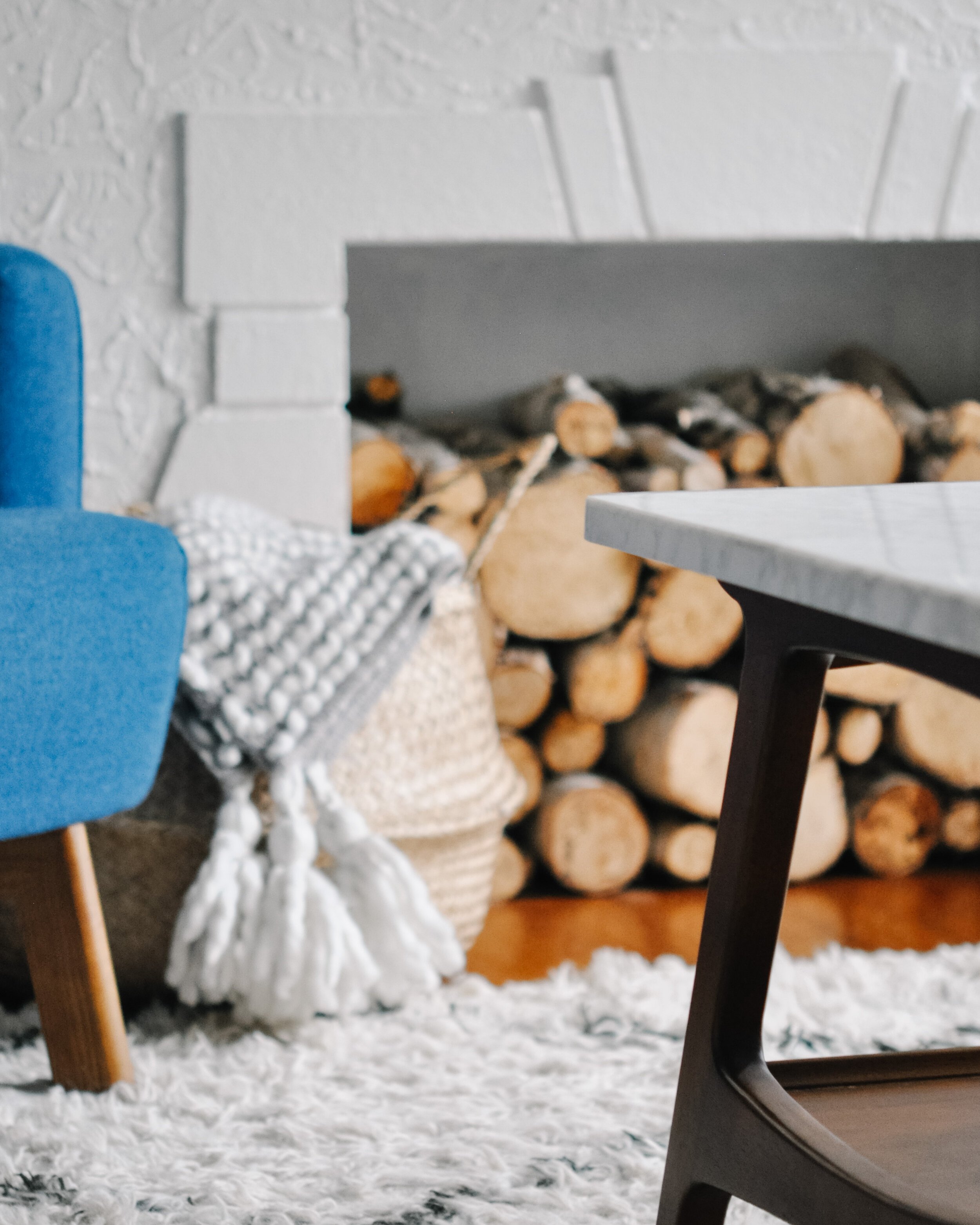
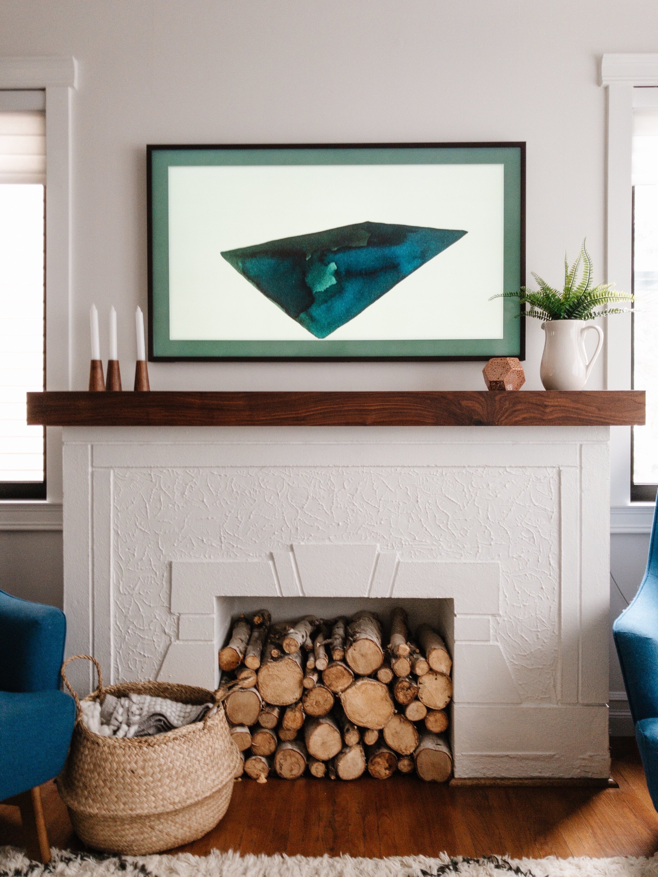
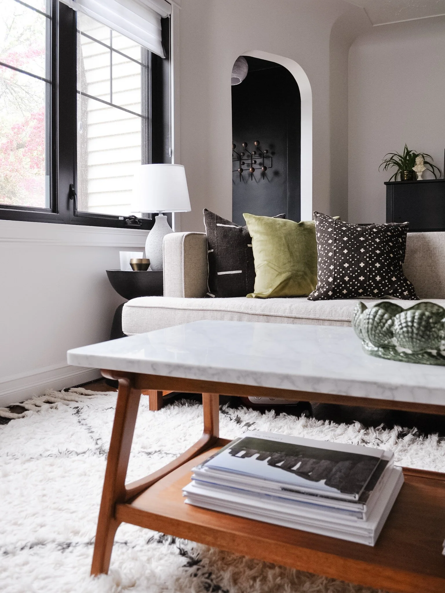
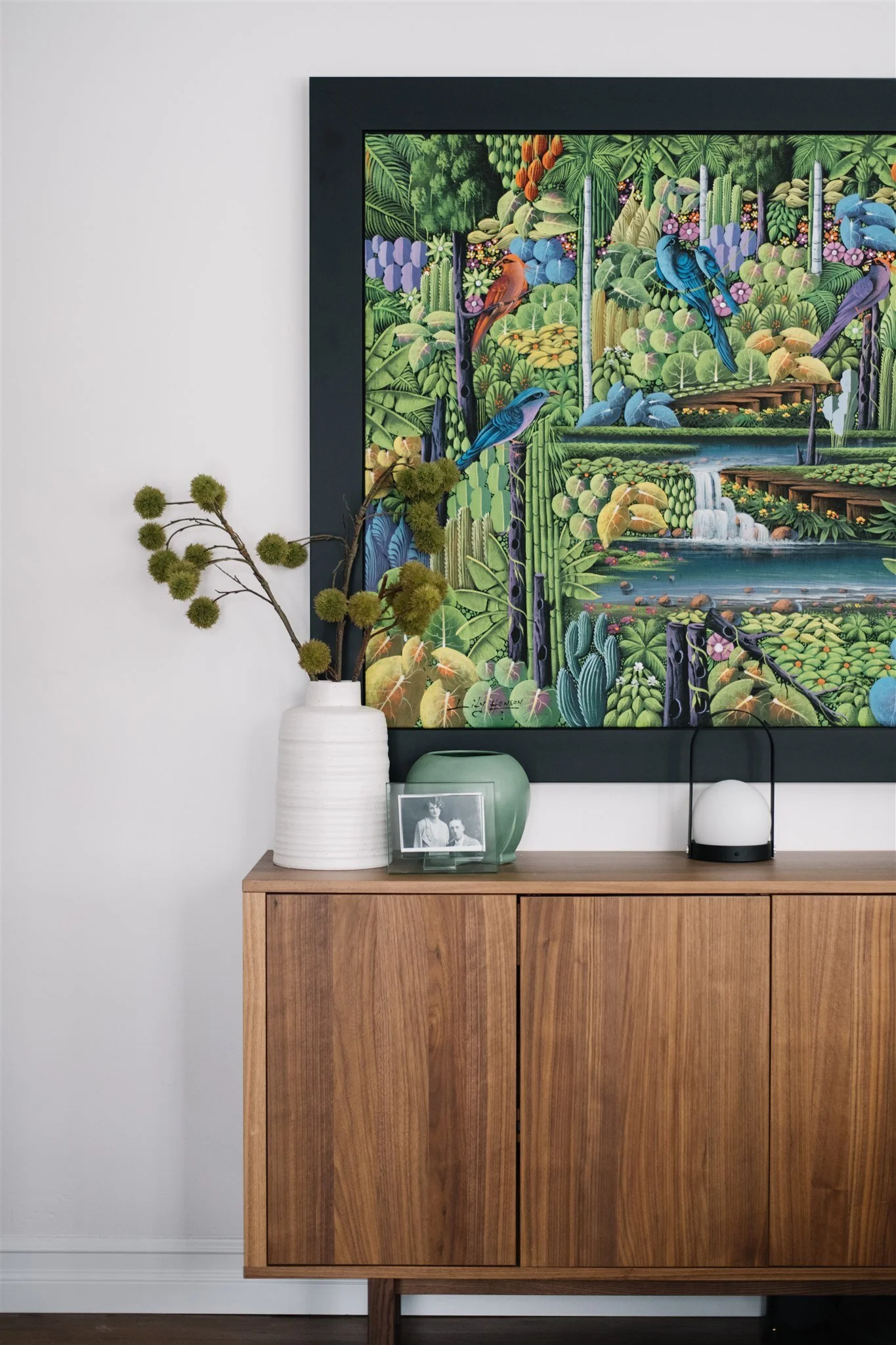
Photo: Tracey Jazmin
You also know that I love pairing high and low together in the same space. The sideboard is from IKEA’s Stockholm line. I actually first saw this piece used at my friend’s home in Norway and didn’t recognize it as IKEA at the time. It turned out to be the perfect fit for our space too! The artwork is a piece I bought on one of my return trips to the Dominican (where I had lived in 2010/2011) and is by Haitian artist Lily Honson. (There is totally a story there too about how the painting made its way to Canada… pretty sure there’s an Instagram post on that!) The blue chairs were actually chosen in part because of this painting - they play off each other so well in the space.
Its accented by various items I’ve collected over time, some old, some new. Some from well-known brands, others from my travels. I always feel like that mix is what gives a home a lot of character and interest.
We spend so much time in this space - from morning coffees to movie nights, and let’s be honest, lots of dinners while watching a show. It’s where we train and groom Wallace. Where we entertain friends and family. It’s the place I go when I need a change of scenery from my office. It’s definitely the heart of the home.

Kierstin Smyth Design
Edmonton Interior Design Consultant